Meanwhile, in this post, I decided not to talk about my photos but rather do a simple review for some amazing freeware (so far) which I've tried lately for making Anaglyphs and other options. I'm not paid to do this review or anything, but I will mention why I like it and what I think it needs further adjustments, but I still don't get many aspects about it yet. We'll come to that in few, but first I need to make an announcement here, though I'm not sure if anyone cares about it anyway:
As time progressed since my return to Instagram around November 2019, after stopping for one whole year, I've decided to stop it again and probably for good this time, as I realized that working with such platform is just a vain and useless (or maybe requires more of my time than what I'm willing to give). I did indeed disable my account (@tj_q8), however, I do have my other account which was dedicated to my conlang (@Ayvarith) and which logged me out suddenly and stopped me from going in. Sent many emails to Instagram to get back this secondary account but they didn't help much and I'm totally locked out. I tried to get it back by logging back to @tj_q8 and adding it from there but that was not useful. Anyway, I left a message there on my last post on @Ayvarith, using my first account @tj_q8, to note that I've been locked out and probably got hacked) and I have no plan to make a substitute account to post for the Ayvarith Conlang. Thus, I can't disable @tj_q8 now because if I do, the message I've posted there would be automatically deleted. Hence, even though the account is re-activated, I'm not going to use it or post in it, and I think this time for good (i.e. never again). One of the ironic thing about people in this platform is they are willing to check the "story" more than they do check and like the images in the basic account; Why? That's beyond me for now. And I don't want to understand it even. So, this is it for now.
StereoPhoto Maker
Again, before I proceed with this review, I want to announce that I'm not paid for this and I'm merely sharing my opinion here according to my own (simple) usage of this program/app, and out of love for this kind of art. I have to say that this program made making anaglyphs much easier for me for some reasons I will mention, but also there are some points that would make me in need to work further on images in Photoshop.
 |
| StereoPhoto Maker window and work space with two of my images open. Click to enlarge. |

I have to admit though there are some terms or names that I didn't understand but the overall usage is quite simple and straight forward. So, what I want to do here first is to go through some of these buttons and go about what they do as briefly as possible. Lot of these buttons do make anaglyph-making such an easy task compared to what I used to do manually in Photoshop.
 |
| Third Section |
So, if you look at the big picture above you might notice how the buttons are divided into sections. The first and second sections are "self-explanatory"; Just hover the mouse over the button and you will get an explanation for what the button does and these first 2 sections are all about the usual operations (saving, cropping, etc). So, fast forward to the third section which you see its screenshot above. Here too, the buttons are quite straight forward, but I'm interested in the first (1) button, which swaps the left and right images. In Photoshop, I used to do that manually (changing the color channels to flip the right and left images and to test which one was better illusion of depth). All this process of flipping and testing the depth of the anaglyph is done with a click of a button here on StereoPhoto Maker!
The rest of the buttons in this section are about zooming in and out but button (5) here somehow perplexed me. The guide (when hovering the cursor over the button) says "Resampling ON/OFF," so it seems to be a button that controls the resolution a bit or the compression of the photo, so I'm not quite sure (I didn't read the help files or anything, I'm brutally attacking the program and experimenting here!).
 |
| Fourth section |
Then we arrive at the fourth section where the bulk of the juice is located! This is the place where you want to play around and experiment, a LOT.
 |
| Interlaced Mode Click to enlarge. |
- Here, this button puts the 2 images in "interlaced" mode. The look of the resulting image here is like ones prepared for usage with lenticular lenses! Which makes me wonder if this is really the purpose of this process here, and if not, would it help to be used in the process of making lenticular images?
- This button would make the typical anaglyph for you, but it will convert the image to B&W or grayscale for better perception of depth (in fact it is recommended that anaglyphs be in grayscale to avoid color distractions). Here you can also see a little arrow for more options for the make of the anaglyph: red/cyan, red/green, and some more; But probably the newest option for me here is the Rainbow anaglyph! I've never seen such an anaglyph so I'm not sure if it just for artistic purposes or there is indeed a theory behind it, but nevertheless the red/cyan tints are given to the image with the general rainbow coloring.
- This button is the conventional anaglyph making button; An anaglyph in colors. Again, you can click the arrow here to see more options for various ways to merge the anaglyph. There are some new names for me here, like Dubois, Suto (the creator?), and some more options. To my own observation it seems that these options control the degree of the red/cyan, because (in case you didn't know) anaglyph glasses vary in types and they are not of a single type of red/cyan. The Dubois option specifically gives that typical yellowish tint to the whole anaglyph which I typically see on anaglyphs on the internet and always wondered why it is like that! There are other coloring options like Yellow/Blue. Also, in this button you can control the anaglyph by choosing Ghost-Reduced anaglyph, where you can control the Levels and Saturation to reduce the ghosting in the image (ghosting is when your eye would be unable to merge the left and right images together for various technical problems). Finally, there is an option to optimize the anaglyph (make it better) either automatically or manually. All that in this simple button here!
- This button is to spread the images on the left and right, as to be viewed as a stereogram (or stereograph?) and in fact once you open the left and right images in StereoPhoto Maker the images will be initially in this position.
- Like No.4, but the images are placed vertically; Top and below.

Sharp 3D LCD Mode
Click to enlarge. - This button merges the image for Sharp 3D LCD display. In looks, this one here looks like the image in No.1 but instead of horizontal strips, vertical ones are used. Or so it seems to me. In fact, I do think that such option might enable people with the polarizing 3D glasses (those from IMAX) to be to view the image in 3D (without losing the color) just like in No.1.
- This button displays the two images in Page-Flip for 3D shutter glasses. Personally, I didn't try such glasses before but I know they are "electronic" and depend on turning on and off images (according to Wikipedia). Anyway, I don't think this is of any concern to me (for the time being).

 |
| Fifth Section |
- This button, called Easy Adjustments, is to adjust some aspects of the two images, left and right. Honestly, I didn't delve deep into this section yet, but a quick glance here shows a typical set of tools, like enhancing the shades of red and cyan for the two images, as well as rotating and fixing the perspective for any of the images composing the anaglyph.
- This button is my favorite. It is the Auto Alignment where the program does mostly everything you need and so far so good for me; It just does it perfectly in a way that enhances the depth of the anaglyph. A quick comparison between this auto alignment and Photoshop's alignment shows a clear difference in algorithm; The two alignments do not match. Also, when doing the alignment, the alignment data are saved in a folder to be called later in case you need to use it later.
- This button is called the Alignment Mode, and actually it is just a manual alignment mode where the program allows you to pick a point from the left image and match it to a point on the right image and voila! The two images are aligned accordingly. However, only ONE point is picked. It reminds me of the manual control points in problematic panoramas when stitching them in PTGui.
- This button is for adjusting the colors automatically, as simple as that.
- In case you don't like the alignment work that you've done, just click this button to reset.
Here also, I didn't go through the menus, which really are direct and right forward mostly. However, there are a number of commands and options in the File menu that I do need to experiment with. Some of these commands are dedicated to save the stereo-image (not an anaglyph) in a specific manner with a specific border. Anyway, my main interest here was anaglyphs, and to be more specific, the red/cyan anaglyphs. So, this is for the general options available, now I'm going to move to list the Pros, and Cons.
Pros and Cons
Well, as I've mentioned earlier, I do like this little program, but I can't isolate it from my workflow with Photoshop just yet. After all, Photoshop might be needed at least to do the sharpening if necessary, right? However, there is more to this. To organize things, I'll make a list here of Pros and Cons. First let's see the Pros:
- The program supports a variety of basic file formats: JPG, GIF, TIF, BMP, PNG, JP2, JPT. I've tried to work with TIF 16-bit format myself and it works.
- Obviously, the easiness of use and being direct. If you don't know what a term means, just try it!
- The alignment of the two images might (just might, not sure about this yet) fix the problem of perspective change when you have the object in one shot larger than in the other. This is something that Photoshop (ahem CS5 for me) still not doing quite well. In fact, I see in this parameter here the seed of fixing my problem with Anaglyph panoramas.
- Gives a wide range of choices to adjust the anaglyph in terms of colors (original colors of the image as well as the shades of the anaglyph).
- The ability to flip right and left images easily to test which version has a better depth.
- Simple, very light program. No installation required or anything. Simply, unzip, and run.
- Support for RAW files in some way or at least DNG format beside the basic formats mentioned above. It's hard, I know, but maybe there would be some way around it?
- The support for color spaces in such a way that the final image can be "converted" to that specific place. So far, and because I often needed opening the file in Photoshop for further adjustments, the best way to work with anaglyphs saved in StereoPhoto Maker was to "assign" (not "convert") the color space down to sRGB which might be fine for an anaglyph for a grayscale image, but for a colored image it would pull down so much vibrancy. So, if you are like me, like to work in ProPhoto or Adobe1998 color spaces, there will be a big hassle to tone down the Red and Cyan tones to fit the tones of the 3D Glasses.
- The support of more than one matching (control) point for aligning the two images (in the fifth section mentioned above). I feel one point, sometimes, is not enough. Of course, the aim of having one matching point here is originally to focus the depth of the anaglyph around one specific feature in the image, but also multi-points would help with some stretching or resizing the two images if needed, I guess?
- Adding an option to "Replace" one image for another while making the anaglyph to test and compare maybe (or simply in case of an error by using the wrong couple of images, it would be easier to replace one and keep the other).
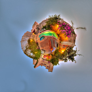
 |
| Anaglyph panorama done by StereoPhoto Maker (top) and manually by me (bottom). Personally, I do feel and see greater depth in the anaglyph created by StereoPhoto Maker. Check it out for yourself. The tones in the two images are different for some long story, but both are tone-mapped from HDR panoramas. Click to enlarge. |
Finale
Well, this is the post for this week folks. I hope you find this review useful, even though I didn't explore the full potential of this little program yet, as there are a number of sub-menus and commands, specially those dedicated to fix and correct the anaglyph. However, this little review, as I believe, does not do any justice to the creators really. I'm already looking for any donations venue to support their work. In the pages I've mentioned above around the beginning of this review, there are a number other solutions for the anaglyph-making process and some of them are related to videos; Something I tried to do long ago but didn't succeed, so maybe these little solutions would help me further when I do get the time to work again on anaglyph-videos. Give it a try and give them some support if you will! Till next week…