Showing posts with label panorama. Show all posts

Thursday, November 18, 2021

The Office…

Alright! I think I can literally say that I'm officially retired now! I didn't go to work for more than a week now (or by the time this is posted, it would be 2 weeks), and as I'm writing this, some papers need to be signed and completely detach myself from that workplace (and it is vexing me off).
I have to say though there are some bitter-sweet moments involved here but I'm trying not to gaze upon these for a long time now and just keep going. I'm not sure where I would be going from here, but the joy of not having to drive the car daily to and from a specific place routinely is just overwhelming!

Last Encounter

As I've mentioned in my last post here, in which I was updating about my life, I've already made some shots in my workplace, specifically for the office where I used work. This is like a tribute and a farewell. Honestly though, I do wish of shooting other buildings around my workplace as they are more interesting (architecturally), but I'm not sure how to be permitted to do so. I might ask about it later.

The last Meeting

So, I've posted The Last Meeting in my last post and I didn't go about the technicality here. Originally, this shot was taken using Hα filter fitted on Voigtländer 20mm lens. The shooting was bracketed but I picked the darker frame of the three to process as it yields the mood better. The colors look almost natural after fixing the WB, and this is typical for Hα filters when used in this manner (the effect is exaggerated way more when doing it outdoors and shooting plants). In the process, diffusion was added on purpose as well to add more to the mood. There is a building showing from the left window, thus it was yellowish.

The Dark Meeting

And because of the number of these shots taken with Hα filter, I've decided to process one of them without adjusting the WB just to see the look and mood of it, as seen in The Dark Meeting. I think not bad for something to give dark vibes. Interesting though to see Blue/Cyan/Green tones are somewhat preserved (though faintly) in this dark version.

Workplace

Then of course we have some words with panoramas, but the big talk about panoramas will be left for later for the time being. After doing the main panorama in the office (which was faced with some struggles), I've headed out to shoot some handheld panorama for the building in general. It was quite an opportunity because things were quiet and just my car is there to add some element to the building. Probably you've guessed it already that Workplace was shot using Hα filter, fitted on Voigtländer 20mm lens. Actually, I've shot it more than once, as the sun didn't allow me to judge the proportions correctly from the LCD (and in fact it was a bit soft and needed to be sharpened). In fact, I did shoot in brackets in order to merge images into HDR slides and tone-map them later after stitching, but turned out that it was not quite needed as not much can be yielded (or let's say, not much drama could be deduced from the scene). 

Workplace II

I made 2 versions of the same panorama by swabbing the Red/Blue channels (quickly by using the Invert layer trick) and in fact I've liked the swapped version, Workplace, more than the original one after stitching, which happens to be Workplace II. Such swapping is common in such images taken with special filters, in order to turn the red sky into blue and give some mixed sense of normalcy and surrealism. Anyway, for me at least, I judge by the overall looks and I do prefer Workplace to Workplace II. Probably the proportions are not quite fit as the ground occupies more space than the sky (and I consider it a bad thing really) but I couldn't ask for more in such a handheld panorama.

The Office

Now, the big part of that "session" in my workplace was a panorama for my office, and I got all my gear for that; Well, most of it… I'm not a picky person when it comes to the gear that I should include when visiting a location.
Anyway, I've already set some basic ideas to set the mood or the general looks for such a panorama:

  • Dark mood, so the panorama would be shot with lights switched off.
  • Reflecting my life in the office, so most of the things in the office should be untouched and not re-organized (except for few items of course).

With these in mind, I've started to settle down with my tripod in that narrow space between my desk and the meeting table (my office is originally a meeting room).

The Office

The shooting went relatively smooth and it was my luck that I got a mix of yellow and blue lights (or warm and cool) from the door and the window respectively. In this shoot, I've tried to capture the nadir point as well in hope that I can stitch it as well with the rest but things didn't go well in that perspective. I was hoping to do that to increase the space at the bottom if possible and not make things look quite close to the edge of the frame in this panorama.

The Door Upward

Of course, the shooting went bracketed for HDR merging later on and I had a peculiar problem there when some specific slides  (and for a reason I'm still not sure of) where the bracketed images were not aligned properly by Photomatix and caused quite a hassle when I tried to stitch them. I've discovered the reason later on, and it was some option in Photomatix for aligning the images; Everything should be off except for By Matching Features (or in fact, I might have turned this off as well!). Anyway, what puzzles me is why that specific set of bracketed images that was affected? I still have no answer. And for sure, one has to turn off the Crop aligned output option. This is designed for handheld panoramas and not a systematic one done with proper tools like this one. I found out all about this the hard way.

At The End of The Office

And of course, if you've known me for a while and my work with panoramas, you might know as well that I won't just satisfy myself with only one version of the panorama. Each projection style has a potential to carry on some kind of message or feeling (or mood) that has a big chance of being different than the original flat normal version. Now the difference of course is not to be understood as "diverse" but let's just say: Tweaked little bit.
So, the 2nd version I've made, The Door Upward, can be interpreted in 2 ways; Either as the door that lead my up (on a financial scale) or the door exiting from which would lead me upward. I'm appreciative toward my work, but I'm just not in harmony with the people in it or the system.
Then I made a 3rd version, which is based on the typical "little planet" projection, and actually I used to call such style "wide view" projection or style. In At The End of The Office I was lucky that the light from the door kind of met the light from the window (with a little help in editing). But this version, unfortunately, is not suitable for big format because of the mess in the ground from trials to remove the tripod remnants. This is one of the reasons that taking the nadir shot and stitch it altogether was a goal when doing this panorama; With such differences in light and tones on the ground, it's just not that easy to clone out the tripod/head remains in the image. I think this version kind of mimics going in a trapped environment and then freedom shows somewhere at the far end. You are free to read it as you wish of course.

Ethereal Opposites

And finally, the 4th version of this panorama and I would say probably my least favorite. In fact, this is one of the reasons that I've done a "wide view" version before the typical "little planet" version (and consequently the "tunnel view" version above). In fact, I've didn't make a little planet out of this panorama (so far) as I couldn't feel the aesthetics behind it. Not only that, but removing the tripod remnants from the little planet would also require a great deal of time (if it is possible to begin with). So in a sense, the tunnel view version, Ethereal Opposites, was quite easier to be done and be dealt with than the little planet version. I don't like the general composition formed by the inner elements of this version but I just like the way the light from the door sweeps through (and I've added more of it in the HDR phase) which somehow gives a sense of spiraling from the center going outwardly. Emotionally, well, I don't think I can feel much out of this version really.

Finale

Well, I've posted everything new that I've made lately in this post, but there are more which was done from old images, some of which do roll back in time to 2010. I'm not sure where to start with.
On the other hand, and as I'm typing this post, I'm still having problems with the management in my (ex-) workplace with the final procedures to get my "leaving certificate". Because of these delays, it is quite probable (or even for sure) I won't be getting any salary or pension for the month of November. Papers here, papers there, and then I've been told things are to be done online, and then after some told me you don't have to do a thing, things will be done automatically and all I have to do is to check my custody; Which is a burden worth a week of work I presume. I'm digging old files and documents to track these items AND I do need to find someone to transfer to. Otherwise, all of these valuable scientific instruments might go away for good with no return. For this matter, I'm officially retired, but I'm bond to go to work now and then to check things and to follow up. One of the jokes I've been told just lately, is that one of the critical websites that I need to complete some of the procedures, would not open from outside; It must be opened with a connection from my workplace. Did anyone laugh? No? Good…


Thursday, October 7, 2021

+5…

Did I pass 2 weeks already without blogging? I guess! I really didn't count the days. I've been under pressure lately which made me unable to do much even with editing my old photos. The largest portion of this stress has passed (somewhat) already, but some deal of it remains still. More about that a bit later.
I don't think I will be posting much in this post except for an announcement, and as I go on, I might think of posting a bit further about some of my latest edits!

Announcement

I think I've mentioned in previous posts about new uploads to Mostphotos. So, here it is, I've uploaded about 3 new panoramas (plus 2, adding to 10 panoramas uploaded months back). So, the total right now is at 15 panoramas at large sizes, suitable for printing as fine art pieces. I think I didn't post much about these extra 5 panoramas, so I'll try to do so here right now. 


Failakan Sunset

Earlier (as in last month or before!) I've added Failakan Sunset  to Mostphotos (exclusively), and it is an old (half-way) panorama shot over a ramp, which is used to slide boats to the water, on Failaka island. It was taken in 2012. I say "half-way" here as it was not a full panorama, but merely 2 rows was shot, and the third one was not shot (probably because at that time it was getting pretty dark on this depopulated island). Originally done in HDR, but this time it is done with singles of RAW files; All edited and stitched. Of course the colors are edited here and in fact they caused me a problem because when merging layers the appearance of the image would change drastically. I had to re-work the colors after merging (and at 100% zoom to ensure the accuracy of the colors). At 300 dpi, the panorama is close to 102cm by 36cm. I think if I was to print this panorama I would print it on a glossy material, preferably metal. Just one must be careful about the reflections from light fixtures. 

Entry
(Slí Isteach)

Then I added Entry, or as I like to call it in Irish: Slí Isteach. This is a panorama shot in 2014 inside a little defensive tower in the remains of Aughnanure castle in Oughterard, Co. Galway. It was my 3rd time in Ireland, and my 2nd time in Aughnanure (the first being in 2009). Generally speaking, this projection is relatively new for this panorama. I did many projections and styles out of this panorama, but this is the first time I do a simple vertical one like this, and centering it at the door. At 300 dpi, this panorama is almost 33cm by 75cm. I had to crop quite a portion to balance the image here and remove unnecessary or incomplete details. I would consider printing this on glossy metal but one has to be careful with the lighting surrounding this; Otherwise it would turn just like a reflective mirror with such dark areas. If one would want to go safe with this one, matte never hurts anyone!

Solar Towers

Then, we have Solar Towers, which took me quite some time to put the keywording for, and I'm not sure why. I think I was passing through some "mind-boggling" phase or something. Anyway, I did the keywording after all and here it is. Of course this is an old panorama and it was done in HDR before but this time, like the rest in this series, it is stitched out of single RAW files. The projection here, though, is the new thing as I didn't do such a projection before out of this panorama specifically. I had some struggles of course with the tripod and its shadows (like in the original) and I had spent quite some time fixing it. At 300 dpi, the size is about 42cm by 76cm. I tend to think that glossy printing of this one would add to the vibrancy of the blue tones and adds more overall contrast.

Beyond Abzu

I rolled back in time and checked some of these winter adventures I did back in 2012, and found some worthy stuff (but with a great deal of post-processing work and fixing), such Beyond Abzu here. Beyond Abzu was one of my first night panoramas and I still remember that cold winter night when my feet got frozen by the cold water. As the processing went on, the general tint of the image got green and that inspired a sense of mystery in me, hence the name Abzu (also Apsu) which is the name of the primitive waters, supposedly, from which the world was created in Sumerian myths. In some way, the whole surrealism in this panorama was pointing to that meaning in my head so I gave it that name. At 300 dpi, the panorama is about 37cm by 85cm, and I would go with a glossy print for this one though I would fear for the level of noise here to be exaggerated. I worked on cleaning the noise moderately because there is a limit, after which details might disappear. However, this panorama still bear some dark aspect and dark areas might work as mirrors in glossy prints,specially metallic ones. But I would imagine it would be so vibrant if printed on metal!

Return to Nammu


Lastly, there is Return to Nammu which I consider like Part-2 of Beyond Abzu. In time, these two panoramas are not far off; Both were shot in the same winter, and both in January of that year. However, with Return to Nammu, the sky was a bit darker than in Beyond Abzu specifically because I shot this facing the sea and the moon and the city lights were relatively further away. This allowed for some star constellations to appear in the sky in the original shots and here I tried to process the panorama and clean the noise without touching the stars. Thus, they appear in the original panorama, despite being shot within the vicinity of the city, but only when zoomed in at 100%. Unlike Beyond Abzu though, this one looks quite colorful, and yet mysterious a bit because of the dark night element and the stars, and that moon that shines like a rising sun (but in the middle of the night!). At 300 dpi, the size is about 85cm by 38cm. Print-wise, I guess it would do good in glossy as well as matte. The green hue here, as I see it, would be a vibrant one on a glossy media, specially a metallic one. 

Well, this is for now 5 new uploads to my Mostphotos, which are exclusive to Mostphotos. The links are up there to visit the profile or the specific images, in case you are reading this and wish to get one of these.
My capabilities right now are not quite aligned to provide such printing services and shipping, so I let these images to be purchased on their own as big original files in JPEG format to be printed on whatever the client would like.

Finale

Well, probably I can't get on so much with this post but I believe the announcement above and the details mentioned are just about enough in length for this post; Let's not make it longer!
I am currently on a leave from work for 2 weeks but not for resting or fun, but rather for stress and tracking. After a long wait, I've finally received my "disability certificate" which took a bit more than 2 weeks actually, and finally I was ready to submit my request for a grant of medical retirement from my workplace. But things weren't easy as I hoped for; Suddenly, solving a problem 2 or 3 more problems would occur and some more responsibilities regarding my work are added to the mix, which made every single passing day count. As I'm typing these words, I've finally submitted my papers by email (after a little adventure in going to the new campus, my future workplace supposedly) and a recent phone call confirmed to me that my papers had been signed and ongoing in the process. I just hope the big part of this is over with just before my two-week leave ends. Bureaucracy is not in a friendly terms with my time.
For this reason, and because of all of that stress, I don't think I would be blogging on a regular basis, but surely I will try as much as I can, at least once every other week. Who knows, maybe by the next blog post here, I would be completely free…


Thursday, September 2, 2021

Backies…

Hello! Here I am, posting again, after some break from blogging. Actually, this post is just a little announcement to tell that I'm still around and didn't forget completely about blogging, despite the lack of content really!

August had been such a busy month for me and still. To add more load to the mix, I'm officially back to work now (with all the rush-hour jams and those nasty stuff). However, I've been taking my first steps in recognizing my disability with Retinitis Pigmentosa; Meaning, I will be given the "special needs" (or "disabled" if you will) status in an official way and in return I'll be given some "small" advantages here and there (like a special permit to park my car in special needs/disability parking lot vacancy). However, the far-fetched goal is to get a "medical retirement" if possible.
The whole story is just still at its beginnings and I'm already having some problems or glitches in the system because of the paperwork and the messy job done by some in such governmental agencies. From my side, I've done all the required tests so far and I'm just waiting for the final decree in my case by some committees (and all that related jargon). I'm living in somewhat strange status, where I feel pressed and relieved at same time. I just hope these people don't make it harder for me to get that certificate and getting my retirement ASAP. Worrying is inevitable here and I just wish that I could blink and all is over with. 

Photo Work

Aside the paperwork that I've just mentioned, not much has been done photo-wise except for editing some old photos. However, I did indeed re-create some new panoramas from old ones as I was planning to be adding them to my Mostphotos exclusively, as large files to be downloaded and printed. As I'm typing this, I've already uploaded 2 more, and 3 more are waiting to be keyworded to be uploaded, but I'm having some hard time in creating keywords for these panoramas, and to focus in general. My brain feels fuzzy and blank. 

Failakan Sunset

Entry
In editing old photos, I've been revisiting old folders, as far back as 2011 (and even 2009) and been trying some new tricks on these old photos, specially those that were never touched because I deemed them useless (and this is one more reason to not delete bad photos). In the process, I've kind of "invented" some technique or style I would say for creating a linear art out of the photo. I'm also considering writing a blog post in Arabic for my Arabic blog about this technique specifically.
I liked the style of these images actually and I'm considering also doing a series of photos (or even taking new photos for this purpose) all to be in such linear art form and upload them to the stocks. Just an idea so far and if I would go ahead with it, I might consider mainly photos of fishes or plants. I think this technique is also suitable to create some of these "coloring book"-styled images.

The Shining Kisser (linear)
A sample of such art

Anyway, all of that is going on at the back of my head at the moment since I'm busy with other things specially with me going back to work right now. My mind is totally blank that I'm out of new ideas to shoot with my camera, and I didn't touch it in months right now. In order to get my fingers cracking with it, I've tried to shoot my 8-month old nephew in the house (it was also some practice for using the back-focus button, but seems this method is not in my favor for the time being).

Finale

So, this is a quick coming-back post. Without much fuss for the time being! I think I need to check previous posts to see where did I stop with photos, or maybe I'll start something completely new away from that series of posts.I'm not sure yet. Meanwhile, I need to prepare for that Arabic post for my Arabic blog, so I'm not sure I will be able to prepare a post for the week after the next. But I will try.
On the other hand, the weather here is miserable (i.e. normal) and I just can't wait for winter to be here, or at least fall (if such thing exists here). In the past few days I had to run errands, coming and going with my sister, under such sun, and such hell. Also most of the days in the past week were humid that it feels like drinking water just by going outside; And it's NOT a cold one.
As my brain is wandering off with ideas and images of what would happen next as I'm going through my plans for retirement, as well as Retinitis Pigmentosa itself, I'm trying hard to keep my feet firm into reality with this mundane day-to-day life. Other matters are also occupying my mind and take space, and it feels like my head will explode any moment now. But all in all, I'm trying my best to keep calm (and that makes me tired all the time really).
So, as for the camera work, I'm waiting for winter as I'm thinking of doing something at night like in the old days. These ideas were ignited when I started looking at some of my old panoramas from the seaside and I noticed how the stars did actually show clearly in the night sky in that panorama despite the high ISO and the noise, but they are there (and I will upload it soon to Mostphotos after keywording). This time, though, my plans involve using the modified camera to capture the seascape at night and not a full panorama. I wish though. We'll see about that when winter comes. For the time being, there are things that are just about enough to keep me worrying… and they are doing such a great job.

Thursday, January 14, 2021

Announcement: MostPhotos…

Well, this is another short post of some sort. I want to announce something and in fact I'm barely having the time to type this! Things just started to get busy suddenly! Home, work, health... mood swings, you name it. With all this mess, some ideas had been building up in my head, and I will talk a little about them down below. But first, with the announcement.

Announcement

As I've posted some announcement in my previous short post, here is another one and this time for something a bit more than just stock photos.
I'm actually providing some of these new panoramas that I've been "re-making" with their original size at the time of stitching. What does that mean? Well:

Typically when I set my images to be stitched and make a panorama, the stitcher would take the original sizes of these images by default, and the resulting image by default would be somewhere around 22k pixels wide! However, when I stitch, I reduce the size to about 10k pixels wide, and from there I do even minimize the size further usually before uploading to the stocks because usually such websites do have a size limitation.
Right now, since MostPhotos does not have a cap on the size, I've decided to upload these panoramas at their 10k pixels wide size and put them in a special gallery on MostPhotos for sale. They would be perfect for large prints, being up to 86cm wide (or more), that is about 2.82 ft, at 300dpi. Meaning, the size can still be enlarged further with proper DPI reduction, if needed.

So far, 10 panoramas had been uploaded to MostPhotos and hopefully more to come. I've been spreading the word across social media and now, in this post. In case you would like to follow up, you can also mark this page and check if any new panoramas been added. Worth noting that these panoramas are exclusively available on MostPhotos, alone.


A glance at the gallery in MostPhotos. Clicking each thumbnail would provide more info about the panorama.
Click to enlarge.

Now, the reason I'm doing this is for the technical (and financial) hardships that I'm having concerning printing and sending prints (even before COVID). Things are worse now because of COVID of course (specially with technically a non-existent postal services here and relying heavily on private couriers which charge much). Thus, I've decided that maybe I should offer those for sale with a suitable price online for people appreciating arts, and leave the choice of printing (and sizing) to them, instead of doing the whole work of printing and sending. As noted, this is a first batch I would say, and hopefully more will be added when I get the chance to make some more (I have some ready but wouldn't upload them for various reasons, but only display them, on smaller sizes).

Finale

Well, as you can see above, I've been busy with the issue of creating panoramas (and still with that in fact), and in the same time busy with new ideas that I'm still trying to figure out how to apply them. In addition to that, I will be preparing another batch of single shots to be uploaded to stocks (mostly some old shots re-processed).
All this work with preparing photos for the stocks makes me think seriously of checking for some "keywording" software to aid me with generating relevant keywords instead of thinking about them from the top of my head! I do use some websites already but I'm guessing that they are not too advanced. That's another story for another time.
On the other hand, I've been surprised by 123RF, which rejected ALL of my previous 25 uploads! The reasoning for 90% of them (if not 99%) was set to "Pixelation" or "Pixels". I deem this completely a non-sense, as I know that the images that I've uploaded were reasonably sharp and clean. Setting this reasoning for mostly all the images makes me think that there was another reason behind the rejection, probably not technical at all. Meanwhile, Dreamstime did accept about 11 out of these 25 uploads (and these 25 are also available on MostPhotos).
February is on the way, and I'm trying hard to squeeze my mind for some ideas regarding my annual shot for Retinitis Pigmentosa; If you are reading this and don't know, February is named as Retinitis Pigmentosa Awareness Month. I used to do a shot every year since 2017. For this matter, I'm trying a bit of brainstorming using some websites for random word generating in order to spark something in my head, beside surfing Pinterest but so far no chain of thoughts had been established yet.
On the other hand, some ideas visit my head concerning drawing inspiration from my daily (or semi-daily) readings for Quran; A habit that part of a resolution I've made some years back and got fulfilled during COVID and lockdown till this very day (and so far I've read the whole of the holy book for 3 times and doing the 4<sup>th</sup> nowadays). That would not be an easy task of course, specially when trying to avoid modeling (which brings me back to selfies). Anyway, since I read one part of Quran almost every day (Quran is divided to 30 parts), then initially the idea is to create 30 images, with each image being inspired by some line I do read in each part. I don't see results pretty soon for this but let's say it's a goal in itself and to be achieved with an open time limit. But I do have to put this aside a bit and focus on my Retinitis Pigmentosa project for now.
Now, all I'm praying for is, some peace of mind, and less mood swings, and yet further some quiet place. Maybe I would be able to recollect some of my thoughts that way…

Thursday, December 31, 2020

Quick Note…

Well, I've been a bit idle lately with my camera, and I didn't do my "promised" stroll outside, yet, but I thought of posting this quick post for this week to announce something I was working on this week. I was not going to post anything actually but I thought, well, not all posts have to be long and detailed!

So, I've been working on uploading some contents to the four main stocks that I usually deal with: Canstockphoto, Dreamstime, 123RF, and MostPhotos. I've been Preparing keywords, titles and minor edits before uploading, but most importantly, looking for what to upload. I've been editing and taking a lot of photos and I've realized that it had been such a long time since I've uploaded anything new to the stocks. I've uploaded already a first batch I would say, but some more would come. At the time of typing this, I'm preparing another set of images, which I will explain in a bit. Anyway, this is an invitation for dear readers, to check upon the new items uploaded.


The uploaded set (first batch)
Click to enlarge

The newly uploaded set is available on my Canstockphoto (1 photo was rejected though), as well as Mostphotos, while Dreamstime accepted part of them so far and maybe the rest are under review. 123RF, on the other hand, still needs more time to review the content so it will take a while. 

The ongoing process right now is about preparing another batch but rather a special one, of some sort, and it is concerned with the panoramas that I've been re-making (and still in fact). I've realized that these panoramas might not be of any value for the stocks but they might be of value as pieces of fine art. Thus, I've decided to prepare them and uploaded exclusively to Mostphotos! Mostphotos does not have also the maximum size limitation and so I'm preparing the files in their original sizes without any resizing. My Mostphotos account had been neglected somehow and I think I need to spend quite a deal of time to re-organize it and probably make a special folder or gallery for the new fine art images that I'm going to upload soon. Hopefully I will post about it here as well.

In case you are reading this and the curiosity got the best of you (maybe?) about the nature of these panoramas, you might see a glimpse of them in this previous post here, but of course they are not limited to them, as there had been a lot of other panoramas that I've re-made but did not post about (and still working on some more). 

That's all I wanted to announce for now, with hope of some more uploads soon as there had been a lot of edits for old and new photos that I think would be good for the stocks.

That's it for now folks. Wish you a happy new year, with a load of common sense! Ciao!

Thursday, December 17, 2020

Spaziergang II…

And we come again to the Spaziergang, or walk, which I've talked about in my last post. Unfortunately, up until the moment of typing these words, my idea for a third walk or "spaziergang" is not yet fulfilled. We had some heavy rains recently (which is good and bad altogether) and the weather would have been good for going out. By my lack of sleep and the totally out-of-sync sleeping pattern made it somewhat hard to cope. Adding to that, I'm still (STILL) not decided on what lens I should be using! This is some story for some other day I guess, whenever I decide that is…

Stroll II

My Neighborhood

Voigtländer skopar 20mm f/3.5
Notice the f-numbers on
the left and right
which help on pinning the hyperfocus.

Just like the previous walk or stroll, I've decided to use one camera and one lens. The camera is, again, my modified or converted Canon EOS 7D, but the lens now is Voigtländer 20mm f/3.5, fitted with H-alpha filter. The previous stroll was done using my favorite Canon EF 50mm f/1.4 USM lens.
This lens, Voigtländer 20mm, imposes a kind of a challenge because it is semi-automatic, and that means few things:
  • I can't use the autofocus (there is none).
  • Depending on LiveView without autofocus (because of the filter on the lens front) and that might give me hard time in pinning the sharpness I need.

Thus, to solve the issue with these major obstacles, I've decided to depend on the principle of hyperfocus. It's kind of a lengthy a story to be explained here but many websites are dedicated to this issue and how to achieve an acceptable sharpness (a concept majorly common in landscape photography). Thus, I've anchored my f-stop at f/8 and rolled the focusing ring in accordance to that, as in the usual methodology of the hyperfocus principle. And first shot, as a test, was for my neighborhood as soon as I left the house. In the shot you see above, I've pointed the camera to the direction I've gone through in my first stroll. This stroll, however, is in the opposite direction to that and going through to reach the main road outside the block.

بَياض
(whiteness)


I have to say, the beginning was not quite "encouraging" or maybe I should say "exciting". The irony is, as I started looking, it seems the targets that I was finding are all fit for the 50mm lens rather than 20mm! Or could that be MY eyes are just adapted to the previous lens and not used to see (visualize) the new perspective of 20mm? I'm not sure really, but anyway I've started to shoot, or try to, starting with a flowerpot near one of the houses. The shot, Whiteness, underwent some cropping and perspective fixes later on in the processing stage as I wanted to make out an image that was divided into three equal bands of objects (just like a banner or a flag). The original color of the blooms was yellow. I did wish to capture some of the dew or droplets on these petals but that requires 50mm (and maybe an extension tube as well). Anyway, after shooting this I've tried to just forget about it and enjoy the ride and not be too technical until I reach home and check the photos up close and personal.
بَهيجْ
(gratifying)

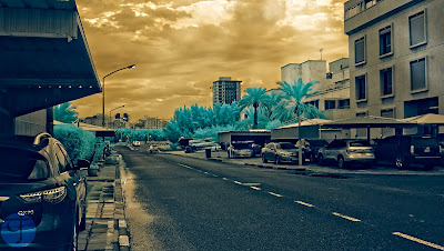
Not far from Whiteness, I've walked along and reached the main 2-way road separating my block and the next block. This road ends with a traffic light that would lead out of the area, and in normal days in the past, this one would cause one heck of a traffic jam at such time I was out in. Luckily though, things were quiet. I really didn't have any aim when I shot Gratifying but I just loved these clouds and thought to myself that I must capture the moment here, thinking that the road itself might work as some sort of a leading line. However, this leading line is definitely NOT leading anywhere! The clouds and the light gaps are somewhat hovering around the beginning or the middle of the road and not in the horizon, where the road is leading to. However, Gratifying is somewhat special to me in some way; As I usually don't use split-toning with shots taken with the H-alpha filter (or any infrared or UV filters for that matter), I've decided to use split-toning with Gratifying and I think the result was astonishing and more "dynamic"; Color-wise. The light rays were done deliberately in edit.

هُيامْ
(ardent love)

Still on that road (pictured above), I've encountered some nice bushes with some blooms, and again, I did wish if I had my 50mm lens with me instead of 20mm! Anyway, there was no use in feeling sorry about that and the whole stroll was to be a challenge to force myself to work with the camera. This time, though, I've decided to break the hyperfocus principle, since I'm shooting up close to the flower (whose original color was yellow, and I think called yellow trumpets). I've rolled back the f-stop down to f/3.5 (the lowest for this lens) to blur the background as much as possible (though still not as awesome as f/1.4), and I had to re-focus. Re-focusing with a semi-automatic (or semi-manual) lens using LiveView is not an easy task, specially without a tripod to rest the camera upon. The hands can get quite busy and shaky! Anyway, to make sure that I don't miss a thing, I've taken several shots with a plan to check them out for sharpness at home. Despite the sharpness, though, I've decided to make the image softer when it processed as I think it adds a dreamy look better. Also, the red colors for the leaves did fit the scene better I guess more than the typical turquoise tint, which is typical for this filter. Of course this was done by swapping the channels (red and blue) and I've found a simple way to do that instead of using the usual Channel Mixer adjustment layer as I used to do with other infrared images:

  1. Add an Invert adjustment layer on top.
  2. Set the blend for the Invert layer to Hue (or Color).

Of course this won't give out a delicate control of the levels for the R, G, and B channels but it is just about enough to do a channel swap between the red and blue channels. I've tested this method with my old way of swapping the channels using the Channel Mixer adjustment layer and the result was a match.
Anyway, the final image of Ardent Love had to go other processes, the major of them being a crop to remove the excess in the background. After shooting this, I've kept walking and reaching to the "boundary" of my area, where the fun was about to begin.

أَطْيافْ
(apparitions)

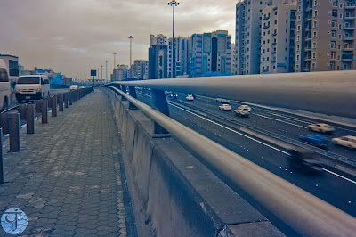
I then started to cross the road (a busy one) to read a junction of a bridge that overlooks a tunnel. The tunnel is an extension to a highway (Kuwait is small so our highways are not like the highways in bigger countries). I have to say though that the scene and even crossing to that location was quite "phobiac"; That is, it kicked my phobias to life. The junction itself is like a U-turn and it was busy at the time of me walking there. Looking at the cars passing under me made my knees go soft just a bit and for some reason I started clutching on my camera fearing that it would fall off down into the tunnel; This is while it is already wrapped around my neck with the strap! Anyway, enough with my phobias. This is not my first time in this corner in fact, but I've been here in this place many years around dusk time (blue hour) with a tripod even! This time though, no tripod, but just a camera and a lens (and no ND filters like the other time). I've started to shoot several shots (all bracketed in case I need them in HDR) and I didn't mind the movement of the cars of course, as this was part of the plan to add some motion blur and make the image "alive". Despite being one of the earliest shots in this stroll, I didn't process this image earlier when we I got back home. Anyway, there was no HDR involved but I've stacked about 5 to 6 images and blended them together, which made the cars look like ghosts (hence the title). Which inspired me for such a title further is the overall bluish streak or tint which occurred unintentionally, but I've increased its impact through vibrance once I've noticed it.
يَوْمِيًّا
(daily)

مِنْ-إِلى
(from-to)

Just before I leave the junction I thought it would be a such a loss if I didn't take some more images in hope to create something. Composition-wise, there are some good chances in that place, but the rest is left to the quality of light, and in that situation I was shooting with a filter and with a not-so-wide lens. However, I still tried to make the best of what I have with Daily where a kind of guide or leading lines are formed but the problem is, there is no real destination or some target in the horizon to point to! The cars in the tunnel kind of helped to add a direction as well but the cars on the left were kind opposing this general direction. Philosophically speaking, it is kind of a reflection of life and its currents I would say. In the same manner, From-To was shot as well but in portrait orientation and stitching 2 (originally 3 but had to discard one) images together. The leading lines here, as I think, have less impact on the viewer because the bar is quite close to the side of the image and causing to be more of a frame rather than being a leading line. In this image, I've swapped the channels, and it is worth noting that since I've realized how to swap the red/blue channels easily using the invert adjustment layer, it became almost like a standard practice to try and swap the channels on any image I work on (even normal ones that are not infrared or taken by any filter). 

خَرَسانَة
(concrete)

Leaving the junction (with some hard movements because of the narrow spaces there), I've headed back to the area away from the busy road and started walking on some asphalt road around some backyards of the houses on the edge of the area. Probably it serves as a walkway for jogging as well, don't know! Anyway, as I've explained before, it was rainy the day before so the place was full of "ponds" (if I can call them so). Unlike other moments when I started this stroll, where I wished to have my 50mm with me, this time I wished if I have my polarizer with me to enhance the reflections off the pond. I have to admit though, the subject matter here is not quite interesting; Not to me at least. But I couldn't let go of a chance to shoot reflections here. I think this shot proves that however digital you go, you would still need filters at some point! I've shot this in brackets (of course) and in fact the photo you see here is tone-mapped from HDR, but I didn't like the idea of going crazy with processing the image. I might try that later (just might!). I was trying to enhance the reflections further by tone-mapping the HDR but nothing can replace the good ol' polarizer.

اِرْتِباكاتْ
(confusions)
غَوْرْ
(depth)

Shooting reflections continued at this point as I kept walking along the fence that separates the area from the main road bordering the area, as I was hoping that I would capture some good reflection. Despite going all the way down almost kneeling on the ground, but that just was not enough. Probably, as well, the composition and the subject matter were not quite interesting, I'd say. Anyway, to make some interest out of these "boring" images like Confusions and Depth, I've sorted out to an old trick: Changing perspective. And this is done mostly by rotating the image for 180<sup><sup>o</sup></sup>. Done it before and it worked, so hopefully it does here, though I didn't get much feed back on these. Currently, my participation and involvement with the social media is ebbing low. In fact, I don't think anyone cares what I post, and I don't care either.

الصاعِد
(the ascendant)

As I walked on, I reached a pedestrian bridge that connects my area with the adjacent one. I've shot a panorama on such a bridge but on another location in the area, back in 2013. Essentially the design is the same, except that near this bridge there is a tree. I liked this tree so much (yes, I'm a tree hugger) specially that it is by the stairs of the bridge. It happens then as I was trying to find a proper angle to shoot this tree, a man passed by. Usually I wouldn't bother with people (street photography is not my thing) but since the man was giving me his back and not looking at the camera, I thought that it would be a good idea to snap the shot. Of course I didn't have my enough with a single shot, but after sorting the images and checking the movement of the legs and the distance of the man, I finally picked what it became The Ascendant (yeah my interest in astrology is getting the best of me here). In the processing phase, I've swapped the channels apparently (in case you couldn't tell so far, everything is reddish in hue instead of blue), and also tried to darken the atmosphere while focusing (dodging) the periphery of the man to grab the focus; Aided with some slight vignetting. At this point, still, the main aim was not achieved! And that is, shooting the tree beside the stairway.

المُسْتَظَل 1
(sought for shadow 1)

I was in dilemma as no specific angle did give the perspective that I really like about this tree, and thus I've decided to go for a hand-held panorama. Such kind of panoramas are always risky at some point in that some angles might be missed and some details won't be there for stitching. Anyway, despite shooting for HDR, I didn't really use the HDR technique here but simply edited the RAW files. At this point I think I got what I was looking for (of course the results were not obvious until I got back home and started to edit the photos). In case you are wondering about the name here, this is just the nature of Arabic where one word can replace a full phrase or expression in English.
المُسْتَظَل 2
(sought for shadow 2)

Of course I had to try out and swap the channels as usual and honestly I was puzzled a bit as to which one is better-looking. I like them both. I sought some opinions from family members and friends and they do prefer the second version (with channels swapped) and on Instagram (yeah, I'm posting back to some extent) the trend seems the same with slightly more likes to version 2 than to version 1. However, the dreamy look that I've worked on in the processing phase, is more pronounced in version 1 as I see it, and that is probably related to the nature of colors, as red might be rendered sharper to our eyes as I believe. Just an opinion. And probably the intriguing part of this image is not the tree itself as much as the small portion of shadow cast on the stairway (and hence the name). I have to say though that it was such an overcast day and the sun was barely visible at that time (almost 8 a.m.), but with some contrast, shadows get pronounced more in the images.

مُضَلَّعاتْ
(polygons)
The fun then just began as I climbed up on the bridge, and I have to say, my retinitis pigmentosa did cast its hideous shadows here. One of the biggest problems for me comes when the environment becomes too much grayish, bright or too dark; In such situations my eyes start to play tricks on me and I don't know the limits of the objects, specially stairs. In such instances, I have to move slowly and sensing my steps with my foot before going up or down. Anyway, upon reaching the "post" after the stairs, I've noticed some interesting octagonal structures, and again, I did wish if I just have something else me here, and this time, my panorama gear altogether! Well, I had to work around this need by doing a hand-held panorama, but this time it was a bit extreme, as I started taking photos and bending my back backward shooting photos are more than 90 degrees. Luckily I didn't get any back pain afterwards! Anyway, the shoot was bracketed of course and this time I DID work with HDR and then tone-mapped from HDR. There were some features in these gaps that I had to clone out. Swapping channels did not change much with the looks and by this I kind of gone depressed because of all the "gray matter" here. Colors would be pronounced more with lively trees with leaves, usually. Anyway, I lie hope in the clouds to make some interest in such images despite the gray looks. Probably even more than I lie hope in the geometrical shapes.

صِراطْ
(straight path)
Then comes the best part from the bridge. Something that reminded me of the old days when I did a panorama on the pedestrian bridge on the other side of the area. Actually, Straight Path, was not a single shot itself, and it is technically a panorama indeed, even though it was not calculated for. The problem here is that the shots are in portrait orientation, and for such geometry, or more precisely, for such a vertical panorama (regardless of its length) one should consider shooting in landscape orientation. Anyway, I was not planning for panorama work at that moment, when I pointed my camera and tried to be at the center as much as possible (and still missed it, sometimes it sucks behind a left-handed). As I got to the processing phase with this set and trying to pick the best candidate to go on with the process, I realized that maybe a combination of two or more would be better in fact, as one shot included too much of the top (the octagons) and another had too much of the ground. Thus, in between the two, it sounded logical to strike a balance by merging the two to form one image. Of course, some cropping was due after all as it can be seen that the top portion is longer than the lower one. Also, I had to work selectively here with layers to sharpen and enhance the details of the bridge in isolation from the rest of the image (the background). After finishing with these shots on the bridge, I've shot the tunnel below again but I guess nothing much to be said about this one except that it was processed with split-toning like Gratifying above. Probably these two from the set are the only ones that had been processed with split-toning, so far. I'll post it below (To-From The Capital). 

صَدَقَةٌ جارِيَة
(perpetual charity)
At this point, I thought it is maybe time to get back home now (I think I've spent less than one hour a bit in this stroll so far). Here, I've encountered what we call here [ماء سبيل: maa' sabeel]. It is a drinkable water outlet (cooler) usually placed near homes for any passerby to drink, as a form of charity. This particular place and object got my interest. I have to admit here again that it might have been better to shoot this with 50mm. Anyway, this is not the main point of this image, but it was the working within HDR. Typically, I would just merge the slides into HDR and then tone-map them (using Photomatix). My typical workflow changed a bit when I noticed that I've captured a lamp post just behind the cooler and the idea got into my head: Let's light up the scene!
I'm not quite the expert with such a task but as I've read about HDR techniques (specifically by Christian Bloch), I've got the idea that working in HDR, is simply Paiting with light. Thus, after merging into a HDR image, I had to first work on some minor issues (but took a load of time!) with the perspective and cropping. The rest then was a matter of trial and error and a LOT of adjustment layers to light up the post AND mimicking its feathering over the surrounding area. Saying it is easy, but keeping it as real as possible is a hard task filled with trial and error. Needless to say here that I needed to change the scene from "morning-like" which is the original, to "evening-like," and some problems later on rendering and tone-mapping the HDR file itself. To be honest, I'm still not quite satisfied with Perpetual Charity but I can say that I did my best here, and I did enjoy working with it more than caring about the final results in fact! I don't often work in HDR images in that manner as I tone-map right away most of the time. 

ما بَعْدَ العاصِفَة
(after the storm)

Just before reaching home, I was passing through a wide space (used to be a playground of some sort for football (soccer) for the kids in the area but now it is merely a… little lake after the rain. When dry, this space serves as a junction and a parking lot. Anyway, as I approached this space, I've noticed some seagulls (yes, seagulls, my area is close to the seaside) and being frustrated myself because of not having a proper lens, I've started to capture the scene in hope that I get a trace of the birds in their low flight (hoping to crop the image later and make it look better). However, I ended up with something better, to me at least!
I've shot After The Storm with bracketed shots (randomly point the camera to the direction of the birds). Anyway, as I processed the image, I realized there is no trace for the birds! Anyway, I didn't process the shot in HDR but I've combined portions from the dark and the bright images manually, in addition to the crop. The light beams in this shot are real and not edited except for some contrast added to the whole scene (unlike Gratifying above where the beams were added in the process). One thing upsets me though about this shot, and that is the car and the boat on the right, taking so much space form the image and kind of "uncroppable"; If this is a word anyway. I wouldn't say it is something to participate with or to print despite the lovely light beams.
At this place there had been other shots as well for some tires and sand but I really couldn't find any interest in the composition (specially that the background was not blurred enough even at f/3.5, the lowest); Thus, I've forgot about these shots and didn't process them at all. I'll keep them just in case, as I usually do!

Finale

مِن-إِلى العاصِمَة
(from-to the capital)
يَتَدَلّى
(dangling)
So this was it with my second strolling out, and up until typing these words things are not clear about my third stroll that I've been planning for for weeks. Meanwhile, my mother is having health issues and it keeps my brain exhausted to even think of holding a camera. I literally don't know how I am typing this blog post (I'm gathering a bits of minutes here and there to type this).
I had plans to post something in my Arabic blog but that also is postponed still since I can't find a good topic to post there. As if this is not enough, I got myself entangled with my brother's studies as I'm trying to help him out (since his English is not good). With all such mess, I think I will be taking some time off from blogging here.
My mood swings had not been the nicest for a while and I have to say that each day is becoming a struggle to have my own peace of mind and to control myself. One way to cope with all of this mess in my life is to read Quran every now and then, specially in daytime under the sun (for sunbathing while reading) or late after midnight when everything is (almost) quiet outside. Sometimes I do even play some Quran from YouTube and wear my headphones to help me go to sleep. Some might say I'm too religious, but with the standards for I live, I am not really so. These interests or curiosities are merely a norm and people here are "supposed" to do or to inspect from time to time, as a way of straightening the soul; And how few of them do right now. I wonder also if traveling would enhance anything with my mental status. I surely need a change in scenery but of course traveling in such circumstances is hard to be done (even before COVID). There is so much mess in my life and I need a good broom to sort things out…


Thursday, November 19, 2020

Athdhéan…

As promised some 2 or 3 posts ago, I wanted to talk a "bit" about re-making some old panoramas (specially that I'm not shooting any panoramas lately, even before COVID season!). I almost abandoned the idea and thought it is somewhat useless, but I proved my own self wrong in fact. In this post I'll explain the story a bit further.

Remake

As a starter, the reason that I'm visiting some of my old panoramas to remake them is that I want to change the processing. Most of my panoramas are done in HDR and then tone-mapped (typically), except for few "special" panoramas which were done using long exposures.
Anyway, as I'm learning new editing techniques (in RAW), specifically those considering dark exposures to add more drama to the scene (instead of making a normal bright exposure), I've decided to try and stitch some panoramas using the dark exposures, or reducing the exposure if needed. All was to be saved as TIFF 16bit mostly (to keep as much as data as possible in each image), and then a trial to stitch was set.


Inchagoillic

The beginnings were not quite "easy," starting with Inchagoillic which is a panorama shot inside Inchagoill church on Inchagoill island back in 2014. I picked this panorama specifically because I didn't really like the version that I've made out of it using HDR technique and it was hard to fix the looks:

The older version

There is a problem also with the perspective apparently. Anyway, my focus was on the colors and the general looks. The process was not easy because of some change in exposure (brightness/darkness) of the images specially of the top row images. This row specifically mostly comes dark in most panoramas (that is the set of the same image order in the sequence of HDR shooting, which happens to be the 2nd image here from each set).

The preview of the initial stitch in PTGui. Notice the dark arch and the dark splotches on the tree and elsewhere, all concentrated on the topmost part of the image.

I've tried some solutions here, but eventually, none did work out properly:

  • Make a stitch of the first images in the set of bracketed HDR shots, editing them to be darker, for the general mood that I wanted to achieve here.
  • Make a merge between the original set of 2nd images, and picking the top row from the set of 1st images.

Both of these solutions didn't work out well for one reason or another, and generally speaking the exposure was not uniform or smooth in some way. My last resort to this problem, then, was to cut out a portion of the blending for the top row of images (i.e. reduce their contribution to the whole image).

The borders of the blended portion of each image in the panorama as seen in PTGui. Notice how the dark splotches in the top row (14-25) are mainly accumulated in the lower part of the images. By reducing the "blending priority" of these images, the lower portion gets omitted and would not contribute to the overall looks.

Despite this "fix" for these dark spots, the solution itself was really dependent on the panorama here and the nature of the scene. Also, the final stitch was not free of more work with dodge and burn to enhance some areas, specially whatever remained of those dark spots. Going through some of the old panoramas trying to figure out a number of these solutions made it clear that it is not the solution I was looking for and in fact it became lengthier than working with a HDR panorama itself. On various occasions though, it was possible to cut the panorama short (crop from the sides or top and bottom, etc) to make a somewhat good looking panorama, like Gnomes Asleep.

Gnomes Asleep

Gnomes Asleep was a panorama that I've shot back in 2012 for the Victorian B&B but I've never stitched it before because of the troublesome contrast when it was shot. The gap in exposure values exceeded 2EV and even though I've shot it for HDR stitching, it turned out that the highlights were out of the range still. Adding to that, I didn't quite like the perspective and the angle of the shoot. Anyway, there was a final shooting trial which made its way and was "proper" in terms of exposure and perspective. This forgotten panorama did have a chance though through editing the RAW files and stitching them (after converting to TIFF 16bit) but the problem remained with those dark areas and splotches. To solve it, I've simply cut out the panorama short.
Those who are familiar with PTGui probably do know already that there are options and controllers to adjust the exposure of the panorama and fix few issues related to that, and I did indeed give it a try. However, the results were catastrophic and nothing really worked. I do believe now though that these options are there for HDR panoramas specifically. It would have been a good option if I can just stitch the RAW files and save the outcome as some sort of DNG, where I can edit this stitched panorama like I do with any RAW file and hence do the effects and the split-toning required for the looks I want, but this is unfortunately unavailable and the RAW files MUST be edited and prepared for the stitch. This fact, forces me to convert RAW files into TIFFs and stitch from there.

In The Grace Of The Cormac

All these limitations made it clear to me that there is no easy way out, and I've really started to lose heart with it. It wasn't all bad though. In panoramas like In The Grace Of The Cormac, for example, I've stitched the panorama twice: One time as a normal stitch, and another time with exposure adjustments or optimization done inside PTGui. I've noticed that with optimization, some areas are better in exposure than the normal stitch (which was either too bright or too dark). In Photoshop (of course!) the two versions were merged and enhanced with layer masks combining the best of the two as much as possible. It was flattering indeed to see this panorama being marked as "Inspirational" on YouPic as well!

Fothrach Órga
(golden ruins)

Still, despite the progress a bit with In The Grace Of The Cormac, it was inevitable to do the lengthy hard work: Editing all photos of the panorama in RAW, each to its own, to fix the exposure, because I was not lucky all the time. Apparently, the whole thing was more time consuming than working with HDR panoramas, but it is worthy to try if it was about adding drama to the panoramas that I've done in the past (specially that they usually look bright and shiny with HDR, and getting them dark a bit sounded a bit romantic at times!). For this reason, I've developed a routine to make things as steady as possible (but it is not really):

  1. Pick a focal image (focus of interest) and do all the editing needed on it. Typically this would be the first image in the set, but it can be another image in the set at times.
  2. Synchronize all these edits for all images.
  3. Now, go over all these images and check how bright or dark it would be in comparison to the edited image in the beginning. At this level, I try to not touch anything except for the exposure slider, and if that didn't work then I would adjust the tones with the parametric curve section. 
  4. Usually a sub-set (e.g. the images of the top row) would have the same problem, so I synchronize them all to the adjustments (in exposure) done to the first one in the sub-set. 

As it can be seen, it is such a lengthy work. However, the goal of adjusting the exposure is to be close in brightness and not absolutely pin down the exposure between the slides. PTGui still do some good work (though limited) when it comes to equalizing the exposure among the slides of the panorama, but apparently fails when the gap in brightness is great. So, it is enough to just get them close, visually.

Ceann Scríbe
(destination)

With all that hard work, it was still inevitable to do various versions of the same panorama but with changing the exposure or optimization in PTGui, just in case it was needed. Usually, one version (the regular or normal stitch) would be enough but there were times when I've used 2 versions of the panorama and even 3 versions merged together, as is the case with Ceann Scríbe, where I've used the topmost portion of the bright version, and the ground for the normal version, and then used the darker version just to enhance the sun flare as it was too bright in the other two versions. It sound like HDR but it's not; In HDR, the images are combined in a special format and technically it's like "painting with light in the image" but in this work we are getting a bit picky about what pixels do we need and not. However, many panoramas remake so far were done using only one version or the regular stitch version from the RAW (after editing them) without any need for the other versions, but I keep stitching them just in case.

Don Eaglais
(to the church)

Along with these new stitches or remakes, comes a change in perspective. Many of these panoramas that I've been doing (and will keep on for some time) had been altered in terms of composition or changing the center of attention (which was typically placed at the center of the panorama). Panoramas like In The Grace of The Cormac above, was done keeping the human element (the lady photographer at the center) which was originally removed when I stitched this back in 2010, and the point of interest was shifted left or right as is the case with Don Eaglais (and even adding a touch to the sun there to make up for the dramatic look), or as is the case with Ceann Scríbe where another point of interest is placed at the center (and I think it is even better). I would have posted the old and new versions of each panorama for comparison but it would make the post even longer than it is already.

Finale

So, this was my story with the remakes of panoramas, old and new; Well, all are old in fact. The work is still going on with more panoramas and I've been quite amazed by the results. They are kind of astonishing more than the original HDRs that I've created in the past. This said, however, that does not mean I will not be shooting HDR panoramas the next time I'm on it. Better play it safe and do the routine and then think of other choices, like the thing I'm doing here already.

الأَنْدَلُسِيْ (The Andalusian)

As for the reasons behind all of that tedious work, the answer lies in the looks and inspiration. Generally speaking, we have to admit that many of our inspirations as photographers do come in the processing phase rather than at the shooting phase. Not to say that there is no inspiration at all during the shoot or prior to the shoot even, but processing sometimes yields results that we didn't imagine at times or simply did not think it was possible. Viewing things in the viewfinder or on the LCD at the back of the camera is not the same as viewing an image, on a monitor, using a wide color space such as ProPhoto (just an example). The colors are simply beyond the simple rendering of the LCD and the human eye even at times.
For such reasons, I've decided to cross the mile and try to do the lengthy work with the RAW files instead of the HDR as it was done before. I might be able to produce the looks using the HDR indeed using many adjustment layers and many layer masks, but the knot that needs to be tied here lies in the fact that I'm not sure what I'm expecting and what is that I'm really seeking out of the looks. There are some panoramas that have changed completely in looks, not only by colors, but also in composition. I've even created 2 separate versions for some of these panoramas and published them both, and I might try a trend with "bright" panoramas whenever it is possible to do so.

An Castán Dorcha
(the dark chestnut)
An Castán Geal
(the bright chestnut)


So, this is my "little" story with the remakes of many panoramas, and many to come further, hopefully. By doing all this, I've been actually giving myself a dose of confidence even at some level here, specially with the success of stitching the nadir point in The Andalusian. It was one of these rare panoramas were I would usually take a nadir shot and try to stitch (with few procedures on-location and in PTGui); A practice that I didn't perform much really but this seems promising and for some reason, seems a bit easier to be done when stitching from regular files like TIFFs, instead of HDRs. 

On another plane, I think I've been getting back my appetite to work with the camera further, rather slowly, specially with the weather change here (we already had the first rains of... winter?). I had my first stroll outside, which hopefully won't be the only one, and I might blog about that the next time!