Showing posts with label ireland. Show all posts

Thursday, December 2, 2021

+10…

So, a month now since my official request for retirement and until the moment of typing these words, things aren't over yet. On a positive note, I don't have to go to work daily right now as I'm officially off, but I'm still not completely detached from work because I didn't finish the paperwork related to my "leaving certificate". Thus, the month of November just passed me by without a salary in bank account. To add pepper and salt to the wounds, everyone is just working slowly, barely answering phone calls, and what would take a day to be done or even less, takes up to 2+ days to do, if not a week or weeks.

Anyway, away from my ranting, I've decided for this week's post to talk about 10 of my images that had been marked as "Inspirational" by YouPic. This comes after finally having my 20th image marked as inspirational. I've made a post long time ago about my first 10 images, and so this post will be about my second 10 inspirational image, as noted by YouPic

+10

So, here is the list and in the order of picking them up as "inspirational". I'll try to be brief as much as possible in describing each image.

1.

_MG_7671

 The first image in the list as you can see bears no title, because, well, I didn't really care much about it and I didn't think of it as something special. It is one shot from a series, when I shot the fireworks during the "Constitution Day" celebrations back in 2012. I was on the roof of Soug Sharg Mall and the location was not special or anything; It didn't provide any good perspective or foreground. Yet, I kept shooting that night and got an arsenal of fireworks shots.

2.

_MG_7773

 As you can see, #2 is like its predecessor and from the same location but with a different focal length, thus more buildings and lights are included. Again, I didn't think of a title for this shot because, come to think of it, it's a series with loads and loads of firework images! I can barely remember my own passwords at this age now (yes, 41 is old). Just to add some "dynamism" to the image, I've decided to crop it at 16:9 as if it was some wide-screen movie scene. Unlike its predecessor, I didn't work quite much on the blacks here to make it lighter. I think the tones weren't helping anyway.

3.

_MG_7751


Another one (and a favorite) from the series of the fireworks which was also marked as "inspirational" by YouPic. I like this one in particular because of the 3D-ish look that happens to be here. I was able to lighten the pitch black sky a bit and like its predecessor, it was cropped to 16:9. At that time I was experimenting with the cinematic looks, so I used this ratio quite often to mimic a movie scene or something. Well, I still do sometimes. One weird thing about this image is that the recorded f-number is f/36, while I'm sure that the max f-number for all of my lenses is f/32!

4.

Peekaboo Building

Peekaboo Building was just a random shot that I've taken in Dubai in 2013, when I was there for some ceremony I was invited to. I've stayed for 3 days but, literally, didn't find much to shoot there during my stay. This place is just not my thing really. Anyway, this is one of the random shots that I've taken as I was walking aimlessly on the roads not from my hotel. Of course, this shot was cropped and adjusted (specially to make the vertical and horizontal lines as straight and divergent as possible). It was uploaded in the abstract section on YouPic even and not in the architecture section. To me, it looks quite random!

5.

Herr Fengus


Then, we have here my little friend which showed up one morning during COVID-19 lock up in 2020, and then disappeared the next day. Well, in our garden some fungi like this show and disappear regularly (I guess they don't stay because of the water force over them). Anyway, shooting Herr Fengus was quite a challenge, because it was taken handheld and getting low. Even the focus here is not quite pinned correctly and I had to do some compromise with the f-number to let in more light. Originally, it was white-yellowish in color, but with post-processing, things flourished!

6.

Abhainn na gCuimhní Binne
(river of the sweet memories)

The next one came to me as a complete surprise. An old shot from Oughterard, Co. Galway, Ireland, which was shot with my old Canon 350D (my first Canon camera ever), back in 2009, during my first visit to Ireland ever. The scene here is quite random but I tried to make something out of it by color grading and dodging and burning here and there. Seems all that work (which I wasn't quite satisfied with) did pay off with being picked for the "Inspirational" section by YouPic. I remember some of these white spaces (the sky) needed some fixes and I'm guessing I've sorted this out by some patching work.

7.

In The Grace of The Cormac


In The Grace of The Cormac is an old panorama shot in my second visit to Ireland, in 2010, and this panorama was the beginning of a series of re-stitched panoramas done from RAW files without resorting to HDR techniques. Also, in this re-stitch of this panorama, I've included a human factor in the middle which I used to remove in the original (and I was lucky to have this lady photographer at the center). Using only RAW in stitching is not quite easy as I thought! The panorama is shot inside McCormac cathedral which forms a compound with Cashel Rock castle.
[Worth noting that this panorama particularly is available in large size for download and printing as a fine art piece from my MostPhotos profile].

8.
Il-Pixxina
(The Swimming Pool)

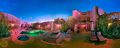
The next one in the series of re-stitched panoramas (from RAW) comes from the swimming pool of the place where I stayed in Qala, Malta. This panorama was shot twice back in 2015. My first trial wasn't successful and problematic because the light was changing quickly, so I tried to fix that the next day with another shoot with somewhat proper timing. This re-stitch, however, which is made from RAWs, was made from RAW files of the first trial (which I didn't delete). One element is missing from the original (2nd trial stitch done first) and that is the cat which posed for me in the scene!

9.

بَـهْـجَـةُ الـعـاصـِيْ
(Sinner's Delight)

As for #9, we have another re-stitched panorama from the old days when I was "able" somehow to go out on those cold winter nights to the seaside and do stuff with my camera. Like its original predecessor, the RAW-only re-stitched panorama was a challenge in terms of noise and details, as well as exposure. The title of this panorama can be understood in two ways depending on the perspective of the viewer; Looking at the city, this place can be the delight that the sinner is looking for, or considering the isolation from the city, this place can be the delight of repentance that the sinner is looking for.
[Worth noting that this panorama particularly is available in large size for download and printing as a fine art piece from my MostPhotos profile].

10.

يَـحْـمـورْ
(Redness)

The last one, came about as a surprise to me for various reasons. First, it had been a really long time since any of my images was marked as "inspirational" on YouPic. Secondly, the image is actually some neglected test shot done in the summer of 2012. I don't find anything special in this image, and here was the challenge in fact (for me) to create some interest by color-grading and other editing techniques. I'm still thinking, how come I didn't point my camera to the city on the left and take a shot there showing the reflection on water? To add more "strength" to the image (so to say) I've cropped it into a square and made sure that the horizon line is around the center of the image. 

Finale

Now, this is the post for this week. I'm not sure if I will post in 2 weeks time, but I do have some ideas cooking in my head which I hope that they would produce something to post about then.

One of the ideas that cook in my head is to pay tribute to the great Arab tenor whose songs I'm in love with: Sabah Fakhri صباح فخري. This great iconic marvel passed away from our mundane world on November 2nd; An event that poured melancholy into my life further, but c'est la vie. I've did few images back in 2016 probably trying to get some inspiration from the classical he sang on various occasions, but I think those weren't enough. More work need to be done in this aspect and I hope that my willpower is up to it.

By the time this is posted, I'm praying that my status with my workplace is finalized. I've spent the whole month of November without a salary because of that and I'm praying that it won't be another month without it. A question keeps popping up in my head now and then: What now after retirement, TJ? However, I'm trying to suppress my thoughts for the time being and just focus on the rubbish on my full plate with all these stuff related to the workplace and the papers here and there. But if I'm to be honest with myself, I really don't know what is my next step after retirement, except that I need to enjoy my life just a bit. Just a bit…


Thursday, October 7, 2021

+5…

Did I pass 2 weeks already without blogging? I guess! I really didn't count the days. I've been under pressure lately which made me unable to do much even with editing my old photos. The largest portion of this stress has passed (somewhat) already, but some deal of it remains still. More about that a bit later.
I don't think I will be posting much in this post except for an announcement, and as I go on, I might think of posting a bit further about some of my latest edits!

Announcement

I think I've mentioned in previous posts about new uploads to Mostphotos. So, here it is, I've uploaded about 3 new panoramas (plus 2, adding to 10 panoramas uploaded months back). So, the total right now is at 15 panoramas at large sizes, suitable for printing as fine art pieces. I think I didn't post much about these extra 5 panoramas, so I'll try to do so here right now. 


Failakan Sunset

Earlier (as in last month or before!) I've added Failakan Sunset  to Mostphotos (exclusively), and it is an old (half-way) panorama shot over a ramp, which is used to slide boats to the water, on Failaka island. It was taken in 2012. I say "half-way" here as it was not a full panorama, but merely 2 rows was shot, and the third one was not shot (probably because at that time it was getting pretty dark on this depopulated island). Originally done in HDR, but this time it is done with singles of RAW files; All edited and stitched. Of course the colors are edited here and in fact they caused me a problem because when merging layers the appearance of the image would change drastically. I had to re-work the colors after merging (and at 100% zoom to ensure the accuracy of the colors). At 300 dpi, the panorama is close to 102cm by 36cm. I think if I was to print this panorama I would print it on a glossy material, preferably metal. Just one must be careful about the reflections from light fixtures. 

Entry
(Slí Isteach)

Then I added Entry, or as I like to call it in Irish: Slí Isteach. This is a panorama shot in 2014 inside a little defensive tower in the remains of Aughnanure castle in Oughterard, Co. Galway. It was my 3rd time in Ireland, and my 2nd time in Aughnanure (the first being in 2009). Generally speaking, this projection is relatively new for this panorama. I did many projections and styles out of this panorama, but this is the first time I do a simple vertical one like this, and centering it at the door. At 300 dpi, this panorama is almost 33cm by 75cm. I had to crop quite a portion to balance the image here and remove unnecessary or incomplete details. I would consider printing this on glossy metal but one has to be careful with the lighting surrounding this; Otherwise it would turn just like a reflective mirror with such dark areas. If one would want to go safe with this one, matte never hurts anyone!

Solar Towers

Then, we have Solar Towers, which took me quite some time to put the keywording for, and I'm not sure why. I think I was passing through some "mind-boggling" phase or something. Anyway, I did the keywording after all and here it is. Of course this is an old panorama and it was done in HDR before but this time, like the rest in this series, it is stitched out of single RAW files. The projection here, though, is the new thing as I didn't do such a projection before out of this panorama specifically. I had some struggles of course with the tripod and its shadows (like in the original) and I had spent quite some time fixing it. At 300 dpi, the size is about 42cm by 76cm. I tend to think that glossy printing of this one would add to the vibrancy of the blue tones and adds more overall contrast.

Beyond Abzu

I rolled back in time and checked some of these winter adventures I did back in 2012, and found some worthy stuff (but with a great deal of post-processing work and fixing), such Beyond Abzu here. Beyond Abzu was one of my first night panoramas and I still remember that cold winter night when my feet got frozen by the cold water. As the processing went on, the general tint of the image got green and that inspired a sense of mystery in me, hence the name Abzu (also Apsu) which is the name of the primitive waters, supposedly, from which the world was created in Sumerian myths. In some way, the whole surrealism in this panorama was pointing to that meaning in my head so I gave it that name. At 300 dpi, the panorama is about 37cm by 85cm, and I would go with a glossy print for this one though I would fear for the level of noise here to be exaggerated. I worked on cleaning the noise moderately because there is a limit, after which details might disappear. However, this panorama still bear some dark aspect and dark areas might work as mirrors in glossy prints,specially metallic ones. But I would imagine it would be so vibrant if printed on metal!

Return to Nammu


Lastly, there is Return to Nammu which I consider like Part-2 of Beyond Abzu. In time, these two panoramas are not far off; Both were shot in the same winter, and both in January of that year. However, with Return to Nammu, the sky was a bit darker than in Beyond Abzu specifically because I shot this facing the sea and the moon and the city lights were relatively further away. This allowed for some star constellations to appear in the sky in the original shots and here I tried to process the panorama and clean the noise without touching the stars. Thus, they appear in the original panorama, despite being shot within the vicinity of the city, but only when zoomed in at 100%. Unlike Beyond Abzu though, this one looks quite colorful, and yet mysterious a bit because of the dark night element and the stars, and that moon that shines like a rising sun (but in the middle of the night!). At 300 dpi, the size is about 85cm by 38cm. Print-wise, I guess it would do good in glossy as well as matte. The green hue here, as I see it, would be a vibrant one on a glossy media, specially a metallic one. 

Well, this is for now 5 new uploads to my Mostphotos, which are exclusive to Mostphotos. The links are up there to visit the profile or the specific images, in case you are reading this and wish to get one of these.
My capabilities right now are not quite aligned to provide such printing services and shipping, so I let these images to be purchased on their own as big original files in JPEG format to be printed on whatever the client would like.

Finale

Well, probably I can't get on so much with this post but I believe the announcement above and the details mentioned are just about enough in length for this post; Let's not make it longer!
I am currently on a leave from work for 2 weeks but not for resting or fun, but rather for stress and tracking. After a long wait, I've finally received my "disability certificate" which took a bit more than 2 weeks actually, and finally I was ready to submit my request for a grant of medical retirement from my workplace. But things weren't easy as I hoped for; Suddenly, solving a problem 2 or 3 more problems would occur and some more responsibilities regarding my work are added to the mix, which made every single passing day count. As I'm typing these words, I've finally submitted my papers by email (after a little adventure in going to the new campus, my future workplace supposedly) and a recent phone call confirmed to me that my papers had been signed and ongoing in the process. I just hope the big part of this is over with just before my two-week leave ends. Bureaucracy is not in a friendly terms with my time.
For this reason, and because of all of that stress, I don't think I would be blogging on a regular basis, but surely I will try as much as I can, at least once every other week. Who knows, maybe by the next blog post here, I would be completely free…


Thursday, March 8, 2018

Discovery Galore…

Here we are again! I've been busy the past 2 weeks or so in writing Arabic articles for my Arabic blog but here I am again into this blog doing, amazingly, nothing. Yes, Nothing. Everything is on hold and I'm not doing much with my camera, BUT, I'm doing lot of thinking and I'm seriously planning to place my next online order soon. Hopefully I won't go bankrupt after this…

Kenko's DR655
One of the major things that I really need to get now is Kenko's DR655 filter, which blocks infrared (i..e it is a hot mirror filter). Despite having Tiffen's hot mirror already but after reading and investigating further, I've realized that Tiffen's filter is technically an open gate!!! It barely blocks any infrared, and thus working with this filter with my leaky B+W 403 Ultraviolet filter is not a good choice at all. I've discovered this as I was reading articles and posts in a page dedicated to Ultraviolet photography with some links to practical tests to various filters (IR, UV, HM), and there I've discovered the hideous truth: Tiffen's announcement about the effectiveness of their hot mirror filter do not coincide with the practical technical testing. The transmission chart even was such a horrible nightmare to me!

Tiffen's hot mirror transmission chart acquired practically and posted in the link above.

Thus, I can say with a degree of confidence: People, do not get that filter even if you want to use it on a regular camera to enhance the colors of your shot. The filter is not even effective at 750nm as I thought. Just for comparison, here is the transmission chart for the filter mentioned above, DR655.

DR655 Transmission chart

Well, we don't need to understand Japanese to really realize how perfect this filter is for my needs. As you can see, DR655 has a steep slope down at around 650nm and indeed blocks at around 700nm, while still allowing ultraviolet range (~ 300nm-400nm). Why I didn't figure this out years ago? Of course, there is the option of having a proper ultraviolet filter other than the one I have already (B+W's) but that alone would cost more than the combined price of a hot mirror and B+W filter. Besides, would shall I do with the B+W 403 filter then? Sell it? I don't think people here do realize this kind of art nor would be interesting in it, not to say what would they do if they discovered it is leaking IR. Yeah, getting a new hot mirror is my best bet for now, and I need to do it fast!
There are other items I would be ordering beside that, not related to photography, but I'll talk about it in some other time maybe.

Ath-Fháil Amach

Most of my activities in the past weeks were focusing on re-discovering some of the old images from Ireland and Malta. I was specifically looking for some chances to make out some more Anaglyphs. Along the way, I was able to identify some images with some potential after neglecting them before, mainly with some focus on enhancing the colors (using LAB technique generally). Well, the potential I mean here is not a potential of being classified as "Top," but I mean an image that can be enhanced and, well, be viewable; Instead of being neglected and deemed useless.

Yellow Caps

Shots like Yellow Caps made me, though, re-consider my approach with editing in LAB. In this image (and few others) I often had trouble with the saturation, so much that I did need to do some extra work to fix the problem. This is beside the "curves amendment technique" which is practically re-assigning the values for the Blacks, Whites and Gamma in the image to enhance the contrast and at some point fix the white balance. In Yellow Caps, it can be noticed how the background contains a large red spot, which is there originally but it got exaggerated in saturation with LAB technique, but then I had to do extra work to reduce the saturation, and yet it might feel a bit popping out still. I've reduced the visual impact further by using Lens Blur on the image (despite having a shallow depth of field already); My main goal with Lens Blur though was to pop out the front element further (with the help of sharpening).

Around Ashford

On the other hand, despite all the extra work that editing with LAB would issue, there are images like Aroound Ashford where the lengthy work paid handsomely with somewhat a mystical look in this ordinary shot with pale green hues (originally). The major thing about this image which made me neglect it is, actually, the spots of highlights between the trees. This is a problem in many of the shots along the years and right now I'm trying to fix some of these images by overlapping (not cloning) with other areas of the same image (sometimes from another image). Most of the time, it gets all natural-looking, and if not, there is the cloning tool to fix some minor issues about that.
Islamic Display Room

One of the things that I work on re-discovering them is the punch of panoramas done back in 2015 for the Al-Uthman Museum, which was a comissioned work. Since I've done these panoramas, I was asked to keep them "in hiding" and not show them, and it was not till 2017 when I started showing my panoramas on Instagram, apparently with no objection from anyone related to the matter. Anyway, right now I'm starting to re-discover other projections for these panoramas and specifically the planet and tunnel projection styles (technically they are the same but with a change in viewing point), and boy, what did I see!

Magnetum Marinum

Some of these panoramas were, well, nice looking. Some of them were, well, SUPER-looking. Examples here, the Islamic Display Room and Magnetum Marinum were both done in tunnel projection instead of planet intentionally. As for Islamic Display Room, I had to switch to tunnel because of some bar in the ceiling which broke the symmetry awfully, while for the other one, Magnetum Marinum, obviously it was the flooring boards which astonished me. I've been always a fan of lines; Harmonic lines specifically and those that just make up swift and smooth geometrical shapes. This is why I fell in love with this panorama in such projection so much that I didn't even dare to put a watermark on it so I won't disturb its harmony, even though that this would put the image in danger after all. I'm still processing these panoramas and still checking and I think there is some good potential. The problem is, though, whether I have the right to submit those for contests and stocks, away from the social media thing. We'll see…

Finale

Bloomless Bloom (3D)
There had been one or two experiments with some other infrared shootings but I'll keep that for later maybe, as they were minor experiments captured after a glimpse of idea, and yet I'm not sure if this idea will grow further. Meanwhile, I do need to get to my other projects that I've listed here already before, but I'm not sure where and how to begin. My mind is still stuck at completing my Scopa project which arrived to a stalemate with no model to shoot (and I'm not going to pay for a model of course). 
Life seems to be getting weirder as I go on now. I'm trying hard to understand myself in the first place and that makes me a bit more isolate than before at some level. It is weird how I get attached easily with people out of my reach and yet find it hard to get along with people close to me. The question of my mental capabilities and whether or not I'm right or wrong about my relations with people around is a continuous hurdle to my mind. It's just amazing how one can find someone similar to a great extent, even in simple things like handedness, and feel attach to, yet they are just out of reach not only by distance, but also by core beliefs; And despite that, things get along. At least from a distance. Meanwhile, everything close seems to collapse with no glimpse of hope about a bright future. I really need to get back to my camera and work non-stop if I can, and a vacation… ASAP…


Stock photography by Taher AlShemaly at Alamy

Thursday, January 25, 2018

Stalemate…

Sounds it's been ages since I've typed anything here. Actually I was busy with my other Arabic blog putting up an article discussing the "Native ISO" as a concept, and how to find it out practically for the camera under question. It seems anyway that most, if not all, Canon cameras do have a native ISO of 160. I used to mix up the concept of the lowest ISO and the Native ISO, but it turned out this is not correct. After testing, I find it indeed as it was mentioned in many websites and discussion threads, the Native ISO of 160 for Canon has less noise than ISO 100 (the lowest)! Not only that, but even one full stops from ISO 160 (e.g. 320, 640) do show lesser level of noise from those less and those more in one third stop for each value. This is one major step of knowledge in fact, as gaining 2/3 of a stop without sacrificing the quality to the noise can do wonders, specially when working with speedlites and high-speed photography. Thus, from now on, I'm going to set my ISO on 160 by default!

Scopone

It feels like being in a head-lock with this Scopa project. Been days now, or rather weeks, without doing anything about it. This is mainly for the lack of people (models) who are willing to take the step with me, as I've finished all the regular cards, and now it is time to shoot the court cards which must contain a person. 

Fante di Denari
My first trial was to shoot the Fante di Denari with my nephew; A shot that needs to be re-done apparently. The shot was taken with my Voigtländer 20mm lens which apparently proved to be a bad choice here, not because of the distortion (barely visible here), but because of the extra spaces that I needed to deal with and which resulted in some space above the head, and that, should not there. Adding to that, my nephew's devilish looks were not, well, devilish enough! After this shot, I've decided to shoot next with my 50mm, which is in fact the correct choice for portraiture photography on cropped sensors like my camera's, because it approximate the perspective of 80mm lens on full-frame camera. So I moved next to do the Fante di Spade, and this time the victim is the usual brother of mine. One day I think he would be killing me but I can't find any better replacements! 

Fante di Spade
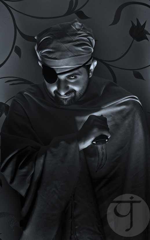
Beside changing the lens to 50mm when doing the Fante di Spade, I've also changed the position of the speedlites. Instead of striking from below on the side as in Fante di Denari, I've placed them right in front of my brother in Fante di Spade. Because of the lack of space inside the frame, I've changed here to a dagger instead, as placing a sword in such narrow space would eventually cause it to protrude outside the frame. Can't say I'm satisfied about his hand placement with the dagger but I need to satisfy myself with it for the time being, after directing his pose myself (ahem). He had some hard time wearing all these stuff already! With him, a devilish face was achieved, and I pretty much liked it that I've made his head shot into a separate image by cropping from the original before converting the whole image to B&W.

Il Fante

It's a good thing that I've been doing all this project's shots in infrared, as it opens such a wide gate for creativity instead of sticking to the original colors, and not to mention the fact that our eyes turn bluish in such images making them a bit more interesting!
Exactly how my chess horse looks like.
Now to add to my obstacles and problems, we have the issue of the Cavallo, the Horseman or Horse card. Of course I will not be shooting a real horse, but it was time to think further of some substitute. Initially, my idea was to find a horse head costume, but seeing how it was hard to get a crown for my Re (king) shooting later on (and I'm not sure if they will fit properly even), so I had to think of something else. It seems inevitable to do some photo editing and montage and the idea was there for me: Superimposing an image of a horse over the original shot. Thought of downloading the image from some photo stock website, but then I thought why not shoot it myself. My first target was my chess pawns, but that thing did look like a Scottish terrier more than a horse!!!

Re-Discover

Since my Scopa project is undergoing a stalemate, I've decided for a big part to dig up and check old photos and apply some techniques that I've not used in a long time, namely the  LAB Editing technique, in which colors are enhanced or modified by converting the image to LAB from RGB (and back to RGB later). Meanwhile, I did indeed discover some stuff, and also I did process some pretty old images that I've totally neglected because of various reasons (mainly being of bad exposure or shaky) - so old were they that some of them actually date back to 2009 with my first visit to Ireland with my old Canon 350D and 2 kit lenses! Moreover, there were some "artistic" editing to some images, doing effects and all these stuff... you know.

Tranquility by The Pond
It started well with some neglected shots from The Chinese Scholars Garden on Staten Island; shot back in 2012. I've neglected some of these shots mainly for not being "interesting" enough or simply because I was not able to think outside the box of HDR rendering. Thinking about HDR, sometimes, made me neglect those images with one shaky exposure. Moreover, some overexposures were and could have been fixed in certain techniques, and I failed to see through it back then. That's why I always hold the believe to always keep the "apparently" not so good images. You wouldn't know when it will be good, at least for the social media!

By The Pond

For many of these shots, the LAB Editing technique comes to the rescue even though the angle can be somewhat "boring." Indeed, I didn't even imagine that people would express their liking for Tranquility by The Pond or By The Pond at all. Worth noting here as well that reflections off the surface of the water were enhanced further by doing such technique and enhancing the colors in general (I didn't have a polarizer back then and I doubt I would be using it if I had it back then even). Probably it would have been even better with a polarizer for sure but at least something is saved and shown! Important thing though is: Editing the RAW file to enhance the shadows and show some details there, specially if it is the darkest exposure of some HDR bracketing trial.

Tríd an Triantán
(through the triangle)
When it comes to overexposure for some areas, and to be specific to the sky, where there are no details, like it was the case with Tríd an Triantán, a simple masking and adding a background would do the trick. I could have added some background from another source, but I always preferred to add from the same image, mostly by duplicating the layer and adding a layer mask to it, then moving it (while detaching the layer mask from the main layer). Some cloning work might be due though, just to add few touches or fix something. In Tríd an Triantán, which was shot in 2009 in the periphery of Ashford Castle (with 18-55mm kit lens), I tried to apply another effect to mimic the shallow depth of field; Say, just to keep it interesting. I've applied this effect before to another image from Staten Island, The Moon Gate, but probably it fits Tríd an Triantán more because of the angle of view (it goes straight, while it is somewhat upward in The Moon Gate).

The Moon Gate

To apply this effect, I had to use Lens Blur instead of the usual Gaussian Blur, and it had to be applied on 3 layers with 3 different levels of blurring. This is essential as in reality the shallow depth of field starts light and ends up heavy in the horizon (or at infinity). Moreover, such an effect is better off with Lens Blur because the algorithm used in this effect mimics the shallow depth of field for the lenses, while Gaussian Blur effect does not (and more systematic). Thus, to keep things real: Please use Lens Blur!
However, with all that work to revive some old forgotten shots, I'm doubtful about their "Printability" - Yes, that's word I've made up just now. Many of these shots look good in small sizes making them good for social media posting and all, but the original ones are unlikely to be printed in large sizes, say like A3 or A2 for any expo to come. This is mainly because of the noise level which, if cleaned, might take off more details than it should. But I wouldn't know for sure till I try, so we'll see!

Panoramic Endeavor

This is something I've been trying for a while since I'm not doing anymore panoramas; So just to create something new out of my previous work. This thing is mainly creating animations out of panoramas, and specially those planet or circular panoramas. Sometimes though, instead of animations, some tessellation-like patterns are made (and uploaded to the stocks!). The main target was Instagram in fact, but with those large files of tessellations or patterns, it did sound feasible to be uploaded (after reducing their dimensions) to the stocks.

A post shared by TJ.Photography (@tj_q8) on


As for the animations, the main problem was the reduction in resolution with the ongoing rotation with each frame (rotating each frame 5°). To minimize this effect, I had to work on larger file sizes and in 16-bit TIFF if possible. However, later on and after reading some threads online, it seems that such a reduction is caused mainly by Photoshop itself for some algorithm-related problem it seems. Meanwhile, rotating an image to the main cardinal points (90°, 180° and 270°) does not reduce the quality of the image. Then it occurred to me, to do four specific layers of the image with each oriented to one of these cardinal directions and rotate each for 5° (making up for 17 frames per copy). This way, the quality loss will be lesser. Adding to that, I still do work with a large file and reducing it to a small size (with a crop) and then rendering the video for Instagram at even a smaller size. All that work is done with JPEGs images and not TIFF anymore, so sparing me the memory crisis! With the addition of Actions, the work now is even a piece of cake; All I have to do is click a button several times and now I have 17 frames rotating with 5° each.

A post shared by TJ.Photography (@tj_q8) on


For the time being, the favorite size to render these animations to is 600X600 pixels. However, it seems that I have to uplift the limit a bit and try 800X800 pixels, as it might look a bit stretched on some devices. And speaking of animations, there is another useful usage for them for regular horizontal panoramas, where I used to cut these into 3 slides (most of the time) and post them in a Swipe or Album manner on Instagram. Posting them like that did make up for some awkward alignment and that's why I would need to add a 4th slide to put things in a proper perspective. Now though, doing animations, this is not necessary anymore. I can simply move the panorama horizontally and it is played back as a video in the same window and no need to swipe!

A post shared by TJ.Photography (@tj_q8) on


There is a tiny problem with these horizontal animations though, which is how to divide the horizontal movement on equal number of pixels that matches the width of the panorama. Thus, unlike with polar/circular images, with displacement measured by degrees, the movement on the horizontal plane is measured by pixels. Hence, it does look sometimes as if the animation has jumps and not going smoothly. The loss in quality during these displacements though seems close to null apparently, which is good!

A post shared by TJ.Photography (@tj_q8) on


A post shared by TJ.Photography (@tj_q8) on


Vertical twisted panoramas as well appeal more to me for making textures like those above and I'm planning to do more of them soon. Those can make up for really huge files, but unfortunately, no stocks would be accepting them (maximum as far as I know, is around 30MB). It would be a great addition to have such files uploaded online at sizes of 100-300MB! To end this matter for now, here is a funny story:
As I was digging my old files looking for old panoramas and old neglected shots to do some art with them or animations, I've noticed that I didn't make a planet panorama from inside the Chinese Scholars Garden; specifically around the pond. I've made only a flat version of that place. Probably I've neglected this option because of some of the hardships and errors, I don't know! But looking at it now, it does sound good enough to be displayed.

Planeta Fenestra

To add some spices to "my discovery," I've edited the image with LAB technique again and tried to enhance some colors as well as reduce the overexposure (which is probably why I've neglected this panorama for long). And with this, we have a happy ending for this story and who knows, I might discover another neglected panorama!

Finale

Selfie Seal
With this long post, it does seem like I'm having a lot of activities in my life, while the truth is the opposite in fact, as I didn't touch my camera much and most of my work is about re-working old photos and trying to create something out of old things (even out of my selfie on the left). My mind is busy, and so is my schedule and body unfortunately. I do have a number of ideas I need to do, specially with February approaching; the Retinitis Pigmentosa Month. Just so to see, let's list these ideas down for the moment:
  • Doing something for RP month as mentioned above.
  • An old idea inspired by Sabah Fakhri, and still cannot do because I do need special arrangement and a narrow space.
  • Infrared panorama indoors which would involve a hand (of a human or mannequin, whatever).
  • Photo shoot for some selfies to be combined later on with Photoshop, reflecting schizophrenia or multi-personalities disorders.
  • Photo series with chairs reflecting on corruption and old mentalities at work.
  • Shooting through the microscope (again).
  • Doing a photo shoot reflecting my personality as I deducted lately from some personality tests, where I got the classification of INFP-T (The Mediator type). 
All of these are just some ideas for now and all on hold, with my Scopa project on stalemate as well. Probably I'm dreaming too much? I guess. My life do look like being on a roller-coaster and I can't stop it. Everything around me is changing, and I don't see it to the good side. I pray that I will be able to travel for some time, away from this place, just to get things out of my mind for real. I feel like my mind and body are overflowing with those things they call "bad vibes." For some reason, I really don't feel like following onto that path of "positivity talk;" Deep inside, I feel it as seeing the world with pink-colored glasses and losing touch with reality, and the end result is a hard slam. If I'm thought of as a pessimist, then I guess I am with no shame in that. Probably my camera has done its job to its fulfillment, and the need to travel for some time is long due. When? I don't know…

Stock photography by Taher AlShemaly at Alamy

Thursday, March 5, 2015

Anocht…

It sounds like a slow-paced week here. Probably because it comes after the holidays. Ah well. It's not the first time. People here, most of them in fact, live from one holiday to another, and from weekend to another, and nothing to be called "living" in between. This is the case with me too, but I try my best to keep myself busy with my own projects as much as possible (despite the physical fatigue). I'm still learning the art of "time management".

Anocht

I've finally managed to go out at night and do some shooting! Seriously, it does feel like a miracle happened of some sort. Anyway, the trick is not to sleep afternoons, but later, to wake up a bit late! Oh, and to pack your tools and stuff earlier so you won't have to do them on time before going out - this thing can be a real hassle and put you down (specially if you are as moody as I am).
The chosen location is somewhere on the seaside (as usual); a pier. This pier specifically was closed for a long time as far as I remember and only been open some months ago. I paid a visit the week before to see what was the situation there and get myself familiar with it. Unlike the pier in Sharg area (Soug Sharg that is), in which I've worked before, this pier seems busy at night somewhat and doesn't get quiet a single minute!

The new location (red arrow) compared to the Sharg pier (blue arrow).

The first experiment there wasn't of much interest in fact. I got out with 3 shots, and to my standards, they are regulars. The architecture of the pier is not fanciful like the one at Sharg, but I'd say it has a potential. I don't think a panorama is possible there with the busy fishermen out there but it seems quite a place for some long exposures.

Canon EF 50mm, f/16, 20m, ISO100.


The first wasn't good, mainly because of nudging aside to allow people to pass. The pier's passage was narrow so I was forced to move a bit to the left to give some space. However, my aim was to get some "depth" despite the very simply structure. Anyway, can't complain. But probably I should have used a fisheye lens here rather than 50mm lens. I tried to fix the perspective in this image but it didn't work out well, and the trails (probably for planets more than stars) were not abundant (probably because I was facing east at this point). Processing was a compromise between contrasts of various regions. You can see in the horizon some blue flashes made by LED lights that fishermen use in their work, but anyway they were not a problem for the exposure after all. The blue spots on the passage are probably caused by fishermen passing by back and forth (as far as I remember it was dry to reflect anything). Probably this image can serve as a minimalistic one, but definitely not for printing with this amount of noise; which when cleared, will reduce the trails even further.

Midnight Showers
Canon EF 15mm fisheye, f/9, 9m, ISO100.

The second shot was, again, another trial. I had hard time framing Midnight Showers, specially with the dark atmosphere on the pier. I didn't have the time to use the white balance disk so I just fixed the WB value to Fluorescent WB, and all should be fixed later in RAW editing. I had to crop it a lot and because of the curvature of the horizon I couldn't really balance the image (fixing one line tilts the others). Even though I could have processed it in a proper way to make everything smooth and crisp but that would put down the few star trails in the sky. Thus, I've decided to abandon the idea of a "good" print and just processed the image in a way to show as much trails as possible, and cleaned the noise as much as possible. The nice thing about this image (though good in small size but not in a large one) is that star trails did really appear while city was surrounding the place. Probably if I used a wider aperture a bit the lines would be more prominent (but the exposure would be shorter of course). And like many do successive 30 seconds exposures for star trails and merge them later, probably successive long exposures would be possible too! I did that already in fact but in a sense of HDR merging (by reducing the exposure time to half between one shot and another).

Luminance
Canon EF 15mm fisheye, f/9, 65s, ISO100.

The last shot was toward this city this time. The main interest for me was the reflections on the water surface, which seemed like colorful columns. It sounds bad already for not having a book with me to read a bit while long exposures are done but anyway it was a good thing to meditate around and notice such colorful columns of light. In Luminance, the long exposure here is not only essential to achieve the required exposure for a good image, but also essential to smooth out the water surface. The water surface was relatively calm (seen a raging sea around here before) but the small ripples surely can benefit from a little longer exposure like one minute to be smoothed out as seen in Luminance. When thinking about it, in fact in a raging situation or higher tides and quite active ripples, one would need a shorter exposure relatively; at least this is what my experience foretold so far!
With these simple 3 shots, I'm hoping to get active in the last few days of winter before the weather becomes unbearable here. Going out this time was in the spur of the moment; no planning or anything, unlike in the old times when I had to observe the times for high and low tides. Coming to think about it, it is probably time to get back to the old locations along the beach of Salmiyah where I used to take shots in the old times, and this time try to go deeper in a low tide to have some proper long exposures. However, I might as well benefit from having boots!

Twitching

In the meantime, I've began already working on converting what have been previously done and processed of images from Ireland last year into B&W. Not all seem to fit of course so I'm trying to pick specific ones. Most of the time this conversion to B&W comes with a tint.

Uaigneach agus ag Fanacht
(lonely and waiting)

Na Riasca Gorma
(the blue marshes)
In most of these conversions, my starting point would be by using the Infrared preset in Black and White adjustment layer in Photoshop. Thanks to its unusual toning, this preset provides a somewhat inspirational kick for the coming steps later on. Some images were tinted with a monotone, like Uaigneach agus ag Fanacht many others, and some were tinted with a duotone like Na Riasca Gorma. However, in general, I wouldn't go with a duotone much right now for the large portion of possibilities and it's quite hard to settle with a combination (beside the different ways available to apply the effect). Images like Na Riasca Gorma was quite familiar in some websites and instagram and was favored by many for the combination of colors (blue and gold), which were complimentary. There were also some panoramas involved in this process but I'll keep them for later probably. My 9th album of images from Ireland 2014 will be completely made out from B&W images of various types (landscape, macro, panorama, ...etc).
Along this trend, there is another line of thought (and it is giving me a headache already!) which is going back to old panoramas and trying to achieve something new under the light of the new projection styles that I've discovered, or let's say noticed. Panoramas from my visit to Staten Island, NYC, are of particular interest in this but I'm going back also to my 2010 visit to Cashel, Co. Tipperary in Ireland.

Hell to Heaven

In particular, the panorama taken from the Grotto are of special interest to me for the particular atmosphere attached to it. Unfortunately here, and for some reason I didn't realize yet, Hell to Heaven was stitched with patches of colors and some smudges (caused mainly by out-of-range HDR slides). I don't remember this thing happened in this panorama particularly specially when I printed it first time and sent it to my friend in Staten Island. Anyway, because of my intentions I didn't really care much about the matter since the overall and the final image is supposed to be small as you see above. Those smudges are hard to notice in smaller sizes and with increasing the sharpness in the image these are reduced. Of course, it was done with the help of Mercator projection and some change in the viewing angle. At the end of the process, a glamor effect was added to enhance the "dreamy" look about it.

Doppelbrennpunkte
(double foci)

However, not only these panoramas from Ireland and NYC were of interest, but even older ones like those taken here, and specifically the gazebo-like structure in Salmiyah, Kuwait. This panorama specifically was involved in many activities, but particularly two activities made it a "top": Mawahb fair, and the luxurious coffee table book printed by Trierenberg circle (sponsors of Austria's International Photography contest). However, in these 2 activities, the same panorama had different projection styles. Now, I decide to go further and try what I've noticed lately with Mercator projection and made out Doppelbrennpunkte. It was hard to decide on what kind of angular view I want to achieve here, but the biggest problem was that this panorama was not perfectly centralized (apparently for the problems in location itself). I settled down with what I call "Extreme Mercator" and centralized the fountain and the the dome (but reversed it so that the dome is at bottom for added surreal effect). The problem here is apparent, with the left side being thicker than the right side with columns stretching out. A friend pointed out the following when he saw Doppenbrennpunkte: Is it possible to make the foci (or centers) of the image in the corners instead of making the panorama twirl around a central point? His question is quite reasonable, and I'm to try that in the coming few days. However, one must bear in mind that the architecture of the place is the one that decides what would be or can be done about the features in it.

Palinopsia

Back to Staten Island with another panorama. particularly one done in the porch of the Victorian (B&B). This panorama in particular was "dormant," meaning not much could have been done about it because of the design of the place itself and the scattering furniture. Anyway, I decided to try the "Extreme Mercator" approach and somehow found some satisfaction when I made Palinopsia. The image looks split in half because of the matched left and right horizontal line meeting at the center (through the roof of course). Anyway, this is not the point I'm putting this here.
The real point about it is, I was tone-mapping (working out the original HDR) this panorama and it did take me particularly long time to achieve the desired look. However, it needed further work in Photoshop to enhance contrast further more and eliminate some colors problems. My first goal was to achieve a status of "fear," "uncertainty," and/or "melancholy" (Palinopsia: visual hallucinations). For this reason I worked in a low-saturation environment and I've increased the portion of black and its shades in the image to give a dark impulse to the scene. This is somewhat a challenge to do because I was trying to achieve a "dark" atmosphere using a relatively happy scene (filled with bright colors in furniture and plants).
Now, to the core of the story. To my surprise, my sister commented on this image saying "the colors are happy" (i.e. the colors emit or radiate a good mood)! I'm not sure how did that come up, and whether it is her only or other people do share this opinion. Increasing blacks and reducing saturation is usually a fingerprint for a psychosomatic atmosphere. Did she concentrate on a specific color in particular and that affected all her feelings about the image? Was it the curves that did (unconsciously) affect her enjoyment about the image without noticing the general atmosphere I'm trying to achieve? Or, is it me that didn't notice the happy aspect of the image? It's quite a puzzle to me. I did tell her that I was trying to make the image "melancholic"; however, no response from her so far, and we didn't talk about it in real. I think some interesting information can be learned in this little experiment!

Finale

At the end, I'm here trying to take life on my own pace. Trying to calm down a bit, and kicking negativity out as much as possible (but it's even a harder job to do when you live in the core of it).
Meanwhile, I'm reading articles and lessons on the web for learning Irish, but of course they are not completely sufficient until they are put into practice but it is a beginning after all. I have to say that reading and teaching myself some Irish did in fact open up gates of knowledge and insight into languages in general, and my own dialect in particular, as we usually speak without thinking why do we say things the way they are but it does sound just right for us that way! Nothing like that happened with me since the creation of Ayvarith. One of the ways I'm using now to force myself into digging deeper into the language and learn more, is translating quotes from Arabic mainly into Irish; this procedure would normally force me to dig the dictionaries and read more to try to achieve the best translation possible.


I'm sure there are a number of mistakes there of course, so I'm just hoping someone would correct me whenever possible. Beside learning the languages I'm keeping myself busy with the images at home and books at work. This workplace must be changed at a certain point of my life for sure.
On the other hand, I've finally extracted something out of my mind to call it a "poem." I can't be a critique for my own works but at least I was able to write something in the whim of the moment, and I called it The Wind of Daisies. Maybe I should specify some special time for such mental processes and write something down. I need to get back to poetry a bit because it is a good vent, and I remember that pretty well from my early 20s. Meanwhile, there had been an interesting offer sent to me to spread some of my images for some commercial benefits. I'm going through it step by step and hopefully it can be a good starting point to the outer world. And I'm hoping this is better than submitting my photos to stock websites. One step at a time. Probably there will be a number of images that I would need to delete from stock websites soon. Hopefully by keeping myself busy, I'll forget a lot of my failures...