Showing posts with label 3D. Show all posts

Thursday, April 22, 2021

Kika VI…

Busy weeks, and Ramadan is already in. It seems that I do have to start typing my blogs very early just when one post is published! My busy schedule, by the way, includes helping and studying for my brother's sake as well as trying to nap intermittently to do these chores. I, too, have a new load of images that I really need to process further and make ready to be uploaded to the stocks. All that while there is a list of images to be uploaded to the stocks already! I wonder if 24 hours a day are still enough.
I've uploaded previously 10 panoramas and made them exclusive to Mostphotos, and I do have plans to add to them. However, because of this hectic life I'm leading right now, this won't be any time soon I guess. I've been trying to promote these panoramas by sharing them over, but seems this method is not working well. Or maybe people are just not interested in such things anymore. Ah well…
I've been struck with an allergic attack out of nowhere this week and my health is kind of up and down (again) but seems things are getting better, though slowly. I just hope it doesn't relapse to something worse!

Kika VI

As the Retinitis Pigmentosa project is over with, I'm going to jump right into Kika's photo-challenge this time and then continue with other shots that I've done before or after or during the running of these photo-challenges (which are over by last week by the way). So, the theme of the 6<sup>th</sup> week's challenge was Growth.


The Two (re-make)
In the beginning I was quite blank about this idea and tried to brainstorm and come about with some unusual ideas. I did in fact come with some sort of idea but the execution failed. For this reason, I thought maybe I should just re-work some old image resembling something about Growth and I did find this image indeed; The Two. A shot I've taken around my workplace back in 2019. I've posted this shot on Instagram long time ago and in order not to be repeating myself, I've decided to edit it in a different way, pushing more on the artistic side rather than the "proper" photography side. Thus, I didn't care much about removing that brick on the right side and the photo was edited in a trial to mimic the pastel colors style. I've tried this editing style in a number of photos but honestly I didn't go deep with such experiments. I think I still need to do more about it.
Anyway, after posting the photo on Instagram, I found out that I still have time - I was too busy with other things that I've doubted I could do my idea in time, specially that is an idea that requires a lot of Photoshop work (or magic, if you will!).
 
صَدَقَة (Alms)
 
The idea came about from a Hadith (reported speech from prophet Mohammed, PUH) which goes like: Never did the money of a servant gone less by alms-giving. Meaning that when someone gives charity, his or her money grows back and do not get lesser.
The execution was a bit clumsy in terms of the hand movement (I don't have flexible muscles). I've used a table covered in black cloth and made the gestures behind the far edge. The lighting though was a bit problematic and I had to struggle with it to get some proper angle. I was too lazy to use more than one and in fact the idea would NOT require more than one. Whenever you think of "drama" always think of "one light". This is my tip for you! The position of the lighting was quite critical to avoid lighting the wall behind me as much as possible. I would be able to merge the photos in Photoshop after all but it is just wise I guess to reduce the workload and the problems as much as possible in the shooting phase. The rest of the tale is, of course, a Photoshop tale; Merging various shots together (and discarding unneeded ones) and playing the game of layer masks, and adding a touch of lighting effects. Luckily all of this was done and posted on Instagram before the announcement of the next photo-challenge by Kika! (which occurred typically on Thursdays on her Youtube channel). I consider myself lucky for finishing this little project in such a short time, with all the mess that life keeps throwing at me! The question remains now as whether I should upload it to the stocks or not, specially that it is such a large image file. Anyway, I better put that on hold as there are other batches of photos that needs to be uploaded first.
 
Gesture
One of the shots that I've liked in my first attempt with this little project.


Rolling Back

After indulging so much in these photo-challenges as well as with RP project, it does sound a bit hard for me to roll back to where I stopped with my random camera working! Among the little announcements that I've used to post for a while, it seems that the latest post of some real camera work was done back in November 2020 or so when I used to stroll around morning times and snap some images around my area. So, What I'm going to do here is to roll back to February 2021.

 
Meditative Behind Bars
 
Typical for such a lockdown (or without it honestly), I often look around to look for something to shoot and back in the day I've picked our poor bird (which I think is a canary). I say poor because, well, I really hate to see birds behind cages but I'm forced to let it be so since I don't own it; Yet, I'm trying to take care of it as much as possible since no one in this house would. I don't actually think anyone here thinks of animals like the way I do.

A Concept of Freedom

The shoot was done using Sigma 70-300mm lens, and my old 7D camera (i.e. the normal one not the modified one). It can be noticed though that I've focused on the pinkish theme here to add some softness and gentleness to the harsh reality of being behind bars (and no, it has nothing to do with feminism nor the feminine side of the bird). There is, supposedly, a trick that would hide the bars but I think I would need special preparations and another lens. I've picked this lens specifically to be able to stay away from the cage and shoot, and the minimum aperture here is f/4.5 (goes to f/5 when zooming). All in all, it was a good practice for motion handheld shooting with AI Servo drive!

Canary (3D)

One of the benefits of shooting a bit further away from the cage (even though the bird does not have much freedom here) is to keep the bird moving and follow him in a close-up. I think it would be such a good practice for people who are into wild-life photography at some stage, but for me it does not exceed the limit of enjoying and practicing the camera and the hold. Since I was shooting in a continuous (burst) mode, there was a great build-up of images with chances for creating 3D anaglyph images as in Canary (3D) where the movement of the camera OR the bird was subtle, but the difference is capable of creating a parallax difference and hence a 3D illusion; This is mainly because of zooming in. In addition to that, some artistic rendition can be made later on (with a tick of inspiration when that comes) as in Desperado.

Desperado

I guess you can see how much I feel sorry for the bird. In fact I've tried to let it go but I've discovered that he was not able to fly and feared it would be devoured by some cat out there, thus we got it back to the cage. In Desperado, the collage was made of images shot continuously for the bird as it was trying to clean itself or something. There was a load of images to check out as well as a load of them to be deleted for the apparent shake. So, again, I consider myself lucky here to have these successive 4 in order.

Finale

Well, Ramadhan is here and I'm absolutely grateful to the fact that I don't have to go to work. Even though, I do have personal troubles and setbacks on the other side of the spectrum here, but well, trying to keep looking at the bright side of things.
I've got here load of things to do (beside typing these posts every other week), mainly helping my brother and attending to Mom a bit. In this mess also, I'm kind of swept by astrology, as I'm trying to learn few tips and bits from here and there. Well, mainly to understand myself really but I do dwell on other aspects from time to time as well.
I really wanted to talk a bit about my "bubbles" project in this post but I thought I should roll back and make things a bit chronological as this project is just recent and worked with in the past few weeks of April. So many images I've processed in this project that I'm going to need some time to prepare them for the stock (and let's hope they accept them as some works of abstracts). I've even made a video for a quick view for all of them. This said, there are a number of them that I've set aside to be processed later (not sure when) as they didn't quite get along the others. We'll see about that.
Days pass now, and my isolation increases by the day. An isolation that strikes in the mind and the heart before in body itself. And this has nothing to do with COVID and the lock-downs, though related in some way, but it is something bigger than that. I wouldn't mind if this isolation was somewhere out there, somewhere green, somewhere with fresh air and singing birds. But here? I just don't know how long I can stand this…


Thursday, June 4, 2020

Review: StereoPhoto Maker…

Well, I'm back, after a short vacation for myself. Ramadhan is over now and the total curfew or lock-down, but we are back to the partial lock-down. However, I might have given myself a little vacation from posting in this blog for a week or but I was still busy preparing a blog post about infrared photography (sort of a second part for an old post) for my Arabic blog.
Meanwhile, in this post, I decided not to talk about my photos but rather do a simple review for some amazing freeware (so far) which I've tried lately for making Anaglyphs and other options. I'm not paid to do this review or anything, but I will mention why I like it and what I think it needs further adjustments, but I still don't get many aspects about it yet. We'll come to that in few, but first I need to make an announcement here, though I'm not sure if anyone cares about it anyway:
As time progressed since my return to Instagram around November 2019, after stopping for one whole year, I've decided to stop it again and probably for good this time, as I realized that working with such platform is just a vain and useless (or maybe requires more of my time than what I'm willing to give). I did indeed disable my account (@tj_q8), however, I do have my other account which was dedicated to my conlang (@Ayvarith) and which logged me out suddenly and stopped me from going in. Sent many emails to Instagram to get back this secondary account but they didn't help much and I'm totally locked out. I tried to get it back by logging back to @tj_q8 and adding it from there but that was not useful. Anyway, I left a message there on my last post on @Ayvarith, using my first account @tj_q8, to note that I've been locked out and probably got hacked) and I have no plan to make a substitute account to post for the Ayvarith Conlang. Thus, I can't disable @tj_q8 now because if I do, the message I've posted there would be automatically deleted. Hence, even though the account is re-activated, I'm not going to use it or post in it, and I think this time for good (i.e. never again). One of the ironic thing about people in this platform is they are willing to check the "story" more than they do check and like the images in the basic account; Why? That's beyond me for now. And I don't want to understand it even. So, this is it for now.

StereoPhoto Maker

Again, before I proceed with this review, I want to announce that I'm not paid for this and I'm merely sharing my opinion here according to my own (simple) usage of this program/app, and out of love for this kind of art. I have to say that this program made making anaglyphs much easier for me for some reasons I will mention, but also there are some points that would make me in need to work further on images in Photoshop.

StereoPhoto Maker window and work space with two of my images open.
Click to enlarge.

First of all, the program is (so far) a freeware with a quite simple facade (as can be seen above) and can be downloaded here. Also, on the same context, there are related-programs that I really want to try at some point here and plenty of galleries that I want to inspect as well! In the About section, you can find the credit for the creators of this marvel: Masuji Suto and David Sykes, so all gratitude goes to their effort to create this wonderful program (or app). Personally, I've encountered the program by an announcement on Twitter and proceeded to try it out and see how it works. My aim was mainly to see how it works with anaglyphs, as I'm used to do anaglyphs manually in Photoshop. However, this little program (which requires no installation, it is a single executable file), proved to be higher in potential than what I would've expected.
I have to admit though there are some terms or names that I didn't understand but the overall usage is quite simple and straight forward. So, what I want to do here first is to go through some of these buttons and go about what they do as briefly as possible. Lot of these buttons do make anaglyph-making such an easy task compared to what I used to do manually in Photoshop.

Third Section

So, if you look at the big picture above you might notice how the buttons are divided into sections. The first and second sections are "self-explanatory"; Just hover the mouse over the button and you will get an explanation for what the button does and these first 2 sections are all about the usual operations (saving, cropping, etc). So, fast forward to the third section which you see its screenshot above. Here too, the buttons are quite straight forward, but I'm interested in the first (1) button, which swaps the left and right images. In Photoshop, I used to do that manually (changing the color channels to flip the right and left images and to test which one was better illusion of depth). All this process of flipping and testing the depth of the anaglyph is done with a click of a button here on StereoPhoto Maker!
The rest of the buttons in this section are about zooming in and out but button (5) here somehow perplexed me. The guide (when hovering the cursor over the button) says "Resampling ON/OFF," so it seems to be a button that controls the resolution a bit or the compression of the photo, so I'm not quite sure (I didn't read the help files or anything, I'm brutally attacking the program and experimenting here!).

Fourth section

Then we arrive at the fourth section where the bulk of the juice is located! This is the place where you want to play around and experiment, a LOT.
Interlaced Mode
Click to enlarge.
  1. Here, this button puts the 2 images in "interlaced" mode. The look of the resulting image here is like ones prepared for usage with lenticular lenses! Which makes me wonder if this is really the purpose of this process here, and if not, would it help to be used in the process of making lenticular images?
  2. This button would make the typical anaglyph for you, but it will convert the image to B&W or grayscale for better perception of depth (in fact it is recommended that anaglyphs be in grayscale to avoid color distractions). Here you can also see a little arrow for more options for the make of the anaglyph: red/cyan, red/green, and some more; But probably the newest option for me here is the Rainbow anaglyph! I've never seen such an anaglyph so I'm not sure if it just for artistic purposes or there is indeed a theory behind it, but nevertheless the red/cyan tints are given to the image with the general rainbow coloring.
  3. This button is the conventional anaglyph making button; An anaglyph in colors. Again, you can click the arrow here to see more options for various ways to merge the anaglyph. There are some new names for me here, like Dubois, Suto (the creator?), and some more options. To my own observation it seems that these options control the degree of the red/cyan, because (in case you didn't know) anaglyph glasses vary in types and they are not of a single type of red/cyan. The Dubois option specifically gives that typical yellowish tint to the whole anaglyph which I typically see on anaglyphs on the internet and always wondered why it is like that! There are other coloring options like Yellow/Blue. Also, in this button you can control the anaglyph by choosing Ghost-Reduced anaglyph, where you can control the Levels and Saturation to reduce the ghosting in the image (ghosting is when your eye would be unable to merge the left and right images together for various technical problems). Finally, there is an option to optimize the anaglyph (make it better) either automatically or manually. All that in this simple button here!
  4. This button is to spread the images on the left and right, as to be viewed as a stereogram (or stereograph?) and in fact once you open the left and right images in StereoPhoto Maker the images will be initially in this position.
  5. Like No.4, but the images are placed vertically; Top and below.
    Sharp 3D LCD Mode
    Click to enlarge.
  6. This button merges the image for Sharp 3D LCD display. In looks, this one here looks like the image in No.1 but instead of horizontal strips, vertical ones are used. Or so it seems to me. In fact, I do think that such option might enable people with the polarizing 3D glasses (those from IMAX) to be to view the image in 3D (without losing the color) just like in No.1.
  7. This button displays the two images in Page-Flip for 3D shutter glasses. Personally, I didn't try such glasses before but I know they are "electronic" and depend on turning on and off images (according to Wikipedia). Anyway, I don't think this is of any concern to me (for the time being).

Fifth Section
Now, in the fifth section, we do have some simple, but beautiful, tools that made my job easier to some extent:
  1. This button, called Easy Adjustments, is to adjust some aspects of the two images, left and right. Honestly, I didn't delve deep into this section yet, but a quick glance here shows a typical set of tools, like enhancing the shades of red and cyan for the two images, as well as rotating and fixing the perspective for any of the images composing the anaglyph.
  2. This button is my favorite. It is the Auto Alignment where the program does mostly everything you need and so far so good for me; It just does it perfectly in a way that enhances the depth of the anaglyph. A quick comparison between this auto alignment and Photoshop's alignment shows a clear difference in algorithm; The two alignments do not match. Also, when doing the alignment, the alignment data are saved in a folder to be called later in case you need to use it later. 
  3. This button is called the Alignment Mode, and actually it is just a manual alignment mode where the program allows you to pick a point from the left image and match it to a point on the right image and voila! The two images are aligned accordingly. However, only ONE point is picked. It reminds me of the manual control points in problematic panoramas when stitching them in PTGui.
  4. This button is for adjusting the colors automatically, as simple as that.
  5. In case you don't like the alignment work that you've done, just click this button to reset.
The rest 2 buttons are something, well, out of my usage and expertise. Anyway, as can be seen, the fifth section is specifically dedicated for aligning the two images.
Here also, I didn't go through the menus, which really are direct and right forward mostly. However, there are a number of commands and options in the File menu that I do need to experiment with. Some of these commands are dedicated to save the stereo-image (not an anaglyph) in a specific manner with a specific border. Anyway, my main interest here was anaglyphs, and to be more specific, the red/cyan anaglyphs. So, this is for the general options available, now I'm going to move to list the Pros, and Cons.

Pros and Cons

Well, as I've mentioned earlier, I do like this little program, but I can't isolate it from my workflow with Photoshop just yet. After all, Photoshop might be needed at least to do the sharpening if necessary, right? However, there is more to this. To organize things, I'll make a list here of Pros and Cons. First let's see the Pros:
  • The program supports a variety of basic file formats: JPG, GIF, TIF, BMP, PNG, JP2, JPT. I've tried to work with TIF 16-bit format myself and it works.
  • Obviously, the easiness of use and being direct. If you don't know what a term means, just try it!
  • The alignment of the two images might (just might, not sure about this yet) fix the problem of perspective change when you have the object in one shot larger than in the other. This is something that Photoshop (ahem CS5 for me) still not doing quite well. In fact, I see in this parameter here the seed of fixing my problem with Anaglyph panoramas.
  • Gives a wide range of choices to adjust the anaglyph in terms of colors (original colors of the image as well as the shades of the anaglyph).
  • The ability to flip right and left images easily to test which version has a better depth.
  • Simple, very light program. No installation required or anything. Simply, unzip, and run.
Now for what I think this program needs, or didn't quite work well for me. These are just my thought of course and I don't think they would fit other people needs of course:
  • Support for RAW files in some way or at least DNG format beside the basic formats mentioned above. It's hard, I know, but maybe there would be some way around it?
  • The support for color spaces in such a way that the final image can be "converted" to that specific place. So far, and because I often needed opening the file in Photoshop for further adjustments, the best way to work with anaglyphs saved in StereoPhoto Maker was to "assign" (not "convert") the color space down to sRGB which might be fine for an anaglyph for a grayscale image, but for a colored image it would pull down so much vibrancy. So, if you are like me, like to work in ProPhoto or Adobe1998 color spaces, there will be a big hassle to tone down the Red and Cyan tones to fit the tones of the 3D Glasses.
  • The support of more than one matching (control) point for aligning the two images (in the fifth section mentioned above). I feel one point, sometimes, is not enough. Of course, the aim of having one matching point here is originally to focus the depth of the anaglyph around one specific feature in the image, but also multi-points would help with some stretching or resizing the two images if needed, I guess?
  • Adding an option to "Replace" one image for another while making the anaglyph to test and compare maybe (or simply in case of an error by using the wrong couple of images, it would be easier to replace one and keep the other).
At this level I wouldn't go far as to imagine such a little program working with HDR or 32-bit images, but who knows! It might happen one day. So far, creating anaglyphs from HDR images requires me to tone-map the two images (usually via Photomatix) using the same settings for both images. Might be fine for images snapped quickly, but could be problematic for panoramic images.

Anaglyph panorama done by StereoPhoto Maker (top) and manually by me (bottom). Personally, I do feel and see greater depth in the anaglyph created by StereoPhoto Maker. Check it out for yourself.
The tones in the two images are different for some long story, but both are tone-mapped from HDR panoramas.
Click to enlarge.

Finale

Well, this is the post for this week folks. I hope you find this review useful, even though I didn't explore the full potential of this little program yet, as there are a number of sub-menus and commands, specially those dedicated to fix and correct the anaglyph. However, this little review, as I believe, does not do any justice to the creators really. I'm already looking for any donations venue to support their work. In the pages I've mentioned above around the beginning of this review, there are a number other solutions for the anaglyph-making process and some of them are related to videos; Something I tried to do long ago but didn't succeed, so maybe these little solutions would help me further when I do get the time to work again on anaglyph-videos. Give it a try and give them some support if you will! Till next week…

Thursday, November 1, 2018

Trending…

Finally! Something to call "weather" in this spot on planet Earth! Temperatures are going down and the breeze is chilling down. It is such weather that make me forget juuuust a bit about traveling and sit around enjoying my cup of green tea or coffee (and if there is rain, that would be better). We had some rains last week and, as usual, some areas had faced hard times despite the occasional rainfall in this spot of the planet. This said, I need to attend to the window in my room before another catastrophe happens like last year when rain water seeped through some cracks made a lake inside my room! Ugh... if I can just control my mood swings…

The Trend

Canister for shooting Argentum.
Well, my activity with the camera is minimum for the time being but I managed to test some aspects. The bulk of my work was posted 2 weeks ago as I was trying the "rim lighting" methods. Moreover, I'm trying further modifications on the canister which I use to cover up the subject to be photographed. So far, it seems that canisters with "slits" are better suited for the task of shooting non-flat subjects like I did with Argentum before already.

Argentum

The canister in which I've shot Argentum is relatively small in diameter, so probably I need to make another one with a larger diameter (when need arises). Just recently, I've made another canister with round holes instead of slits (using usual drill bits). My current simple experimenting with this canister did not yield good results, and this is probably related to the shape of the holes. Thus, I can say with some confidence that slits or flat openings are better suited for the task of "rimming" (well, I coined that, don't know if there is any real term for this kind of photography!).

Keyz

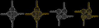
Beside working on Argentum with somewhat an innovated canister, I've worked on a little project on the side as well with a theme of security. I called the series Keyz. To make the series, I've shot individual keys, and to make sure that I get some realistic look, I've shot 4 different keys (in fact 5 originally but had to cancel one), as this will provide different serration (engraved side) for each key, and then combined the keys in Photoshop in the shape of a cross and then in a square formation. Originally, there were two versions in B&W; A cross and a square. However, later I got a spark of an idea that I would make them also in golden color, culminating with 4 images in total. Surprisingly, they were accepted quickly on Canstockphoto and Dreamstime! It seems that the security theme never dies out in time and always in demand! Hmm, that makes up for so much cliché I presume. As much as I want to study the trends and work along with it for the stock, as much as I feel empty and thoughtless when it comes to shooting a specific trend theme or subject (and not shooting models makes it worse I think). Again, mood swings and flying ideas like sparks of fire takeover the process of my mental attitude!

Complexionem (original)

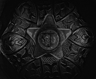
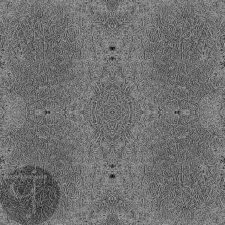
Another composite was made by shooting the metallic surface of a bowl (the other half of Argentum). This time, I'm using the slit-canister again like in Argentum, but the difference here is that the bowl is concave and I was trying to shoot from upper slits to let the light somewhat shine into the bowl. I could have turned the bowl over but I really wanted to see how things turn out with a concave object like this. The result was so-so but the final result, Complexionem, was reached by extensive editing in Photoshop. Without going into the details, I had to in fact "patch" up the image and replicate it and then try to hide the seam lines as much as possible and finally convert the image into an outline (or a sketch if you will). As the title signifies above, this is just the original one, and several ones were made into various colors and they are already available on, again, Dreamstime and Mostphotos. Those uploaded to Mostphotos, though, are larger in size (original size) as those in Dreamstime were minimized a bit to fit into the rules of the website for maximum size allowed. The colors range from Ruby Red to Argentinian Blue, going through Roman Silver and, my favorite, Gold. Hope those arbitrary and somewhat random art make up for a good pattern and texture and gain some stance to be sold!

Rolling Back

In my effort to focus closely and more on the stocks that I have neglected a bit when I was a member in the photography group, I'm trying not to re-check and re-edit some of these photos, and eventually re-discover some old neglected shots or go around some of these images which I deemed unsuitable before. This is normal, since what was suitable for the activities of the group (the expos and contests) is seldom of the stock variety.

Planeta Lacuna

Shining Xewkija
Shining Xewkija
Exclusive to Dreamstime
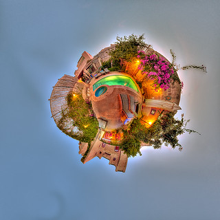
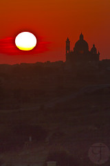
I'm putting more focus on my photos from Malta, as I'm planning to put some of them exclusive to Dreamstime, under the category of travel and tourism. However, not all can be submitted, such as Planeta Lacuna, which I've re-discovered, so to say. This panorama was done inside Dar ta' Żeppi in Qala (Gozo) near the pool. I've done this panorama in flat (normal, equirectangular) format, as well as in Mercator format vertically, but to my surprise, I realized that I didn't make a planet out of this panorama (probably for some difficulties with the nadir point). Anyhow, I prepared a smaller version and sent it to the owner of the B&B and uploaded one to my Flickr. I can't submit this to the stocks because it requires a property release. Most probably I would be uploading to Mostphotos. As I'm uploading some exclusive images from Malta to Dreamstime, I'm trying to make Mostphotos as my base for panoramas, specially those surreal ones, since it does not strict the image size as most stock agencies do (I've uploaded some which exceed 100MB in size even!). On the other hand, photos from Ireland can be spread, probably, across various stocks. Unfortunately, some stock agencies, like Canstockphoto, removed their "exclusive" options. That makes Dreamstime, for me, the only target for exclusive images when I need to upload them (as I feel right however!). Let's just hope that my campaigns on Twitter to get more exposure will pay off soon... or later at least!

A Maltese Home (3D)

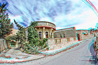
During this work of re-discovering my previous images (since I didn't travel in like 3 years now!), I'm also focusing on possibilities that I didn't pay attention to before, for making out some nice or acceptable 3D anaglyphs, as the Maltese home above. I did already upload some of these 3D anaglyphs to my stock on Dreamstime and Mostphotos (and few on 123RF), but it's a No-No to Canstockphoto. However, the anaglyph above is not to be uploaded, again, because it lacks the property release. Many of these anaglyphs, like the Maltese home above, were not planned to be merged into a 3D anaglyph, thus some of them can be a struggle to be working with and fit. Nevertheless, it pays off well!

Finale

I think I've posted in the previous post that I was working on writing a new poem. I was suffering from a blockade and words didn't come easily, even though feelings were there; Hovering. Finally, I did produce a piece, which I've called Rejected:

Rejected

Season, as per season, changing along,
then to number one goes the frozen heart.
A circle since the birth and never gone wrong,
carrying on the pain, like a form of art.
Encircling circle.
A daily Hurdle.
Then to the beginning, all had to start.

A last standing in the field of all time,
withered by the struggles, the ups and downs.
Innocent to be is the only crime,
A confused blind and poor, crowded by the sounds.
Innocent thug.
Urging a hug.
Dead, yet keeping the shoot on battling grounds.

Rosy, were the dreams dreamt on the summit,
but no rainbow shone nor the rain did fall.
Waiting for fate's mercy like a puppet,
and even beliefs dismissed the sacred call.
Fateful doom.
A weeping bloom.
And the rosy dreams are born to be small.

Rejected, this is all the offers to be,
what in the power that could have been done?
Then after, Death would be the only sea,
to swim in, calmly, away from the sun.
Dead, silently.
Joyful quietly.
Only then, the life of Life will be won.

One of the first problems that I've faced to link my thoughts together was what rhyme scheme to use. After all, I've decided (or rather felt) to use (ABABCCB) with a stable syllable-count for every verse as (10,10,10,10,4,4,10). Doing a bit of research, I've found that such rhyming scheme was already in use and probably called The Swinburne, but with more restrictions on the length of the lines and rhymes. So, maybe I can call my work here as Free Swinburne? Anyway, another question was raised in my mind here, as I read my own work after submission and posting: Where do I go with all of this? What is the chronological connection or logical connection between the verses? In a self-critique attitude, I think Rejected lacks such connection and it might as well be just a dumpster for my thoughts. The next question then arises: How am I supposed to organize my feelings and upon which basis? Trivial as it sounds, I'm sure there is some way to do this and if done correctly, the poems would be more concrete and strong, I believe.
Away from poetry now, I'm trying to take life on my own pace. My body is apparently growing old with some bones and muscles not functioning as they used to be, but well, we all grow old. Let's just hope this won't stop me from doing what I love to do. I'm growing accustomed to be living the life of an estranged person; No connection to anything, and almost no emotions. Where to does this lead me? I don't know, but one thing for sure: I'm tired. 


Thursday, October 18, 2018

Rimming…

Well, that was a break! A break from blogging that is, but a forced one unfortunately. I was preparing a post for my Arabic blog about "rim lighting" and things started to build up as my work demanded some work which required some dedicated time. I even worked on that during the weekend! Can you imagine? Doing a work-related work in a weekend? Pfft… Just to add to my misery, a car accident occurred which actually wasted my whole day (I had it as an off-day from work).

Meanwhile, because of that article I was preparing, or even before starting with it, I did prepare some images and probably would be working in the future about some more. But first things first!

Split

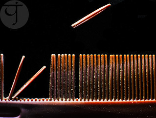
It all started with a comb. Yes, a comb. And not just any comb. A comb which might be used with beards or baby hair (I guess?)... and it's broken into pieces. Probably, as an INFP myself, metaphors and symbols do play an integral part of my expressions; Visually and linguistically. Thus, when I saw this tiny comb, I think something inside had been moved…

One By One

580EX II Speedlite covered and
leaving a small slit on the top only.
Now to business: Lighting. I knew from the beginning that lighting this shot is going to be somewhat picky. It needs to be dramatic, as well as directed to the comb itself alone as much as possible. The situation was settled by using a black paper on the speedlite to block all the light except of a tiny strip. This tiny strip was also somewhat wide for the comb but it did the job after all, and an increase in f-number (to f/8 actually from f/2 I think) was required to give it that dramatic look. I had to, however, paint the background in black myself because the black surface I used had a texture and with lighting on its side it gives out quite a visible texture behind the comb. This little quickie shot, triggered more work later on in fact.
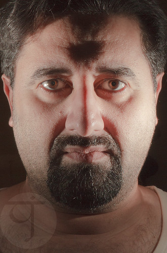
I could not resist the temptations for trying out this method (of covering the speedlite) with a selfie, and so I did. This time though, I've covered 2 speedlites with black papers and made a vertical slit in the middle (almost) about 1mm wide or so (tried to make it as thin as possible and yet passing some light). The results were... interesting!

Split


I didn't have the time to fix the speedlites on tripods or anything and then level them up and down. I just held them both in my hands and extended my arms to the sides at full length. The looks are somewhat similar to the hatchet lighting style but with more drastic shadows I guess. Quite a strange look to me as if the light beam stopped at some limit on my face though! But the strangest thing was the black "hole" in my forehead is if my forehead had a bulge! I guess I won't know if this is normal or not until I have to shoot faces of other people (with the camera of course), and see the results for myself.

Rimming

A cylinder opened on both sides.
This is what I used for the next
few experiments with the speedlites.
These experiments with "slitting" the light beam reminded me of an old method which I've read in some books but didn't get the chance to apply it much. That method is specifically dedicated to shooting engraved flat objects, like coins or medals. Having a plenty of cans around (from consuming those delicious chocolate biscuit sticks!), I decided to go on and experiment further to see for myself what can be done with those. Thus, I picked one (and I have an arsenal of them!) and removed its bottom, and stuffed it with black paper (don't have a black paint). In the beginning, I thought of lifting the cylinder a bit with some coins but they were too slippery and shaky, so I used small paper clippers (and they would help holding the paper inside the cylinder firmly as well).

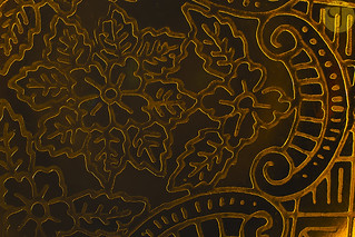
Golden Curves

The first trial was with a decorated golden tray. We use it here for serving coffee (my favorite Turkish style!). It was tricky somewhat for a number of reasons:
  • The tray was smooth and caused the metallic can to slide easily.
  • The tray was polished and that caused some reflection problems.
This is beside the common problem of lighting inside the cylinder when the camera is placed on top (and turning the inside of the cylinder into pitched dark), but that was a minor problem somehow because light was still seeping through and I could even use the AF function of the lens sometimes. For those situations where light is critically needed inside the cylinder with the camera on top, I would be using some LED light placed near the speedlites. However, the critical problem with those polished surfaces is the reflections of my hand and the camera's strip (the camera's body is black so that was not a big deal). The best I could do about these reflections is to try to let them be on the edges of the frame as much as possible and then crop them later. Usually in such situations, specifically when shooting glass (like those in museums), we would place the camera and lens into somewhat large black paper or foam board (just big enough to cover the actual frame to be photographed) and in that way the black color is reflected off the glass or in other words: clearing the glass. This is beside using polarizers too sometimes. However, all of these techniques are for the "macro" world and not for the macro shooting we are doing here with a lens going inside a cylinder! Anyway, to keep things a bit interesting, I've created a "texture" made out of the repetition of Golden Curves, and it's now available exclusively on Dreamstime.

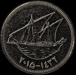
Glowing 20.

There is one thing for sure in such shots and that is cleaning is a must. By cleaning I mean working on Photoshop to clean the image. Here in Glowing 20, I didn't work on cleaning the image (except of replacing the background with black), and adding some sharpening to that and the surface of the coin got bloomed with these small dots like digital noise! Now, the challenge still did not begin, yet.

Delicati

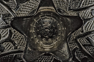
Shooting objects which are not flat proved to be difficult with such a cylinder. Mainly, of course, because the light is projected from below and we do need details of the top part. Thus, the light should strike at about the middle of the object or on its top (from the side to give a rimming effect). In Delicati above, I got desperate and I was back again to the black paper slits covering the speedlite head. For this reason, I've decided to "make" another cylinder with various slits on the sides, and holes as well. It's too early to talk about the results from these 2 as I didn't experiment with them much (and I would delay this blog post if I want to include the results here!), so I might keep this for another post. However, I did try a cylinder with slits with the same object in Delicati.

Argentum

Cylinder with slits, the one I used
to shoot Argentum. Covered
some slits with black pieces of
paper with the help a rubber band
so the light from speedlites would
pass through certain slits only.
The looks of Argentum look pretty impressive, more than Delicati. Well, to my eyes at least. But the mystical look as I believe is greatly emphasized in Argentum rather than in Delicati. But one problem here remains: Flares. By flares here I mean the harsh highlights reflecting off the metallic surface. Probably to solve such issue I would have to place some kind of a modifier to soften the light as it enters through the slits of the cylinder but this is another issue I need to test with in the near future to see how it would work out; Though I have my own suspicions about the usefulness of this. In Argentum I've worked around such strong flares on the metallic body in Photoshop doing some magic with the "Blending" options for the layers. Just to note, Argentum is also available on the stock, in 123RF
After working on Argentum, I did continue to do some work and little projects with this method of lighting and some of them are on the stock already indeed, but let's keep that for another post maybe.

On The Side

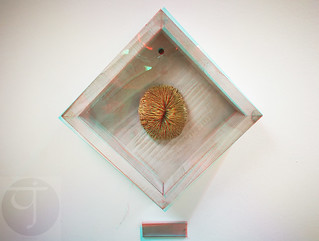
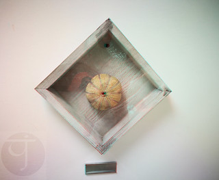
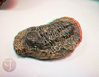
Beside all of this fuss going on with my speedlites, I couldn't hold myself further from capturing and making some new 3D anaglyphs. The target this time was some fossils in the Geology department in my workplace. The department was renovated and the display cases had been changed or re-organized and I have to say some of those was really, really, appetite-instigating for some 3D work. 

Fossil I

Fossil II

Even though I've noticed those a month or two ago, but I couldn't work out with them except in recent weeks, and I had to do it using my Huawei Mate 9 smartphone, and there is a word I'd like to say but let's end this 3D talk first. It would have been better if I could have shot those using my DSLR camera but the situation is not on my side here specially that I go to that department in the final minutes before leaving my workplace (to do the fingerprint scanning for leaving). Moreover, I would have probably used a polarizer or some black board to hide the glass flare but with a mobile phone camera there was not much I could do. Thus, though the illusion is good enough for pop up (at least to my eyes), but the flare and reflections from the glass case makes it a bit annoying.

Trilobite?

The case with the trilobite (if my memory serves me right here about the name) was a bit better but the probably the shit was too much between shots that it took me some time further to ensure that this illusion goes without ghosting effect. It is with this image that it was prevalent that higher pixel resolution does not mean necessarily a good image quality. The resolution for my Huawei Mate 9 is 20MP, while it's 18MP for my old Canon EOS 7D. Naturally, the file size for shots taken with a 20MP camera is larger than those taken with 18MP camera. However, the resolution when zoomed in at 100% proved to me that there is a critical factor related to the sensor and its size and not just its resolution which decides how clear the image can be. At close up, the shot for this trilobite was a bit muddy-like and not quite sharp. One might say it's motion blur or a focusing problem, but all that is (with time) can be quite easily distinguished when seen on the image. And that murky-looking details is absolutely a resolution issue and not anything else. Anyway, I'm limited with my options here and at the end, I do have to work with the mobile phone (I even look weird shooting several shots for these fossils with students roaming the place!). I still have some specimens in my mind and I might try to shoot them for 3D work in the coming few days!

Finale

Now, I was going, hopelessly, to write down a new poem but unfortunately, because of this busy schedule and pressed time and exhausted body, it was really hard to focus on the words and feelings I need to write, even though I do have a general concept in my mind about what I want to express. All I can hope for for now is that I would be able to do something about it in 2 weeks from this post!
The weather is getting down with its temperatures. Such a good tiding and announcement for the coming of winter. This summer really exhausted me as it is already. I can't believe how I'm coping with this for 3 years now without traveling. 
After quitting Instagram, I'm trying to focus my attention onto Twitter, as I'm using it as a platform to "advertise" for my stock images on somewhat a daily basis. Not sure how effective this is but this is the least I can do to publish my work. I am also publishing some weird panoramas (mostly planets) that I didn't think of uploading to the stocks before, but with a catch: Each stock website would be responsible (or exclusively offering) a specific type of images; From Malta, Ireland or even those tiny projects I do at home. Beside Twitter, I'm also publishing my work on Pinterest, even though it kind of feels weird and I'm not sure how it really works! This said, I'm also trying to cancel out my accounts in some stock websites as I deem them not useful at all. Who knows though, I might consider finding new venues as well.
Meanwhile, my time is passing in such a strange way as my life goes on. It is slow, yet so fast in the same time. Memories from the old days are frequently passing my mind and evoke emotions that I've been trying hard to hide in every single damn day that passes. I'm not ashamed to say even that some times I had to cry alone, but well, who cares after all. It's me, and it's my time and no one else's. The question remains though, how much time is left for me to live what I want to live, or maybe I'm not destined to live what I wanted to live…


Thursday, March 8, 2018

Discovery Galore…

Here we are again! I've been busy the past 2 weeks or so in writing Arabic articles for my Arabic blog but here I am again into this blog doing, amazingly, nothing. Yes, Nothing. Everything is on hold and I'm not doing much with my camera, BUT, I'm doing lot of thinking and I'm seriously planning to place my next online order soon. Hopefully I won't go bankrupt after this…

Kenko's DR655
One of the major things that I really need to get now is Kenko's DR655 filter, which blocks infrared (i..e it is a hot mirror filter). Despite having Tiffen's hot mirror already but after reading and investigating further, I've realized that Tiffen's filter is technically an open gate!!! It barely blocks any infrared, and thus working with this filter with my leaky B+W 403 Ultraviolet filter is not a good choice at all. I've discovered this as I was reading articles and posts in a page dedicated to Ultraviolet photography with some links to practical tests to various filters (IR, UV, HM), and there I've discovered the hideous truth: Tiffen's announcement about the effectiveness of their hot mirror filter do not coincide with the practical technical testing. The transmission chart even was such a horrible nightmare to me!

Tiffen's hot mirror transmission chart acquired practically and posted in the link above.

Thus, I can say with a degree of confidence: People, do not get that filter even if you want to use it on a regular camera to enhance the colors of your shot. The filter is not even effective at 750nm as I thought. Just for comparison, here is the transmission chart for the filter mentioned above, DR655.

DR655 Transmission chart

Well, we don't need to understand Japanese to really realize how perfect this filter is for my needs. As you can see, DR655 has a steep slope down at around 650nm and indeed blocks at around 700nm, while still allowing ultraviolet range (~ 300nm-400nm). Why I didn't figure this out years ago? Of course, there is the option of having a proper ultraviolet filter other than the one I have already (B+W's) but that alone would cost more than the combined price of a hot mirror and B+W filter. Besides, would shall I do with the B+W 403 filter then? Sell it? I don't think people here do realize this kind of art nor would be interesting in it, not to say what would they do if they discovered it is leaking IR. Yeah, getting a new hot mirror is my best bet for now, and I need to do it fast!
There are other items I would be ordering beside that, not related to photography, but I'll talk about it in some other time maybe.

Ath-Fháil Amach

Most of my activities in the past weeks were focusing on re-discovering some of the old images from Ireland and Malta. I was specifically looking for some chances to make out some more Anaglyphs. Along the way, I was able to identify some images with some potential after neglecting them before, mainly with some focus on enhancing the colors (using LAB technique generally). Well, the potential I mean here is not a potential of being classified as "Top," but I mean an image that can be enhanced and, well, be viewable; Instead of being neglected and deemed useless.

Yellow Caps

Shots like Yellow Caps made me, though, re-consider my approach with editing in LAB. In this image (and few others) I often had trouble with the saturation, so much that I did need to do some extra work to fix the problem. This is beside the "curves amendment technique" which is practically re-assigning the values for the Blacks, Whites and Gamma in the image to enhance the contrast and at some point fix the white balance. In Yellow Caps, it can be noticed how the background contains a large red spot, which is there originally but it got exaggerated in saturation with LAB technique, but then I had to do extra work to reduce the saturation, and yet it might feel a bit popping out still. I've reduced the visual impact further by using Lens Blur on the image (despite having a shallow depth of field already); My main goal with Lens Blur though was to pop out the front element further (with the help of sharpening).

Around Ashford

On the other hand, despite all the extra work that editing with LAB would issue, there are images like Aroound Ashford where the lengthy work paid handsomely with somewhat a mystical look in this ordinary shot with pale green hues (originally). The major thing about this image which made me neglect it is, actually, the spots of highlights between the trees. This is a problem in many of the shots along the years and right now I'm trying to fix some of these images by overlapping (not cloning) with other areas of the same image (sometimes from another image). Most of the time, it gets all natural-looking, and if not, there is the cloning tool to fix some minor issues about that.
Islamic Display Room

One of the things that I work on re-discovering them is the punch of panoramas done back in 2015 for the Al-Uthman Museum, which was a comissioned work. Since I've done these panoramas, I was asked to keep them "in hiding" and not show them, and it was not till 2017 when I started showing my panoramas on Instagram, apparently with no objection from anyone related to the matter. Anyway, right now I'm starting to re-discover other projections for these panoramas and specifically the planet and tunnel projection styles (technically they are the same but with a change in viewing point), and boy, what did I see!

Magnetum Marinum

Some of these panoramas were, well, nice looking. Some of them were, well, SUPER-looking. Examples here, the Islamic Display Room and Magnetum Marinum were both done in tunnel projection instead of planet intentionally. As for Islamic Display Room, I had to switch to tunnel because of some bar in the ceiling which broke the symmetry awfully, while for the other one, Magnetum Marinum, obviously it was the flooring boards which astonished me. I've been always a fan of lines; Harmonic lines specifically and those that just make up swift and smooth geometrical shapes. This is why I fell in love with this panorama in such projection so much that I didn't even dare to put a watermark on it so I won't disturb its harmony, even though that this would put the image in danger after all. I'm still processing these panoramas and still checking and I think there is some good potential. The problem is, though, whether I have the right to submit those for contests and stocks, away from the social media thing. We'll see…

Finale

Bloomless Bloom (3D)
There had been one or two experiments with some other infrared shootings but I'll keep that for later maybe, as they were minor experiments captured after a glimpse of idea, and yet I'm not sure if this idea will grow further. Meanwhile, I do need to get to my other projects that I've listed here already before, but I'm not sure where and how to begin. My mind is still stuck at completing my Scopa project which arrived to a stalemate with no model to shoot (and I'm not going to pay for a model of course). 
Life seems to be getting weirder as I go on now. I'm trying hard to understand myself in the first place and that makes me a bit more isolate than before at some level. It is weird how I get attached easily with people out of my reach and yet find it hard to get along with people close to me. The question of my mental capabilities and whether or not I'm right or wrong about my relations with people around is a continuous hurdle to my mind. It's just amazing how one can find someone similar to a great extent, even in simple things like handedness, and feel attach to, yet they are just out of reach not only by distance, but also by core beliefs; And despite that, things get along. At least from a distance. Meanwhile, everything close seems to collapse with no glimpse of hope about a bright future. I really need to get back to my camera and work non-stop if I can, and a vacation… ASAP…


Stock photography by Taher AlShemaly at Alamy

Thursday, July 27, 2017

Quickie Quick…

It's getting busy at work (mainly related to reasons of stupidity) as well as an expo to attend to, so I'm not supposed to be typing this right now actually. I barely have the time! But anyway, just a quick stroll through things I've been doing lately.

First to mention is the project for July which seems I'm quite behind with. Despite my trials to create something but, so far, nothing is good. To me at least. The project for July is about Motion and Splashes. As I did splashes before (and it's messy) I didn't want to get into it right now (despite the fun!) and instead headed to try and shoot something for Motion. My first target was my watches.

Static

I was approaching this idea from various philosophies (past and present, old and new, stable and changing, you name it) but unfortunately the set itself was not appropriate and the watches were not as well it seems. The main technique was to use the Multi (Stroboscopic) properties of my speedlites to record the movement of the seconds hand on one of the watches (by flashing every second) but that never worked. My thought was that the size is not proper for this mission. Thus, after many failed trials, including Static above, I had to abandon this set and try it out with something else. Something bigger.

Waiting

My next approach was to set my wall clock with a withered rose (no worries, it's artificial one and burnt a little to mimic the effect as much as possible). In Waiting, my idea of motion got a blend of my passion for Sabah Fakhri [صباح فخري] and was inspired from 2 lines from one of his songs. As the title depicts, it is about waiting someone in vain. Here too, unfortunately, my speedlite's stroboscopic option failed to get the movement. It seems that the hands must and better to be in white for better reflection. Anyway, as I was working on this, and because of using a wide aperture (f/2, to blur the background), the lowest power in the flash were overloading the scene with highlights. Thus, I had to fix my B+W 092 Infrared filter on the lens (50mm) to lower the power down. Since the stroboscopic option didn't work here either, it was inevitable to mimic the multiple exposure effect using several shots taken in a periodic manner (using intervalometer); as Canon EOS 7D does not have the option for multi-exposure. The final image though, Waiting, is composed from some of these images (total 20) and not all of them since I wanted to make some more spaces between the movements of the minutes hands from one image to another. And for some reason there were some shots where the flash did not fire, probably because the speedlite (which was off-camera and triggered wirelessly) did not get the signal properly from the master on camera. Anyway, I'm still not so satisfied about this blend for the images and I might re-do it again with proper, shallower depth of field if possible and better blend.

However, in this mess with this project, in the last few days remaining of July, I suddenly got the urge to perform some new 3D anaglyph, starting with a selfie (well, no need to post it here anyway) and a video; since I do have two cameras already! But there were some preparations to be made for my converted camera of course, mainly using a hot mirror filter to block IR as much as possible as in normal cameras.


It was a sluggish work though but it is a beginning. The settings for the two camera were kept identical as much as possible, but for the white balance I had to use my WB Disk to calibrate both cameras to the same degree of color correction even with hot mirror filter being placed on the lens. I used here my Canon EF 50mm lens on my converted camera, while placing my very old kit lens (18-55mm) on my regular camera. I did shoot various videos after the first video (above) but seems the first one was the best. In editing phase, though, I had to minimize the size of one of the videos to fit the other one; quite a tedious task for me since I don't know much about video editing, but well, learning still. The 3D anaglyph video above is not that good though and it comes to me that it is probably better to use wide angles to record such videos at the moment, and lenses with focal length of 50mm and more would need closer spacing between the two lenses to have a good quality 3D anaglyph video. Just a thought and applying this would come later hopefully. Meanwhile, these spintops did indeed flip my brain back to the Motion project as I will try to do some experiments again with them, for the project this time. Yet, I guess I need to wait for the weekend to arrive as I'm busy with many things during weekdays now. See you later!

Stock photography by Taher AlShemaly at Alamy