Showing posts with label circle. Show all posts

Thursday, June 12, 2014

Zu Teilen...

A week marked with laziness and blown mind because of the heat. I'm seriously having issues regarding my workplace; I started to reduce my "respect" to it, as if there is any already anyway. I'm skipping some days to do what I consider a more important job for me, regarding this blog, photography, and do some studies regarding my conlangs and phonology. Not sure how long this status would last, but in such summer and heat, and such disrespect for the admins who barely know what is science, which for, I spent 6 years of my life in this college - it is hard to tell if I can regain any respect back.
In the meantime, I'm on the path of doing some new set of experiments with my camera but yet I'm not ready to put on the pictures here; till the moment of typing this there are no shots yet! But hopefully something would be ready for the next week. However, I did a little tutorial for tone splitting which you can read below under Split It!, if you like this technique!

Crescent Beach

It was back in April when I worked with this panorama on the beach at night, in a place that I commonly call The Secret Spot. This panorama, which was majorly done by continuous long exposures ranging from 2 to 4 minutes, and took around 2 hours to be done - it was done in several formats and projections. Except of one which I suddenly remembered!

Mare Lunare

The forgotten projection was the Globe or Circular projection of the same panorama. I seldom use this projection to show panoramas because of the limited view, and hence, the limited creativity aspect that can be controlled with such projection. The projection is circular mainly and the background is transparent (if saved in a file format that supports it). Because of this circular shape, some features might look cut instead of being highly distorted. However, I decided to take a chance at it, specially that this is one of the last panoramas done before the advent of summer. Sorry, I mean hell.

Crescent Beach

Once achieved, it was really hard to pick up a suitable angle. Moreover, it was apparent that a crescent shape would form but there was a dilemma should it be made out by the sand or the sky. After changing the aspect (in terms of rotations) I've finally decided that I should make it with the sand portion of the panorama. In editing the panorama later, I've worked with many layers to remove color casts, increase contrast, and most importantly, brighten the sand portion of the image and suppress the luster of the sky just a bit to pronounce the crescent more. The formation of the crescent though wasn't quite good enough because of the connection between its ends on the far right. I think I've made a mistake in making the sand crescent here look directly to the right (i.e. in a right angle). Probably something twisted and tilted a bit would give more dynamic view and interaction with the eyes. Anyway, it is an experience, and hopefully the impression and knowledge shall be memorized for future work!

Split It!

As you may now know (if you are a follower), I've been working on converting some images to B&W and also using Tone Splitting specifically. Tone splitting provides a new taste and flavor to the B&W; Maybe I can call it the next level of tinting a B&W image.
For those who know nothing about it already, Split Tones, or Tone Splitting, is a technique to divide the highlights and the shadows to two different colors. Even though the technique, theoretically, can be applied to any images, but it is more apparent and more resilient in the arena of B&W images rather than colored ones.
Usually this is done in RAW editing phase, but sometimes we do need to edit a JPG file, thus I had to work out some way to split the tones "manually" if so to say. This method might not be as accurate as editing directly in RAW, but it accomplishes the look somewhat. I'll describe it below.

I. Open the image file (in Photoshop of course). Here, I will presume it is a colored image already. I'll be dealing with one of my old images: Harmonie.
Harmonie

II. You can duplicate the background layer to feel safe (Ctrl+J) or you can work directly on this layer. The choice is yours. However, we add then a Black and White adjustment layer by clicking button (1) and picking (2) from the menu. The tones are then adjusted to taste (3), but pay attention to the details and how the highlights and shadows are connected!
Click to Enlarge

III. Then we add a Threshold layer to split the highlights and shadows of the image. Click the button again (4), and pick (5) for the list, and adjust the tones to taste (6). Again, pay attention to the highlights and shadows here. I suppose there should be a balance between the two at this stage but it is after all a matter of taste.
Click to Enlarge
 
 IV. As the layer Threshold 1 is highlighted, press Ctrl+Alt+Shift+E (altogether!). This will merge all the layers in a new layer on the top (7), then turn off Threshold 1 (8) by clicking the eye icon beside it.
Click to Enlarge

V. While the new layer is still highlighted (i.e. selected), Press Ctrl+A (Select All), then Ctrl+C (Copy), and then Ctrl+D (Remove Selection). Now, the new merged layer should be stored in the memory (to paste it in the next step).

VI. We, again, add and adjustment layer (9), and this time we pick the Photo Filter adjustment layer (10). After the layer is placed on top as usual, turn off the previous layer (11). While holding Alt, click on the layer mask of the Photo Filter layer (12) and the page turns white. Press Ctrl+V to paste the image we copied earlier in step 5. After pasting make sure you press Ctrl+D to remove the selection. Now pick a color in any way you wish and tone it as you like (13) - this should be controlling the highlights. It might be a good idea to keep Preserve Luminosity option checked.
Click to Enlarge

VII. After finishing setting the color and its level in the previous step, directly duplicate this layer by pressing Ctrl+J (14), and then directly press Ctrl+I (15) to reverse the colors of the layer mask. This is, now, the shadows controller. Now set a new color and its tone (16). If the dialog didn't appear, just double click the icon of the layer (i.e. the one beside the eye icon).
Click to Enlarge

At this point, the main process is over. The rest is experimenting with the colors chosen for highlights and shadows, and their strengths. Some extra stuff can be done are:
1. Adding Vibrance adjustment layer to increase the vibrancy of the colors.
2. Adding Contrast adjustment layer to increase (or decrease contrast).
3. Do a slight Gaussian Blur to the layer masks of the Photo Filter adjustment layers; and the amount is dependent on the image size of course. This is to soften the edges where the two tones of highlights and shadows make a contact. The blur is better be of the same magnitude for both layer masks.

Just another halfie.
Tones split between blue
(highlights) and
yellow (shadows).
The balance here is shifted
to the shadows more, making
the blue tint of the image in the
highlights not directly visible.
These are just some suggestions. Generally, I've been using the concept of "complimentary colors" in doing split toning jobs to my images; that is use one color for highlight and use its complimentary color for the shadows (e.g. yellow-blue). However, this is, of course, not a rule. But a good and logical way to start. It would be useful to know (and memorize) the circle of colors!
All in all, even with split tones, it might look like a work of tinting a B&W image sometimes, specially when the weight of tinting shifts to one side (i.e. to highlights more than shadows or vice versa) in an obvious way. For example, Just another halfie on the left was split-toned (in RAW format) between Blue/Yellow*. Yet, to achieve the look that I really liked, the balance was shifted towards shadows more than highlights making the image look generally yellow, but with a slight tint of blue on the skin which can be hard to notice for some eyes; this is noticeable only when the blue is removed and the skin becomes "white" - only then, the difference to the eyes would be clear. When I did this experiment, it was obvious how important is to add a highlight tint (specially a tint from the complimentary color) even if it was hard to notice easily by the eyes. Even a slight amount of complimentary color into the image, whether in shadows or highlights, can produce a pleasant contrast that gives some more strength to the image. I had the advantage here to suppress the green background by toning the Green tones down; I think I was lucky for not wearing green that day!
Beside using complimentary colors in split toning, sometimes I do get the idea of the major colors in the image itself; this is if it was majorly ruled by two major colors.

Orbis Fidei
Original Panorama.
Majorly dominatedby yellow and blue.

Orbis Fidei
After splitting tones using Yellows for highlights,
and blues (cyan) for shadows.

Here comes another reason why manual tone splitting can be useful. Panoramas are not RAW files to be edited in RAW and their tones can't be split there. Thus, manual work is due (whether with high resolution TIFFs or regular JPGs). I'm still digging in the past panoramas to find those which are suitable for such technique.

*It is a convention, to myself, when mentioning colors of tone splitting, to mention the color of the highlights first, then of the shadows.

Finale

Time is ticking, and I've finally finished the bulk of the work with the Irish Visa. What is left now is the other half of the bulk! That is a proper photo for the application, and a 6-month record from my bank (to prove I can support myself there). I'm planning on leaving around the end of September. Though 3 months are ahead, but I have to hurry up with these tasks and send my documents (I think to the embassy in Abu Dhabi now) because such procedures might take 8 weeks as they stated; i.e. 2 months!

I have recently received a surprising phone call from an interior designer which quite swept me through in surprise - could this really be a start of a business trend? I'm not quite sure what is the next step, as the other side asked to arrange a meeting, which would probably fall within Ramadhan. The mention of panoramas, as he stated, gave him more ideas than he was thinking of. Anyway, I've left organizing a meeting for him to schedule and I just have to sit and wait I guess. If this could happen for real, I might have some sort of condolences regarding the despicable workplace I'm dipped in.
As for now, I'll just sit and watch my life, and work with my camera as much as possible. My dreams, myself, and I... with my camera... is all what is left for me here...


Thursday, April 25, 2013

Geometria...

Here we go, another week, with not much of activity, but at least I'm trying to grease the engine slowly. In the meantime, I do have something for mathematics and geometry still going on in my mind so far since the time when Mom was in the hospital, and that made me think of some weird stuff - simple, but weird I'd say. I'll come to that later on. Also, the group sent me (or maybe I should say put me in front of the cannon) for an interview on TV regarding aluminum prints. Ironically, I have nothing to do with this, except that I was "supervising" the printing process for the expo back in March. It went well (and short) but I have problem getting and viewing the video from the TV channel's youtube channel, mainly because they used a copyrighted topics and issues in their show which made the episode unwatchable in Kuwait! Thank you guys!

As for Mom, her health is progressing, specially that she started to head to the kitchen often and THAT is a very good sign in general, yet, personally and for my own state of mind, I won't feel comfortable until the number of dialysis processes that should be done per week is reduced. At the current time, we have to pick her to the dialysis center (luckily near my working place) 3 times a week, and each session takes around 4 hours. As far as I know (and some by logic), doing dialysis on the long run can cause more hibernating to the kidneys (because dialysis is doing what the kidneys should do) and that would weaken the body even more, beside weakening the immune system naturally. Two things that I don't wish Mom to be acquainted with.

Grease:

Source: B&H
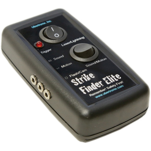
It's been a month or a bit more since I've got the Ubertronix Strike Finder Elite for triggering the camera (or flash as it seems), but unfortunately I'm still unable to work out any ideas to work with it. Sure, water drops and splashes seem to be an obvious target but they are cliches by now. I was trying to find something new or some creative venture within these two topics (water drops and splashes). Since I couldn't think of any, I've tried at least to do some testing for the device.
The Ubertronix seem to work fine except for few awkward delicacies!
  • The wires of the sensors (for sound and motion) are short, but probably can be lengthened by some means.
  • The device contains no controls for the sensitivity of detection (specially when it comes to sound detection).
  • The port used for connection to the camera also bears "Flash" on it, but in the instructions manual there is no explanations involving triggering flashes instead of cameras. Could that be with the help of the PC port in the flash itself?
  • Motion and Laser detection seem a bit unpredictable. 
  • The sensors for sound and motion with their short cord are also hard to be placed. Probably duct tape is due in some situations. They are in a bulky rectangular box shape and because of the sturdy cord it can be hard to make them stay flat on a table for example or make them still on their sides.
These might be some awkward points, otherwise, the device works in a wonderful way. I think even the Laser detector can be used as a motion detector but I'm not sure of that yet and I need to do more experimentation.

Rising Eye
Canon EF 50mm + 12mm & 35mm tubes, f/11, 400-1sec, ISO100.

On the other hand, I was trying to catch some eyes with the help of extension tubes but my trials with other people were in vain, so I've tried to do it on my own eye. Of course it is not like a piece of art (specially with all these reflections of flashes on the iris). I've been fascinated with the lines formed on the iris and I thought maybe the best way to do this is to use extension tubes. Using speedlites, on the other hand, was problematic but it was a must; otherwise no light is available in such narrow corner! Doing the whole thing on my own eye is a really hard task, specially with using an external portable monitor to judge the focus and the composition. After many shots, I've decided to pick Rising Eye to work on its RAW and filter it a bit more. I like this version mainly because the iris is situated in the corner (and I cropped a little from the top right corner to emphasize this fact) and it breaks the monotonous look of the iris being in the middle of the frame (and I did take shots that way as well). I've never imagined myself going so deep with the macro field, but it might be time to plan for some rails for fine adjustments?

Geometria:

With my sudden amusement with geometry and mathematics (not something new in fact), I've been playing around with circles and rectangles, along with squares of course. Needless to say I had some crush on Schläfli and his symbols.
From that perspective, I've been thinking of ways to organize my composition or the way I see things in my pictures. I'm quite a believer in what Bruce Barnbaum mentioned in his book The Art of Photography about the myth of the law of thirds; something that I would beheaded for if I talk about in here inside the photographic community in Kuwait! Bruce, however, had his own points and logic indeed. Anyway, for me, I do tend to think of the law of thirds and the golden spiral as means to merely organize the objects in the scene but not a critical tool to get the attention of the viewer. I'm aided with this point by the common belief among photographers that Rules are made to be broken in general!
Stemming from this point of view, I've been working around to base some order based on geometrical means rather than visual means opposed to the theory of the thirds and the spirals.

Red: Golden Spiral.
Blue: Law of Thirds
Green: Diagonal-Circles

My first trial was to draw quarter circles from the corners of a 3:2 rectangle; with 3:2 being the usual ratio for imaging sensors (at least for the APS-C cropped sensors?), and the radius of these circles is half the length of the diagonal. Thus, the quarter circles would meet at the center point of the rectangle, and by drawing the diagonals of the rectangle we can specify the points of intersection between these circles and the diagonals (green on the image above). Now, would these points make an interesting composition? This, I wouldn't know without trials. However, I do imagine it is a good starting point for circular (specially overlapping circles; e.g. in a rose) subjects. But the intersection points seem a bit far away from the center which makes me skeptic about its use in general, but again nothing can be talked of without trials.

Red: Golden Spiral.
Blue: Law of Thirds.
Green: Diagonal-Circles.
Yellow: Central Circle.

Another thought then occurred to me is to draw a central circle within the 3:2 rectangle in such a way that the center of this circle is shared with the rectangle, bearing in mind that the radius should not exceed the height of the rectangle (the y-axis length). Then, drawing quarter circles from the corners like before. This one diagram is unusual for me because it shows here more than the usual 4 intersections; in fact we have 8 intersections. However, four of these intersections don't seem to be practical (the two central intersections up and down) because they touch the edge of the frame itself. Probably, after removing the 4 central intersection points, we are left with the other four that are close to the diagonals and work more in harmony with the law of thirds and the golden spirals (yet far away from the diagonals-circles intersections). I guess placing a subject in these points won't make much difference visually since it is close to the other perspectives. However, those points close to the edge of the frame which I've omitted in the beginning might make a difference if they are to be included in the rules of the composition. Notice here that I'm talking about placing a subject in ONE and only ONE of these intersection points, whether it may be law of thirds, golden spirals or any other perspective I've been mentioning so far; but what if some of these perspectives, specially this last one (Central Circle method) would work as a whole, meaning that intersection points are to be used all together to organize subject(s) in the scene and not one subject only? You think this would be visually interesting? Again, only trials would prove if it's appropriate or not.

Red: Golden Spiral.
Blue: Law of Thirds.
Green: Diagonal-Circles.
Yellow: Central Circle.
Grey: Diagonal-Central Circle.

By the end of my thoughts chain I was almost going to forget about the result of intersecting of the diagonals with the central circle. Not strangely, these grey points are in harmony with other perspectives like the thirds and the spirals, as well as the central circle intersecting points. In fact, I think the four perspectives or divisions: thirds, spirals, central circle and diagonal-central-circle do all make clusters for one position at a time around the center of the frame, and if we have one big subject within the frame it would be covering these four points in one corner at one time probably. This leaves two main questions of how affective these perspectives are when it comes to the Diagonal-Circles perspective (Greens) and the central intersections of the Central Circle (those closer to the edge). Well, as for the central circle perspective, we might, as I've mentioned before, work with the 8 points altogether (or 4 of them at a time) to place a certain subject. The greens, however, might have been tried before from my side without noticing like I did with one of the shots for some roses and petals.

Die Sanfte Ringe

Probably Die Sanfte Ringe reflects in a way how the Diagonal-Circles perspective would work - but I have to say here that this shot was taken long time before thinking about these different geometrical plays within the 3:2 frame. Yet, it does coincide somehow as a subconscious drive I presume! Notice that the Rising Eye mentioned before does somehow imply the Diagonal-Circles perspective and again it is as if it is a subconscious drive within my mind to do it that way, specially when it comes to circular subjects or rings and loops. There is a difference though between the Rising Eye and Die Sanfte Ringe in that the former is indeed a 3:2 rectangle, while the latter is a square. Not sure yet how to think about the visual impact in between these two but one step at a time - I think there is a plenty of time to think about these crazy geometrical means. As for now, I need to work a bit more on more serious stuff!

Libros!

I've exhausted all my arsenal of books by now (and only one or two short stories are left). I've been working on my queue of Arabic books that I've purchased some months ago from the books fair back in November. Back then, I did purchase some stories just to rest my mind little bit from the technical aspects that I usually wander on. Now my eagerness is back to the technical side and I've decided to purchase 3 new books from Amazon. As usual, I've decided to take up 2 books about photography and 1 about science (specifically archaeology).

Source: Amazon
One of the books that I'm eager to read is Lens Design Fundamentals by Rudolf Kingslake. The book is cheap and in fact I was going to order another one which costs around US$150, but judging from the contents, I believe the latter is way too advanced for me for the time being (it appears to be too academic in style). Thus, I changed my mind and picked this one since it's cheaper as well as it is aimed for beginners. I'm not sure where does this lead me but I've always wished to gain more insight about the make of lenses and where the power lies in the design after all.

Source: Amazon
 The second book deals with Tabletop Photography, by Cyrill Harnischmacher with some twist about using speedlites. From what I reckon about its table of contents, it is dedicated for people who don't like to work in studio environment, and eager to use some tricks with their speedlites. Not sure how much I will gain from such a book, but I'm pretty sure that I won't be disappointed as it is the case with most of rockynook publishing.

Source: Amazon
The last book is something attracted me mainly because of some formulae inside! The Handbook For Classical Research, by David H. Schaps, seems to be a general overlook about humanitarian sciences and how mathematics merge into them for purposes of studies. I was looking for a pure archaeological book with pure scientific prospect, but unfortunately most of the books I've found were novel-like and don't deal much with the scientific and mathematical side. This book, however, bears much about studies and how to do them and how to analyze data in such fields like anthropology and archaeology, in different sub-fields. This is, at least, what I've regained from reading the table of contents and some few pages in between the covers. I don't think I would be disappointed here though - anything that has some numbers in its language can be quite interesting in the current time!
The only problem that remains now is how to manage my time between these 3 books. I think I'd read the rockynook issue first, because they can be over with quickly, usually!

Conlang:

In the meantime, I'm not forgetting my beloved conlang(s) in such frustrating times, but actually I'm not putting ideas onto papers or notes - but simply everything is going on in a mental note. I need to enhance my memory about some basics about the Bulughman conlang as well as Betenic.
There had been an idea of a funny or a comic version of English as a conlang. I thought about it long time ago and proposed it to Simon Ager, the author of Omniglot.com, but as he said, the priority is for conlang with conscripts (i.e. artificial and new scripts) while my version was simply using modified Latin alphabet. From that point I've been thinking of inventing a new conscript indeed. Priorities for now, however, is for the Geltani project that seems endless. Sometimes, I do think I need a wife not to love or share dreams together, but simply to organize my time. Might be a plausible idea, but I don't think I would call it a marriage, can I?

العين التي رعتني
The Eye That Cared For Me


Thursday, February 7, 2013

Loud and Silent...

It was a week highlighted with anger and relief in the same time. Something weird, but well, not so weird when I look back at all my problems with the future engineers I've met in my college days. But anyway, after being shown on TV twice in a week almost, maybe some awkward people that I've dealt with this week would reconsider when they deal with me personally, or with the group in general.

Earlier this week, and during the Cultural Festival in Kuwait University, the group received some phone calls about a request to prepare for an expo. In the beginning I didn't realize what is it about or where. Later though, I've realized it would be in the faculty of engineering (i.e. college of engineering). It is a place, allow me to say, I despise.
I can make out a novel about this event and all the bad surprises I've met, but I'm going to follow up with some points to make writing this a bit easier:
  • Failing to describe the location of the expo perfectly. In the beginning, it was a corridor, then suddenly they told me it's a hall, and then back to reality; it was a corridor. A corridor outdoors is a bad location and I would have said NO, but we were entwined that we had to do it anyway.
  • The group's organizer invited one of those so-called organizers for this event to check our gallery in the cultural festival in Kuwait University for a whole three days of the festival and he didn't come to check if the photos are appropriate. He didn't bother himself to come and check. Amazingly he had the guts to lie even and to tell me that he made a contact with our organizer before 2 weeks!
  • We were surprised to discover that the event would be just 4 hours and for one day only! Information about the time span was not exposed to the group's organizer as it seems, because he was surprised as I was!
  • For such a small event in such small time span, I was so much bugged with phone calls and rush from their side (typical attitude for engineering students).
  • Preparation time was changing from afternoon to night and back to afternoon time, and then finally I got a flood of phone calls to come and prepare (and urged to fulfill a promise and agreement as if my word for it was not enough).
  • On preparation at night, a friend and I headed to the location and worked (with a bad tape) to fix the images, but before that the so-called organizer swept through the images on the ground as cheap prints. 
  • He was begging for pictures of cityscape. Seems he thought that making such photos and printing them is as simple as building a house out of LEGOs. What surprises me is the childish tone used to beg. As we say in Kuwait: A beggar, and putting on conditions!
  • I was aware that tapes used to hang the photos are not good enough, thus next morning I came as early as possible with a staple gun to work out on the photos and fix them on the stand by stapling the corner without puncturing the mat board itself. Also, I brought 2 of my framed panoramas with small stands, just to show good will and that we are still want to achieve something good in this event (since he was begging for urban imagery). Anyway, later in the day I had to look for someone to move the stands outside and when this was to be done, they almost crushed my Grand Mosque framed panorama and the stapled photos fell down like leaves in autumn.
  • Despite my warnings the night before about the power of the wind in such a passage, yet the future-engineers claimed there is nothing to be afraid of since there are buildings and trees to lessen the power of the wind. The result? Prints flying over my head and on the ground while stands falling down with the slightest blow of wind. One them almost fell down on my head even!
The mess inside the show room after fixing the prints in the morning before moving them out.
 After all of this mess and even more, I got mad and I phoned our leader and he gave me the green card to withdraw and leave them without a photography section. When I left the place (heading home to keep the prints there away from the sun), I felt some RELIEF to end it that way after all the humiliation and the lousy work and arrangements.
After such events, I've started already to plan for some kind of a show in my own work place, the faculty of science - the faculty of engineering's neighbor. The primary negotiations seem promising and I went into the public relations office with one idea and I went out with two ideas or more. A new challenge now arose after the little meeting: creating art from environmental topics and concepts in a form of photography. Hopefully, we will be discussing the matter with the group and see what can be done.

Silent Night:

It was such a quiet (and long) night. Woke up around 10:30 p.m. on Thursday's night, and it was such a long sleep (from 4 p.m.) which I thought it would be simply, a nap. Apparently, my body was so exhausted. As it stroke 3:00 a.m. Friday, the blood was pumping urging to go out in such a night. Tranquil as it may seem, and filled with eerie atmosphere as well.

Himmelsweg
Rokinon 8mm, f/22,
121 sec, ISO 100.

My target that night was the usual gazebo on the seaside - around 10 minutes driving (with traffic lights) from home. This is when the road is quiet of course.
One thing that was absent from my own chain of thought back then: the light pillars. I was heading there in hope of doing long exposures because this is something I was planning to do for a long time now, but the pillars screwed my plans for real! What to do now?
My only solution to this situation was to use the Rokinon 8mm fisheye lens, as it allows me to approach the subject up real close. So, I've simply went to the gazebo and stood between it and the light pillars. The problem? I can't use any filters. Thus, I had to work out my exposure depending on the readings taken from the gazebo and from there I would decided on the total exposure time (with very small apertures). Another problem that proved to be prevalent later is the distortion which was hard to fix with a suitable outlook to the whole scene - at the end I had to leave images like Himmelsweg and the others without much distortion fixation.

Geistersnacht
Rokinon 8mm, f/22(?), ISO 100
HDR
Working in the almost complete darkness (while stray cats were chewing on my backpack!), I settled and started to do many exposures with different settings and positions. To my surprise at home though, I've realized that I've created almost an HDR out of long exposures! First, however, I had to work with one exposure which resulted in Himmelsweg.  While working on Himmelsweg and trying to fix the exposure and the WB, I've noticed that with Tungsten WB the body of the gazebo would turn green (because it was slightly yellow from the light pillars). Furthermore, when I've merged 5 exposures (90, 120, 130, 663 seconds) to make the HDR image, and then tone-mapped it, the greenish glow of the gazebo was really pronounced. The funny thing is, I'm not sure that all exposures were done at f/22! I remember changing from f/16 to f/22, but... when? This lens is completely manual and nothing is recorded in the EXIF!
Tone-mapping Geistersnacht was followed with some Photoshop work to add a glow or haze and to add contrast and dodge and burn. The original HDR file, however, was saved before tone-mapping to correct for the yellow tint of the gazebo and to try to retain its gray look.

Träumesnacht
Rokinon 8mm, f/22 (?), ISO 100
HDR
There is one old trick to counteract the effect of a color cast by using a Photo Filter adjustment layer. However, you can also use the Color Balance adjustment layer to fix color casts but this might not be so flexible and not so direct, besides that it won't work in HDR (32bit) mode! I was trying to fix the greenish-yellow cast of the gazebo and yield more naturally gray. However, there is another problem waiting for me when using Photo Filter adjustment layer.
The method of using Photo Filter to balance some cast depends majorly on reversing the sign of the a and b in the Lab panel; meaning: if a is minus we change to plus and vice versa, and the same for channel b (and channel L is untouched). However, in 32bit mode, i.e. when working in HDR environment in Photoshop, the Lab is not present, but only the RGB panels (with floating numbers) and HSL panels.
At this moment, I was stuck a bit but some idea about the color of circles made my life easier and I was able to counteract the effect of yellow.

Circle of Colors

As you can see, from the circle of colors, there is an opposite color for each side (or each color). This circle of colors is the concept for the Hue command in today's programs and image editing software base, and that means supposedly that I can cancel each two colors together and neutralize them by adding them together. This is exactly what I used here: click with the eyedropper on the gazebo (under Photo Filter), and change the Hue by adding +180 or subtracting -180; this way you are moving to the opposite side of the circle! It was as I expected, and the result was as in Träumesnacht, where the gazebo was neutralized and the sky was tinted blue because of the neutralization process (and we have a layer mask to control the areas of the effect, but I didn't use it here).


The Hue Fix

This is a fast guide, which inspired me in fact to write a new tutorial as soon as possible for the group to enhance their photo-processing. I will try to explain here with few screen shots, and of course you can click each image to view the full resolution.

The original section from the HDR slide with green overcast.

With Photo Filter adjustment layer, we can choose a type of filter from the menu, or we can click the other option for optional color. We click the second option and a palette is open and now with the eyedropper I click somewhere on the green portion of the image (or any other areas I want to balance). Notice the Hue value is 106o. Make sure before using the eyedropper that the Layer Mask of the adjustment layer is NOT selected.

We add 180 to the Hue value: 106+180 = 286. We simply put this value down in the Hue space. The result is a magenta color. Simply click OK then. The effect is still not so obvious.

Back to the original Photo Filter dialog box after clicking OK. Here, we increase the Density to 100% to prevail the effect more. Notice how the steps turned balanced and almost with no tint. Remember all this work is done under HDR mode without tone-mapping.

 After the last exposure, I've decided to move in a hurry and get back to my car as the rain started to drop down slowly. Once I've reached the car it started to hammer down faster and faster! Silent night, and a rainy one. Perfect, but with only one thing missing; someone...

Silent Morning:
After finishing with the Silent Night above, I was already excited to have another go the night after, that is Friday/Saturday night. Unfortunately for me, my afternoon nap didn't go well and I've ended up sleeping on and off at late night.

Über die Steinen
Canon EF-S 18-55mm @18mm,
f/14, 60sec, ISO 100.
However, I pulled myself together by early morning time and tried to reach my favorite spot on the beach (near McDonald's) before the sunrise, but the traffic lights delayed me enough to brighten the sky. Well, I'm there already and didn't want to miss a thing. There were some heavy clouds above my head, and some are scattered in the horizon and I thought it is a good chance to start with some long exposure using NDs. The problem here is, to include more details and foreground, I have to use the 18-55mm EF-S which I hate the most - the sharpness of such lens is not reliable and needless to talk about the shaky situation when using a polarizer or NDs on this lens of the shaky focusing-ring.
After some trials and fixing 7 stops of ND on the lens, and after some planning and framing steps, I think I've came to the proper image (which is not on Explored section of Flickr!), Über die Steinen. Originally the image was a full 3:2 frame, and uploaded to some websites that way, but then decided to make it a square to remove an excessive unused space on the right. Of course, at such morning time my favorite WB setting would be the Fluorescent WB, but it didn't make up much difference since the image was harshly tinted with magenta because of the excessive use of ND filters (3+3+1). Even though I've used the White Balance Shift control in the camera itself to bias the White Balance to the green side (opposing the magenta) but It made out a little experimentation in the RAW editor to fix the white balance and retain the colors back. Apparently, controlling the bias has no effect on the NDs tint. GUYS, ALWAYS SHOOT IN RAW!

Ciudad en Rojo
Canon EF-S 18-55mm @35mm, f/8, 3.2sec, ISO 100.

As the time proceeded, the sun kept going on above the horizon, and I thought "why not try some IR?" After all, I'm trying to increase the exposure time to record the movement of the clouds and the IR filter is a good light stopper, but of a special kind!
After some time fluctuating between landscape and portrait orientations, I've settled with a landscape orientation. The IR and the polarizer were fixed on top of each other, a move that I've done before to add more stops (but gives me hard time unscrewing the filters apart later on). I was surprised though; the exposure took only 3.2 seconds at ISO 100! Then I've realized that I'm shooting a bit facing the sun, and the shutter speed would be have been as fast as 8000-1sec probably if the filters were not used!
On the technical side now, when I started to process Ciudad en Rojo I was going with the typical IR workflow that I've developed for myself. However, since I've realized that Canon's DPP is far better than Photoshop for fixing the white balance of such images, it was natural to start the workflow with this software. The results were not so convincing, so, I switched back to Photoshop and started to edit the RAW file from there. After a glance into the image, and cropping little bit, I did really like the redness of the atmosphere (with a somehow annoying sun). Thus, all what was done is merely a reduction in the Red saturation, and the rest was a regular work of enhancements: dodge and burn, contrast and noise cleaning with the addition of sharpness.
What I really liked about Ciudad de Rojo is the reflections on the sea surface that I didn't notice clearly on location! I'm not sure if it got clearer because of the polarizer and/or the IR filter (a polarizer is more of a candidate of course), but it was a shot of luck indeed (and would have been better with a longer exposure to soften the water surface). While processing the image I had to burn a bit to emphasize the reflections and to my surprise as well, the reflections showed a longer extension downward more than I thought!

Sonne nach Dunkelheit
Canon EF-S 18-55mm @21mm,
f/8, ISO 100, HDR.
Then there was a trial just before leaving (because the rain started to drop down) and it was still with IR filter. This time, the work was bracketed initially to see which exposure RAW would be best to work with (I'm still not used to judging the exposure of IR images on LCD or even histogram). Lately, however, I've realized that I could do with some HDR after fixing the white balance in DPP and convert the files to 16bit TIFF files. Mixing the original RAWs with such hard red tint is not really a good idea for tone-mapping later. However, after fixing the WB in DPP, there were some blue tints within a majorly black and white image (or slightly sepia tinted black and white) and all the resulting TIFFs were merged into one HDR file which was tone-mapped.
The first thing to do then in the processing sequence was to swap the Red and Blue channels (and hence all the blue streaks were turned reddish or yellowish).

 As for now, my queue of books is a bit hovering and my reading pace is slowed down. Getting busy with the group does leave me exhausted most of the time at night time and I can hardly open my eyes and continue reading anything. On the other hand, I have to keep being busy a bit even at home to get further news about contests (international ones specifically). Being busy seems to be an amendment for some issues in my life; as Thomas Edison once said "as a cure for worries, work is better than beer"...
Now, it is time to look for those damn TV tapes!