Showing posts with label archaeology. Show all posts

Thursday, August 7, 2014

How do you see it?

It's Idle time here. I gave myself a "vacation" from blogging last week for the Eid holiday. Not much has been going on except for some shots done in the family gathering - and they were not as vibrant as the years before. I, in fact, spent many days in the holiday sleeping for long hours (8 to 10 hours a day!). I guess I'm compensating for all the sleeping problems I've faced during Ramadhan. Meanwhile, I decided to do a little study on some aspect of tone-splitting technique. This study is not scientific in any way, but it is mainly observational to take some notes. I wonder though if there is a way to "scientify" this process after all.

Vergleichung

Since I've been working in Tone-splitting techniques for some time, I wanted to test some matters related to it. Yet, I'm not sure how to make a scientific and bold approach to such matter, since they are artistic in the first place. Thus, the sole reasoning in this experiment is done by heart and feelings initiated by eyes vision. The task here is to investigate the relation between luminance colors and their usage in tone-splitting process; how would they appear and feel when used as one of the tones in the process. But before going through rummaging, I will talk a bit about the process.

Concept
In the beginning, the general idea here is to use 2 colors: a specific chosen color from part of the image, and its complimentary color. Now, these two colors can be bright and dull sometimes, according to how we see it, but the main question was, how to specify this? What makes a color lustrous more than the other? If we have two complimentary colors, they are just opposites on color circle, and the difference between the two is barely in the Hue value, while Saturation and Brightness (or Lightness) have the same value. After searching around and with the help of the colors websites I have at hand, I've found out that the most adequate tool to compare these two is by checking their CIE-LAB values (LAB for short) - and more specifically, the "L" value (which stands for Luminance).

Portion from ColorHexa website showing the LAB values (in Red). The Luminance value which I've used for comparison between colors marked in blue.

After doing some experiments and comparing various colors, seems my guessing was right: The "L" value is indeed responsible for how "bright" the color is as we see it. So, what now?

Work
The work now was to choose a specific color. In the beginning, I was kind of in dilemma for what color should I choose in each image, as I didn't want to make the whole set is based on two complimentary colors alone - but it should be something of general concept. In the beginning, I tried to use the Average Blur command which makes an average of all the pixels in the image into one color. Sounded a good idea, but unfortunately, the colors resulting from this process were mostly dull and with low L-value, and their complimentary colors have the same characteristics. Thus, I had to do it in the usual manner as I usually do the tone splitting process for some of my images; by picking a lighted area in the image itself and analyze its color, and then pick the complimentary for that color. The two are used then to do the usual job of tone-splitting for the image.
I won't go on with the manual procedure of tone-splitting with the images, but to make things standard as much as possible, the random-picked images were turned into Black and White and using Maximum White preset (which can be found in the menu of the command in Photoshop). This preset sets all values for all tones to 100. Usually in my regular work in tone splitting I would play around with these values to pronounce specific details more than the others, but since I'm going to test several random images here, it is better to make something as a basic procedure.
Now according to these procedures and after picking a color and its complimentary color from the available colors in the image itself, we are in front of two cases, which I called "AB" and "BA" for easiness and affluence, where:
  •  AB: The color of the higher luminance is assigned to the highlights, and the colors of the low luminance is assigned to the shadows.
  •  BA: The opposite of the above; the low luminance color is assigned to the highlights of the image, while the color of high luminance is assigned to the shadows.
Thus, for each image picked here, we have two cases; one for AB and one for BA.

The Images
The images for the test are picked randomly, from various folders and years. Nothing specific was set to be looking for; simply random. The images are below and they are minimized. You can click any for a bit larger view. The total is 12 images.


Observation
After checking for myself with these twelve images (which is not enough in fact), I've made a simple statistical count:
AB preferred:  58.3%
BA preferred: 16.6%
Undecided: 25%

I can't surely say that having a luminance color to be taking the place of highlights is a sure thing, but I would say that with the abundance of highlights in some image, and placing a luminous color when splitting the tones in place of the highlights, that would make pretty much a bright image to the extent that, sometimes, it eclipses the complimentary color given for the shadows - thus, probably in such instances of abundant highlight, the AB type is not advisable. On the other hand, the colors chosen would play a great role, but in this instance it is all the role of taste. Those 25% of the undecided, might be so for compositional factors I presume, or ought to a balance in the overall highlights and shadows in the image, making the eye sight torn in between elements of the image without really residing on a specific element. This is all I could think of in the time being, but sure it doesn't end here. I'm wondering what would the next step be? More experimenting? Notice that all of this experiment, from A to Z, is based on color and complimentary color relation - there are other schemes to be investigated as well. Anyway, for the time being maybe I can put a guide line for myself in the matter of tone-splitting which might go like:
In tone-splitting process, the color of the highest luminance, or "L" value in LAB system, is to be assigned to the highlights, and its complimentary would be assigned to the shadows, providing that highlights do not overwhelm shadows in the image. And that is a starting point for creating and contrasty and easy-to-notice image.
And more testing should be coming on the way.

Finale

I was supposed to have some rest in this month, regarding my workplace which made it easy with the fingerprint attendance process. However, on Wednesday, I've received some letter asking that I should be doing the fingerprint attendance again after being told that I do have a exclusion permit till the end of the month. Such news really rose my blood pressure levels and added 10 more points to the scale of how much I do hate administrators and this workplace specifically. This, specifically, is an addition for really disrespecting this place even more. I just wish it is September already and I'm ready to go away from this trash just to smell some fresh air in Ireland.

On the other hand, I've checked out for another appointment for my eyes examination instead of the one which was during Ramadhan and I didn't attend. Even though it could have been in the next week but I told the nurse to put it some time in November. The appointment is supposed to take place on November 16th. A special date if you ask me!
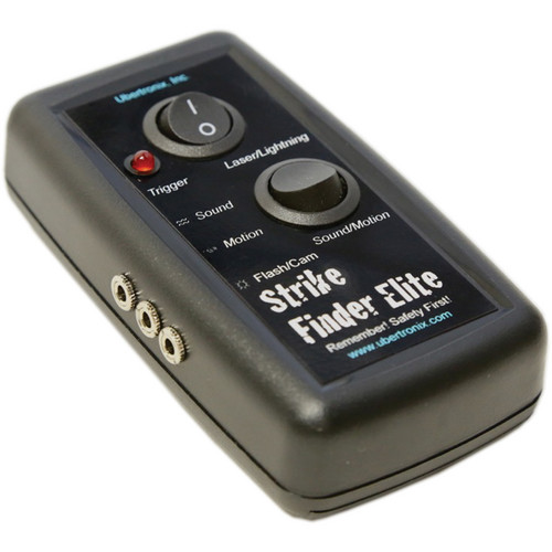
Source: Amazon
Book-wise, I've finally finished the optics book, which was small and old, but HUGE in its content of information. Of course most of the techniques mentioned in this book are, probably, obsolete by now, but the information mentioned here are nevertheless pretty much valuable. The book is direct and highly technical without much theory. I like such books. That doesn't mean I don't encourage reading theoretical books as well, but too much theory without a real scope on how to use such a theory in a proper and physical manner to be beneficial can almost be in vain.
Source: Amazon
Now, I've moved to the next book on the queue line, Archaeology Essentials. According to the introduction, it seems to be a "student" edition, or the type taught in colleges. Sounds good. I've gone through few pages so far and I like it. It is indeed concerned about Archaeology rather than sociological issues like the last book I've read. That book was somewhat a disappointment. I don't think I can finish this book in just a month, thus I think it will be my companion when I head to Ireland hopefully.

For now, I've stopped my extreme macro experiments. I still do have problems in lighting opaque subjects from the front, and I couldn't come up with a proper solution specially with my slow progress and my lessened attention to this matter. For this reason I've decided to stop it for now and think of some real photography to do in the few coming days, when possible.

My life looks like been punched with one big vacuum in the middle. Missing out some elements which are hard to be found any where, any time soon. All what I'm hoping for for the time being is to have one nice vacation. If someone doesn't feel bright about work, and doesn't feel at home in home, where would one go? I wonder...


Thursday, May 1, 2014

Nacht der Langzeitbelichtungen...

Well, now we are back to the rhythm after two posts about my trip to Failaka; despite the fact that I'm still processing some of the images taken there. But probably the bulk of the images that I really enjoyed taking were already done... till I discover something new though. The B&W processing and tone-splitting sound promising but I do need more time with my images. In the meantime, I'm trying to settle down with time ripples as I'm torn in between two blogs, both of which would require an early preparation to be posted in time. Probably my future posts in this blog would be short (be happy!).

Nacht der Langzeitbelichtungen

I hope dear reader won't consider the title offensive*. It's just a title that reflects what I've been doing since I got back from Failaka island two weeks ago. I'm trying to do the best I can before the weather gets warmer (than this already); long exposures at night time.

Sky and Earth
Rokinon 8mm fisheye, f/8(?), 3.5m, ISO100.

My beginnings were shaky. Despite the fact that the low tide timing was perfect for me, because I wanted to go deeper into the sea shelf (the area which is covered in high tide time), yet, the tide was not low enough. To add to my problems, the beach area was not "silent" at 3:30 a.m.!
My first exposure, Sky and Earth, which was for around 4 minutes, came out blank. Not literally blank but out of features. I was hoping to go deeper into the sea shelf specifically to capture more rocks in the foreground, but it wasn't the case here.

Luminatus
Rokinon 8mm fisheye,
f/8(?), HDR, ISO100.
As you can see, because of the time that lapsed when these images, Sky and Earth and Luminatus, were taken, I've completely forgot what was the aperture used back then in this manual lens; but I doubt I've gone further than f/8 (hence "f/8(?)" in the caption). Luminatus, in particular, was shot about 180 degrees to the other side on the shore, away from the first shot Sky and Earth. Now, I have to admit I don't like both shots, but I did shoot after all. I didn't want to go back with empty hands after struggling to the beach at 3 a.m. that day! Some people commented that they like the transition in the horizon line in Sky and Earth, and I might like it a bit because of its minimalistic approach to the seascape, yet, it's not much more than a play of colors; in fact this is all what I depended on here to make this image work a bit. Otherwise, it is one big fail. Luminatus on the other hand was a fail still but with some liking from my side because of the spot-like effect that surrounds the buildings. This is mainly caused by the lights of the buildings themselves which caused a halo effect somehow. The HDR technique (gathered from long exposures) helped a lot here in controlling the range of the halo, but then some work in Photoshop was required. My night was over then and I had to go back to my car on the soft sands, carrying the load!

Extraterrestrial
Rokinon 8mm fisheye, f/8(?), 8m, ISO100.

The night after was a bit more promising but I have to admit here as well, I didn't expect the results. One of the major differences between an amateur and a professional photographer is the expectation of the final outcome before the work is done. The timing isn't really what I was hoping for because it was close to dawn, and the exposure time, when calculated in the regular way as I usually do, must be shortened than the real calculations; This is because the sun is on rising even though slowly, but it does affect the outcome significantly (in some trials before, the exposure time would be one minute short than calculated to get a proper exposure, or at least a proper histogram distribution).
In theory, when doing long exposure for moving clouds, a cloudy day in fact is not good - this is because the movement would not be so obvious in the sky. The movement won't be noticeable unless there is some spacing in between the clouds. In the meantime, I was thinking: Is it possible to record the movement of a hole in the clouds when a cloudy day? I think I got the answer in Extraterrestrial. I'm not a meteorologist, but it seemed that this place in the sky specifically was like a barrier for the clouds passing through it and hence the lines formed around this specific vacancy. The bright spot in the sky was probably the sun disk which, on location, was completely invisible to the naked eye. Probably this is one of the beauties of doing long exposures: to see the unseen!

Blauentraum
Rokinon 8mm fisheye,
f/8(?), HDR, ISO100.
Just before leaving the place, after observing how much light is shining on the land, I decided to do one last trial, this time for HDR bracketing (and if I remember correctly it was also a series of long exposures). As you may have noticed  in Blauentraum and Extraterrestrial already, I've been using the Fluorescent WB excessively for such time of the day (along with dusk time too). In processing the HDR, I didn't try to do any magic here, but simply eliminate as much as possible the ground of the beach while darkening the sky a bit. The guide line here is not strong, and the only thing I would rely on in this image is the hues and blend of colors. Otherwise, I wouldn't submit this to be judged in a contest!
The coming weeks after that did (and will) witness more long exposure trials but I'll keep these images for later...

* In case the reader is not aware what it means; the title means "night of long exposures"; parallel to the Night of Long Knives (Nacht der Langen Messer), which was a name given to a  series of political murders in the beginnings of the Nazi regime.


Finale

Source: Amazon
 New books now arrived, and I've already started reading it. The new book is a contemplative book somewhat (just like another book I had before) but in a different style somewhat. I do have some list of books that I'm reading already for bedtime (an Agatha Christie novel in Arabic in fact) and at work I'm somewhat busy doing work related to this blog and the other blog, thus reading this book is a challenge for me now. The best I could do for now is to read in between when taking breaks, or when I wait for my fingerprint time before leaving work. The other books are related to Archaeology and principles of optics which I'm also dying to read. The latter specifically looks an old edition; I really didn't check it out! But it doesn't matter as long it gives some basics.

Source: Amazon
On the other hand, I've ordered another flash cable instead of my Vello cord which got broken after some accident. This one (from Pixel) though is cheaper than Vello's. I'm not sure why though, but it works fine and tested it for High-Speed mode on my 580EXII. If it is about the make, then I have to say the Vello is higher in price and yet couldn't stand the fall of a tripod; hence, it wouldn't make a difference for me I guess if I get a cheaper one. After all, I'm not using it excessively for the time being - but that doesn't mean it's not necessary!

This is it for now I guess. I'm not sure I want to talk about work here, because I'm trying to keep myself busy as much as possible just to forget the insults that I see daily in that place. The summer is coming, and the hell is starting to cook my body already. My only condolence is to see students finish off their semester as soon as possible to release some of the jam in this place.
Meanwhile, I do feel guilty though for not doing much work with my Geltani conlang. Two weeks of vacation and yet, I didn't touch it at all and concentrated all my time for photography; it's unfair I guess. Too many things to do, and one body to do them all...

Thursday, April 25, 2013

Geometria...

Here we go, another week, with not much of activity, but at least I'm trying to grease the engine slowly. In the meantime, I do have something for mathematics and geometry still going on in my mind so far since the time when Mom was in the hospital, and that made me think of some weird stuff - simple, but weird I'd say. I'll come to that later on. Also, the group sent me (or maybe I should say put me in front of the cannon) for an interview on TV regarding aluminum prints. Ironically, I have nothing to do with this, except that I was "supervising" the printing process for the expo back in March. It went well (and short) but I have problem getting and viewing the video from the TV channel's youtube channel, mainly because they used a copyrighted topics and issues in their show which made the episode unwatchable in Kuwait! Thank you guys!

As for Mom, her health is progressing, specially that she started to head to the kitchen often and THAT is a very good sign in general, yet, personally and for my own state of mind, I won't feel comfortable until the number of dialysis processes that should be done per week is reduced. At the current time, we have to pick her to the dialysis center (luckily near my working place) 3 times a week, and each session takes around 4 hours. As far as I know (and some by logic), doing dialysis on the long run can cause more hibernating to the kidneys (because dialysis is doing what the kidneys should do) and that would weaken the body even more, beside weakening the immune system naturally. Two things that I don't wish Mom to be acquainted with.

Grease:

Source: B&H
It's been a month or a bit more since I've got the Ubertronix Strike Finder Elite for triggering the camera (or flash as it seems), but unfortunately I'm still unable to work out any ideas to work with it. Sure, water drops and splashes seem to be an obvious target but they are cliches by now. I was trying to find something new or some creative venture within these two topics (water drops and splashes). Since I couldn't think of any, I've tried at least to do some testing for the device.
The Ubertronix seem to work fine except for few awkward delicacies!
  • The wires of the sensors (for sound and motion) are short, but probably can be lengthened by some means.
  • The device contains no controls for the sensitivity of detection (specially when it comes to sound detection).
  • The port used for connection to the camera also bears "Flash" on it, but in the instructions manual there is no explanations involving triggering flashes instead of cameras. Could that be with the help of the PC port in the flash itself?
  • Motion and Laser detection seem a bit unpredictable. 
  • The sensors for sound and motion with their short cord are also hard to be placed. Probably duct tape is due in some situations. They are in a bulky rectangular box shape and because of the sturdy cord it can be hard to make them stay flat on a table for example or make them still on their sides.
These might be some awkward points, otherwise, the device works in a wonderful way. I think even the Laser detector can be used as a motion detector but I'm not sure of that yet and I need to do more experimentation.

Rising Eye
Canon EF 50mm + 12mm & 35mm tubes, f/11, 400-1sec, ISO100.

On the other hand, I was trying to catch some eyes with the help of extension tubes but my trials with other people were in vain, so I've tried to do it on my own eye. Of course it is not like a piece of art (specially with all these reflections of flashes on the iris). I've been fascinated with the lines formed on the iris and I thought maybe the best way to do this is to use extension tubes. Using speedlites, on the other hand, was problematic but it was a must; otherwise no light is available in such narrow corner! Doing the whole thing on my own eye is a really hard task, specially with using an external portable monitor to judge the focus and the composition. After many shots, I've decided to pick Rising Eye to work on its RAW and filter it a bit more. I like this version mainly because the iris is situated in the corner (and I cropped a little from the top right corner to emphasize this fact) and it breaks the monotonous look of the iris being in the middle of the frame (and I did take shots that way as well). I've never imagined myself going so deep with the macro field, but it might be time to plan for some rails for fine adjustments?

Geometria:

With my sudden amusement with geometry and mathematics (not something new in fact), I've been playing around with circles and rectangles, along with squares of course. Needless to say I had some crush on Schläfli and his symbols.
From that perspective, I've been thinking of ways to organize my composition or the way I see things in my pictures. I'm quite a believer in what Bruce Barnbaum mentioned in his book The Art of Photography about the myth of the law of thirds; something that I would beheaded for if I talk about in here inside the photographic community in Kuwait! Bruce, however, had his own points and logic indeed. Anyway, for me, I do tend to think of the law of thirds and the golden spiral as means to merely organize the objects in the scene but not a critical tool to get the attention of the viewer. I'm aided with this point by the common belief among photographers that Rules are made to be broken in general!
Stemming from this point of view, I've been working around to base some order based on geometrical means rather than visual means opposed to the theory of the thirds and the spirals.

Red: Golden Spiral.
Blue: Law of Thirds
Green: Diagonal-Circles

My first trial was to draw quarter circles from the corners of a 3:2 rectangle; with 3:2 being the usual ratio for imaging sensors (at least for the APS-C cropped sensors?), and the radius of these circles is half the length of the diagonal. Thus, the quarter circles would meet at the center point of the rectangle, and by drawing the diagonals of the rectangle we can specify the points of intersection between these circles and the diagonals (green on the image above). Now, would these points make an interesting composition? This, I wouldn't know without trials. However, I do imagine it is a good starting point for circular (specially overlapping circles; e.g. in a rose) subjects. But the intersection points seem a bit far away from the center which makes me skeptic about its use in general, but again nothing can be talked of without trials.

Red: Golden Spiral.
Blue: Law of Thirds.
Green: Diagonal-Circles.
Yellow: Central Circle.

Another thought then occurred to me is to draw a central circle within the 3:2 rectangle in such a way that the center of this circle is shared with the rectangle, bearing in mind that the radius should not exceed the height of the rectangle (the y-axis length). Then, drawing quarter circles from the corners like before. This one diagram is unusual for me because it shows here more than the usual 4 intersections; in fact we have 8 intersections. However, four of these intersections don't seem to be practical (the two central intersections up and down) because they touch the edge of the frame itself. Probably, after removing the 4 central intersection points, we are left with the other four that are close to the diagonals and work more in harmony with the law of thirds and the golden spirals (yet far away from the diagonals-circles intersections). I guess placing a subject in these points won't make much difference visually since it is close to the other perspectives. However, those points close to the edge of the frame which I've omitted in the beginning might make a difference if they are to be included in the rules of the composition. Notice here that I'm talking about placing a subject in ONE and only ONE of these intersection points, whether it may be law of thirds, golden spirals or any other perspective I've been mentioning so far; but what if some of these perspectives, specially this last one (Central Circle method) would work as a whole, meaning that intersection points are to be used all together to organize subject(s) in the scene and not one subject only? You think this would be visually interesting? Again, only trials would prove if it's appropriate or not.

Red: Golden Spiral.
Blue: Law of Thirds.
Green: Diagonal-Circles.
Yellow: Central Circle.
Grey: Diagonal-Central Circle.

By the end of my thoughts chain I was almost going to forget about the result of intersecting of the diagonals with the central circle. Not strangely, these grey points are in harmony with other perspectives like the thirds and the spirals, as well as the central circle intersecting points. In fact, I think the four perspectives or divisions: thirds, spirals, central circle and diagonal-central-circle do all make clusters for one position at a time around the center of the frame, and if we have one big subject within the frame it would be covering these four points in one corner at one time probably. This leaves two main questions of how affective these perspectives are when it comes to the Diagonal-Circles perspective (Greens) and the central intersections of the Central Circle (those closer to the edge). Well, as for the central circle perspective, we might, as I've mentioned before, work with the 8 points altogether (or 4 of them at a time) to place a certain subject. The greens, however, might have been tried before from my side without noticing like I did with one of the shots for some roses and petals.

Die Sanfte Ringe

Probably Die Sanfte Ringe reflects in a way how the Diagonal-Circles perspective would work - but I have to say here that this shot was taken long time before thinking about these different geometrical plays within the 3:2 frame. Yet, it does coincide somehow as a subconscious drive I presume! Notice that the Rising Eye mentioned before does somehow imply the Diagonal-Circles perspective and again it is as if it is a subconscious drive within my mind to do it that way, specially when it comes to circular subjects or rings and loops. There is a difference though between the Rising Eye and Die Sanfte Ringe in that the former is indeed a 3:2 rectangle, while the latter is a square. Not sure yet how to think about the visual impact in between these two but one step at a time - I think there is a plenty of time to think about these crazy geometrical means. As for now, I need to work a bit more on more serious stuff!

Libros!

I've exhausted all my arsenal of books by now (and only one or two short stories are left). I've been working on my queue of Arabic books that I've purchased some months ago from the books fair back in November. Back then, I did purchase some stories just to rest my mind little bit from the technical aspects that I usually wander on. Now my eagerness is back to the technical side and I've decided to purchase 3 new books from Amazon. As usual, I've decided to take up 2 books about photography and 1 about science (specifically archaeology).

Source: Amazon
One of the books that I'm eager to read is Lens Design Fundamentals by Rudolf Kingslake. The book is cheap and in fact I was going to order another one which costs around US$150, but judging from the contents, I believe the latter is way too advanced for me for the time being (it appears to be too academic in style). Thus, I changed my mind and picked this one since it's cheaper as well as it is aimed for beginners. I'm not sure where does this lead me but I've always wished to gain more insight about the make of lenses and where the power lies in the design after all.

Source: Amazon
 The second book deals with Tabletop Photography, by Cyrill Harnischmacher with some twist about using speedlites. From what I reckon about its table of contents, it is dedicated for people who don't like to work in studio environment, and eager to use some tricks with their speedlites. Not sure how much I will gain from such a book, but I'm pretty sure that I won't be disappointed as it is the case with most of rockynook publishing.

Source: Amazon
The last book is something attracted me mainly because of some formulae inside! The Handbook For Classical Research, by David H. Schaps, seems to be a general overlook about humanitarian sciences and how mathematics merge into them for purposes of studies. I was looking for a pure archaeological book with pure scientific prospect, but unfortunately most of the books I've found were novel-like and don't deal much with the scientific and mathematical side. This book, however, bears much about studies and how to do them and how to analyze data in such fields like anthropology and archaeology, in different sub-fields. This is, at least, what I've regained from reading the table of contents and some few pages in between the covers. I don't think I would be disappointed here though - anything that has some numbers in its language can be quite interesting in the current time!
The only problem that remains now is how to manage my time between these 3 books. I think I'd read the rockynook issue first, because they can be over with quickly, usually!

Conlang:

In the meantime, I'm not forgetting my beloved conlang(s) in such frustrating times, but actually I'm not putting ideas onto papers or notes - but simply everything is going on in a mental note. I need to enhance my memory about some basics about the Bulughman conlang as well as Betenic.
There had been an idea of a funny or a comic version of English as a conlang. I thought about it long time ago and proposed it to Simon Ager, the author of Omniglot.com, but as he said, the priority is for conlang with conscripts (i.e. artificial and new scripts) while my version was simply using modified Latin alphabet. From that point I've been thinking of inventing a new conscript indeed. Priorities for now, however, is for the Geltani project that seems endless. Sometimes, I do think I need a wife not to love or share dreams together, but simply to organize my time. Might be a plausible idea, but I don't think I would call it a marriage, can I?

العين التي رعتني
The Eye That Cared For Me


Thursday, May 17, 2012

Loaded...

A busy and idle week in the same time. Currently, I've been busy working on a report for a friend, and I do it mainly when I get back from work, at home; while at work digging for material for this report as much as possible. On the other hand, being idle with my own projects.
This said, I've finished the Failaka Folio and I've received some commentary and notes about some aspects that hopefully I will follow on with when I create my second folio, to be entitled "Good Morning Kuwait". I had some hard time converting this folio into a PDF, but it was done after all. However, I'm still considering printing this folio, and probably in the future, make it into a marketable item with a music CD if possible. My plans are on hold in this venue so far (like my Ayvarith and Geltani projects).

On the other hand, I've been trying out some aspect about my new lens: Canon Telephoto EF 100mm f/2.8 USM Macro Autofocus Lens:

Source: B&H

In the first instance of using the lens it was somehow hard to adapt myself to it. I'm not used to a prime (fixed focal length) telephoto lens. The only primes I had were fisheye (wide-angle) lenses, and hence moving forward or backward was not much of a big deal in most of the cases, but here, I think I will need some time to program my brain on the distances I need to stand at before catching. However, the closest distance as noted on the lens (for a macro shot) is around 0.3 ~ 0.4 meter away from the subject (i.e. 1~2 ft).  It is also adaptable to my Vivitar 2x extension but this needs more experimenting.
With simple testing, seems this lens is good in dealing with chromatic aberrations. I've taken a shot for the window frame with a strong backlight from the outside and examining the image closely I almost saw no infringes.

Source: Amazon
Seems, however, that my latest reading on The Practice of Contemplative Photography started to, somehow, affect my mind. With me roaming with wide open eyes, I'm trying to catch details. Even though one of the instructions in the book is not to work hard on "finding" something but to let it all come by meditation, I still think I have to keep my eyes (and mind) wide open for any chances. I do believe this book benefits specifically abstract lovers, but of course it is not only for them. Yet the topic of meditation and enlightening the mind combined with photography is usually linked with the abstract style in arts in general.
The first yield of all of this thought came about one day, when I prepared my daily coffee after coming back from work, when I noticed the cluster of bubbles accumulating on the surface. However, till I made my camera ready, the bubbles were pushed to the edges of the top surface.


Caffeine Art

After some shots, some were dark and some were bright, I've decided to settle with one and work on from that point. There was some cropping as well, and by the end, a load of some adjustment layers to enhance the colors. The joy of working in ProPhoto is the ability to create vivid colors in a slide that you might have deemed dead already!
This simple "experiment" made me now think of possible venues like doing long exposure with this lens, and also with coffee, but I have to make the setting ready for the mess that will come out by then!

Source: Amazon
Now with the other book that is left in my collection from the last order I've made: Ideologies in Archaeology.
The book is actually "heavy"; meaning hard to digest with my brain when it talks all about sociology and Marxists theories... etc. Personally, at school and college I hardly made any sense of that. I think this is because my brain is mainly physically-educated, and without examples, I wouldn't comprehend what, to me, seems like a vague space of words. Add to that I'm more inclined to visual learning. This is the same feeling when I run over advanced mathematics, and to me, mathematics is meaningless without something like Physics say, or Chemistry.
I'm not finished with this book yet of course but, reading it surely gives my brain some hard time (specially with lack of some pictures or diagrams of any type!). I'll just hope that my brain does its best with it.


Some thoughts are racing in my mind now regarding some aspects of my social life... but I'll keep them for myself right now and cook them more into the pot. I'm not sure these ideas will lead to anything serious but, after all, I can't get rid of them...


Thursday, January 19, 2012

Laboriosus

Something went wrong this week. I don't know what is it exactly but all I know is that I've been idle and unable to perform well, with my mind or my camera. Well, at least I did something last week (after my last post) with my camera, otherwise, the week was vague. I'm trying to push myself to do some work out, even simple ones, just to activate my body somehow but even that was a fail. Anyway, in the "good news" department we have a new recording available, this time for chapter 4 of Alexander's story. You can check the English version (text only) here, and the Ayvarith version with sound clips here.
Now, let's hope I don't lag behind with chapter five.

I. More Geltani:
The progress with the new conlang and conscript is slow, yet I'm trying to work around it as much as I can. I'm settling my mind here and there about some aspects of syllables and seems I will be deriving a syllabic system out of the original Geltani script which will be dedicated for writing foreign names in Geltani. Ironically, I'm not sure how to write down "Geltan" in the Geltani script! Most probably I would make a name completely different in pronunciation.
One of the real problems that face me right now is some of the ambiguities encountered because of the abjadic nature of the Arabic orthography and script. Abjadic systems (like Arabic and Hebrew) tend to record the consonants alone and add only signs for vowels (in Arabic case, short vowels only are represented with signs and long ones with letters). Just an example from Arabic to elaborate this idea, the possibilities branching from the letters MLK.


MLK [ملك]
Mulk [مُلك]: Kingdom/Ownership.
Malik [مَلِك]: King
Malak [مَلَك]: (he) ruled/owned (Also "angel" in some context).
Mulik [مُلِك]: (he) was owned.

All of these versions of simply 3 letters (and the Arabic language is full of such examples) makes it hard for me to think of a way to go around it when forming words in Geltani based on Arabic. The original idea is mimicking the Arabic letters in form of lines in the first place, but I didn't plan for mimicking the vowels and their signs as well. I'm not sure how to go around such a problem yet, but maybe it lies somewhere between inventing new shapes and symbols and/or creating more sounds for them, or maybe exchanging short vowels for long ones to make the original Arabic word more like alphabetic in nature rather than abjadic. I have yet to think about it.
Another problem on the line is the packing of strokes and whether or not to allow one word to be written into 2 diagrams (or characters). Most probably I would try to fit all in one character as much as possible, because for the time being, and adding some grammatical twist to the whole language, I've decided to let preposition articles to be placed after the word in one line (while the sentences are written vertically top to bottom from left to right).
I'm running to simplify the grammar as much as possible (and that might be awkward when expressing some moods and modes). One of such cases is the conditional (if statements) and the habitual (would statements). So far, I've created a special character for regular and passive tenses, plus the conditional "should". Who knows, I might as well add to the already established characters for verbal words.

The initial design for verbal characters and their divisions. The tense is designated by the number of dots (not the placement of the dot).
Studying possible combinations of both divisions, regular and passive, in order to express more moods and modes.

Other variations of the same characters


II. In Slow Motion:
The beach area was a target, again, to my camera. This time though, although close to McDonald's area where I usually shoot, but it is the first time I land on the sand. I have to admit though that I went there in a hurry and didn't completely equip myself properly (specially with flashlights). The wind was strong and chill but I was determined to work with my lenses AND my ND filters as well. The ND filters caused me another problem but this time I had to investigate after this problem and I discovered that it is something reported widely for Cokin's ND filters. More details will come later on.
The clouds were nice. Not scattered much like cotton balls as I wished but they had nice shapes after all. The first thing was to try my Rokinon 8mm fisheye lens with some long exposure before the sunrise above the horizon. The timing here is critical since I don't have any filters to fit fisheye lenses, so I have to time my work with darkness. The best I could get was within the range of 2 minutes exposure after all, and more than that proved to be problematic somehow. To add to my problems, as the time was a morning time and the sun would rise abvoe the horizon, then once you calculate the time required for the shutter, you have to expect that you might get blown highlights because of the gradual increase in the light level in the atmosphere.
However, it did work out well with me in the beginning with my 8mm, and made two shots; vertical and horizontal one.

Racing Heaven
~100 seconds

Race of Heavens
~120 seconds

The clouds' race is more obvious in the landscape orientation (naturally since it shows more and wider view of the sky), while the first one probably is good in the contrast between the sky and the sand.
Both images were fixed from distortion by DxO Optics Pro. This software got the option to fix the distortion without cropping (to keep the aspect ratio of width and height) and hence it gives more stretching effect on the sides and I think it is a good thing for long exposures of this kind. Notice in both shots here, the sun didn't rise yet and it was relatively dark on location.
After being done with my fisheye lens, comes here my EF-S 18-55mm lens, which is the widest thing I have right now which I could use filters with. The sun here started to show a bit, or let's say the sun rays, but the darkness was diminishing slowly. For now, although I do use metering by camera to judge how many ND filters I would need, but I got somehow a grab of sense on it. Not firmly, but a bit. I directly used 3xND8 filters (that is 9 stops: 3+3+3). One minute exposure was enough but as time was progressing, it came down to 30 seconds exposure which made the scene that I want. However, I got the same weird problem again, which eventually I've discovered that it has nothing to do with the white balance, but rather it is the make of the ND filter itself.

The scene directly from RAW file.
30 seconds exposure.

As seen, the scene is reddish and I used to get this many times in my trials with long exposures. They say a good ND filter would NOT give such a result and the colors should remain with no change, at least virtually. However, some mending process did the job to some extend the scene was recovered; but the question is, is that useful every time I take a long exposure with those filters?

Coming

I have to say though, despite the apparent "malfunctioning" of such filters, I do like the reddish look indeed. But maybe not this time.

III. Re-Visited:
The panorama taken 2 weeks ago from a deep point on the beach was something hardly can be done again (although I'm thinking about it seriously). For this reason it was hard for me to satisfy myself with what I've done before about this panorama. I felt there is more to be done.

Nox Salmiyah

Planeta Ignis

In the previous formations done with this panorama particularly, the white balance was not changed when the HDR was made out of the shots. The white balance was Daylight back then. However, with me having RAW files, I have the flexibility to change the white balance significantly.
From previous experiments with the night sky on the roof of my own home, I've realized that Tungsten white balance works better with such atmosphere. It simply adds some magic. But first, I had to recombine the whole set of images into HDR slides and setting the WB to Tungsten. It was then time to work with PTGui again, which was not an easy process (spent around 2 or 3 days trying to fix some images in their places).

Topmost

Personally, I did like it better than the previous two. In this shot however, which looks like a single shot with a fisheye lens, I've used the Mercator projection in PTGui; a projection style that I don't use much and to me, it doesn't differ much from the cylindrical projection except in some stretch in some areas (the height specifically). However, I think the Mercator projection here helped on curving the horizon upward and forming a shape of Earth's surface from outer space.
Hence we conclude, a change in WB can change the mood and feel of the image completely.

IV. Waiting...
Finally, I've placed some orders for some books and simple stuff for my camera. Things I've delayed for long until now and I think it's time to have them. This year will be starting with some heavy debt on my credit card but I need to. My plans for a vacation seem to be delayed for now and I'm not sure I will be traveling this year even. Traveling to me is more than a vacation in fact; it is a time for photography.
One of the most important items I'm waiting for right now, is something that would supposedly can solve the matter of long exposures with my Canon 15mm fisheye lens: Gel Filters.


Source B&H

Supposedly it is a pack that contains four  1-, 2-, and 3-stops filters of each. Frankly, I'm not sure it will fit in the place of the filters at the back of the fisheye lens, or would I have to cut it (as I've been told before) but I'm going to try something new after all. The thing now is to try to use such thing, if possible, with my other Rokinon 8mm fisheye lens.
Another set of gels was ordered but not for lenses this time. They are supposedly to fit my flash head in case I need to change the color cast of the flash head. No plans for using them now, but they would expand my options and might create new ideas in the near future.

Source: B&H

Finally, on the "tools" section, we have a bracket that will help me to place the flash a bit away from the camera or on the side, while still carrying it along with the camera.

Vello CB-500 Dual Shoe Bracket
Source: B&H


Now to the books section. I'm waiting for 3 books, but one of them is not about photography, but about some old passion inside me that is still burning; Archaeology.
I've stopped reading about archaeology for some time, but I felt that I have to get back now and kindle this passion again. Too bad I couldn't study this field in my early days. Anyway, the book is entitled: Forensic Recovery of Human Remains: Archaeological Approaches.


On the other hand, there two photography-related books:
1. The Photographer's Guide to Making Money: 150 Ideas for Cutting Costs and Boosting Profits.
2. Mastering Canon EOS Flash Photography.

As you can see I'm sort of dedicated to understand the flash unit more and how to control the light. Let's hope this field is digested with this little mind of mine, because I did find it difficult before to "paint" an image with light in my mind. Quite an essential capability if you want to deal with portrait photography in the first place.

Well, I've put so much in this post for now. Hope you didn't get a headache going through all of this. It's time for me to put it down, and hit the sack. So much headache involved in doing this blog... gosh!


Tuesday, March 9, 2010

Alexander 6, V12.

Despite the sleeping time that was relatively good (7 hours instead of typical 4 hours or 5 hours in generous times), I still feel tired. Well, not as tired as yesterday however. I barely woke up this morning even though I slept earlier last night, after putting on the stitching process ON.
I don't remember I've read this before in the panorama book by Harald Woeste (Wöste?), but it was a thought that occured to me by coincidence and I always see it in PTGUI software for stitching, but I never realized what does it do. It is something called "apply template." It's there all the time and could even spared me the fuss in some other occasions, but anyway, I still need to try it out more.
The idea is simple, you stitch some panorama, save the control points and the other settings of the stitch, and then apply what you have saved of settings on another panorama. This will save much time mangling with and trying to fix the HDR images with their large file size. I produced already a list of images with Exposure Fusion and stitched them together and made out a JPG file out of it and this stitching was saved (merely as a safety procedure in case I need it again some other time but it came in handy just now!).

 
The EF version of the Living Room panorama in Little Planet projection (not finished).

After loading the HDR images into the software for many times and mangling with it, I had after all to cancel 3 images of the list (reducing the number from 55 images to 52) just because they made a problem with control points (they have no distinguishing features as they were taken for a blank space in the ceiling). This step resolved the issue of the blurry background that I faced the day before, because the software thought these images were for the floor and fixed them there with no control points however.
However, in my trial to do the HDR stitching and because of the problems related to alignment of lines, I tried another approach which was not very liked by me, but it was a trial and I saved the control points file. The approach was to tone-map all the HDRs according to some fixed parameters (in a batch process) and then nail them down with PTGUI. I noticed that here, most of the problems with the lines vanished (but few remain as well which aren't so obvious as I was working with the HDR version);

 
Tone-mapped then stitched (based on painterly style), flat spherical projection (not finished).

The 2 images above had been adjusted a bit in Photoshop for contrast by the way. Anyway, after all of this fuss I decided to "apply template" of this tone-mapped version of the HDR (which sounded good enough and without much fuss in the lines) to my HDR stitching list. There is one option that is always recommended to be run whenever a stitch is to be done, that is the "Optimizer". It helps on fine-tuning the control points over the images and also to fix the shear and other stuff in the images depending on data taken from the camera or entered manually. The thing is, this option did screw me big time indeed! After applying the template of the tone-mapped version to my HDR list, I just forgot about optimizing, because I did once and all it did was to screw the panorama more. It is purely a mathematical approach, I understand that, and hence it cannot substitute completely the sense of the human eye. Moving along now, I made already a flat 360 panorama of the living room in HDR format (but with reduced size and not in maximum output, since I don't want to play games with my CPU) and also I left the house letting the software stitch a "fullframe" version of the panorama, which made it look like peeking into a keyhole somehow. I need this panorama in HDR in the first place to fix the errors and to remove the tripod remains in the image and then manually tone-map it since I like to control some aspects of the picture, specially the light sources in it (light bulbs in the ceiling). Otherwise, I would settle down with the tone-mapped version of Photomatix.
 
The work load in my work place seems to be on the verge of increasing somehow with many missions given to me between my hands. I already neglected an invitation for a workshop to Ukraine for 5 days since I don't feel like it is worthy. My mind has completely changed from what it was 5 years ago when I just graduated. I think problems of life do change the scales of aspects of the life greatly, so much that I don't even care about science like I used to do before. All what I have in my mind now is pleasure and photography which brings me pleasure as well.  I have a list of fish samples to work with currently and just now I've been asked to prepare a layout for the poster that we intend to do for some of our results in a simple research we did. Moreover, there is an intention to work with some people (from the ministry of health, the radiation department) on some aspects of non-ionizing radiation (mobile signals ..etc) as a friendly gesture without something official  in order to have some experience with the work in such field. I'm even reluctant now to go and ask about the available scholarships and the ability to study Archaeology as I wished before. I still love Archaeology really, but who knows what's in the job market for this field, otherwise, it is such a magnificent field of mystery and living in the past. I'm no treasure hunter with childish dreams of some adventures, but traveling for such a job or such a field and get to know "friendly" cultures and live the past again away from these busy times, is surely something that always kept my imagination vivid.
We have, adding to the load, some guests that are expected to come tomorrow and they are some expert in the field of radiation and hence, I do really hate to be there. I'm thinking seriously of making something up just to avoid going to work.

__________
265. Alexander controlled his anger severely
266. he almost wanted to kill the demon
267. and the demon was laughing with no feelings
268. then the hero said to the demon slowly
269. "have you not done enough evil to the world?
270. to come here and trick the minds of people,
271. verily your end is near by my hands"
272. the demon laughed out loud and said,
273. "what people? nothing shall live on this Earth,
274. except of us, who are made of fire,
275. if your God loves those, He shall give them the mind,
276. and since no mind on them is set, I am their lord"
277. and since that moment Alexander could not stand
278. but got his sword out and attacked Kadmún
279. with a direct hit on the head
280. but the demon was fast and not a fool
281. and Kadmún then raised his fire sword
282. known in the legends of the ancient days
283. the sword of Balíkhah
284. the one made by the father of demons
285. whose name was Marjí Shadúm
286. who used it to cut the mount of Fototuus
287. and made it the Fulkan Muttere as today
288. to be his home and for his children


Saturday, February 28, 2009

6th Part Just Began

Sitting here inthe airport waiting for my sister to arrive, I've decided to take the laptop with me and do some writing and searching while waiting. Thus, I've decided to start my work on the 6th part of the story of Alexander. Maybe I didn't do much about it but I think the start was good, just to begin with 48 lines. As I said before that this last piece is supposedly not confined to the usual limit of 144 lines.
While doing so, I'm doing some search on the net trying to find more information about the Danish expedition to Failaka back in 1958. I need some information about the techniques used by them back at that time, but yet no luck. The expedition is mentioned in many places but not in detailed manner.
In the same time, I'm struggling with my new blog, since I don't know how to settle lot of options. There is no blogroll like in Yahoo! blog where I used to put my sites in this option called "blogroll." I still visit the options in this blog from time to time and try to surf a bit in the options to see if there is something I've missed already. I need a concrete way to tell people about my previous blog where most of the details about the story of Alexander and the fonts had been mentioned before.
In the meantime, I go one trying to imagine what to do artistically concerning the story of Alexander. I've decided to go on trying to do something that looks like a medieval manuscript with some paintings and text in Ayvarith script and depicting a scene from the story of Alexander. Yet, I'm not sure how I'm going to add all of that into the site in the myth section, but there is a big chance that I will use the Flash capabilities. Flash is good for compressing audio files. Also, I will try to depend solely this time on OpenOffice for typing the transliteration and other things (like my archaeology report), I think this program has a future specially that it's free and has most of the options provided in Microsoft Office. The only bad thing I have here is that I can't use a shortcut for typing a symbol in the text, but I have to use the menues all the time and so on. Long process, but I might overcome that by using the "replace" capabilities in the "Edit" menu.

Too many ideas and too many work and yet little bit of mood is available.
Just remembered, maybe I should send a notice to some friends about this new blog, though, they might not like it anyway!