Showing posts with label PTGUI. Show all posts

Thursday, November 19, 2020

Athdhéan…

As promised some 2 or 3 posts ago, I wanted to talk a "bit" about re-making some old panoramas (specially that I'm not shooting any panoramas lately, even before COVID season!). I almost abandoned the idea and thought it is somewhat useless, but I proved my own self wrong in fact. In this post I'll explain the story a bit further.

Remake

As a starter, the reason that I'm visiting some of my old panoramas to remake them is that I want to change the processing. Most of my panoramas are done in HDR and then tone-mapped (typically), except for few "special" panoramas which were done using long exposures.
Anyway, as I'm learning new editing techniques (in RAW), specifically those considering dark exposures to add more drama to the scene (instead of making a normal bright exposure), I've decided to try and stitch some panoramas using the dark exposures, or reducing the exposure if needed. All was to be saved as TIFF 16bit mostly (to keep as much as data as possible in each image), and then a trial to stitch was set.


Inchagoillic

The beginnings were not quite "easy," starting with Inchagoillic which is a panorama shot inside Inchagoill church on Inchagoill island back in 2014. I picked this panorama specifically because I didn't really like the version that I've made out of it using HDR technique and it was hard to fix the looks:

The older version

There is a problem also with the perspective apparently. Anyway, my focus was on the colors and the general looks. The process was not easy because of some change in exposure (brightness/darkness) of the images specially of the top row images. This row specifically mostly comes dark in most panoramas (that is the set of the same image order in the sequence of HDR shooting, which happens to be the 2nd image here from each set).

The preview of the initial stitch in PTGui. Notice the dark arch and the dark splotches on the tree and elsewhere, all concentrated on the topmost part of the image.

I've tried some solutions here, but eventually, none did work out properly:

  • Make a stitch of the first images in the set of bracketed HDR shots, editing them to be darker, for the general mood that I wanted to achieve here.
  • Make a merge between the original set of 2nd images, and picking the top row from the set of 1st images.

Both of these solutions didn't work out well for one reason or another, and generally speaking the exposure was not uniform or smooth in some way. My last resort to this problem, then, was to cut out a portion of the blending for the top row of images (i.e. reduce their contribution to the whole image).

The borders of the blended portion of each image in the panorama as seen in PTGui. Notice how the dark splotches in the top row (14-25) are mainly accumulated in the lower part of the images. By reducing the "blending priority" of these images, the lower portion gets omitted and would not contribute to the overall looks.

Despite this "fix" for these dark spots, the solution itself was really dependent on the panorama here and the nature of the scene. Also, the final stitch was not free of more work with dodge and burn to enhance some areas, specially whatever remained of those dark spots. Going through some of the old panoramas trying to figure out a number of these solutions made it clear that it is not the solution I was looking for and in fact it became lengthier than working with a HDR panorama itself. On various occasions though, it was possible to cut the panorama short (crop from the sides or top and bottom, etc) to make a somewhat good looking panorama, like Gnomes Asleep.

Gnomes Asleep

Gnomes Asleep was a panorama that I've shot back in 2012 for the Victorian B&B but I've never stitched it before because of the troublesome contrast when it was shot. The gap in exposure values exceeded 2EV and even though I've shot it for HDR stitching, it turned out that the highlights were out of the range still. Adding to that, I didn't quite like the perspective and the angle of the shoot. Anyway, there was a final shooting trial which made its way and was "proper" in terms of exposure and perspective. This forgotten panorama did have a chance though through editing the RAW files and stitching them (after converting to TIFF 16bit) but the problem remained with those dark areas and splotches. To solve it, I've simply cut out the panorama short.
Those who are familiar with PTGui probably do know already that there are options and controllers to adjust the exposure of the panorama and fix few issues related to that, and I did indeed give it a try. However, the results were catastrophic and nothing really worked. I do believe now though that these options are there for HDR panoramas specifically. It would have been a good option if I can just stitch the RAW files and save the outcome as some sort of DNG, where I can edit this stitched panorama like I do with any RAW file and hence do the effects and the split-toning required for the looks I want, but this is unfortunately unavailable and the RAW files MUST be edited and prepared for the stitch. This fact, forces me to convert RAW files into TIFFs and stitch from there.

In The Grace Of The Cormac

All these limitations made it clear to me that there is no easy way out, and I've really started to lose heart with it. It wasn't all bad though. In panoramas like In The Grace Of The Cormac, for example, I've stitched the panorama twice: One time as a normal stitch, and another time with exposure adjustments or optimization done inside PTGui. I've noticed that with optimization, some areas are better in exposure than the normal stitch (which was either too bright or too dark). In Photoshop (of course!) the two versions were merged and enhanced with layer masks combining the best of the two as much as possible. It was flattering indeed to see this panorama being marked as "Inspirational" on YouPic as well!

Fothrach Órga
(golden ruins)

Still, despite the progress a bit with In The Grace Of The Cormac, it was inevitable to do the lengthy hard work: Editing all photos of the panorama in RAW, each to its own, to fix the exposure, because I was not lucky all the time. Apparently, the whole thing was more time consuming than working with HDR panoramas, but it is worthy to try if it was about adding drama to the panoramas that I've done in the past (specially that they usually look bright and shiny with HDR, and getting them dark a bit sounded a bit romantic at times!). For this reason, I've developed a routine to make things as steady as possible (but it is not really):

  1. Pick a focal image (focus of interest) and do all the editing needed on it. Typically this would be the first image in the set, but it can be another image in the set at times.
  2. Synchronize all these edits for all images.
  3. Now, go over all these images and check how bright or dark it would be in comparison to the edited image in the beginning. At this level, I try to not touch anything except for the exposure slider, and if that didn't work then I would adjust the tones with the parametric curve section. 
  4. Usually a sub-set (e.g. the images of the top row) would have the same problem, so I synchronize them all to the adjustments (in exposure) done to the first one in the sub-set. 

As it can be seen, it is such a lengthy work. However, the goal of adjusting the exposure is to be close in brightness and not absolutely pin down the exposure between the slides. PTGui still do some good work (though limited) when it comes to equalizing the exposure among the slides of the panorama, but apparently fails when the gap in brightness is great. So, it is enough to just get them close, visually.

Ceann Scríbe
(destination)

With all that hard work, it was still inevitable to do various versions of the same panorama but with changing the exposure or optimization in PTGui, just in case it was needed. Usually, one version (the regular or normal stitch) would be enough but there were times when I've used 2 versions of the panorama and even 3 versions merged together, as is the case with Ceann Scríbe, where I've used the topmost portion of the bright version, and the ground for the normal version, and then used the darker version just to enhance the sun flare as it was too bright in the other two versions. It sound like HDR but it's not; In HDR, the images are combined in a special format and technically it's like "painting with light in the image" but in this work we are getting a bit picky about what pixels do we need and not. However, many panoramas remake so far were done using only one version or the regular stitch version from the RAW (after editing them) without any need for the other versions, but I keep stitching them just in case.

Don Eaglais
(to the church)

Along with these new stitches or remakes, comes a change in perspective. Many of these panoramas that I've been doing (and will keep on for some time) had been altered in terms of composition or changing the center of attention (which was typically placed at the center of the panorama). Panoramas like In The Grace of The Cormac above, was done keeping the human element (the lady photographer at the center) which was originally removed when I stitched this back in 2010, and the point of interest was shifted left or right as is the case with Don Eaglais (and even adding a touch to the sun there to make up for the dramatic look), or as is the case with Ceann Scríbe where another point of interest is placed at the center (and I think it is even better). I would have posted the old and new versions of each panorama for comparison but it would make the post even longer than it is already.

Finale

So, this was my story with the remakes of panoramas, old and new; Well, all are old in fact. The work is still going on with more panoramas and I've been quite amazed by the results. They are kind of astonishing more than the original HDRs that I've created in the past. This said, however, that does not mean I will not be shooting HDR panoramas the next time I'm on it. Better play it safe and do the routine and then think of other choices, like the thing I'm doing here already.

الأَنْدَلُسِيْ (The Andalusian)

As for the reasons behind all of that tedious work, the answer lies in the looks and inspiration. Generally speaking, we have to admit that many of our inspirations as photographers do come in the processing phase rather than at the shooting phase. Not to say that there is no inspiration at all during the shoot or prior to the shoot even, but processing sometimes yields results that we didn't imagine at times or simply did not think it was possible. Viewing things in the viewfinder or on the LCD at the back of the camera is not the same as viewing an image, on a monitor, using a wide color space such as ProPhoto (just an example). The colors are simply beyond the simple rendering of the LCD and the human eye even at times.
For such reasons, I've decided to cross the mile and try to do the lengthy work with the RAW files instead of the HDR as it was done before. I might be able to produce the looks using the HDR indeed using many adjustment layers and many layer masks, but the knot that needs to be tied here lies in the fact that I'm not sure what I'm expecting and what is that I'm really seeking out of the looks. There are some panoramas that have changed completely in looks, not only by colors, but also in composition. I've even created 2 separate versions for some of these panoramas and published them both, and I might try a trend with "bright" panoramas whenever it is possible to do so.

An Castán Dorcha
(the dark chestnut)
An Castán Geal
(the bright chestnut)


So, this is my "little" story with the remakes of many panoramas, and many to come further, hopefully. By doing all this, I've been actually giving myself a dose of confidence even at some level here, specially with the success of stitching the nadir point in The Andalusian. It was one of these rare panoramas were I would usually take a nadir shot and try to stitch (with few procedures on-location and in PTGui); A practice that I didn't perform much really but this seems promising and for some reason, seems a bit easier to be done when stitching from regular files like TIFFs, instead of HDRs. 

On another plane, I think I've been getting back my appetite to work with the camera further, rather slowly, specially with the weather change here (we already had the first rains of... winter?). I had my first stroll outside, which hopefully won't be the only one, and I might blog about that the next time!


Thursday, July 10, 2014

Mono, Duo, Tri, Quad!

One third of Ramadhan is gone by now - and things are tightening on my schedules and life pace. I literally spend most of my time sleeping or trying to catch on my sleep; specifically at work! Even though I used to fast before Ramadhan already, Ramadhan becomes an issue. Always.
For this reason, I didn't have much to do with my camera, but I did some experiments eventually and some of them are still on going.

Duo

In the process of doing more studies with the tone splitting technique, I've re-visited a mode provided in Photoshop, along the RGB and CMYK; the Duotone mode.
This mode in fact provides several modes in it: Mono-, Duo-, Tri-, and Quadtone. Each mode provides a specific number of tones to be implied to the image and in that sense, it is a step further from tone splitting. Further more, for each tone, the control of the "amount" of the tone is a bit decisive.

The Duotone mode window in Photoshop. Here, Quadtone is picked from the menu,
allowing for 4 colors to be mixed.

There are some awkward features for this mode of course, like the fact that to convert the image into it, you have to pass by the Grayscale mode first. Thus, converting directly might hinder the user cuffed with the tone distribution before doing Duotone. Probably it would be better to use the Black and White adjustment layer first to control the tones and THEN convert to Grayscale mode - this is if it was necessary of course. It seems, however, that controlling the tones in this mode is actually a control of the levels of "ink" for printing this image itself. This is what I perceived when I did a little research online about this mode. This makes it harder to control, unlike the easy way to do it in the RAW editor or by laying out layers in a Photoshop process - because in this process or in the RAW Editor, the thing under control mainly is the distribution of the tone to highlights and shadows, and its intensity.

Doppelganger
Duotone: Shamrock Green, Black.
One of the interesting features as well is the Overprint Colors, which is somewhat like a control for how to interpret the merging of two tones together. Of course it's going to be a tedious task in case of Quadtone (4 tones) but it's worth the study to gain more perception of what related colors could do. This is a nice instance for using Colors Schemes, which are groups of related colors that can be found and deduced using many websites like ColorHexa and ColorHexCode. Such groups can be, for example, analogous colors, or tetradic colors. The other awkward feature here is that a file done in Duotone cannot be saved in a proper common format, like JPEG or even TIFF. It must be saved in one of Photoshop's own formats like: PSD, PSB, RAW and EPS. Note here that "RAW" is not the conventional camera RAW, but it's Photoshop's RAW format (which I don't exactly know how it works or what is it). EPS is a vector format, while PSD and PSB are the usual conventional Photoshop Document format. Here, Doppelganger, was done in Duotone using a color named Shamrock Green (Hex: #009E60) with Black. To save the image for displaying it here, I had to roll back the mode to RGB and save the image as JPEG. This, I think, produced some artifacts and banding (specially in the background in the blurred green plant area). Controlling the curves of tones for each tone of those was really a rough job to do with delicate observation to see where there are issues of banding and such. That was only for two tones, so imagine the work for a quad!

Luster

My sole work this week with the camera was to give it a try and do some commercial-like shooting for this piece of jewellery which I got for my niece for her coming birthday on the 23rd. The piece is silver-made and this put on a bit of dilemma on the choice of the white balance to work with.

Right: Flash WB. Left: Fluorescent WB.

Most of the people whom I asked did actually pick the bluish tint. However, one or two persons picked the adjusted or corrected form (i.e. Flash WB) because this shows and emphasizes the blue stone in the middle. They have their point of course. I decided to work with the blue tint but I've found myself working more with the adjusted level because it gives more luster to the metal work and it gives more shine (beside contrasting the blue stone of course).

Close Look
Sigma 70-300mm @180mm,
f/6.3, 250-1sec, ISO200.
In the beginning I was planning to take a picture of the whole earring, but then I realized that this approach would take up the fine details of the craft done to the silver itself. Thus, I moved on to using a telephoto lens, namely Sigma 70-300mm, with the help of extension tubes to allow me to stay close to the piece (closest focusing distance for this lens is around 1.5m, or around 5 ft). I admit, my work was pretty quick and filled with errors, like not cleaning the piece (you can see the blue stone being dusty little bit). The background is a black cloth (which I got back to do some scanography experiments) and from which I hung the earrings. This background is not suitable but I had nothing better to use; the texture was pretty annoying and could not be removed. A black metallic surface would probably be better.
The work of the speedlites (580EXII and 430EXII) was experimental, and at some point I used the on-camera flash as well to give a frontal light to shine on the blue stone specifically. Not bad I believe, but I didn't achieve still what I was aiming for: a gem sparkle. I think I had here a conflict of interests; a wide aperture to blur the background, while I do need a narrow aperture to achieve a sparkle effect. I gave up that idea anyway. Light from 580EXII was concentrated using a mesh on snoot, while 430EXII was reflected off a shiny surface (car windshield shade). When all was set, I decided to add some light from the front (and the position of the 580EXII with the snoot was changed repeatedly), this was done by the on-camera flash with a slight power. All work was done wirelessly; obviously I was lazy to use some wires here and there! After all, there was no need for it really - it would be essential if I wanted to go beyond the sync speed of 1/250 seconds. Only then, a cord to connect the speedlite and the camera is essential.

Silver x Blue

The interesting experiment was still to come. I decided to go extremely macro and placed 50mm lens with 20mm+36mm tubes. The significance here is that I managed to take 3 images in vertical order and then merge them like a panorama (in PTGui). I'm not sure if I can say it is a macro panorama for this though! Since it was just an experiment, I didn't take the whole jewellery piece into consideration but merely some portion mimicking an abstract sense and feel.
For some time, a software, namely PhotoAcute, is used to process several images to produce on high resolution image (beside other uses). Even though it is still a useful software, but in this process of taking several images with some distance and stitching them, the resolution of the overall image was boosted from 18MP (if we assumed the same framing) to around 26MP, and if I managed to take more shots, I believe it would be boosted more. The only problem with this method is the movement of the camera itself; If things are to be done in a proper manner, something should be automated here or systematized: either the camera movement, or the object itself. In my shot for Silver x Blue, the camera was moved slightly up and down with the use of the central column of the tripod; sluggish movement but did the job. If I was to take more precise images at such macro level, I would probably try to do it in a different way. The final image is composed of 3 shots, with 30 seconds each, and because no speedlites were used here, there was actually some slight green tint caused by the surrounding walls as it seems. Some editing reduced this tint and, again, despite adding a slight blue cast but with contrast and other edits and adjustments, the silver turned almost neutral like before. Glamor effect helped on showing some luster as well. All what is left, is to hope this shot is to be considered for addition into some stock websites!

Twirl

I've been trying, for some time, to study the relation between the rule of thirds and the golden spiral concept in terms of the placement of the "power points" in each system. This is to help me with framing with the camera, which doesn't have a spiral system but only a regular grid and a rule of thirds grid (in its LiveView mode). The main point here is to find a basis for the difference between one power point in one system and the other.
I have to say that I've failed here so far, and probably I have to polish my geometrical concepts a bit; didn't use those much since college days! Anyway, there is one key difference between the two and for which I had to rely on some approximations, and that is: the golden spiral rule depends on a rectangle drawn with the golden ratio (given the symbol φ), while the rule of thirds as it is in the camera, based on the ratio of 3:2. I'm not sure yet what kind of results I'm trying to find out but I'm still working on it and hopefully I can share some thoughts about it!

Finale

I have here some appointments that I guess I have to skip. Clinics should really stop giving appointments in Ramadhan - the schedule is just unbelievable. I think I will re-schedule this appointment (supposedly to be on 13th) and I hope it won't clash with my travel to Ireland; otherwise, I have to cancel, again!
My reading process is going slowly as well, and despite this book being small, it surely is rich in information! I'm glad I bought this book really. However, it needs some careful reading still to gain a firm understanding of how optics work. Too bad that I can't do the experiments mentioned practically myself, thus I have to depend solely on my imagination for this matter. There is a book about archaeology still waiting for me and, if I was lucky, might take it with me to Ireland to read at any point.

Everything is going slowly here. Needless to say how my life goes as well anyway. Dying to head to Ireland by every single passing day, where I can have some fresh air, and some clear mind and some more photos and nicer weather. The air is getting heavier to breathe here. I get a wave of panic from time to time but no obvious reason but simply like that. It's annoying. It's a killer.


Thursday, August 22, 2013

Approaching Approaches...

Well, I'm not so sure how to describe this week. One thing for sure though: it is exhaustive. What a way to start the 33rd year of my life. Sometimes I do wish if my birthday was not in summer. However, I've managed to do one experiment at least but it took me around one full week to work with the results, as I was trying to do the peeling effect again for the good ol' censer which I've used to photograph smoke before. I like this one censer specifically; lot of details, great color and design. This time, the effect is done solely by hand, or should I say, the blending of the different layers was all done manually, with no help from PTGui.


The shoot for this censer was done with the help of a speedlite (580EXII) which was fixed with a diffuser to the top of the censer. It was controlled in wireless since I was really, really, not in the mood for cables and wires hanging around. I didn't even use a literal arm to dangle the speedlite on top, but simply raised it up high on a regular tripod and put it extremely close to the tripod carrying the rotating plate.
As I've mentioned above, the process to blend the layers was done manually and took me the whole week but I have to say, I'm still not satisfied, and the whole matter is just as if it ia study for the technique itself.
After the shoot was over, the images were processed in DxO to correct for tilts and distortions (even though the 50mm shows minimum distortion, if any). Yet, it seemed that the tilt was there after all even after correction!

Approach Eins!

First Trial
In the first approach, I've tried to stitch only 180o using shots at 45o distances. The total was 5 images only to blend together. Easy, but not so accurate as the base was not coherent at all and showed the usual fan shape. I've tried to straighten the image by PTGui, but to no avail. Anyway, after seeing this, I've decided to work again, and this time using around 36 layers, composing a full range of 180o.

Approach Zwei!

Second Trial

In the second approach, I've tried to blend layer by layer manually, starting from the far left portion of the censer. However, after working for some time, I've realized that the center of the censer is not exactly centered in that way, and it is more like if it is looking to the right, and I've figured that if I continue in that manner I might have just one large censer with a handle on the left. Not bad though, but I was planning on having double handles on both sides instead of one. After realizing this, I had to stop in the middle of the process and start all over again!

Approach Drei!

Third Approach

In the final approach, the look was relatively better but still it had lot of blending errors (or I would call them stitching errors as well). At this point, I've started with the middle portion of the sequence, which shows the frontal face of the censer, then worked my way with blending to the left all the way to the handle, and then the same thing was done to the right. I would say this is the best that could be done if only I could handle the blending more delicately. The base suffered some problems as well and I'm not sure if this because of the tilt or simply a bad blend. Lot of things to be learned still at this point, but I have to say that the 45o approach (first one) sounds promising if it wasn't for the fan shape! Without perfecting this technique, I wouldn't be able to upload those into the stock sites.

Approach Geltani
The work with Geltani is slow, as usual. I've started now to assign phonetic values to the leading part of the alphabet and try to test it with some words. Reading into Turkish language and grammar made me formulate a lot of ideas and recall some things that I've forgot before. The Geltani phonetic system is going to be rich I suppose, which might be a bit frustrating. It would be a weird combination between Asian-typical sounds, and Indo-European sounds, with a bit of Semitics.
One of the critical things now is to add more to the vowel system and in fact, I've been assigning some consonants a vowel-value when it falls as a leading part. So far, the "D" would sound as "ü" (as in German or Turkish) if it is in the leading part of the syllable. I can't of course work all consonants in the same manner but it is just a beginning and more thoughts about this to come. The letter "C" was also done but it is so vivid in its phonetic values given in the leading part of the syllable, and at this point I've added Semitic sounds like Ayin [ع] and Chet [ح] (notice I'm using the Hebrew name but the equivalent Arabic letter for such sounds), and some few others were added as well.
Finishing the phonetic system is important at this point because without it, it's not possible to send a brief case about the conlang of Geltani to Omniglot for publishing. Later, we would have to talk a bit about the hard time doing a specific HTML for this conlang!

Approach Finale
Source: Amazon
Now, with the lack of new books, I've been going through some old books from here and there (including some old language books like the Turkish language book). I've been going through the Portrait photography book as well, since I didn't comprehend much of the info inside it back then because, unfortunately, most of the explanations lack visual aids. This is one the negative things about this book, and probably the new editions of it are better, I'm not sure. I'm still not into this field, but I thought having more stable feet when it comes to the formation of light, metering, poses and studio equipment would as well be useful for other fields of photography, as well as being prepared just in case I need to do this kind of photography for any occasion.
For the time being, I'm just dying while waiting for summer to be over. I don't care what people usually say about it - most of them here like it because it is the only time when they can travel (and in fact they do a good job in making my life calmer in summer). Yet, I'm so sick of the heat, and I do feel as if it is killing my brain slowly. Lately, I've been thinking of going back to poetry since I didn't write anything for such a long time but, as usual, there are some words but I can't find the proper stitching form between them. I do pass occasionally on some of my old writings and just wonder how did I write those?
My 33rd year starts off with some hope inside me... but I'm cautious as well for the slaps of life...

Thursday, August 15, 2013

PolaPeel...

OK. This one is done in a hurry. I barely had something to post this week, and I'm still trying to adjust my time after the end of Ramadhan. I was going to cancel the post for this week just as a... gift to my own self, for my coming birthday on the 17th, but then there was this tiny project that I hated to delay more than it is delayed already.
Furthermore, my appetite for photography was on hold because of some migraines and sleeping disorders, as usual. However, I was lucky to work in a hurry and somehow thoughtlessly on some project that I was planning to do some time ago: Polaroid Peel.

PolaPeel
Back in March this year, I was invited to attend the rewards ceremony of HIPA (Hamdan International Photography Award) in Dubai; an event that took place a week before Mom's sickness. There, they distributed a package containing a polaroid camera for the ceremony attendants. I have to say I'm so excited to have such a camera out of the ordinary digital cameras line, and I'm hoping to get the chance to use it one day for some nice shooting. Unlike the digital stuff, with such cameras as it is with film cameras, it is a one click business.
Anyway, I've decided to work with this polaroid camera to do a peeling effect. Most of the time I was trying almost regular objects with cylindrical or semi-cylindrical shapes and I thought now it's the time to try out some real irregular shapes with sharp edges.
In the beginning I wanted to check the potential of PTGui to do the job despite my doubts about it. A prime stitch confirmed my doubts and such objects won't get along with the slit-crop method that I usually use in PTGui.
After this failure, I thought it's about time to get back to the classic methods of manual blending of layers to make up for such a peel. In the beginning it was frustrating as how to align and how to start, but things just went on (with errors of course). The job took around 2 days, and the work took around 48 layers stacked together. The original working PSB file (Large Document Format) sized more than 5GB! I've decided here not to include the back portion of the camera body because then I would have a problem with the lens at the front - I want this to be in the middle of the image and adding the backside would disturb the balance.

Polapeel


There are many issues that are still going through my mind about this simple project and probably I should put them in specific points:
  • In such instances, it is even better to use the flash on top like I used to do before. It would shorten the exposure time significantly, and lessen the troubles with the shadows below subject.
  • I'm not sure about the specific technique to blend. Technically, I was actually aligning different features on both sides and blending manually (using layer masks). Would there be a specific form of approach for this?
  • Would I need indeed a shot every 5o? Or it would be enough to take a shot every 30o or even 45o for the object? Probably it also depends on the type of the object I'm trying to peel? Surely, if it works for 45o the work load would be significantly lower, but I don't know if it would work. Only experiments would do.
These were the main points that I've been thinking of, and I'm sure there are more on the list in the future as I go on doing such stuff!
However, these experiments seem hazardous a bit because I'm straying away from the typical photography venue and concentrating on something typically called special effects and not a real style or school of photography. Yet, I think it is my desire to create the unusual that is always driving me to such experiments, including panoramic photography.

Finale
The engine is still greasing, or trying to be so, even after the end of Ramadhan. If I was tired during Ramadhan for waking up early and picking Mom to the dialysis center, it's doing to be a doubling of efforts when the jam starts with schools return and students' come-back to my work place. Yet, the routine and the schedule with Mom's duties do not change. Ever.
I've been reading more into Turkish and discovering more about its grammar, which is somehow inspiring for my Geltani project, but I won't apply everything I read blindly. I admit, in the past 2 weeks, Geltani was of the least concern to me as I was chasing after my camera, and Mom's health. All what I need is some time organizing, and some physical health. In hope that Geltani would be in front of my eyes again and soon, probably, get published. Now, with no new books to read in my free time at work, I hope I can dedicate this time for Geltani.
My readings into the Turkish language lead me, by virtue, to be listening to a lot of Turkish music (and I do like such oriental music long before I try to understand the language). In musıc, though, there are always those strings that should not be touched that mangle in the heart. Isn't it a wonder, how something makes you so sad, yet you keep listening to it all over again?


Thursday, August 8, 2013

Pine-O-Rama

Here we are. Finally, the last week of Ramadhan (and writing this 2 or 3 days before its end). Not to say that it was a heavy burden, but people and life in general are so during this month. Fasting was not a problem for me (or let's say a minor one) back in regular days when I used to fast before Ramadhan, but the time shifts that occur during this month, and the sluggishness of people aided with my not-enough-sleep syndrome, all of that, can make up for one month long of defocus.
As a consequence of this turbulent time, I couldn't post anything last week. I didn't prepare any material; Not with Geltani, nor with my camera, for the lack of ideas and will. Even though I did some "brainstorming," if I can call it so, but that didn't help, specially that I don't have what it takes to do some of those ideas.
Mom's situation remains the same and I can't see a glance of hope of, at least, reducing the dialysis times per week. I guess I have to live it that way. Isn't it amazing when you have such a large family? Meanwhile, she almost got me into a heart attack last week when her blood pressure refused to "calm" down and at the end I had to give her one full pill to reduce the blood pressure (and she used to take only half a pill when needed only). Knowing Mom, I'm almost pretty sure that her pressure raised up because of someone and/or something that she either saw or heard. The typical worrisome heart of a mother.

Still
Out of despair, I've picked my stuff downstairs into the guest room where there is a plenty of space to move around and do some "acrobat" and tried to shoot something. Anything. The first thing that my eyes fell upon is my can of marbles (which I've used before for some trigger testing).
I didn't know what I wanted to do with the marbles but as an initial thought, I wanted to make a still life image with some water droplets on the surface of one of the marbles. However, that didn't work because of, I presume, the surface tension which doesn't hold perfectly. I heard that photographers who are into flowers and macro do make use sometimes of glycerine to mimic the water drops or dews on leaves. I guess I needed that here, and one more thing on the list to try to get!

Planeta Marble
Canon EF 100mm macro + extension tubes, f/22, 320-1sec, ISO400.

After realizing how water drops failed, I've decided to just work and test my speedlites and just make it another ordinary experiment to familiarize myself more with my speedlites. I've realized also that working with 50mm and extension tubes is far easier than working with 100mm macro lens AND extension tubes (and also I was working with Tamron 70-300mm tele- and macro lens with extension tubes).
Even though I've brought several reflectors and been trying to create some interesting light pattern over the marble but I've found out that probably the easiest way is to roof the marble with the big reflector-diffuser which was connected to the 580EXII speedlite.

Position of reflector-diffuser over the marble.

Of course this is not a substitute for a good light tent to photograph such objects but it was a quick quirk. The result of this can be seen on Planeta Marble above where the tissue of the diffuser is reflected on the surface of the marble (a light tent is not supposed to give such a reflection). Anyway, since the surface is a sphere, I didn't really mind that. Also, to create the rim light from behind, I've placed my 430EXII with a yellow gel at the back of the marble (not shown above) with a snoot.
As I was going in and out from my room I've noticed another object that I could be working with: my pine cones, which I've brought from Ireland in 2009. The awesome texture of the pine cone surface is perfect for abstract shots and it can push the inspirational attitude forward I would say. It just needs meditation...

Blooming Pine
Canon EF 100mm + Extension tubes,
f/32, 320-1sec, ISO400.
Touch of Pine
Canon EF 100mm, Extension tubes,
f/22, 250-1sec, ISO400.
Even though when shooting for the pine cone I've used both speedlites (580EXII and 430EXII) but the major light source in shaping the final image came from the 430EXII which was handheld with a reflector and a yellow gel, and controlled by wireless. I've taken several shots while changing the position of the 430EXII speedlite by hand and checking the results. If I'm asked about which one I like the most, that would be Touch of Pine because it bears some mysterious sense within the touch of light on the tip of its wooden shards.I wouldn't say it would be suitable for other purposes though as I'm sure that for contests it has no meaning, and for stock agencies it, possible, has no meaning as well nor any potential customers. Probably someone would like to see it as a background or printed?
The same thing applies as well for the marble shot, which I do consider somehow as a minimalistic approach (and I'm pretty sure that it doesn't attract many people). I have to say that the original marble was dark green and almost opaque but with the change in the color temperature while processing the RAW image, the surface turned blue, which goes along well with the yellow rim light.

Source: B&H
Reflections: With this work, with the marble and the pine
Source: B&H
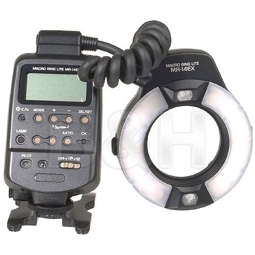
cone, I've really started to think again about having some kind of ring-flash or a beauty dish. I'm not sure I do need the high-end tech stuff like the Canon's Ring Lite or Canon's Twin Lite flashes, and for this reason I'm planning to look for some "remedies," if I can call it so; Stuff under the DIY category. The beauty-dish would be a start as it is easily constructed but the problem is, it cannot be held by the lens to light the object from the front in macro situations, and here comes the part where we need ring flashes. The two items displayed on the right are expensive and yet not into my budget range (specially after buying my new PC). I need some time to recollect my finances and be firm again before buying such luxurious devices. Also, before getting such devices, I have to develop my sense for still life shots and products photography (or I should say, tabletop photography in general). My mind is still hanging in the arena of landscapes and architectural venue.

Pine-O-Rama
The observations mentioned above about the pine cones dragged me to do another experiment directly after finishing with the macro shots. Peeling.
This time, I didn't use the typical flash from the top of the object like I used to do before, but I depended directly on the available light in the room beside increasing the exposure time a bit more to create a high-key-like image. Anyway, however I would try to place my object in the middle of the rotation plate, it seems to slide to the sides after some angles. Probably because the body itself is tilted!


Notice how the right and left margins change as the pine cone rotates as if it is dragged to the right during the rotation. Anyway, after many trials to stitch the shot images I've came about a compromise which needed lot of work to be done to clone out the stitching errors; Some of them, but not all. I'm lucky now that I do have such a fast PC to stitch larger panoramas and in less than 10 minutes. The fortune that I've spent on this PC instead of the car's cooling compressor paid off I would say!

Pine Roll

In my trials, I've stitched the peels in various ways but I think the best way was to use the spherical projection as that enabled me to correct the fan-shape of the original stitch by changing the "virtual" pitch of the image. In other words, I had to drag the final result upward over the canvas and PTGui would do the job to stretch and stitched image. However, it was not perfect of course and some work had to be done in Photoshop to do some cropping and some perspective corrections, and the bulk of cloning out irregularities. By this method, the stitched image lies in a sea of "black" or empty background, thus to preserve the original resolution of the stitch, I had to stitch with maximum dimensions that sometimes exceeded 65K pixels wide (and the file had to be saved on PSB, or Large Document Format, and not on TIF). The resulting size was in the range of 1 to 16GB!! Of course that was reduced radically after cropping and correcting perspectives to something around 650MB (not something weird for a panorama on 16-bit).
To reduce the load of work I had to do some sacrifices with some details, or maybe some of these stitching errors were beyond fixing as well! However, I've noticed that the largest portion of stitching errors and smudges were concentrated on the upper part of the image (middle point and above). Thinking about it in the terms of the laws of rotational motion, I think it is because the upper part formed a wider circle while rotating more than the base would do.

C = θxR,
where C is the curve of the rotation (or portion of the circumference), θ is the angle of rotation, and R is the radius from the center of the rotation to the surface at a specific height. Well, it doesn't need any brains of course, unless you really suck in maths like I do! However, because of this, the virtual change in the features of the pine (or any object that is) as it rotates for every 5o would be greater when C is greater. The question raises then of how to make this value as minimum as possible and would it have been better if the pine was up straight (providing that the center of rotation is exact)? The pine cone can be resembled with a cylinder, but what about other irregular objects? I can't have any thoughts about this until I try more and more of irregularities. 
In my work with such peels, I've started to attack the problem without much calculations sometimes and depending solely on changing the number of pixels for the crop factor (from which PTGui would read the control points). It doesn't work all the time and often I find myself tracked back to do the regular degrees-pixels calculations, but done in various of ways in hope that a better stitch would result (with minimum of errors). 

Finale
I'm exhausted. That says it all. I wish if I can find a word that expresses me better than this. Thursday is an official holiday (either for the last day of Ramadhan or for Eid), yet I'm not going to see any resting point soon, as I still have to pick up Mom to do her dialysis. Talk about having a family without being a family. God knows what dwells in the heart, but I shall try not to complain anymore.
Goodbye for now Ramadhan, I've got to prepare myself to the usual munching-engine mode again. Probably I can do more in the near future if I just have the right amount of strength. I need to play more games for now...


Thursday, July 25, 2013

In Failure We Trust...

Here we go, my new PC is finally online, and the process of keeping it up-to-date with the software arsenal is going on in fact. How much I'm relieved. I didn't feel such speed in ages!!
Because of the busy schedule (sleeping time is included in this statement) I couldn't do much work with my camera or with Geltani. Some mental work was involved here though. In a haste, anyway, I tried my luck with another peeling project which was not achieved as I wish (hence the title of this post!) but I got my lessons somehow.

Censer Censer Against The Wall
This week I've noticed that Mom had a small censer, other than the one that I've already used in a previous experiment to capture smoke. The new censer is small and thin and quite seductive to my eyes because of the curves it has, but all of that proved to be a real challenge later for the peeling work (which was never done right here up to this moment).

The previous censer.
The new censer.

This time, and because of the shape of the new censer, I've decided not to light the object from above like I did previously with the mug peeled mug shot. I've realized that if this is done, then the thicker top part will cast a shadow to the bottom. Hence, I've decided to use both of my speedlites (580EXII and 430EXII) on the left and right of the censer - a decision that I've regretted later.
One of the critical aspects of this object is its relative small size, and hence, any small offset from the center of the rotation was drastically apparent in the series of the shots taken (meaning the objects won't be rotating around its own axis, but it will move in a circle around a common center!). Another problem was, as usual, the tilt of the images taken which was not so obvious until the images were examined on PC.

One of the trials done for peeling.
As you can see above, the final stitch had many errors and mainly it became a fan-shaped stretch instead of (relatively) flat stitch. This is mainly because of off-center movement mentioned above which means the base would look nearer and further on different angles as the object rotates. This was also evident when the mug peeling effect (posted in previous posts) but the general size was larger and the offset did not show in a drastic way as in this experiment.
Notice also that the top portion (top right) of the stitch has broken lines and not a smooth stitch. In my mug experiment, when this happened, it meant that I need to narrow my crop or the slit from which PTGui should scan to make the connecting lines smoother. Here, however, this was not possible. The above example is stitched at -/+8o from a common central point (picked by comparing the minimum and maximum extensions of the body to the left and right during its rotation), meaning the total angle was 16o.

Cross-hair marks added on feature-less sides to help on stitching later.


Notice here that I've added cross-hair mark by pencil on the censer itself to aid the stitching process, but I have to say it didn't help much in this situation. Going lesser than 16o for the crop caused much hassle an PTGui would miss a lot of the matching points. One of the ironic things is, why did I use 180o in previous posts to measure the different in pixels, while I can measure the number of pixels for each degree simply by measuring the move in two successive shots of 5o.
I've mentioned above that I've regretted using both speedlites on the left and the right of the censer. I've realized this fact while working on PC and comparing images to establish some control points. The thing is, the body is not unique in its shape and has many protruding features, which means shadows on the body itself. However I try to balance the lights from both directions it was almost impossible to eliminate the shadows completely. The problem of the shadows is, as the body rotates, the shape of the shadows will change eventually, making the stitching and matching control points even harder. Maybe I should have proceeded with speedlite from the top as I did before (or one from the bottom, but I would need a glass surface below the censer as it rotates).

Comparison between two shots few degrees away. Notice the change in the shadows and the light levels.

It wasn't till I've installed DxO Optics again when I fixed the tilt perfectly. DPP (Canon's software) was not much of a help and cumbersome when I tried it. Probably the less problematic stitch was achieved when the images were corrected with DxO.
As I was going on to find a solution to the problem, I've tried to make the crop literally by Photoshop. I'm lucky now that I have a faster Photoshop (32- and 64-bit) and what would take 30 minutes is done in the matter of 30 seconds or even less! Anyway, such method didn't work as well, and even blending in Photoshop didn't go much far away with the results than PTGui did. However, one interesting experiment in Photoshop yielded something of fractal-art quality I would say and I really liked the result and might upload it later to some stock sites as an abstract art.

Fractal Censer (blend of 72 images)

I'm not sure how the colors were produced in the image in that way, but I do appreciate abstract art anyway and I don't mind the extra colors!
I need to go further and study this matter further. I might try to do it later but one thing for sure: I need a new base for rotating, as the current one is not precise with its center of rotation.

Γλώσσες
As I've mentioned in the beginning, I didn't spend much time doing a practical examination for Geltani, but there were some mental notes, specially that I've started reading a book about learning Turkish. Well, I'm not intending to delve much deeper into the language itself as of to speak it, but it did give me some insight on some matters (mainly grammatical) that were absent from my mind even during the make of Ayvarith.
However, I'm not intending to copy-paste features from real Turkish into Geltani but it is worthwhile to think about some grammatical cases and special verbs. Turkish, being somehow similar to Arabic in some aspects, got a special features in its verbs to denote the verb that acts on itself, and the verb that acts on something else (sorry I don't know the exact name of this grammatical case). Just to explain, here is a simple example:

Arabic
Study: daras [درس] (someone studies on his or her own).
Teach: darras [درّس] (someone teaching or making someone study).


Turkish
Study (learn): öğrenmek.
Teach: öğretmek.

Notice that in English the two verbs are completely different, and this is how Ayvarith used to work. In Turkish and Arabic, despite the critical difference in roots, they do act according to some basic regulations to formulate verbs that act on their own, and those which act on something else. The question is now, how to implement this with Geltani? Leave Geltani; What about Bulughman - an artificial language that I've made it sound like a Turkic language?
In Geltani, the verbs are derived from the noun (mentioned that in previous posts). Hence, the noun "flight" is used with suffixes and prefixes to make the verb "fly". However, I don't have a clear idea yet of how to formulate a verb that expresses the action "made something fly". Would I have to introduce auxiliary verbs in such instances? How that would sound and look with the dilemma of the writing system already? Too much thought and my mind is so tired of thinking much into this matter for the time being. In hope that all this mental power will be boosted after Ramadhan.

Finale:
It was relatively a busy and a tiresome week that just passed me by. I just can't wait to get into the regular time-table. I think what really wears me off is that the whole community goes under a time shift making working in the usual way, for someone who is used to fasting, a hard task to do (with waiting).
Earlier this week, there was a meeting for photographers invited by HIPA of Dubai, to introduce and identify the HIPA reward in its third session. I tried to attend, but with the delay in the opening which was supposed to take place at around 9:00 p.m., and me being awake since 6:00 a.m. to pick up for dialysis and then back home to work on something else, made a 30 minutes of delay such a great displeasure. Thus, at around 9:30 a.m. I've left the scene, before the ceremony would even start.

However, during the waiting time, I've met a friend who was a member of the photography group I'm in, and left after some tensions with the management. As expected there was a chitchat about the quality and the functions of the group, but I have to say he had some points that I share, yet, I'm really so tired of all that tension between photographers in here. It is largely a talk of money-making, and how things are done, but I didn't hear much about the philosophy behind photography. This friend pointed out to some photographers and mentioned to me some names, and when I answered, simply, that I don't know any of these guys (who apparently are famous in their fields) he said "Whom do you know then if you don't know these?". I replied: I'm working with the camera since 2007 for my amusement and never made a contact with Kuwaiti photographers up till 2012 when I joined the group, and now I'm regretting that I've been social with other Kuwaiti photographers. No offense, not to say all are bad, but surely it is something that probably I should regret. I got myself into struggles and wrestles that I should not have been into. I can't remember when was the last time I talked with a Kuwaiti photographer about the art of photography or its philosophy and its meanings; It was mostly a talk dominated by money and gear, and nothing else. Useless talk if you ask me.

Next Saturday it is scheduled to have a meeting to sort out some images. I'm sure I'm going to have another batch of disappointments. The sorting process is aimed for Cyprus photography contest and I'm not sure how it works, but it is apparent that registration is for single photographers and not groups. What I've noticed that in most contests, the most renowned photos are those of exotic places and/or those of portraits and people shots. Now, how am I supposed to get into exotic places (specially with my situation being stuck now with Mom to care for her)? And am I supposed to do something I hate just to please the judge? Am I supposed to please the judges to get some good results in a contest, or am I supposed to do photography for my own sake? The answers to these questions lead me straight to the belief of the futility of such contests in my case and made me even less interested in them. I'm not supposed to take a burden just to have a photo. I'm supposed to please myself in the first place, despite all the criticism I'm receiving from the group.

Peace of mind is a precious thing, and simplicity, I reckon, should be in the core of my goals. Yet, I ask myself, would life allow me to do so? Would there be someone who would help me to be so? The view is blurred...


Thursday, July 18, 2013

Dilemmas...

Here we go, and as expected. Ramadhan has arrived and the unneeded stress started along. There is never enough time to do anything. Majorly, the main problem is the after-work nap which takes from 2 to 3 hours and sometimes even for 4 hours, and that makes me awry at night and unable to sleep early as in regular days. People in Ramadhan do indeed make a time shift and sleep late (because working hours are also shifted as well) but for me, I always try to fix my sleeping time as in regular days and never stay late unnecessarily. Now, I need to do that more than ever because Mom's dialysis timing is not changed and I do have to pick her up to there in the same time as in regular days. Moreover, I have to make her something to eat before leaving home (while we used to grab something on the way in regular days). In Ramadhan, it is insulting (and illegal) to eat in public while the whole nation is fasting. Well, we do have a medical permit or reasoning, but still, no need for embarrassment.
I've been to the doctors to check up with my nose and see the reason for bleeding. He said that the capillaries are probably weak and I need to have more vitamin C in my diet and provided me with some method to stop the bleeding as well. Finally, he said if that didn't work, then I have to go back to cauterize, probably by laser (?). I think in this week alone, I've lost a quarter liter of blood just through my nose!

The Dilemma (1)
This week I've been working on an idea for a panorama (and barely did) which I've been cooking in my head for a while. However, unfortunately for me, I'm having technical issues and a sluggishness in my skills. The panorama was taken twice in two different days, and two different lighting conditions, and with two different techniques.
In the first trial, in order to fix the bracketing for the HDR merging later, I've used my light meter and measured the light (incident) from different angles to the camera. There was a considerable gap in the EV values. In the beginning, the expansion of the bracket was from -2EV to +2EV but apparently that some shots were somehow dark and the +2EV shots appeared as if they were taken at 0EV instead, thus I've started all over and made the expansion from +3EV to -3EV. However, the story was not over here.
In the current time and because the memory issues in my old PC, I've decided to work with my (new) laptop as I'm still preparing my new PC before plugging it online completely. Sincerely, I'm so lazy to do all of that and it's connected to my TV at the current time; Not a pleasant view and my room is a mess. However, in my laptop and after merging the RAW files into HDR slides and trying PTGui to stitch them out, it turned out that the slides were apparently dark and PTGui could not find control points at all!
This matter triggered me to do another trial and this time, instead of working in Manual mode and taking light measurements, I've decided to go back to the old methods (tried and true!); Working in Av mode and letting the camera decide for the shutter speed, and I had this occasion to increase the f-number from f/8 (as in the first trial) to f/16, to make sure than things are sharper.
The reason I've decided to do a second session is the assumption that the dynamic range was so wide that PTGui could not assemble some control points in between any two images. However, even in my second trial, Photomatix and PTGui followed with the same behavior: dark slides, and unstitchable panorama. After many trials to install and re-installing older versions of both programs, I've finally came about to some solution and finally the panorama was stitched.

Wooden Hall (trial stitch)

I've spent several days trying to figure out what was going wrong with my (usual) procedure and why things do not work out in the laptop as they do on PC. The panorama above, Wooden Hall is just a trial and not a final image to be submitted to stock sites because of the weird (and usual) blue spots, but I've decided to put it online anyway without any fixes and ask for help about this matter, if there is any available! I'll try to summarize my thoughts here in points:
  1. Apparently, the main problem was in Photomatix and not the (new) PTGui. After installing several versions of both, it turned out that Photomatix v4.0.2 yielded clear HDR slides that are viewable easily in PTGui (any version), but the new version (v4.2.4) was problematic. I'm not sure why this is happening but there were already some issues when I moved from Photomatix v3.0 to v4.0, like the ability to tone-map without opening the HDR slide - a problem I used to encounter with large little planet panoramas, and my way around it was to set the values in v4.0, save the settings and use the side-cart file (the XMP file in which settings are saved) into v3.0 using the batch process facility. The thing is, because of the large file size, v4.0 used to give me a memory error and stops responding when I try to process the tone-mapping at once. Why don't I use v3.0 to tone-map already? Well, it turned out that v4.0 has a better on-monitor representation of the actual image after the tone-mapping is done. When tone-mapping in v3.0 (as far as I remember), opening the image in Photoshop later would yield a completely different image in terms of colors and shades and I would have to work around this with adjustment layers. The situation here is somehow similar in between v4.0.2 and v4.2.4. Advice: Don't always jump on newer versions of any particular software. It is good to try new stuff but always make sure you will be going smoothly with it. Keep older versions in store somewhere, as you might need them at any time!.
  2. The new PTGui (v9.1.6, and I think v9.1.7 is out there) has lot of interpolation possibilities, more than I had in the old stuff in my old PC. Interpolation is the way that a program would interpret or "read" the pixels across the image. The three basic ones were Bilinear, Bicubic, and Nearest Neighbor. Each one of those of course got a specific usage (some of them are explained in Photoshop resizing facility), but in PTGui there are no descriptions about any of them. In the new version, however, the list is expanded further to include Lanczos and Spline (with each one of those got several types). Speak about new stuff to learn and burn the time with!
  3. I've merged the RAW files several times and stitched the panorama several times (and thanks to my fast laptop, the stitching process takes merely 5 minutes for a 10,000x5,000 pixels panorama!) as I was trying to figure out the reason for these blue streaks across some regions in the panorama. My conclusion is (and I've done that before actually) it is more related to the color space, and it might be related as well to some gaps in the dynamic range of the HDR slides; I'm not sure yet. However, merging in different color spaces and stitching the panorama after, proved to me that the blue color spots (you can see them in the image above) were reduced significantly (in saturation let's say) when merging the HDR in a lesser color space as sRGB. Also, the streaks appear more or less around regions were there happens to be some stitching errors. Stitching errors cause such problem? Color space? Dynamic range? All of them? Not really sure, but it is surely annoying. I couldn't edit the panorama and fix it in this laptop mainly because of the size of the laptop and my sluggish movement with it and the display is small already. Thus, I've decided to upload it as it is and might try to fix it later when my new PC is ready.
My world is spinning right now and I have to finish up with this PC and try to hold to my camera again, and work with more panoramas even.

The Dilemma (2)
Well, this second dilemma is somehow to a lesser degree. It is just a dilemma about Geltani and some aspects about it. I've been working a bit with the sounds that are to be used in Geltani and I've figured out that it is almost impossible to avoid repeating some sounds. I've decided here that it is time to introduce some sounds that are unfamiliar to the far east in general, thus giving a touch to alienate the conlang from a typical Asian sense. With these new sounds, like the Arabic ħ [ح], I've decided to add some possibilities for creating dual-consonants and doubling (or stressing) some. Even with those creations, it is impossible as it seems, to provide a distinctive sound for each combination of leading and driving couplet. Would there be two words with similar sounds and different meanings?
In that sense, the scenario would be a mimic of reality of the far east languages, and specifically Chinese and Japanese, where is typical to find one character with several pronunciations and even meanings. However, I don't think Geltani would be close to that level of complexity of the real languages, but it has a comforting effect to think that having a repetitive scheme of sounds for different types of couplets is not really a bad thing, and it somehow mimics the real world to some extent. The characters (or logograms) would be definitely different if, at any chance, two words or more bear some resemblance in the sounds. The question now is, on what basis I should base the driving sounds?

Finale
David Schap's book is over with right now, and I'm trying to find something to replace it with from my arsenal of old books. As I've mentioned before, probably I would go through my old languages books.
Many ideas are racing through my mind right now, like having a leave for the rest of Ramadhan just to have my own timing and not to worry about work and waking up in the morning, but Mom's dialysis schedule holds me back from this idea, because the center is near my work place and eventually, the torture won't stop (but yes, I would have more time for myself).
Because of all this pressure, in the work-front and the home-front, all what I'm trying to do right now is to break all the cuffs and find a way out of obligations to work with my own projects and my camera. Feels like being married without a real partner, I guess.
Also, I'm trying to consider some way to integrate myself through the group back again, but without the work load that I used to get. Probably my membership would be changed from special to regular because of the low activity level I'm participating with. There is also a crazy idea cooking in my mind: to write a book in Arabic about the basics of photography. This idea arrived to me looking at the arsenal of the photography books that I have that are all in English, and many people here can't have the benefits of such books despite their love for photography because their lack of expertise in English. It is such a sorrowful thing that a language can stand a barrier in learning. Not sure this idea will go further but it is worth considering anyway!
I'm typing this post and watching TV in the hall, with some show about the Canary islands; It makes me dream of vacations and traveling again. I want to see the world again out there... if only I can find someone to take care of Mom as much as I do...