Showing posts with label golden. Show all posts

Thursday, January 15, 2015

Lazy…

OK I admit; I have been lazy in the past week. Well, 2 weeks. That's why no post last week. The temperatures here dropped suddenly with a chilling wind on and off. Truly a bone breaker. Not sure why, but I've been feeling tired and lazy lately to even go out at night in such weather which I like the most. Probably it is the erratic sleeping pattern (which persists even in working days). For this reason, I've been mostly editing and creating new panoramas, besides trying a bit of the new "observations" in the field of panoramas to some of the older panoramas. Moreover, there is one extra observation on the way as well!

An-Mór

I never thought of myself being so interested in such projection style which seemed so boring before like Mercator. The beginning with this projection was (as mentioned in previous posts) was to make a more plausible vertical panoramas because vertical panoramas are "slim" and cropping the sides would do more harm. Mercator was a solution because the vertical perception comes almost in a square ratio (height = width), and occasionally the sidelines make a nice curvature with no need to crop even! However, time had to come to push my views further with an extreme approach.

Ashford Domhanda
(global Ashford)

The beginning was about doing a vertical panorama (again) for Ashford castle in Co. Mayo, but with a twist or a swirl as it was with other panoramas recently. However, this approach didn't work out and I decided to play with the sliders a bit. All to be done was to stretch the viewing window or space to the extreme ends to show the full extent of the Mercator projection rather than compressing it, and the result as you can see in Ashford Domhanda; a global look like those maps which are also made using Mercator projection.
Casadh an tSúgáin
(twisting of the rope)
I was seeking a swirl like this
for Ashford castle panorama.
My personal impression about the implications of such projection style is that it gives sense of grandness, totality, greatness; probably these impression come from the back of my head as I used to see lot of Mercator maps (specially in school times). However, this projection style has one awkward disadvantage, even though a normal result: the stretched and blurred sides and corners. My intentions were to crop these portions out in the beginning, but that would corrupt the overall oval shape of the center, which is to be the main interest. For the time being, I would just call this style as Extreme Mercator. I'm still working on discovering the possibilities here, and specially with old panoramas.
When it comes to old panoramas, I made a trial to do the "twisting" effect again with one of the places I like and taken a panorama from back in 2013: The Arab Organizations Headquarter. Such a place with quite amazing wooden craft and Arabesque and Islamic designs. Anyway, it seems a twist here is not quite that attractive, for various reasons...

El Andaluz Bailando
(the dancing Andalusian)

Generally speaking, the hall is a mess. Despite the fact that it was wide and bears not many obstacles in view, yet it had many reflections, and twisting the panorama that way as in El Andaluz Bailando made some eyes "sore". I sort of came out with a conclusion that to do a twist, the roof of the place must be close and it is better to have the surroundings on the ground arranged in some systematic manner. In the case of El Andaluz Bailando, the roof was too high, and the surroundings on the ground were not giving out a sense of symmetry.

An Solas Sníomhta
(the twisted light)
The twisting effect appears stronger
and more concrete when the roof is at proximity

However, the work was not limited to Mercator, despite being big part of my work lately. The old tunnel projection (the reverse of the planet projection) was a target for some "surreal" editing. It is a surreal projection after all, but I mean here something out of the usual look for such projections. Something off-center.

An Cúinne Geal
(the bright corner)

Frankly, I was aiming at a sweeping movement for the landscape and the house and decided to make the tunnel projection as a starting point. However, things went out of hand a "bit". Why would I restrain myself for centralizing such panoramas anyway? Specially those which do no possess any degree of symmetry anyway! Call me an impressionist, but those curves can do a lot further when moves off the center; Curves = Emotions.
The main problem here is the cropping factor. No, not the sensor's crop factor. Here, the original panorama was 9000x9000 pixels in size (meaning a resolution of 81MP!). However, after some crops to adjust the portions of the panorama and the curves of lines (controlling those with coordinates is hard), the size came down to around 5000x5000 pixels (i.e. 25MP). Such a loss of size. Of course, I can stitch it again with a larger size to crop it back again, but that means more processing power. Imagine this: for a panorama coming down from 81MP to 25MP with such crop, then that means only 30% of the original size is used. If I'm going to do this on the usual size of 8000x8000 (64MP) like most squared panoramas before, then I would need to stitch to somewhere around 213MP in resolution, that would be somewhat around 14500x14500 pixels; this is just to crop it down to the size of 64MP.
Anyway, this is just the beginning, in hope that I would do more observations about this. One of my goals right now is to create something else with panoramas, specifically in a vertical format, but no success so far. All I can say about it right now is, it would be a diagonal panorama!

Geltani Again!

I know, I've been neglecting this project for a really long time and I've totally forgot about doing some representation for Omniglot.com as well.  However, I was working slowly for some time with this project before traveling to Ireland last October and I think I didn't post anything about these "inventions" and additions.
For a beginning, I tried to make a standard set for the "radicals"; those large strokes that contain other glyphs combinations. Usually those radicals are the last letter of the word. I wouldn't say it is a final set, but it is a trial to make it so.

A scan for some of the radicals designed already (from my Geltani notebook). Sorry for the bad quality here; I did barely make it through the technical problems! The asterisk here points to the position of the other glyphs relative to the general (larger) radical glyph.


On the other hand, there had been some tiny approaches to imagine out a general aspect for the grammar, and this was by some trials to form the passives, conditionals and perfectives. Not planning to complicate things here, so the general formula for such phrases would consist of a mix of the verb "to be" in a specific tense, with the original tense marker of the verb itself. This is the idea for now and seems it works (logically!).

Another scan for some grammatical constructions with the verb "to fly" which transliterate as "píj" (pron: peej, with "j" as in "jacket").
The top 2 columns of 4 lines discuss the direct tense (flew, fly, will fly, fly!) on the right column, and the passive form (was flown, be flown, will be flown) plus the modal (should fly) on the left column.
Next line is an example: would have flown, which literally here becomes (fly-will be-was)
Next example: he should have flown, literally here becomes (must-fly be-is)
Last example: would have flown (to...), which literally becomes (... to fly-was be-was)
As seen here in general, it is combination of two tenses of the main verb and the verb "to be"


Beside these forms, it seems that it would be necessary to merge some phonemes or sounds in Geltani when they come successively, like the sounds of "J" (as in Jacket) and "Ch" (as in Church), but I'm not sure yet of this theory right now. I hate to deal with a language like mathematics - this is not the way I learned English (even though it's not perfect anyway!), but it is important to "live" the language and make sense of it. Just get into the flow and only then things would fit into place, and this is what I'm trying to apply myself as I'm going through some Irish lessons online (sadly written and no audio available).
It is funny though how I got into formulating the grammar without even working on representing my work and the script. I've been overwhelmed with many things to do at the spur of the moment which effectively made my mind scattered in all directions.

Finale

Snufkin
The Moomins
Well, I won't be ashamed to say that one of the reasons to be lazy in the past week and this week is the fact that I was busy playing games, and watching cartoons. Old cartoons that is, like The Moomins. Well, I remember this cartoon long time ago (and played in Arabic back then of course and I'm watching this version specifically) and I used to get scared somehow every time it is played because it, simply, looked weird. However, now it gives another feelings when I watch it, specially after knowing that originally this Finnish comic and stories were dedicated to adults with some deep meanings. To me it resembles the simplicity and the life of adventure in simple terms, needless to say the imaginative stories and the countryside framework which fits my mood perfectly. I think my favorite character here is Snufkin. This is the English name of course. I like his role and I think it does have some aspects that I need, crave, or already have. This is not the only cartoon on the list; Golden Cities (or as dubbed in Arabic: Golden Dreams) is next on the queue line. However, I might not start it immediately after The Moomins. I need some time in between to reschedule my priorities!

On the other hand, I've been thinking seriously on having another instagram account for Ayvarith to post some aspects about it since there is no homepage for it yet. Another failure, I know. I have to admit, I do hate building websites! However, this will also mean added pressure, and with the technical problems I do have already with connecting to instagram and posting in it, it is probably better to wait and watch out for the next move. I'm so pressed in time with my photo-processing schemes and duties for the group, as well as my usual daily posts on instagram. In all of this, I'm giving my workplace my back, which I know it does sound dangerous a bit but I can't force myself to respect something that doesn't respect me back.

As I'm typing this, I've received an email informing me that one of my images submitted to HIPA (Hamdan International Photography Award) was qualified after the first round. The image was submitted for the Night Photography category. Meanwhile, my other images for other categories did not pass. The image submitted was Die Kuwaitische Mitternacht, but I had to translate the name into English as per the rules. It is funny that I've submitted my images in a haste just 2 days before the deadline. There was another event I wanted to role into, and also takes place in the UAE, which was an award for achievements done for the Arabic language. My aim was to submit my blog, but I had to back off. I think my blog is relatively new beside the fact that I was not sure of the regulations about electronic contents in that way. I had to let it go for now as I have more important issues to attend to (and ironically one of them is find a topic for my next article for my Arabic blog!).

Die Kuwaitische Mitternacht


Laziness in the meantime comes as an essential part of my life now. I feel that I need it strongly. I just realized that even when I play a game, it comes to me as a "duty" to do and not merely an entertainment to have. I think I've completely lost the definition of "entertainment" in my life…

Thursday, July 17, 2014

Extrema…

Well, the matters had officially went into a disaster zone. It official now that I do have a sleeping crisis, which makes my "whole" life is idle. Well, in case I can call it a "life" anyway. Not only I've skipped my eye appointment on 13th, but I had to stop writing my Arabic blog for some time and I'm seriously considering making it on a monthly basis, for the lack of topics so far and the hardship in organizing my thoughts. Needless to say how that affected my other projects as well concerning Languages and Conlangs. All what comes to my mind right now is sleep, sleep, and more sleep.

Extreme

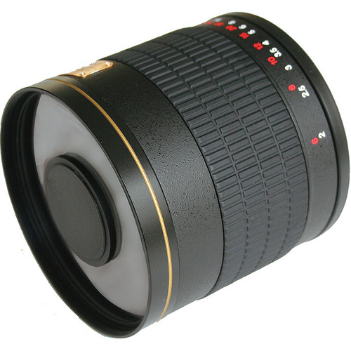
They say we had a "supermoon" this week, specifically on July 12th. It did sound like a good idea to try out my Rokinon mirror lens of 800mm, with two 2x teleconverters (for a total of 3200mm). However, and pardon me, just thinking about working in this weather and heat (even at night) with my cumbersome schedule now, did sound more like a fantasy! And with "fantasy" I mean something to be found in children's book or Hollywood movies.
Rokinon 800mm mirror lens.
Source: B&H
Instead of doing this astro-adventure, I thought for a moment about the possibility of doing an extreme macro experiment with this mirror lens like I used to do with other telephoto lenses before. If we combine 800mm with 2 teleconverters (2x each) then we are assuming that total focal length is 800x2x2 = 3200mm. Now, if we combine a 50mm lens in reverse to this combination, we are supposed to get 64x magnification (3200/50=64). Logically, this is supposed to mean that 1mm dot in reality, should be projected as 64mm on the sensor (or 6.4cm, 2.5in). Despite my trials, the situation was hard to achieve mainly because of the design of the Rokninon mirror lens. This lens resembles the catadioptric telescope in its design and the large difference in the diameter of the objective (the front of the lens) made it hard to combine another lens in reverse. Even though I tried to place the 50mm lens in front of it to some distance and covering the gab with black cloth to block the light. Here, I was working in horizontal manner instead of hanging the camera high up as before and dangling it over the specimen. Anyway, It was hard to work that way and technically nothing was to be gained from such setting. I had to go around it in some way. The answer to the problem then knocked into my brain with Tamron 70-300mm, which is damaged and lying around, and another (useless) lens in my pack; the old Canon EF-S 18-55mm.

The final setting. Teleconverters and not shown here.
Click to Enlarge.

I didn't want to use my Sigma 70-300mm here. It's relatively new and I didn't use it often. It has a better glass quality compared to the cheap Tamron, but I don't want to risk it in such setting. According to calculations, Tamron at 300mm plus two x2 teleconverters should yield a total of 1200mm. When combined with 18-55mm at 18mm in reverse, then the magnification should be (supposedly): 1200/18=66.66x, or approximately 67x. Meaning, 1mm dot would be projected on the sensor as 67mm (6.7cm, 2.6in), which is slightly more than what has been calculated in the previous proposed setting (of 800mm mirror lens and 50mm lens in reverse). This case was easier to be done as you can see from the image above. I had to spend some considerable time trying to improvise a way to hold the sample in this experiment and to provide a strong light source at its back (I tried to cast the light from the front but to no avail). Focusing is pretty delicate so I used the macro rail to move the sample in some way, and I ended up using the Bulb mode and managing the time empirically without doing any calculations. Just trial and error. Maybe with some considerable time, I can enhance this setting.
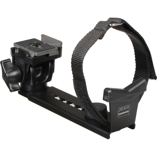
Manfrotto telephoto support
Source: B&H
The good thing about the horizontal position is that the weight and the pulling force on the camera's body (the lenses consequently) is significantly small, while the whole system was carried by Manfrotto's telephoto lens support. Usually it is a problem because in many occasions this support would make moving the focusing ring (or even zooming) cumbersome, but it's not a problem here because everything is set and the lenses are not supposed to be touched. The only thing to change here is the macro rail distance to move the specimen. I had some problems with the rail itself too, since the screw to move the rail was knocking on the lens' front - but the focusing required kept this screw away from the front for some considerable distance. Anyway, that doesn't mean it might not be a problem in the future!

Results

The results were not much of artistic nature nor a clear variety. But it's a beginning. Probably if the lenses' qualities were better the images would have been better? Who knows!

Sun Side
Shade Side

Shooting in RAW is absolutely a must here. Using a remote and a portable monitor is also a must. In using Bulb mode in the camera, the LiveView (which is transmitted to the portable monitor) mimics the light conditions a bit to see through what to focus on, but this is of course in no way the final result to be expected - Bulb mode is about arbitrary timing. This is one of the benefits for working in Bulb mode in such a situation because using other modes like Av would make it hard to mimic the light. ISO-wise, I think it's hard to expect something below ISO400. Long exposure can be done but it's not advisable I'd say - we need to do shots fast relatively to avoid any sudden shake.
It is a common practice in (regular) macro to use a stop around f/8 and more to gain some acceptable depth of field. Here, however, I don't think this rule of thumb holds - in fact I'm not even sure if a higher stop would do any good, but anyway I used the highest f-stop possible. It is recorded as f/72 but this is a false reading because Vivitar's teleconverter doesn't communicate information with the camera's body. Thus, by re-calculating the f-number under the new focal length (1200mm), the value should be around f/128. You can see from the images above that even such depth is not really strong enough which makes me suspicious about the usefulness of raising the f-stop here. If using a low f-stop would yield almost same results, then it might be fit for this experiment to allow more light in and make my life easier!!!

φ

Been some time trying to polish some simple mathematics in my brain. I didn't use my brain in a while! It had been a while now as I was trying to find some relation between the rule of thirds (ROT) and the rule of golden spiral (RGS) in terms of the difference between the two "power point" in both systems.
One of the major difficult points here is that the two systems are adapted for different ratios of frame. Previously, I've worked with a frame of 3:2 ratio, as it is the ratio usually adapted for most cameras nowadays. However, it was a bit cumbersome in terms of some mathematical identities, thus I've decided to work with φ:1 ratio and adapt the results I could get as an approximation. Numerically, the (3:2) ratio is equivalent to 1.5, while (φ:1) ratio is equivalent to 1.618, meaning a difference of around 0.1 unit; I guess something that can be neglected.


In the beginning I had to use an approximation for the power point in RGS, which I've found in this page. As can be seen in the page, the power point or the center of the spiral can approximated by two diagonals: one for the whole frame, and one for the smaller rectangle after rectangle rabatment (marked with the blue line). The ROT is marked with red lines. The segment I'm seeking here is SG and the angle θ. One of the good points about having such ratio for the frame is that the ratios AB:AG, and AG:AB is equal to the golden ratio: φ. This postulate makes it easier to do some mathematics here. Well, not going to list everything done here, but it turns out that:
  • The angle (θ) is equal to -31.72o. The negative sign is to mark it as going under the x-axis. This angle would of course change by changing the location and perspective (in relation to the x-axis); it would be positive if the power point under inspection is the top right one, and it would be 180±31.72o for the left side.
  • The segment under question, SG, is approximately equal to [(φ-1)√(1+φ2)], or it can be marked as [φ-1√(1+φ2)]. This is because (φ) as a numerical value is equal to (1.618), and consequently: (φ-1) and φ-1 are both equal to approximately (0.618). Going further with more decimals seems unnecessary in this occasion.
  • Numerically now, the segment SG is approximately equal to (1.176), or expanded little bit it would be (1.1755).
What I'm hoping for is to use this simple information item in various settings, like in the camera's LiveView for example, or in Photoshop itself, even though I heard that newer versions have several systems implemented for cropping. I'm not sure how I'm going to do this, specially in Photoshop, but it surely needs a lot of experimenting with various photos. Another interesting method would be the diagonal method, which was developed (or discovered) by the Dutch artist Edwin Westhoff. The Diagonal Method specifically is well suited for 3:2 frame. Would be interesting to see this kind of grid available for work in the coming generations of digital cameras.

Finale

Here I am, just waiting for the month of Ramadhan to pass. It's not something weird to happen in fact; I do suffer from insomnia and sleeping problems all year long and it doubles every Ramadhan almost, but the thing is different now with extra annoyances at work, and a tiresome body. I think this is what they mean by "getting older".
When this is all over, there is so much to do as well. Schedule a new appointment if possible, and prepare for my travel. Though I need such a travel to rest my mind a bit and enjoy my photography, I do wish if I was accompanied by someone. Someone special...


Thursday, July 10, 2014

Mono, Duo, Tri, Quad!

One third of Ramadhan is gone by now - and things are tightening on my schedules and life pace. I literally spend most of my time sleeping or trying to catch on my sleep; specifically at work! Even though I used to fast before Ramadhan already, Ramadhan becomes an issue. Always.
For this reason, I didn't have much to do with my camera, but I did some experiments eventually and some of them are still on going.

Duo

In the process of doing more studies with the tone splitting technique, I've re-visited a mode provided in Photoshop, along the RGB and CMYK; the Duotone mode.
This mode in fact provides several modes in it: Mono-, Duo-, Tri-, and Quadtone. Each mode provides a specific number of tones to be implied to the image and in that sense, it is a step further from tone splitting. Further more, for each tone, the control of the "amount" of the tone is a bit decisive.

The Duotone mode window in Photoshop. Here, Quadtone is picked from the menu,
allowing for 4 colors to be mixed.

There are some awkward features for this mode of course, like the fact that to convert the image into it, you have to pass by the Grayscale mode first. Thus, converting directly might hinder the user cuffed with the tone distribution before doing Duotone. Probably it would be better to use the Black and White adjustment layer first to control the tones and THEN convert to Grayscale mode - this is if it was necessary of course. It seems, however, that controlling the tones in this mode is actually a control of the levels of "ink" for printing this image itself. This is what I perceived when I did a little research online about this mode. This makes it harder to control, unlike the easy way to do it in the RAW editor or by laying out layers in a Photoshop process - because in this process or in the RAW Editor, the thing under control mainly is the distribution of the tone to highlights and shadows, and its intensity.

Doppelganger
Duotone: Shamrock Green, Black.
One of the interesting features as well is the Overprint Colors, which is somewhat like a control for how to interpret the merging of two tones together. Of course it's going to be a tedious task in case of Quadtone (4 tones) but it's worth the study to gain more perception of what related colors could do. This is a nice instance for using Colors Schemes, which are groups of related colors that can be found and deduced using many websites like ColorHexa and ColorHexCode. Such groups can be, for example, analogous colors, or tetradic colors. The other awkward feature here is that a file done in Duotone cannot be saved in a proper common format, like JPEG or even TIFF. It must be saved in one of Photoshop's own formats like: PSD, PSB, RAW and EPS. Note here that "RAW" is not the conventional camera RAW, but it's Photoshop's RAW format (which I don't exactly know how it works or what is it). EPS is a vector format, while PSD and PSB are the usual conventional Photoshop Document format. Here, Doppelganger, was done in Duotone using a color named Shamrock Green (Hex: #009E60) with Black. To save the image for displaying it here, I had to roll back the mode to RGB and save the image as JPEG. This, I think, produced some artifacts and banding (specially in the background in the blurred green plant area). Controlling the curves of tones for each tone of those was really a rough job to do with delicate observation to see where there are issues of banding and such. That was only for two tones, so imagine the work for a quad!

Luster

My sole work this week with the camera was to give it a try and do some commercial-like shooting for this piece of jewellery which I got for my niece for her coming birthday on the 23rd. The piece is silver-made and this put on a bit of dilemma on the choice of the white balance to work with.

Right: Flash WB. Left: Fluorescent WB.

Most of the people whom I asked did actually pick the bluish tint. However, one or two persons picked the adjusted or corrected form (i.e. Flash WB) because this shows and emphasizes the blue stone in the middle. They have their point of course. I decided to work with the blue tint but I've found myself working more with the adjusted level because it gives more luster to the metal work and it gives more shine (beside contrasting the blue stone of course).

Close Look
Sigma 70-300mm @180mm,
f/6.3, 250-1sec, ISO200.
In the beginning I was planning to take a picture of the whole earring, but then I realized that this approach would take up the fine details of the craft done to the silver itself. Thus, I moved on to using a telephoto lens, namely Sigma 70-300mm, with the help of extension tubes to allow me to stay close to the piece (closest focusing distance for this lens is around 1.5m, or around 5 ft). I admit, my work was pretty quick and filled with errors, like not cleaning the piece (you can see the blue stone being dusty little bit). The background is a black cloth (which I got back to do some scanography experiments) and from which I hung the earrings. This background is not suitable but I had nothing better to use; the texture was pretty annoying and could not be removed. A black metallic surface would probably be better.
The work of the speedlites (580EXII and 430EXII) was experimental, and at some point I used the on-camera flash as well to give a frontal light to shine on the blue stone specifically. Not bad I believe, but I didn't achieve still what I was aiming for: a gem sparkle. I think I had here a conflict of interests; a wide aperture to blur the background, while I do need a narrow aperture to achieve a sparkle effect. I gave up that idea anyway. Light from 580EXII was concentrated using a mesh on snoot, while 430EXII was reflected off a shiny surface (car windshield shade). When all was set, I decided to add some light from the front (and the position of the 580EXII with the snoot was changed repeatedly), this was done by the on-camera flash with a slight power. All work was done wirelessly; obviously I was lazy to use some wires here and there! After all, there was no need for it really - it would be essential if I wanted to go beyond the sync speed of 1/250 seconds. Only then, a cord to connect the speedlite and the camera is essential.

Silver x Blue

The interesting experiment was still to come. I decided to go extremely macro and placed 50mm lens with 20mm+36mm tubes. The significance here is that I managed to take 3 images in vertical order and then merge them like a panorama (in PTGui). I'm not sure if I can say it is a macro panorama for this though! Since it was just an experiment, I didn't take the whole jewellery piece into consideration but merely some portion mimicking an abstract sense and feel.
For some time, a software, namely PhotoAcute, is used to process several images to produce on high resolution image (beside other uses). Even though it is still a useful software, but in this process of taking several images with some distance and stitching them, the resolution of the overall image was boosted from 18MP (if we assumed the same framing) to around 26MP, and if I managed to take more shots, I believe it would be boosted more. The only problem with this method is the movement of the camera itself; If things are to be done in a proper manner, something should be automated here or systematized: either the camera movement, or the object itself. In my shot for Silver x Blue, the camera was moved slightly up and down with the use of the central column of the tripod; sluggish movement but did the job. If I was to take more precise images at such macro level, I would probably try to do it in a different way. The final image is composed of 3 shots, with 30 seconds each, and because no speedlites were used here, there was actually some slight green tint caused by the surrounding walls as it seems. Some editing reduced this tint and, again, despite adding a slight blue cast but with contrast and other edits and adjustments, the silver turned almost neutral like before. Glamor effect helped on showing some luster as well. All what is left, is to hope this shot is to be considered for addition into some stock websites!

Twirl

I've been trying, for some time, to study the relation between the rule of thirds and the golden spiral concept in terms of the placement of the "power points" in each system. This is to help me with framing with the camera, which doesn't have a spiral system but only a regular grid and a rule of thirds grid (in its LiveView mode). The main point here is to find a basis for the difference between one power point in one system and the other.
I have to say that I've failed here so far, and probably I have to polish my geometrical concepts a bit; didn't use those much since college days! Anyway, there is one key difference between the two and for which I had to rely on some approximations, and that is: the golden spiral rule depends on a rectangle drawn with the golden ratio (given the symbol φ), while the rule of thirds as it is in the camera, based on the ratio of 3:2. I'm not sure yet what kind of results I'm trying to find out but I'm still working on it and hopefully I can share some thoughts about it!

Finale

I have here some appointments that I guess I have to skip. Clinics should really stop giving appointments in Ramadhan - the schedule is just unbelievable. I think I will re-schedule this appointment (supposedly to be on 13th) and I hope it won't clash with my travel to Ireland; otherwise, I have to cancel, again!
My reading process is going slowly as well, and despite this book being small, it surely is rich in information! I'm glad I bought this book really. However, it needs some careful reading still to gain a firm understanding of how optics work. Too bad that I can't do the experiments mentioned practically myself, thus I have to depend solely on my imagination for this matter. There is a book about archaeology still waiting for me and, if I was lucky, might take it with me to Ireland to read at any point.

Everything is going slowly here. Needless to say how my life goes as well anyway. Dying to head to Ireland by every single passing day, where I can have some fresh air, and some clear mind and some more photos and nicer weather. The air is getting heavier to breathe here. I get a wave of panic from time to time but no obvious reason but simply like that. It's annoying. It's a killer.


Sunday, February 21, 2010

Alexander 6, V1.

Somehow, it was a tiresome and busy weekend. I didn't post anything yesterday (Saturday) as I promised myself but anyway, it was not much of importance I believe, except to put on with the first verse of Alexander VI.
I made some experiments again with my beloved golden turtle, and this time I used the FEB (Flash Exposure Bracketing) as a substitute, since I can't use it in a completely dark room;


Turtle (FEB, manual, 3/3)
The blue background is actually black. But with some fixes and because of the flash light striking it, it turned bright and blue. Combining the three shots was done with Photomatix (and some values of exposures were adjusted since softwares use certain numbers in the EXIF of the image, i.e. data attached to the image). Yet, tone-mapping was done manually with Photoshop (and also fixes) because the Photomatix version was hard to smooth out and equalize the proportions of light. The image you see was actually like split horizontally in the middle, with bright portion being up and the dark shadow being down. Such thing cannot be done with Photomatix, but rather done easily with Photoshop's adjustment layers and brushes. Hue and Saturation were also fixed to some extent and voila! here you go. As for the time being, I've been using Photomatix to merge the images together and save it as EXR, and then edit them (mostly) with Photoshop. Sometimes, I get them back to Photomatix after adjusting them and saving back again in EXR, because my skills with manual tone-mapping are just novice!
This is some of my summary about using Photoshop and Photomatix in HDR making and Tone-mapping; of course people who read some books don't need it, as these are just my thoughts after working a with them, and there are plenty of softwares out there that are good for things and bad for other things maybe and so on:

Photoshop:

 - Good stuff:
  • Gives you the ability to adjust the HDR image in various ways with adjustment layers.
  • When joining into HDR, a dialogue box appears with calculated exposure values and gives you a choice to tick-out any unwanted images into the sequence.
  • Got instant 32-bit slider to view the image in various exposure settings instantly.
  • For those who like to use their own hands with baking the HDR, tone-mapping here with Adaptive settings (and others) are fine.
  • Plugins capability makes it easier to do noise reduction after tone-mapping directly, if needed.
 - Bad stuff:
  • Memory consumer.
  • Exposure values cannot be changed manually (only if the file is stripped out of its EXIF data).
  • Does not have a tool to view a HDR historgram.
  • Aligning, while processing the images to HDR is not, compared to Photomatix, good enough.
 Photomatix:

- Good stuff:
  • Does not consume much memory.
  • Exposure values can be fixed in case of some problems with calculations (and you get a dialog box even when the brackets of the exposures are not even or normal let's say).
  • Got Exposure Fusion capability (which is not an HDR merging but useful at times).
  • Can view a HDR histogram (and this is extremely important for me to check that there are no cut-offs in the exposures sequence; at tails mainly).
  • Saves the HDR image in major formats as Radiance (.HDR) and OpenEXR (.EXR, ZIP and PIZ).
  • Tone-mapping is semi-automatic, with pre-fixed schemes and the ability to adjust the sliders. This is good for none-experienced manual workers like me!
  • Has 2 aligning algorithms embedded and can be used in two modes: normal and high (in case your tripod moves much because of the air or something). It is far better than Photoshop's.

- Bad Stuff:
  • Once the sequence of the images is made, and when an error pops-up for some problems in the exposure values, you cannot tick-out some images, but only fix the exposure values.
  • Generally, it is not an image editing program, thus, you can't do much to your HDR image before baking.
  • Personally, I don't trust the "noise reduction" option that is applied to the images before being combined. After all, noise reduction is a must after tone-mapping.
  • No plugins capability, thus, you can't work with plugins embedded in it like Photoshop; plugins like NeatImage are deemed useful.
  • No instant 32-bit viewer or slider to move and check the various exposures. There is however an option for going up and down with exposure (F11 and F12 keys) which isn't exactly as flexible as in Photoshop.

The term "bake" and "baking" I'm using here, is a term that adapted (and I like it by the way) from Christian Bloch's book, in which he explains how to fix HDR images before tone-mapping, i.e. baking. I think he was hungry when he was writing that section but anyway, it works fine with me... 'cos I'm always hungry.

With points from here and there, it is, at least for me, hard to work with one program alone. I do have to work with both here and there. Yet, my main first step in the workflow, would begin with combining the images in Photomaix first and saving the HDR file. Sometimes, but not often, I do combine the images into HDR in Photoshop but it is rather to check if there is any difference or any enhancement, since the two softwares tend to give me different calculated exposures' values for the same set of images.
I've been trying to do the same FEB trials on my old censer as before, and this time with a black background (from the papers I purchased last week). I did not design a black box yet, but so far I'm putting the paper freely and bend it softly to make a background. In my experiment with the censer (which I did not make up images for it yet), I used the diffuser on the flash head. I did not use it before because, I just thought it is designed mainly for the wide-lens apparatus (as mentioned in the manual) and to avoid vignetting (darkening of edges) when using wide-lens with normal flash. The flash tends to concentrate in one spot then. However, I used it with my 18-55mm lens and it works fine on spreading the flash to a wider area and softening the strike on the body of the censer itself. Why I didn't think of this before? Damn it!
When the diffuser is pulled out, the flash automatically sets the zoom level to that of a wide-lens, and maybe that's why I didn't try to use it in that condition.
Everything was going fine, until it was the time for the third shot which is supposed to have a relative exposure value of +3, when it turned out with a level of "0". This is bad for combining the images later on, even if I fixed the values manually in Photomatix. I made other shots changing from Av (aperture priority) mode to Tv (time priority), but here, the results were not exactly what I want, with the flames of the candle inside were almost turned off and the aperture was set to f5 making a shallow depth and no sparkles (like in the image of the turtle above). It is hard to combine elements from the 2 experiments, but I'm trying still, or I should conduct a new experiment today, completely.
__________
1. thus Alexander decided to leave his people
2. and head to where he never been before
3. alone without any companions
4. weak without any weapons
5. except of his Charnagút
6. and he walked with his torn clothes
7. amid the deserts and mounts and valleys
8. and he stopped at the ruins of Taghlút
9. the capital of the khanate of Ghutan
10. where he crushed some idolaters
11. just like a grain of salt in the wind
12. and he stood upon the ruins of the tower
13. of the mighty castle he wrecked with iron and fire
14. and he meditated and remembered his golden age
15. and the tears could not be kept in his eyes long
16. and he raised his harsh hands up to heaven
17. and praised God and His mercy
18. then he knew for sure deep inside him
19. that nothing in this life remains
20. and like you take, you shall be taken
21. and like you own, you are owned
22. while this life is nothing for sure
23. but like a grain of salt or sand
24. to the wind shall fly away