Showing posts with label comparison. Show all posts

Thursday, February 9, 2023

Manfrotto X Benro…

Well, for this week, seems I won't be posting about images specifically, but I remembered that in one of my previous posts I've mentioned that I might put a review and a comparison between two macro rails that I have already, and probably it is time to do this review. So, this post might be short (I don't have the content planned already before typing the post so I can't quite tell the length of the post ahead).

Now before I go ahead with the review, I have to say that this item is discontinued already and I'm sure the web is full of reviews for such item, so this review is mainly about my impression since I did have a rail before this one. Since I've used 2 different types of macro-heads here, I thought I'd write something about it here.

Benro MP80

First of all, I guess I'd need to list my reasons for why did I think of buying a new macro-head since i do have one already. My reasons might be summarized in two main ones:

  • The need to play with a new toy (for a change as I didn't get any new gear in a long time).
  • The need for a more stable macro-head than my old Manfrotto MA 454.


Manfrotto MA 454
Now, the main thing that I didn't quite like in the Manfrotto head is the shaky movement of the rail and sometimes it's hard to judge the movement's distance from the scale on the side. Also, there is not much fine-tuning for the movement so one has to be quite picky when moving these knobs to move small distances in order of millimeters or less than that. I can't remember the price tag for this head really since I got it a long time ago (and ordered from outside). I have to say though, after using Benro MP80, I'm now quite aware that such a simple design for Manfrotto was for a reason, and I appreciate it.

Benro MP80

As for the Benro MP80, the matter was somewhat strange and perplexing even before buying the item. I've purchased this macro-head from a local store specialized in photography gear (and few units were left in the stock). The price tag was almost 20K.D. (around 65 USD). The head was apparently out of stock in many websites, but what I was surprised for is the price tag for such a head in other stores outside the country. Like this one here which offered a used one for almost 200 USD, which is like 3 times the price I had it for from the local store! Or like this store in the UK which offered it for £210, which is just a bit shy from being 4 times the price I got from the local store! There are even a number of websites that offered it for almost 300 USD. I've even found it in Alibaba which offered the price directly converted to K.D. and it was for 92 K.D.! It was such a strange thing to have it for 20 K.D. (and I'm not complaining really but it's just strange!).

Schematics of operating the head

Unlike the Manfrotto head, Benro's head has lot of knobs and it is also advertised as a "panorama" head in some websites. This is because of its circular base with scale for degrees of rotation as it can be seen from the picture above. As a panorama shooter myself, I know this is not enough but it is, let's say, fair. What I was thinking actually is that such rotating base can be used as a turning table of some sort to take pictures of products or to do my favorite "peeling" effect when needed, but I have my doubts about the usability of such feature in such task despite the easiness of rotating this circular base compared to the base of my old cranky and bulky panorama head base. Anyway, that's a story for another time and yet I have to test it.
As can be seen from the schematics, the head is quite flexible when it comes to movement and probably the most useful feature here (which Manfrotto miserably lack) is the lateral movement capability. Yet, things are not all sweet about this head.

Vexing Points:

Despite the lateral movement (which I do like, really) which would be quite beneficial for doing 3D anaglyphs work on macro level (or even in normal settings), yet there are issues that I couldn't digest well and made me think of it as lost money (but hey, still cheap compared to other places and I'm grateful for that). I'll try put things in points here:

  1. The circular base is simply bulky and means that to work in macro, I can only place the camera horizontally, unlike the Manfrotto head which I could place on a ball-head or any other head to direct the camera in specific angle. It can be cumbersome indeed with the Manfrotto head, yet it gives a degree of flexibility. I'm aware that most macro rails (specially serious ones) do work that way, and just move the camera on a horizontal plane, but that definitely pushes one to work more on preparing the sample and to angle it in a proper way in front of the camera (and automatically, this means it is suitable only for indoors work only, mostly).
  2. Benro's head here is supposed to take a load up to 12 kg (~26.5 lb) according to the websites I've fund, but with such heavy load on the moving plate, it becomes harder and harder to move the knobs (specially #3 in the schematic diagram above, which is responsible for moving the camera back- and frontward). I'm pretty sure when I worked with it, my camera and lens complex was around 1 kg (that is 1/12th of the announced load), give or take. Still, moving the camera frontward and backward was a hard and clunky, specially with such a small knob which comes under the camera body making it harder to hold with the fingers and rotate softly or precisely.
  3. Because the plate that carries the camera is serrated at the bottom and moved by gears when rotating the knob, the movement becomes not so smooth specially with more heavy loads, so much that it felt as if the camera is passing over tiny bumps as it goes forward or backward. In Manfrotto's rail, the movement is done by a helical (screw-like) road at the center which pushes the camera forward or pull it backward.
Honestly, as for the second point, Manfrotto suffers from that as well somehow but it is such a big deal with Benro's macro-head here. In Manfrotto's macro rail, the rotating knob has a hexagonal opening which makes it suitable for placing some Allen key and use it to rotate slowly and probably more precisely (a bit), but none of that is available with the knobs on Benro's MP80 macro-head and one has to use the fingers solely to rotate it.
 
So far, I've gave out simple trials to shoot with Benro's head (some leaf as seen above at various magnification levels, using reverse lens and tubes). This leaves me with the rotating base to see how suitable it would be for shooting product (or rather peeling objects). It rotates smoothly, more than that of my old panorama head but maybe I would still need to put it on some kind of tripod to hold the base firmly as I rotate the head, and not put it simply on a table. Working on a table with such an item would be a plus for me specifically to use the light tent that I've received as a gift from a friend last year. The light tent (or box) solves a big deal of problems when it comes to the background for shooting such objects, so it would be a nice addition to work with a smooth rotating head inside that light box.

Finale

So, this is my humble experience with this head and a comparison to the previous macro rail from Manfrotto, which I had for years (and I guess I'll keep using). There are of course more advanced macro rails and heads, and some are even programmable for serious photographers who wish to do serious focus-stacking, but I think this is not for me as of yet. 
 
Meanwhile, I've already started strolling outside, since January, and been shooting around the neighborhood, trying to find new stuff around, mainly using my Sigma 12-24mm lens, and I have to say it is quite a challenge, specially when done with the normal camera and not the modified one, so to increase my chances for a creative juice flowing, I've decided to shoot bracketed most of the time and work with HDR images most of the time (i didn't work in HDR for a long time now). I allowed myself to go crazy a bit with tone-mapping, but that's a story for another time, hopefully as a post in here in the coming weeks, if time permits. 
 
I say as time permits here as my life had been suddenly busy with some blockade to ideas with the camera. Well, the blockade has been there already but it is more now, specifically with the absence of a maid to take care of many things around the house, which I find myself doing to help around. 
On the other hand, it is also February, the Retinitis Pigmentosa Awareness Month! Which means I have to get busy working on something for the month and to be posted on Instagram as well, and so far my head had been blank and out of ideas. There had been humble trials for brainstorming but nothing was yielded still. I just hope that I get the idea(s) clicking in as soon as possible.

For this reason, I'm thinking of maybe keeping out from blogging for some time, but I'm not sure about that. Anyway, I will leave it to time and I'll see to it in 2 weeks time for now. I'm also planning to put this review in Arabic for my Arabic blog, since I didn't post for months now (again, breaking my resolution of posting once a month at least). So this might take another toll on my time as well. 

Would all that "keeping busy" be just enough to keep my mind from wandering away and swirl into depression as usual? We'll see…

Thursday, April 4, 2019

YouPic: A Review…

Well, I can call this week to be a failure somewhat because I was not able to work with my camera, but I really have my excuses here; Eye appointment, fixes around the house, sleeping problems and lack of power and ideas (well, ideas are there but I'm procrastinating). And despite having 2 days of sick leave after my appointment, I didn't really invest much time into my camera. Hopefully I will do so soon and post whatever I can do here.
For this occasion and just not to keep this week without a blog post, I've decided to write a review, or more like a chain of thoughts about the website that I've recently "re-joined": YouPic. If you are reading this, bear in mind that this is just my thoughts and my observations and I'm not really aiming on pushing people into or away from the website, but it is simply my experience around it for the past 3 weeks or so since I've re-joined.

YouPic: A Review

I remember some years back when I joined YouPic, I've deleted my account after some weeks and I think the reason was, back then, that I didn't want myself to get involved so much into social media and waste time there instead of putting time and effort into my camera and real photography and away from "socializing." Now, however, I've re-joined because I've simply left Flickr and Instagram for good and this website did sound like a good substitution, for the time being. Anyway, now after some weeks of uploading photos there, I think I have to say that not everything I've encountered was positive. From my own perspective at least. To be fair, let me put that in a form of points to organize my thoughts, and classify them into Positives and Negatives.

Positives:

  • Going around the website and reading the About section, the website is apparently established by a group of youth with great ambition (I think most of them are Swedes). Frankly, to deal with a website of that kind which is NOT based in the US like the bulk of the other "infamous" websites - that, for me, is a nice experiment that I'm willing to take away from the major stream.
  • With paid membership (which I don't have still) one can establish a business through the website. I'm not sure yet how it works but seems there is a way to sell photos just like in stock websites, or maybe selling prints as well. Again, I didn't go through this experience because I don't have a paid membership, but the options are available and visible.
  • The website has a system of "gaming" as I like to call it; Some sort of interactive awards (e.g. Award for traveling to 5 countries). I think it is dedicated who do like to achieve through challenges, and it is sort of fun to see the daily progress and the upgrade of levels and such.
  • The website provides statistics for various aspects about your profile to track your progress and that is WITHOUT even having a paid membership (like the case with Flickr for example).
  • Providing contemporary trending hashtags (as well as the typical aspects of social media, like messaging, commenting and sharing).
  • The chance to "see" real photography with high resolution images as much as possible (unlike Instagram) and also providing categorization method for these photos (assigned by the uploader).
  • It has an "Explore" section to find all about newly uploaded images or trending images and so on.
  • Surfing through the website, I don't see much (if any) ads - Even though they advertise that with a paid membership, you will not see ads (with other benefits).
I think those are most of the points that occur to my mind right now about the positive side of YouPic. However, the negative, to me, is a bit of a killer on some sides, specially after encountering some incidents, which I will try to explain after listing the negatives.

Negatives:

  • One major killer here is the pricing of memberships. The lowest membership type does actually cost, annually, more than Flickr's annual membership after their recent change in policies. Flickr's new policy caused some photographers (including me) to leave the platform for good as the annual membership is almost the double of what it was before. YouPic's annual membership does cost even more than that amount at about $60 for the Enthusiast membership; The lowest of the two options available.
  • I'm not a fan of nudity but the website provides the users with the capability of tagging their images as "Adult Content" which does not view the image wherever you encounter it until you click few buttons. However, some people for some reason do not tag their nudity images and it shows clearly and directly making the website not suitable for some specific range of ages. Moreover, the admins of the website does not seem to track down these incidents efficiently as I can see it is such a common occurrence.
  • Blocking a user is an available option (which I need to use actually). However, when blocking someone, you just block them from interacting with you only; You can still see their profile. I'm not sure if this is what most people want but for me, when I block someone, it means a block for good, in two directions.
  • Starting first with the website, when I first started to upload, my images would get instant Likes and exposure. In time, the exposure did look quite limited and hard to get any and I'm not sure if this is related to the timing of upload.
  • I started uploading my photos on some sort of a regular basis, twice or thrice a day, but then and out of sudden, I was shocked for the limitation of 12 hours time period between uploads because my account was Free type; Nothing was mentioned about the time limitation before in the process of registering.
I've mentioned above that there was some incidents which I might as well add to the negative side of things on YouPic, and maybe I'm starting to get a feeling that the website is trying to push me hard to get a membership in some hidden ways. Imaginations? Maybe, but this is how it feels right now.
When I started surfing the Explore section on YouPic (a nice leisure time activity actually that somewhat helps on inspiring me), I've noticed that some users that did upload ads as if it was Instagram. I did take it seriously and did report these posts and I got message from the admins thanking me for the help on keeping the community of YouPic clean. However, and strangely, after some time, I was not able to upload my photos. I've discovered later that I was able to upload through my laptop at work but not at home using my PC, and that meant that my IP address was on some kind of block list. I've contacted the admins over the course of some days to resolve the matter but nothing happened and the problem was not resolved. Finally, I'm now using a VPN service (free) just to upload my photos from home using my PC. In the course of this problem, I've received some messages from the admins offering me the membership and even with some discount using a special code as a promotion (estimating that, it was still higher than the annual fee for Flickr). This incident, now, pushed and pushes me to think that probably the problem with the sudden drop in exposure, and probably the uploading problem and maybe other downside matters might all be a "drive" to let new comers get involved with the website with paid memberships.

Please, don't get me wrong here with my suspicions. After all, they are just suspicions, but they felt and feel like true. The fact that I'm still unable to upload in a regular manner like before from home despite chatting with the admins and providing all the information they required is something that annoys me greatly despite the easiness of using a VPN, and for free.
The quite common posts of nudity (which I don't like to name as an art in the first place), which sometimes even gets down to the limit of being simply pornographic in nature and not quite related to the art of photography, and the incapability of tracking these photos effectively, makes the website not suitable for all ages (and for some people, not suitable for workplaces as well).
I think the website needs some rigid and effective push forward by changing some policies and methods used to manage the website BEFORE asking the users to purchase a membership with such prices. Thinking about it, Instagram would sound quite a suitable solution for photographers to spread and expose their images for free (despite its negatives) and with some good skills, any user on Instagram can turn his or her account into a base to start a business. For this reason, I don't think the prices of YouPic are justified still.

If you are reading this, I would advise you NOT to take my words for granted but to go out there and try the website yourself and make your own judgement about the website.

Thursday, August 4, 2016

Filter Galore…

The toys are finally here, and it is that time of the year! Even though it is hot outside but I have to cope a little and check the results of "playing" with my new toys.
As a brief for what I've ordered before, here is a list:
  • UV-cut gel (polyster) filter.
  • IR-pass gel (polyster) filter.
  • Solar filter.
  • Hot Mirror circular filter.
  • Motorized tripod head.
There are other stuff but no need to list them right now until comes to talk about them. This set of filters is the core of my testing this week, beside the motorized head. The hot mirror (or IR-cut) filter is of interest for me because I'm intending to use it with my B+W Black 403 filter, which passes Ultraviolet, but has a considerable leak in the infrared region as well, and here comes the hot mirror part: to block infrared from reaching the B+W filter.

Arbeit

In the beginning, I've tried to test a combination of various sets of filters against a tungsten lamp, but realized later after some research that tungsten lamps, despite being a good source for infrared, but are not good sources for ultraviolet. Moreover, and probably because I was shooting the source directly, the images of the tungsten lamp with stacked circular filters suffered internal reflections. It looked good though!

Consequences of internal reflections in between the filters stack (in the circle).


For this reason, I had to think of shooting a reflective surface, and under the sun of course since the sun is source #1 for ultraviolet. Even though most of my lenses are not specialized for ultraviolet and do have some coating, but I carried on the tests with both cameras; converted and unconverted (regular) one. The interesting part was done with the converted camera, while for the unconverted camera, I just wanted to see and check how UV-cut and IR-Cut filters do affect the image. We'll come to that later.

Converted

Since I barely have time to do what I want to do at home (specially after coming back home from work with a wrecked body because of the heat), I decided that it is best to pick my stuff with me to my workplace and try to test these filters by shooting some green foliage around the place. Even though none of my lenses is prepared for ultraviolet shooting but the results were somewhat significant. I decided to work without calibrating the White Balance (like I did when shooting the tungsten lamp) and to avoid any dragging (changing focus or zoom by mistake) I've used 50mm f/1.4 lens, affixed at f/11.

Click to enlarge.
Legend: Null=no filter, UVC=UV-Cut, IRC=IR-Cut, IRP=IR-Pass, UVP=UV-Pass.
Plain=camera and lens without any pass filter applied.

As can be seen from the comparison table above, I've organized the work by shooting with the camera and lens plainly, then applying the pass filters gradually, and by the end, applying both pass filters with each other. In every trial, the band-cut filters were applied; single and together by the end. As I stated before, the White Balance was not calibrated and it was not changed later when editing the RAW format, but I did some work with it later on to compare some results in particular. The color space was fixed to Adobe 1998 (unlike my usual way to work in ProPhoto). I'll try to navigate through some particular observations in order:
  1. Using the filters first on the lens directly, it is noticed that UVC doesn't do much, but IRC gets the image closer to the real colors, and adding UVC later probably makes it darker a bit and maybe closer further to the real colors. The image still reddish after adding the hot mirror (i.e. IRC), and probably this is caused by the fact that the hot mirror starts blocking infrared only at 700nm, while some considerable amount of infrared do in fact exist before this range as well (at around 650nm, in some instances).
  2. Using IRP on lens and then applying the filters again, probably emphasizes the fact that the hot mirror does leak a bit of infrared further. My B+W 092 filter starts its transmission at around 650nm. It is noticed that the image gets darker and redder as IRC was added. UVC did not change much features significantly, either alone or with IRC.
  3. Using UVP on lens and applying the filters again shows again that UVC didn't have much effect in fact, and the hot mirror blocked some infrared indeed and the image becomes darker. That doesn't mean we are looking at pure UV image though, since we have the coating on the lens and the UVP filter does leak IR a bit before 700nm, and thus in between that range we would still be looking at a tiny amount of infrared still.
  4. Combining the two pass filters here, IR and UV, and applying filters on them, provided some unique looks, specially with IRC. The whole scene turned into something like a X-Ray slide but in red, with edges being brightly the most. UVC didn't add much here though but it did contribute a little to the image brightness (i.e. reduce it a bit further). It's hard to notice with first glance maybe.
Away from these results, a quick inspection for all these sets after fixing the white balance in the RAW file, yielded some interesting results, such as that shots taken with IRC filter on (excluding the plain shots) tend to be yellowish in general, and shots where UVC is involved tend to remove some bluish streaks slightly and lighten the shadows a bit.

Unconverted

With my unconverted (i.e. regular) Canon EOS 7D, not much was noticed using UVC and IRC filters; not even the very old 18-55mm lens. However, of interest to me, was the UV gel (or polyster) filter which I've purchased specifically to be used with fisheye lenses, specifically Canon EF 15mm f/2.8 fisheye lens, which is my main tool for making panoramas.

Kylemore Abbey
Notice the bluish streak on the mountains.
 As it can be seen here with this example above, getting bluish streaks is common with my work, and beside the chromatic aberrations, these blue tints can be really troublesome to fix, specially when the work done involves HDR technique. For this reason, I was hoping that LEE UV-2B Resin Filter would be the solution for this. In fact, to my understanding, the UV-2B works on a range of wavelengths different than that of the circular UVC (scientifically, UV is divided to 3 bands: A, B, and C, but seems the naming is irrelevant to this). According to the description provided on B&H website, it is mentioned that it is "... useful for high altitude photography and eliminates almost all UV present..."


Click to enlarge
A: with UV-2B filter.
B: without filter.
Looking carefully at the two shots above, it can be seen that the grass and shadows are brighter when shot using the UV-2B filter. Notice that the two exposures are the same, at 1/200sec. Moreover, upon a close-up check, this filter greatly reduced the bluish haze around the branches; and this is a problem which I usually suffer from when shooting a panorama outside with trees or fine objects against the sky.

Click to enlarge
200% zoom of the branches.
Left: with filter
Right: without filter.

In zoomed portion above, notice how the blue streak around the branches on the right, is reduced on the left. Also, the shaded area of the tree or bush looks brighter with the filter. This blue streak around fine branches is a major problem when applying HDR technique and doing panoramas in general. Many panoramas had this strong bluish glow around fine objects set up against the blue sky. I'm hoping this filter will be the salvage for some of my problems with colors when doing panoramas. I've made a square piece for my Canon fisheye lens, and probably will make another one for my Rokinon 8mm fisheye lens as well, even though I didn't test the filter with this lens yet, which has a stronger distortion. Would this filter be useful in reducing chromatic aberration as well? Though logically they are not connected, but since the filter acts in the blue range, it might help with its reduction.

100% crop of a panorama done in Cahir, Co. Tipperary, in 2010.
Notice the purple and blue streaks around the branches.
The situation became catastrophic further with sharpening!
Could the UV-2B filter enhance such panorama and make it better?

Now with all these results, it is time to pick up a project and work on something to discover more about these filters; specially the UVP and IRC combination, and also using the UV-2B gel filter for regular panoramas.
Along the line, I'm researching the possibilities of putting my old useless lenses to use back again by adjusting them for UV Photography, as it seems there is some specific way to remove the coating from the lens front element. Not sure if the rest of the elements do have special coatings as well but I might as well research that to see. There are 3 main lenses which are kept aside; two of them because of damage and one because of its old age and little malfunctioning: Tamron 70-300mm (broken), Canon EF 55-200mm kit lens (broken), 18-55mm kit lens (malfunctioning). Some "adventurers" talk about the use of chemicals to remove such coatings and some speak of rather physical activity (like using sandpaper?) to remove the topmost layer of the lens front. I think it is worth a try, since these lenses are just taking some place and I hate to throw them out just like that. I think it is the time now for them to be useful for little experimenting!

Finale

With these tiny experiments, still more to come, as I need to test the IR gel filters, and the solar filters (tried some but no success). The motorized head had gone some testing too, and it is a valuable tool but has some cumbersome sides to it, which I might address in a review on B&H.
As I'm typing these words, I've received a new email message telling me that another panorama was chosen as an Editor's Pick for 360Cities website. This is the second time in around a week or so since my other panorama from Oman was picked as well. This looks promising, even though the panorama didn't appear yet in the Picks section of the website yet.

 
Inside The Victorian (B&B)

There is a call which I hope I can discover or try soon,  and that is the aerial panorama. I'm not sure how it is done, but if it involves the usage of those new 360 cameras to take the whole space, I might as well skip the idea. A drone is out of question for the time being, but it needs a further investigation to see what's behind such a trend!

With summer getting on my nerves already, and the seemingly becoming-harder life in here, makes me wish to travel as soon as possible and putting a burden on my budget. There is a vacuum in the heart, yet I'm not sure how to fill it. I'm tired…


Thursday, August 7, 2014

How do you see it?

It's Idle time here. I gave myself a "vacation" from blogging last week for the Eid holiday. Not much has been going on except for some shots done in the family gathering - and they were not as vibrant as the years before. I, in fact, spent many days in the holiday sleeping for long hours (8 to 10 hours a day!). I guess I'm compensating for all the sleeping problems I've faced during Ramadhan. Meanwhile, I decided to do a little study on some aspect of tone-splitting technique. This study is not scientific in any way, but it is mainly observational to take some notes. I wonder though if there is a way to "scientify" this process after all.

Vergleichung

Since I've been working in Tone-splitting techniques for some time, I wanted to test some matters related to it. Yet, I'm not sure how to make a scientific and bold approach to such matter, since they are artistic in the first place. Thus, the sole reasoning in this experiment is done by heart and feelings initiated by eyes vision. The task here is to investigate the relation between luminance colors and their usage in tone-splitting process; how would they appear and feel when used as one of the tones in the process. But before going through rummaging, I will talk a bit about the process.

Concept
In the beginning, the general idea here is to use 2 colors: a specific chosen color from part of the image, and its complimentary color. Now, these two colors can be bright and dull sometimes, according to how we see it, but the main question was, how to specify this? What makes a color lustrous more than the other? If we have two complimentary colors, they are just opposites on color circle, and the difference between the two is barely in the Hue value, while Saturation and Brightness (or Lightness) have the same value. After searching around and with the help of the colors websites I have at hand, I've found out that the most adequate tool to compare these two is by checking their CIE-LAB values (LAB for short) - and more specifically, the "L" value (which stands for Luminance).

Portion from ColorHexa website showing the LAB values (in Red). The Luminance value which I've used for comparison between colors marked in blue.

After doing some experiments and comparing various colors, seems my guessing was right: The "L" value is indeed responsible for how "bright" the color is as we see it. So, what now?

Work
The work now was to choose a specific color. In the beginning, I was kind of in dilemma for what color should I choose in each image, as I didn't want to make the whole set is based on two complimentary colors alone - but it should be something of general concept. In the beginning, I tried to use the Average Blur command which makes an average of all the pixels in the image into one color. Sounded a good idea, but unfortunately, the colors resulting from this process were mostly dull and with low L-value, and their complimentary colors have the same characteristics. Thus, I had to do it in the usual manner as I usually do the tone splitting process for some of my images; by picking a lighted area in the image itself and analyze its color, and then pick the complimentary for that color. The two are used then to do the usual job of tone-splitting for the image.
I won't go on with the manual procedure of tone-splitting with the images, but to make things standard as much as possible, the random-picked images were turned into Black and White and using Maximum White preset (which can be found in the menu of the command in Photoshop). This preset sets all values for all tones to 100. Usually in my regular work in tone splitting I would play around with these values to pronounce specific details more than the others, but since I'm going to test several random images here, it is better to make something as a basic procedure.
Now according to these procedures and after picking a color and its complimentary color from the available colors in the image itself, we are in front of two cases, which I called "AB" and "BA" for easiness and affluence, where:
  •  AB: The color of the higher luminance is assigned to the highlights, and the colors of the low luminance is assigned to the shadows.
  •  BA: The opposite of the above; the low luminance color is assigned to the highlights of the image, while the color of high luminance is assigned to the shadows.
Thus, for each image picked here, we have two cases; one for AB and one for BA.

The Images
The images for the test are picked randomly, from various folders and years. Nothing specific was set to be looking for; simply random. The images are below and they are minimized. You can click any for a bit larger view. The total is 12 images.


Observation
After checking for myself with these twelve images (which is not enough in fact), I've made a simple statistical count:
AB preferred:  58.3%
BA preferred: 16.6%
Undecided: 25%

I can't surely say that having a luminance color to be taking the place of highlights is a sure thing, but I would say that with the abundance of highlights in some image, and placing a luminous color when splitting the tones in place of the highlights, that would make pretty much a bright image to the extent that, sometimes, it eclipses the complimentary color given for the shadows - thus, probably in such instances of abundant highlight, the AB type is not advisable. On the other hand, the colors chosen would play a great role, but in this instance it is all the role of taste. Those 25% of the undecided, might be so for compositional factors I presume, or ought to a balance in the overall highlights and shadows in the image, making the eye sight torn in between elements of the image without really residing on a specific element. This is all I could think of in the time being, but sure it doesn't end here. I'm wondering what would the next step be? More experimenting? Notice that all of this experiment, from A to Z, is based on color and complimentary color relation - there are other schemes to be investigated as well. Anyway, for the time being maybe I can put a guide line for myself in the matter of tone-splitting which might go like:
In tone-splitting process, the color of the highest luminance, or "L" value in LAB system, is to be assigned to the highlights, and its complimentary would be assigned to the shadows, providing that highlights do not overwhelm shadows in the image. And that is a starting point for creating and contrasty and easy-to-notice image.
And more testing should be coming on the way.

Finale

I was supposed to have some rest in this month, regarding my workplace which made it easy with the fingerprint attendance process. However, on Wednesday, I've received some letter asking that I should be doing the fingerprint attendance again after being told that I do have a exclusion permit till the end of the month. Such news really rose my blood pressure levels and added 10 more points to the scale of how much I do hate administrators and this workplace specifically. This, specifically, is an addition for really disrespecting this place even more. I just wish it is September already and I'm ready to go away from this trash just to smell some fresh air in Ireland.

On the other hand, I've checked out for another appointment for my eyes examination instead of the one which was during Ramadhan and I didn't attend. Even though it could have been in the next week but I told the nurse to put it some time in November. The appointment is supposed to take place on November 16th. A special date if you ask me!

Source: Amazon
Book-wise, I've finally finished the optics book, which was small and old, but HUGE in its content of information. Of course most of the techniques mentioned in this book are, probably, obsolete by now, but the information mentioned here are nevertheless pretty much valuable. The book is direct and highly technical without much theory. I like such books. That doesn't mean I don't encourage reading theoretical books as well, but too much theory without a real scope on how to use such a theory in a proper and physical manner to be beneficial can almost be in vain.
Source: Amazon
Now, I've moved to the next book on the queue line, Archaeology Essentials. According to the introduction, it seems to be a "student" edition, or the type taught in colleges. Sounds good. I've gone through few pages so far and I like it. It is indeed concerned about Archaeology rather than sociological issues like the last book I've read. That book was somewhat a disappointment. I don't think I can finish this book in just a month, thus I think it will be my companion when I head to Ireland hopefully.

For now, I've stopped my extreme macro experiments. I still do have problems in lighting opaque subjects from the front, and I couldn't come up with a proper solution specially with my slow progress and my lessened attention to this matter. For this reason I've decided to stop it for now and think of some real photography to do in the few coming days, when possible.

My life looks like been punched with one big vacuum in the middle. Missing out some elements which are hard to be found any where, any time soon. All what I'm hoping for for the time being is to have one nice vacation. If someone doesn't feel bright about work, and doesn't feel at home in home, where would one go? I wonder...


Thursday, December 19, 2013

Zu Studieren...

Let's see. A week that started with a semi-disaster, after the escape of the maid from the house. Now, we (or me) have to do much of the house work as much as possible to keep Mom rested as much as possible. It is hard as it is WITH the presence of a maid, as Mom tries to keep active and simply denies her ailments.
On the other hand, I've done all the paperwork and payments to get the new car. I think I will take a shot for it and maybe even a panorama from the inside. It's too early for this talk anyway!
Because of this busy schedule either in daytime or after working hours I didn't even have much time to do anything with my camera except for a simple study and a simple shot. Even that simple shot is not worthy (so far) for publishing, specially after discovering that my leg is in the image by mistake!! (common mistake in fisheye shots!).


Comparison and Study
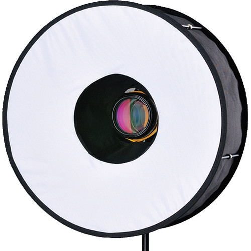
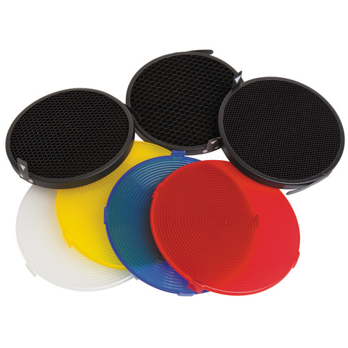
As I've mentioned last week that I've done some experiment to check and make an idea of the effects of some light modifiers after receiving my new shipment of Impact Syl Arena Strobros On-Camera Flash Light-Modifier Kit.

Source: B&H
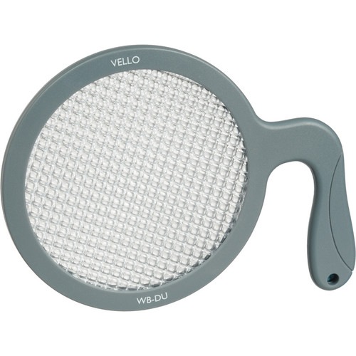
Initially, I've done the test with my 580EXII Speedlite against my green wall. After checking the results of such test, I've decided to do the test again, and this time against my wooden door because it has a clear texture and it is better to judge the effect that way. I've also added the RoundFlash modifier to the list for a general comparison. But first, I'll post an original image with plain 580EXII in use. It's worthy to mention that the distance from the front of the lens to the door was kept at around 1 meter (~3.3ft) and f/8. The shutter speed and the power of the speedlite were subjects to change to adjust the level of the light. To ensure a neutral white balance with natural colors as much as possible I've used the Vello Universal White Balance Handheld Disc and shot with the speedlite naturally and used that image in Custom WB settings. In the following set of images, it would be better to click and enlarge the picture to have a better view.

Plain 580EXII
Canon EF 50mm, f/8, 320-1sec, ISO100.

Notice how the center of the light strike is closer to the top edge with flare and gradually fading in all directions. I don't know though why it is not exactly at the center of the top edge!

RoundFlash
RoundFlash shot

Source: B&H
In the RoundFlash shot here, I've used the High-Speed mode for the 580EXII to kill the ambient light and also to decrease the flare on the wood. Strangely, and probably it is a property in the High-Speed mode, the light became more bluish despite fixing the WB by Custom WB settings.
As you can notice, the light accumulated in the center of the shot and gradually spread to the corner, but the graduation is short and blends to darkness like it's vignetting. One of the main problems with the RoundFlash modifier is that the lens should have some length to fit properly in the center. My Canon EF 50mm f/1.4 USM lens was not long enough and initially had problems to fit it in between the strings in the middle of the modifier.
At such level, and 1 meter away from the target, the spotlight of the Speedlite falls almost perfectly in the center (even though in the plain shot it was not!). A good point to consider when shooting portraiture and macro; in fact, RoundFlash was made as a cheap substitution for the expensive ring flash used in typical macro shot. One bad point about it though, it is bulky and I wonder how fit it is for macro shots. You must have some long lenses to keep away from the target (if it was a sensitive one as an insect for example) and to have the lens fit firmly in the center of the modifier. Concentrating the light in the center, and in such amount, would somehow mean harsh shadows for the subject if it was used for portraiture shots I believe.

Beauty Dish, Golden Plate, and Diffuser
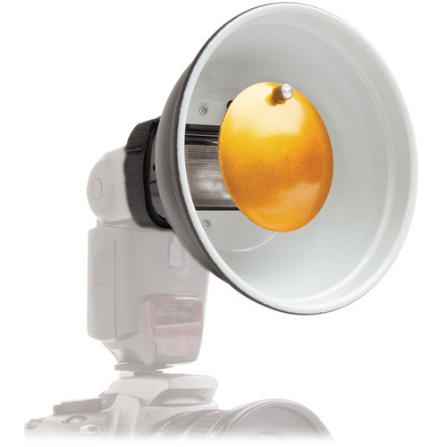
Beauty Dish + Golden Plate + Diffuser

Source: B&H
Source: B&H
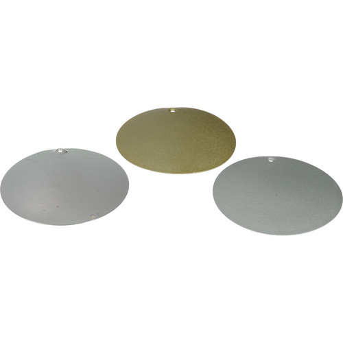
Then comes the beauty dish, which is a well-known modifier in the fashion world and fashion photography. Technically though, I've never (so far) used it for portraiture or anything else but this test as you can see here. Along with the kit, some specific diffusers and grids to fit the beauty dish are available, thus I've decided to check the effect of the diffuser (the white disc in the image), as the other discs are simply colored diffusers and probably wouldn't help me if it casts a color on the reddish-brown wood. I also didn't check the effect of the grids because their effect is known - simply to concentrate the light into a narrower angle.
Back to the light show now.As it is noticed, the flare of the shot is on the top level above the center and closer to the edge but the size of the flare is relatively small (compared to the RoundFlash and the plain shot). The color of course is changed a bit because of the golden plate inside the beauty dish which made it a bit of greenish hue more than bluish hue. The graduation of the flare is faint (and appears first as if it is cut abruptly). This light attitude makes me think of the usage of the beauty dish; it must be used with some angle even though it is (here with this kit) considered an "on-camera" speedlite modifier. Otherwise, if it was used directly to hit the subject, it would cast a harsh shadow on the spot where it falls. Well, unless a dark background was in use which would hide such shadow maybe!

Beauty Dish, and Golden Plate
Beauty Dish + Golden Plate

I see that when the diffuser is removed there is, virtually, not a big deal of difference in the location of the falling light according to the frame, or to the graduation in the light level. Probably the diffuser provided a greater expansion in the periphery of the falling light, and probably this difference would be more apparent if the power of the light was increased (by the speedlite, by the aperture, or by slowing down the shutter). Could be a subject for further testing.

Beauty Dish, and Silver Plate
Beauty Dish + Silver Plate

Source: B&H
The next plate in the queue was the silver plate to be fixed in the center of the beauty dish. As it's predecessor, the silver plate doesn't seem to change much except for the color of course where it accentuates the blue tint of the speedlite. Usually, with gel filters fitted upon the speedlite, a balance between the ambient light temperature (or color) and the speedlite temperature is sought in that way, and consequently, the white balance is controlled more properly. Here, however, the story is a bit different when using the plates and a speedlite which emits a tinted blue light. Makes me wonder now about the possibilities (and the creative process) of blending gel filters on the speedlite with those colored plates in the beauty dish. The results got to be crazy!

Beauty Dish, and Mirror Plate
Beauty Dish + Mirror Plate

It might appear as completely black frame, but in fact there is a faint light. This result, however, was a complete surprise for me as I was expecting more reflectance from the mirror plate. The mirror plate (which comes in a concave shape) has two sides: polished (convex) and unpolished (concave) surfaces. Other plates don't have polished surface like a mirror. Anyway, according to the settings I've noticed, the concave part must be facing the speedlite. The light here was very faint. I would increase power to make a clear note of how the graduation or feathering of the light goes, but it's enough for me now to see and compare with other settings of other plates. Seems that the mirror plate feathers and scatters the light emitted from the speedlite so much that it only makes a faint tracing of light in the frame. Leaves me with the question: How would that appear in a wide-angle lens?

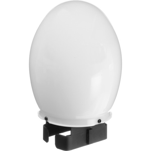
Bulb Diffuser
Source: B&H
The next modifier is one that I've seen photographers use it a lot, either directly or indirectly. However, the usage of the Bulb Diffuser might be known to many but that didn't keep me still without testing it here. It is a diffuser after all and dedicated for smoothing and feathering the light in a pleasant way. Anyway, because the bulb shape emits lights in all directions almost, and because the typical setting as shown in the guide that the speedlite must be pointed up, I've decided to do my own testing with various tilting angles of the speedlite.

Bulb Diffuser, speedlite pointing up.

On the first trial here with the typical setting: Speedlite pointing up. As it can be seen above, the feathering is nice and smooth going all the way down from the top with little flare on the top edge. Remember that we are using the Canon EF 50mm lens here, meaning that with a little extension in the focal length, more than 50mm, we can be left with the feathering alone without the flare on the top edge of the frame. A good point to memorize I suppose!

Bulb Diffuser, speedlite at 45o.

After trying the typical position, I've tilted the speedlite head down by 45o. This position looks good despite the relatively large flare on the top of the frame (which as I stated above would be avoidable by using a longer focal length). The graduation or feathering is slow making the luminance almost (not completely) homogenous across the frame. Probably this would be a favorite position when doing portraiture (with a little raise in the speedlite level or longer focal length).

Bulb Diffuser, speedlite at 90o.

Finally, we have the 90o position which in fact almost replicates the plain shot of the speedlite without any modifier. Yet, however, in the plain shot above you can notice the black edges like vignetting effect, but here with the bulb diffuser, the edges are also illuminated and almost no vignetting can be found. This makes me think of using the speedlite with other modifiers from Rogue collection which I got before in order to maximize the spread of the light circle and yet give an act as if the speedlite is unmodified originally! Needs a bit more of trial and error.

There are a number of other modifiers along with the kit but I didn't test them because, simply, their effect is known; like the snoot (with grids) and grids for the beauty dish. In addition, a new set of gel filters and a velcro band arrived with the kit but I didn't use them yet, as they are similar to other sets I had already. I need to practice my "speedliting" as much as possible now.

Finale
It feels like my life has been monotonous right now. The only way to break out the routine and the duties of the everyday living seems to be paying close attention to details around me in a trial to amuse my brain in things that usually I don't think of. There are books still on the queue but they are not photography or archaeology books, so my progress in digesting these books is slow. I'm praying for some vacation again, but a real one, out of this country. I'm feeling sick of my (unappreciative) work place, as well as of the majority of people around me. Such a dream seems far a bit for now.
Now, I'm waiting for every weekend like a treasure seeker, and hoping that I can do some night photography in each weekend. Is it worthy to try to be unique already?


Sunday, February 21, 2010

Alexander 6, V1.

Somehow, it was a tiresome and busy weekend. I didn't post anything yesterday (Saturday) as I promised myself but anyway, it was not much of importance I believe, except to put on with the first verse of Alexander VI.
I made some experiments again with my beloved golden turtle, and this time I used the FEB (Flash Exposure Bracketing) as a substitute, since I can't use it in a completely dark room;


Turtle (FEB, manual, 3/3)
The blue background is actually black. But with some fixes and because of the flash light striking it, it turned bright and blue. Combining the three shots was done with Photomatix (and some values of exposures were adjusted since softwares use certain numbers in the EXIF of the image, i.e. data attached to the image). Yet, tone-mapping was done manually with Photoshop (and also fixes) because the Photomatix version was hard to smooth out and equalize the proportions of light. The image you see was actually like split horizontally in the middle, with bright portion being up and the dark shadow being down. Such thing cannot be done with Photomatix, but rather done easily with Photoshop's adjustment layers and brushes. Hue and Saturation were also fixed to some extent and voila! here you go. As for the time being, I've been using Photomatix to merge the images together and save it as EXR, and then edit them (mostly) with Photoshop. Sometimes, I get them back to Photomatix after adjusting them and saving back again in EXR, because my skills with manual tone-mapping are just novice!
This is some of my summary about using Photoshop and Photomatix in HDR making and Tone-mapping; of course people who read some books don't need it, as these are just my thoughts after working a with them, and there are plenty of softwares out there that are good for things and bad for other things maybe and so on:

Photoshop:

 - Good stuff:
  • Gives you the ability to adjust the HDR image in various ways with adjustment layers.
  • When joining into HDR, a dialogue box appears with calculated exposure values and gives you a choice to tick-out any unwanted images into the sequence.
  • Got instant 32-bit slider to view the image in various exposure settings instantly.
  • For those who like to use their own hands with baking the HDR, tone-mapping here with Adaptive settings (and others) are fine.
  • Plugins capability makes it easier to do noise reduction after tone-mapping directly, if needed.
 - Bad stuff:
  • Memory consumer.
  • Exposure values cannot be changed manually (only if the file is stripped out of its EXIF data).
  • Does not have a tool to view a HDR historgram.
  • Aligning, while processing the images to HDR is not, compared to Photomatix, good enough.
 Photomatix:

- Good stuff:
  • Does not consume much memory.
  • Exposure values can be fixed in case of some problems with calculations (and you get a dialog box even when the brackets of the exposures are not even or normal let's say).
  • Got Exposure Fusion capability (which is not an HDR merging but useful at times).
  • Can view a HDR histogram (and this is extremely important for me to check that there are no cut-offs in the exposures sequence; at tails mainly).
  • Saves the HDR image in major formats as Radiance (.HDR) and OpenEXR (.EXR, ZIP and PIZ).
  • Tone-mapping is semi-automatic, with pre-fixed schemes and the ability to adjust the sliders. This is good for none-experienced manual workers like me!
  • Has 2 aligning algorithms embedded and can be used in two modes: normal and high (in case your tripod moves much because of the air or something). It is far better than Photoshop's.

- Bad Stuff:
  • Once the sequence of the images is made, and when an error pops-up for some problems in the exposure values, you cannot tick-out some images, but only fix the exposure values.
  • Generally, it is not an image editing program, thus, you can't do much to your HDR image before baking.
  • Personally, I don't trust the "noise reduction" option that is applied to the images before being combined. After all, noise reduction is a must after tone-mapping.
  • No plugins capability, thus, you can't work with plugins embedded in it like Photoshop; plugins like NeatImage are deemed useful.
  • No instant 32-bit viewer or slider to move and check the various exposures. There is however an option for going up and down with exposure (F11 and F12 keys) which isn't exactly as flexible as in Photoshop.

The term "bake" and "baking" I'm using here, is a term that adapted (and I like it by the way) from Christian Bloch's book, in which he explains how to fix HDR images before tone-mapping, i.e. baking. I think he was hungry when he was writing that section but anyway, it works fine with me... 'cos I'm always hungry.

With points from here and there, it is, at least for me, hard to work with one program alone. I do have to work with both here and there. Yet, my main first step in the workflow, would begin with combining the images in Photomaix first and saving the HDR file. Sometimes, but not often, I do combine the images into HDR in Photoshop but it is rather to check if there is any difference or any enhancement, since the two softwares tend to give me different calculated exposures' values for the same set of images.
I've been trying to do the same FEB trials on my old censer as before, and this time with a black background (from the papers I purchased last week). I did not design a black box yet, but so far I'm putting the paper freely and bend it softly to make a background. In my experiment with the censer (which I did not make up images for it yet), I used the diffuser on the flash head. I did not use it before because, I just thought it is designed mainly for the wide-lens apparatus (as mentioned in the manual) and to avoid vignetting (darkening of edges) when using wide-lens with normal flash. The flash tends to concentrate in one spot then. However, I used it with my 18-55mm lens and it works fine on spreading the flash to a wider area and softening the strike on the body of the censer itself. Why I didn't think of this before? Damn it!
When the diffuser is pulled out, the flash automatically sets the zoom level to that of a wide-lens, and maybe that's why I didn't try to use it in that condition.
Everything was going fine, until it was the time for the third shot which is supposed to have a relative exposure value of +3, when it turned out with a level of "0". This is bad for combining the images later on, even if I fixed the values manually in Photomatix. I made other shots changing from Av (aperture priority) mode to Tv (time priority), but here, the results were not exactly what I want, with the flames of the candle inside were almost turned off and the aperture was set to f5 making a shallow depth and no sparkles (like in the image of the turtle above). It is hard to combine elements from the 2 experiments, but I'm trying still, or I should conduct a new experiment today, completely.
__________
1. thus Alexander decided to leave his people
2. and head to where he never been before
3. alone without any companions
4. weak without any weapons
5. except of his CharnagĂșt
6. and he walked with his torn clothes
7. amid the deserts and mounts and valleys
8. and he stopped at the ruins of TaghlĂșt
9. the capital of the khanate of Ghutan
10. where he crushed some idolaters
11. just like a grain of salt in the wind
12. and he stood upon the ruins of the tower
13. of the mighty castle he wrecked with iron and fire
14. and he meditated and remembered his golden age
15. and the tears could not be kept in his eyes long
16. and he raised his harsh hands up to heaven
17. and praised God and His mercy
18. then he knew for sure deep inside him
19. that nothing in this life remains
20. and like you take, you shall be taken
21. and like you own, you are owned
22. while this life is nothing for sure
23. but like a grain of salt or sand
24. to the wind shall fly away