It was one of these weeks that I could call busy. Yet, however, I'm not so satisfied about it because I've found myself too lazy to do a single thing. Seems it's the effect of summer. I've just realized that I had been in almost continuous activity for around a year, without real vacations. Summer had its toll on me and I'm seriously growing sick of it. Temperatures are going down slowly, yet it is still hot. For example, instead of being 46oC (~115oF) at around 11:00 a.m., it is now in the range of 41-42oC (~106-108oF) around the same time. Where are you winter; I need you badly.
Anyway, after some struggles, I was able to do some work with my camera this week, trying to do more experiments with the IR Filter which I didn't use much. This time, however, not outdoors, but indoors.
I've discovered last week that I've completed (unintentionally!!) the 3rdalbum for images from Staten Island. I didn't work for some time with these images. At the end of this post, I'll post a slideshow of this album.
Seems reading some of my old books did not go in vain after all. Going through Portrait Photography and The Photographer's Guide to Making Money by Karen Dórame did inspire me a bit to do some experiments in combination with the IR filter, and with car windshield's shade. Yes. Car shades.
The tip for using a car shade as a reflector is taken specifically from Karen's book, but I've developed this idea further for my own needs. I will explain stuff later in this post. So, what's going on here? A book, a car shade, and IR filter? This life is filled with silly stuff, no?
The first idea was to use the shade as a reflector, specifically for the hair light. Well, partially inspired by reading into portrait photography for a while. However, in this venture, I've tried to accommodate this the infrared filter for some "toying" around. Remember that portrait photography is not my cup of tea, and I must add something to it that excites me to some extent, and IR filter was the solution!
The first trial to try the shade was to take a head shot of myself (as usual). Because of this, I have to stay a bit further away from the camera, making holding a cable and checking a portable monitor a bit of a hard task, and with IR filter it is just awesomely... difficult. Thus, for this reason, most of the shots taken in this trial are soft and out of focus a bit. Increasing the depth here (i.e. f-number) would result in darker images. The speedlites here are reflected and not directed, making their task harder even with IR filter on lens. However, some poses were fine and I might consider doing the whole set again if possible; some people did like those shots despite the soft focus.
There were other shots of course but probably these 2 were the best of them. The differences in the tones here is majorly because of the different approaches in dealing with IR images. I've tried to process these images in DPP (Canon's software) and also Photoshop (or the ACR) but I have to say that it was such a hard task because of the darkness of the images relatively. In outdoors shots I was able to get some bright areas and correcting the white balance was an easy shot somehow with DPP, as Photoshop didn't do a good job in that manner. However, indoors proved to be something totally different for IR shots, and I had to surf further looking for answers and tips on how to process these images digitally, specially for camera that are not converted for IR photography (i.e. with normal unmodified sensor). This step, anyway, was looked upon after my next trials for eye shots.
I've been dreaming of having a ring light or ring flash for a while. Anyway, an idea struck me again since I've got a car shade of two circular sides. I've cut through the middle and divided the shade into 2 parts: the first would act as a reflector, and the second would act as a ring light. To do the ring light job, I've made a hole in the middle of the shade part (as shown above) which would be suitable somehow for a Ø58mm lens. This cut was done in a haste without much measurements like I usually do, but seems it worked fine! The idea is to reflect the speedlites onto this reflector and the light should reflect back on the subject, which is in this case, my eye. The close distance between the subject, the speedlites and the reflector, made it possible for me to use a high f-number and ensure the shot is sharp despite the slight movement of my body. Remember: the LiveView or what you see in the viewfinder is always the scene at largest f-number. Thus, it is kind of hard to judge the sharpness as the body moves in front of the lens but with high f-number, all is OK and a slight shake won't hurt a bit!
Despite the many shots I've taken, I thought that one was enough to be processed in various levels and ways. Erster Blick and Zweiter Blick are actually one shot but one with the Clarity option being low (soft) while the other was maximum (harsh). Of course there were some processing in between to adjust colors and clone out some overexposed areas before uploading but the general criteria here was the Clarity issue. In fact, this shot was intended as a test shot before attaching my infrared filter on the lens.
Intriguing as it may be, the reflection of the shade into my eye. This phenomena, despite its simplicity, it was something I never thought of. This reflection can open up a gate of other possibilities and art venues! We have to think about some stuff to do in the near future I believe.
As usual with any eye shot done before, I've went through the process of converting them to B&W as you can see above. In all these images, I greatly miss the NeatImage plugin which can do some job automatically somehow with some nice results. NoiseNinja, despite its nice work, it can leave a dilemma in the mind for what's right and what's wrong. I have to say because of these images now, the statistics of my Flickr reported nearly 900 hits that day!
Just before I leave it completely, I couldn't resist the temptation to "edit" this shot further instead of just enhancing colors and tones. That is, adding some features to the iris and doing some work with the colors. Some work was done, and Dritter Blick was produced.
The Dritter Blick is actually based on the Zweiter Blick but in this shot, beside lowering the saturation, a Curves layer was used and the black point was set based on the pupil color, thus adding some harsh contrast. As for the reflections in the eyes, probably if the speedlites were closer to my head, the reflection would be more even across the diameter of the iris.
OK. You might be wondering now where does the IR fit in all of this. In fact, all the images above were a result of a single test shot! After testing the light level, I've fixed the IR filter on the lens and started taking pictures (depending on the portable monitor in front of me) trying to find an adequate position and changing the distances of the speedlites and their angle of incidence.
All shots were dark and I had a problem fixing their white balance in DPP and ACR. The main problem in fixing the white balance is, there is no real reference point to take the white balance from Usually, in a landscape shot, the white balance is majorly a matter of the green leaves on trees or the grass, or the sky itself. Here, there are no real reference point to depend on in setting the white balance.
I did a bit of surfing and I've learned some techniques not known to me before, specifically for working with digital IR images in RAW (majorly some method to expand the white balance range). What I discovered during my little research is the fact that, in general, the matter of processing IR images, either indoors or outdoors scenes, it is mainly a matter of art and sensuality. You have to imagine yourself to be a designer and work with your images in what you think is proper. There is no right method or a wrong one. There are just some basics and the rest is a matter of processing in Photoshop or other editing programs, after doing initial adjustments in ACR. IR do sound like a fertile soil for artistic venues.
As for the shots themselves, they were (naturally) too dark despite the fact that the speedlites were on full power. I didn't want to increase the ISO further as I know the annoying noise level would make a headache but probably I should have loosen the f-number a bit, say to f/16 or even f/11 instead of leaving it to f/22. Anyway, from all the shots taken, Infra Auge was probably the least in headache. Notice I said "the least." Generally, all of them were a headache!
The blue tone of the image is a result of channel swapping, that is exchanging the places of the red and the blue channels together. The noise level because of the ISO and because of the increment in the exposure level was beyond imagination, and despite the fine look in a small size image like the one above, the real image is not as smooth as it appears here. In fact, even the focus was smoothed out while trying to clean the noise of the image. Here also, to reduce the amount of the color noise (which was specially apparent on the pupil) I've used the Curves adjustment layer again and setting the black point from the pupil itself. The contrast increased and I had to sacrifice some tiny details in other areas which became darker. The iris was brightened out wit dodging techniques. Surprisingly, some say they like this one the most from the series! I'm not expecting such image to be accepted in stock agencies anyway.
Meanwhile, I'm still working slowly on phonic values for the sounds of Geltani and assigning more possible combinations of vowels and consonants. The progress is slow, and it made me delve (back again) more into the IPA (International Phonetic Alphabet), and trying to figure more about the sounds it includes. What I discovered here is, somehow, that the IPA is somehow too precise that it makes some confusion. When I checked the phonetics (or Phonology) of the Arabic language, there seem to be more than one representation for the symbol for the simple sound of [خ] (equivalent to Scottish and German "CH"). The only different is the amount of air probably and the friction position (I leave the anatomical names inside the mouth for doctors here!). I believe this is somehow unnecessary. Once you learn a language, the sounds should flow along even with some minor changes in the air flow - if this change was significant, probably our ancestors would have discovered that earlier and decided to make a separation in symbols for such phenomena.
Similarly, in Ottoman Turkish, when it was written with Arabic script, there was no real distinction between "V," "U," "Ü," "O," "Ö." Most of these sounds in modern Turkish were represented simply by the letter [و], and only when the diacritics were used in the body of the text some distinction is made between some of these sounds. I think the Ottomans back then didn't give much importance to these differences in vowels because the general speech was understood and the tonal values would flow depending on the surrounding vowels and consonants in the word. This is apparent in some Turkish words in modern Turkish in which the last letter would change according to the additions. For example, the "p" in [kalp] (heart) would change to "b" with some additions like [kalbım] (my heart). Just to note, "Kalp" is originally an Arabic word and in Arabic it ends with "B" [ب], and only in modern Turkish it would end with "P". Turkish is full of such words that change their ends from light to heavy sounding ones. The question remains though: is it necessary to write and document such changes? Probably a native Turkish speaker would, naturally, end such words with light sounds as "P" (and some others) because of the nature of the vowels and consonants the proceed this consonant, thus even if we wrote it as "B", a Turk would still say it as "P" because it is more natural to his native tongue. The philosophy of precision is under question: is it really necessary to add some complexion to the written words?
In the meantime, I had as well some crazy idea to make an Arabic-based script for Turkic languages, including Ottoman, but this time it would be more to be an alphabetic script rather than an abjadic one. The Uyghur script is already in that way but it causes much confusion, at least to me, because the laws of written Arabic are broken (concerning what letters to be joined at the end and which ones to not be so). Probably I would call it, UniTurkic. The idea is just at the beginning and I need more time to make it grow. For the time being I shall be busy with my Geltani, at least.
One of the things that are on my list to be ordered after some time (after I finish some few debts) is the RoundFlash which is something cheap (compared to the ring flash) and works with the regular speedlite on camera. Probably this what inspired to make the experiment above with the car shade! Anyway, it's on the list with other stuff. I'm considering having another lens to my collection but the matter is still under consideration and I'm not really sure if I do need one. I have something for prime lenses for the time being and wouldn't like to add a zoom lens to my list. Also on my list, a new tripod. However, that would be another story for another post probably.
I need some time to recollect my thoughts about my private life for the time being. It seems to be more disastrous than before under the current circumstances. Scariest of all is the fact that, I don't know where the end of the tunnel lies.
I leave you now with a slideshow for images of the 3rd album from Staten Island, New York.


Anyway, after some struggles, I was able to do some work with my camera this week, trying to do more experiments with the IR Filter which I didn't use much. This time, however, not outdoors, but indoors.
I've discovered last week that I've completed (unintentionally!!) the 3rdalbum for images from Staten Island. I didn't work for some time with these images. At the end of this post, I'll post a slideshow of this album.
All Eyes On Me
 |
| Source Amazon |
The tip for using a car shade as a reflector is taken specifically from Karen's book, but I've developed this idea further for my own needs. I will explain stuff later in this post. So, what's going on here? A book, a car shade, and IR filter? This life is filled with silly stuff, no?
The first idea was to use the shade as a reflector, specifically for the hair light. Well, partially inspired by reading into portrait photography for a while. However, in this venture, I've tried to accommodate this the infrared filter for some "toying" around. Remember that portrait photography is not my cup of tea, and I must add something to it that excites me to some extent, and IR filter was the solution!
 |
| Side View of the shade on tripod and speedlites on monopod pointing into it. Don't ask how I balanced this monopod. |
 |
| Frontal view of the set. Hope you don't mind the mess! |
 |
| Infra Me I Canon EF 50mm, f/4, 0.5sec, ISO500 |
 |
| Infra Me II Canon EF 50mm, f/4, 0.5sec, ISO500 |
There were other shots of course but probably these 2 were the best of them. The differences in the tones here is majorly because of the different approaches in dealing with IR images. I've tried to process these images in DPP (Canon's software) and also Photoshop (or the ACR) but I have to say that it was such a hard task because of the darkness of the images relatively. In outdoors shots I was able to get some bright areas and correcting the white balance was an easy shot somehow with DPP, as Photoshop didn't do a good job in that manner. However, indoors proved to be something totally different for IR shots, and I had to surf further looking for answers and tips on how to process these images digitally, specially for camera that are not converted for IR photography (i.e. with normal unmodified sensor). This step, anyway, was looked upon after my next trials for eye shots.
 |
| Second set for eye shot trial, with car shade torn in the middle. |
I've been dreaming of having a ring light or ring flash for a while. Anyway, an idea struck me again since I've got a car shade of two circular sides. I've cut through the middle and divided the shade into 2 parts: the first would act as a reflector, and the second would act as a ring light. To do the ring light job, I've made a hole in the middle of the shade part (as shown above) which would be suitable somehow for a Ø58mm lens. This cut was done in a haste without much measurements like I usually do, but seems it worked fine! The idea is to reflect the speedlites onto this reflector and the light should reflect back on the subject, which is in this case, my eye. The close distance between the subject, the speedlites and the reflector, made it possible for me to use a high f-number and ensure the shot is sharp despite the slight movement of my body. Remember: the LiveView or what you see in the viewfinder is always the scene at largest f-number. Thus, it is kind of hard to judge the sharpness as the body moves in front of the lens but with high f-number, all is OK and a slight shake won't hurt a bit!
 |
| Erster Blick Canon EF 50mm + Extension Tube, f/22, 125-1sec, ISO500. |
 |
| Zweiter Blick Canon EF 50mm + Extension Tube, f/22, 125-1sec, ISO500. |
Despite the many shots I've taken, I thought that one was enough to be processed in various levels and ways. Erster Blick and Zweiter Blick are actually one shot but one with the Clarity option being low (soft) while the other was maximum (harsh). Of course there were some processing in between to adjust colors and clone out some overexposed areas before uploading but the general criteria here was the Clarity issue. In fact, this shot was intended as a test shot before attaching my infrared filter on the lens.
Intriguing as it may be, the reflection of the shade into my eye. This phenomena, despite its simplicity, it was something I never thought of. This reflection can open up a gate of other possibilities and art venues! We have to think about some stuff to do in the near future I believe.
 | |
| Erster Blick (B&W) |
 |
| Zweiter Blick (B&W) |
As usual with any eye shot done before, I've went through the process of converting them to B&W as you can see above. In all these images, I greatly miss the NeatImage plugin which can do some job automatically somehow with some nice results. NoiseNinja, despite its nice work, it can leave a dilemma in the mind for what's right and what's wrong. I have to say because of these images now, the statistics of my Flickr reported nearly 900 hits that day!
Just before I leave it completely, I couldn't resist the temptation to "edit" this shot further instead of just enhancing colors and tones. That is, adding some features to the iris and doing some work with the colors. Some work was done, and Dritter Blick was produced.
 |
| Dritter Blick |
The Dritter Blick is actually based on the Zweiter Blick but in this shot, beside lowering the saturation, a Curves layer was used and the black point was set based on the pupil color, thus adding some harsh contrast. As for the reflections in the eyes, probably if the speedlites were closer to my head, the reflection would be more even across the diameter of the iris.
OK. You might be wondering now where does the IR fit in all of this. In fact, all the images above were a result of a single test shot! After testing the light level, I've fixed the IR filter on the lens and started taking pictures (depending on the portable monitor in front of me) trying to find an adequate position and changing the distances of the speedlites and their angle of incidence.
 |
| Infra Auge Canon EF 50mm, f/22, 125-1sec, ISO500. |
All shots were dark and I had a problem fixing their white balance in DPP and ACR. The main problem in fixing the white balance is, there is no real reference point to take the white balance from Usually, in a landscape shot, the white balance is majorly a matter of the green leaves on trees or the grass, or the sky itself. Here, there are no real reference point to depend on in setting the white balance.
I did a bit of surfing and I've learned some techniques not known to me before, specifically for working with digital IR images in RAW (majorly some method to expand the white balance range). What I discovered during my little research is the fact that, in general, the matter of processing IR images, either indoors or outdoors scenes, it is mainly a matter of art and sensuality. You have to imagine yourself to be a designer and work with your images in what you think is proper. There is no right method or a wrong one. There are just some basics and the rest is a matter of processing in Photoshop or other editing programs, after doing initial adjustments in ACR. IR do sound like a fertile soil for artistic venues.
As for the shots themselves, they were (naturally) too dark despite the fact that the speedlites were on full power. I didn't want to increase the ISO further as I know the annoying noise level would make a headache but probably I should have loosen the f-number a bit, say to f/16 or even f/11 instead of leaving it to f/22. Anyway, from all the shots taken, Infra Auge was probably the least in headache. Notice I said "the least." Generally, all of them were a headache!
The blue tone of the image is a result of channel swapping, that is exchanging the places of the red and the blue channels together. The noise level because of the ISO and because of the increment in the exposure level was beyond imagination, and despite the fine look in a small size image like the one above, the real image is not as smooth as it appears here. In fact, even the focus was smoothed out while trying to clean the noise of the image. Here also, to reduce the amount of the color noise (which was specially apparent on the pupil) I've used the Curves adjustment layer again and setting the black point from the pupil itself. The contrast increased and I had to sacrifice some tiny details in other areas which became darker. The iris was brightened out wit dodging techniques. Surprisingly, some say they like this one the most from the series! I'm not expecting such image to be accepted in stock agencies anyway.
Linguamechanic
This week, I've spent some more time (at work) with my Geltani and also reading more into the Turkish lessons. I'm trying to settle with my opinions of what features to take from the Turkish language to implement into Geltani. Apparently Turkish is complex (relatively speaking) and Geltani has to be simpler in form and expressions (and it is already logographic!).Meanwhile, I'm still working slowly on phonic values for the sounds of Geltani and assigning more possible combinations of vowels and consonants. The progress is slow, and it made me delve (back again) more into the IPA (International Phonetic Alphabet), and trying to figure more about the sounds it includes. What I discovered here is, somehow, that the IPA is somehow too precise that it makes some confusion. When I checked the phonetics (or Phonology) of the Arabic language, there seem to be more than one representation for the symbol for the simple sound of [خ] (equivalent to Scottish and German "CH"). The only different is the amount of air probably and the friction position (I leave the anatomical names inside the mouth for doctors here!). I believe this is somehow unnecessary. Once you learn a language, the sounds should flow along even with some minor changes in the air flow - if this change was significant, probably our ancestors would have discovered that earlier and decided to make a separation in symbols for such phenomena.
Similarly, in Ottoman Turkish, when it was written with Arabic script, there was no real distinction between "V," "U," "Ü," "O," "Ö." Most of these sounds in modern Turkish were represented simply by the letter [و], and only when the diacritics were used in the body of the text some distinction is made between some of these sounds. I think the Ottomans back then didn't give much importance to these differences in vowels because the general speech was understood and the tonal values would flow depending on the surrounding vowels and consonants in the word. This is apparent in some Turkish words in modern Turkish in which the last letter would change according to the additions. For example, the "p" in [kalp] (heart) would change to "b" with some additions like [kalbım] (my heart). Just to note, "Kalp" is originally an Arabic word and in Arabic it ends with "B" [ب], and only in modern Turkish it would end with "P". Turkish is full of such words that change their ends from light to heavy sounding ones. The question remains though: is it necessary to write and document such changes? Probably a native Turkish speaker would, naturally, end such words with light sounds as "P" (and some others) because of the nature of the vowels and consonants the proceed this consonant, thus even if we wrote it as "B", a Turk would still say it as "P" because it is more natural to his native tongue. The philosophy of precision is under question: is it really necessary to add some complexion to the written words?
In the meantime, I had as well some crazy idea to make an Arabic-based script for Turkic languages, including Ottoman, but this time it would be more to be an alphabetic script rather than an abjadic one. The Uyghur script is already in that way but it causes much confusion, at least to me, because the laws of written Arabic are broken (concerning what letters to be joined at the end and which ones to not be so). Probably I would call it, UniTurkic. The idea is just at the beginning and I need more time to make it grow. For the time being I shall be busy with my Geltani, at least.
Finale
I need a vacation. This is the bottom line of my life in the current time. I do plan to have some leave from work but I'm hesitated. Such leave might give me a break from work, but I'm still faced with duties for Mom, specially after planting another valve in her arm for dialysis.I think this will be the situation for a really long time, so I'm trying to prepare for it psychologically.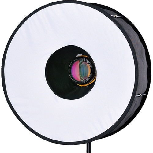 |
| source: B&H |
I need some time to recollect my thoughts about my private life for the time being. It seems to be more disastrous than before under the current circumstances. Scariest of all is the fact that, I don't know where the end of the tunnel lies.
I leave you now with a slideshow for images of the 3rd album from Staten Island, New York.


