Showing posts with label black and white. Show all posts

Thursday, April 30, 2020

Checkmate…

Strange, weird times are coming through. As much as the time appears to be slow because of the idleness, yet it is kind of pacing fast simultaneously. I feel like I didn't have much time since I finished my last blog post in Arabic, and feels like it was not weeks since I took the following shots that I'm going to talk about here! And guess what? Ramadhan is here already.
I'm actually grateful that Ramadan this year comes by while we are home, supposedly, instead of having to go to work and maybe sign up for a leave during the month to take care of my hysterical sleeping habits that get confused greatly during Ramadan, every year. It's such a bless for me, really.

Marbhsháinn

Well, this is just checkmate in Irish. I've mentioned in my previous post (or posts) a glimpse about my work with the chess set. I got this set specifically for photo shoots; I'm not a chess fan! Anyway been some time since I did something with this set, and so I thought it is time to work a bit. The annoying part though, working with chess can be quite noisy and loud unlike working with the feathers! If you are going to try to do anything like what I do here I hope you don't risk bothering anyone with the noise.

Воздушная Битва (the air battle)

Just as a starter, all my plans were set ahead to make these photos in black and white. Why? Well, let's just say it gives strength to the sense of drama here and also because black and white are strongly attached to the game of chess (in my case, the pieces are made of wood, and reddish and milky in color). In these shots, I've used 6 speedlites: 5 to flash, and 1 master to trigger the rest without shooting. This leaves me with one extra speedlite, the old 420EX which I didn't use here because it is, well, cumbersome to work with. I've checked the manual for this one and seems the only way to control its parameters is to be connected directly to the camera, but I might be wrong here. I got this speedlite for cheap from a friend. Anyway, adding this last one would not add much since I have 430EXII and 580EXII on both sides of the set, and 430EXII on top; Thus things were symmetrical. Why so many speedlites? Well, it was a high-speed session!

The chess set before adding the rest of the speedlites on left and right.
The white boards on right and left are for bouncing the light from the speedlites.

Now, the first shot, Воздушная Битва or the air battle, got me into a tiny trouble, which I had to solve by merging shots instead of doing everything in a single shot as I was planning. Well, several problems in fact:
  • My hand shadow from the top speedlite did cover and obstruct the shadow of the falling knight piece. Specifically the black one because I was holding the remote with my left (I'm a leftie) and dropping the pieces with my right. The problem was minor with the white knight but was a major one with the black knight.
  • As you might have inferred from the first point, I could not drop the two knights together. Working with a timer is not as precise as triggering the remote with my own hand, and holding the two knights in one hand and dropping them made them so close together which is not what I wanted. I really needed them to face each other. Thus, the only solution for this was to drop each piece alone (several times to pick the best shot) and merge them later.
Luckily, I've taken a shot before I work as a reference and that one was the base upon which the knights were merged, so in total, 3 images put together, with some edit to the shadows of the knights. Well, beside the total edit for the whole shot of course. In Воздушная Битва specifically, I like the luster on the flying black knight and in fact I've toned the luminosity of the colors when I converted to black and white specifically to keep this luster on the flying knight piece.

Фантом Кони (Phantom Horses)

Over with a high-speed shot (or composition to be precise, I guess), I moved further to the Multi or the stroboscopic flash. It's funny how this type of flash was unthinkable to me when I work with my speedlites, but now it is a favorable option when I work with such experiments. Again, I tried to throw 2 knights or horses together in one hand while triggering the camera with the other hand, but the results were not fascinating, to say the least. Thus, I needed my brother's help here and voila! It was perfect from the first shot. I had though to use also another shot for the background to merge it because my brother's hands shadows from the top speedlite. I'm not sure how many strikes of flash were there but I'm guessing 5 from the number of "ghosts" in Фантом Кони, and surely the frequency was low, probably 50Hz. In fact, 5 strikes of flash when working with stroboscopic light is now my standard and my starting point. It seems to yield some reasonable results in most cases. One thing I regret though in this shot is that I didn't ask my brother to hold the horses opposing each other face to face, so as you can see they are falling here and both looking left.

Кто Стоит Последним (who stands the last)

Next in order comes a simple shot, yet hard in the same time. At this point, and in order to shoot Кто Стоит Последним, I had to change the lens. In the previous shots I've used my Sigma 12-24mm and that's out of necessity a bit because the perspective needed to be adjusted a bit because of the tripod's stance. However, with Кто Стоит Последним, I had to change the lens and use Voigtländer 20mm lens so that I can use my polarizer. The Sigma lens is 82mm in diameter and I don't have a filter that fits, and converting rings (step-down) would be problematic. Thus, it was safer to just change the lens to Voigtländer 20mm which has a diameter of 52mm. The polarizer was needed here to emphasize the reflections of the pawns or pieces on the board.
The general idea for Кто Стоит Последним here does not involve any speedlites, but simply some dark atmosphere, dark enough to give me a long exposure. Meanwhile, as the exposure is on, I would be changing the placements of the pawns and keeping the kings in the middle without touching them. I was pretending to play a game of chess (don't know much about chess anyway!), so I kept knocking some pieces down and changing the placement of some others. All of this mess of course produced some ghosts, as needed. Good thing though that I didn't knock over the kings or move the board by mistake; With my Retinitis Pigmentosa in dark places thing could go... astray. Total exposure time was around 4m30s; And I guess this is exactly the time needed to defeat me in a game of chess, if not less!

Báisteach na Ridirí
(the knights' rain)

Then I had this idea, which was kind of "crazy" a bit, but I'm sure not as much crazy as other people I've known (nor my life). The trigger for this idea was that: since I've been editing or composing and merging my previous photos (except for the one using long exposure above), then why take a step further (just a bit!) and make a rain out of knights!?
I realized from the beginning that I'm going to need a lot of work done here, and as if it wasn't hard already, I had to struggle with batteries and power resources for my speedlites as I was preparing them to shoot high-speed. A LOT of high-speed shots.

Идет Дождь Коней
(It's raining knights)
My thought for working with this "project" was to divide the work on separate sessions, with each session being dedicated to shoot a specific portion of the image:
  • Shooting the 2 kings at the center of the board (and fixing the focus at that point).
  • Shooting the plain board.
  • Shooting the dropped white knight piece on various locations from the back to the front and sweeping left to right each time.
  • Doing as with the white knight but this time with the black one.
  • Doing as with the white and black knights but this time dropping them both together.
The last point here was actually eliminated later and I didn't touch it because of the crowded image that later became to be when I worked with the white and black sets separately. The plain board shot was kept as usual as a backup; I didn't really use it. All shots were done with the same light, same shutter speed, as much as possible. Because I was dropping the pieces on the board, there had been tiny movements that would be visible only on comparison but they didn't have a great impact on the merging process; Excellent!
I won't go into details here about the way I organized the files and merging them, but I'd just say I've followed a systematic way (and the file size was enormous). Not all images (more than 52 in total) were used; Some of them had to be canceled for various reasons. You might have noticed in the image above that there is a knight blocking the black king and I left it there intentionally to give depth and dimension to the image.

The white and the black sets separately when combined. Of course there is a number of them that were removed in the final image shown above. Merging them alone makes some nice shot it seems so I will try this later!

Unlike the previous high-speed shots, I've slowed down the shutter speed here to 1000-1s, down from 8000-1s (max for Canon EOS 7D). I was hoping to capture some motion blur for the falling pieces, which it did, but not to my desire. The view on the camera's LCD was not good enough to judge, but anyway, I continued working as it is. After finishing the merging of the white and black pieces layers, I've tried to do the same with the doublets (those shots I've made for dropping the white and the black knights together, using one hand) but the image looked crowded already and no need for more. I'm keeping this set though for some editing experiments!

The Falling
One of the "doublet" images that I decided to not include in the final image.
Using the polarizer really paid off.
I had some ideas also to do an experimental light painting on the set before I move on another idea in my work with the camera but I couldn't find a suitable method or idea to apply here, and probably I don't have proper tools to do such delicate painting for small pieces like that. Most of the time, as I've encountered so far, light painting is done on a larger scale a bit and not a delicate one like a pawn and a chessboard.

Finale

Crazy times, and I'm trying to use every minute I could to the max, with my camera. Well, maybe other things as well (gaming for example?) but I'm on the go and trying to try more and more with my camera, in hope of creating something unique still.
Meanwhile, thoughts of leaving my work and do something on my own still roll around my head, as I'm not sure how stable my current job would be still. yet, I'm grateful for the situation now, but nevertheless I cannot guarantee anything in such times. Not sure where I'm heading but I'm trying to take it one step at a time, and enjoy as much as I can. If only I can control the damn mood swings.
Being in lock-down and home quarantine might not be as a catastrophic for an introvert like me, as it would be for an extrovert. Yet, I do have my feelings towards it. In such times, my eagerness for traveling has increased ten-folds than before, even though I didn't know before this crisis whether I can travel or not and probably I wasn't ready for it, but now I really need it to just change the scenery and be away from people. As for me, I don't go out of home much already as it is in normal days so a quarantine or home-stay won't make much difference, but it s the general atmosphere and the people around that would just push your buttons up and down and screw up that peace that I've been trying to work on for quite some time. I need to travel probably to change the people, and not the scenery. It is in such times I just so wish that I have a home of my own, but in a place like this, how would this be possible at all…

Thursday, January 9, 2020

Darling…

I think I was supposed to take a break from blogging for a week or two for the new year? I'm not sure; But I've been into making some photos and I thought maybe it's time to post about them. I'm typing this as I'm on a vacation from work until January 9th. Typical, though and unfortunately, I've been lazy with my camera work as usual with any vacation that I take. But I'm trying!
Some of these trials are simple and my main aim was to go out at night and shoot but it seems I have no chance, specially with this exhausted body of mine. Some incident (not a serious one) happened as I was out with my brother outside close to midnight around the beach area where I used to practice and do many shots long time ago, and I realized there are still nosy people who would just grab any stranger to chat with; Something I really find irritating for my night outgoing and my peace of mind at such hours of the night. This little incident kind of held me back a little and I'm hesitant now. Needless to say, my sleeping pattern is a mess during this little vacation but nevertheless, I'm relaxed because I have no obligations in the early morning hours. Anyway, let's see what was achieved.

Darling

After doing my previous shot, The Beggar of Nothingville, which was inspired by a poem of the same name, I've had another idea at the back of my head, which was already planned in B&W as well. This shot, however, is more like a starter or a dedication for the new year (sort of). Despite its simplicity, shooting it was not as easy as The Beggar of Nothingville (relatively). To make the shot this time I had to use my wireless tethering with Case Air tethering tool which I didn't use for quite a while (not even for The Beggar of Nothingville). Working was a hassle and I was about to cancel the whole thing.

Case Air for wireless tethering


Happy New Year, Darling
First of all, the idea of the shot is about these things that we love, care for, and appreciate, but unfortunately we are forced to leave behind. Despite its title, Happy New Year, Darling, the shot is not really specific to the new year - But the term "new year" is used symbolically to signify these new beginnings; Well, some beginnings that I might be willing or wish to start with (or not). This is the philosophical side of the shoot. Now, back to the technical.
I've proceeded with my 50mm lens, as I thought it is the "norm" for such a shot, but thinking about it now, probably I should have used 20mm to give myself some more space and crop later. However, all worked well in the end but after quite some trials and errors. It was one of these experiments in which I've got a bit upset for not finding someone to help me. Holding the problematic props in one hand and the mobile phone to control the camera via wireless tethering was indeed a great distraction. The props consisted of a little cut branch and a small broken cup (my niece made that and broke it!) and since I didn't find any soft sand around, I've decided to use some Ovaltine instead; After all, the image will be in B&W and the real material of the soil is not important, right?
For those who
don't know what
Ovaltine is!
The shoot was done over the span of 2 or 3 days with many issues. Mainly, the level of my hand and how clear is the broken cup. Despite the somewhat natural gesture in Happy New Year, Darling, the pose was hard to be done for me as I had to twist and stretch my arm and palm. Adding to that, the little branch would fall often and it was not possible to stabilize over the soft Ovaltine. When I created a shot that I like, I've realized after examining the photo on screen that the most important part of the image, the plant, was out of focus. Despite many trials later, nothing really worked as I like.
Source
A book I'm re-reading recently.
However, and thanks to some of my recent reading in Learning to Photograph Vol. 2, I've decided to settle down with the version seen above despite the slight cut in the thumb. Another reason, beside the incomplete thumb, that made me go over this shot in the beginning, is that the little plant was not straight up. All in all, I can't say that I'm absolutely satisfied with this shot but I have to (or had to), because in some way this is a kind of "perfectionism suppression" that I need to practice because otherwise I won't finish a single job or idea I get into my mind. Moreover, as per Learning to Photograph, it turns out that a slight cut like that to any shape (specially circles) works on anchoring the image, or in other words, as if the image is stabilized, or it does start, from this anchor point and forward. This is a somewhat psychological effect to be perceived by most. Bearing these aspects in mind, I've decided to pick this image which was one of the earlier trials to make this shot. I was hoping to shoot in natural light and I've picked a specific room in the house specially just because of the quality of the light coming through the window. However, unfortunately, and because of my laziness, I couldn't be there in the early morning to shoot and use the daytime to perfect the shot with daylight; So, I had to get some help from a speedlite (430EX II) which was not a big deal. Just pointed it to the side wall with its 14mm panel to get a wide-angled beam and bounce it back to somewhat mimic the effect of natural light through the window. This also helped with the shutter speed a bit to make things faster a bit (something essential with my shaky body!). The color cast of the speedlite is not important (not completely) after all since the image is to be converted into B&W.
The Diagonal Method
Probably it is noticeable how the image is sort of elongated a bit and does not go under the conventional or most common ratio of 3:2 (at least for my DSLR). Actually processing this image did require some valor, and some challenge to my perfectionism trend (again). Meanwhile, I recalled that I've installed a special plugin for my old Photoshop which helps on cropping on various systems, such as the golden ratio and the golden spiral. One of these rules is The Diagonal Method, developed by a Dutch photographer, namely Edwin Westhoff, after studying many artworks. Now, the special thing about this method is the claim that important or significant points of interest for the viewer are not single concrete points of intersection, but rather interesting subjects can be placed along diagonals which stem from hypothetical squares within the frame (see the link above). You can see how that works on the side, and instead of keeping the aspect ratio the same, I've cropped freely without keeping the ratio and placed the lower central point on the plant. I had to crop my head a bit to remove any distraction or dominance on that side. Now, the rest of the work is simply toning down the colors in B&W making the Greens as bright as possible along with the contrast, and many, many, many layers of dodge and burn! And… the story is over.

Finale

Well, I really wanted to post another shoot and new venture with mirror lens, though simple but I think I've blabbered a lot here that I guess no need to lengthen this post some more! In fact, this might just give me the time to do one last experiment with this mirror lens which I was planning to do with my brother but I didnt for the lack of time. I was thinking of shooting a selfie of me by this lens with the help of Case Air but that would be even more troublesome than it is already. But, it is still an idea to consider.
Now, my vacation is coming to an end, I need to re-organize my life after living clueless for a while. Going back still feels like a burden though but good thing that my toothache is almost gone, even though I can really bite on that side, but the pain disappeared, thanks to my sister and her knowledge in traditional medicine. The thing that is left for me now, to find a direction…


Thursday, November 9, 2017

Daruma!

Well, been a week or two (or were they three?) since I've made a blog post in either English or Arabic, but seems life got a new hobby right now, which is to put more stress on my way and laugh. I didn't do much with my projects with the camera, despite the fact that there are some ideas already circling around in my head, but  I just didn't get the chance, the time and the power to do them. On the other hand, my sleep deprivation doesn't help as well; since I try to compensate for all the tiresome time during the week on the weekend, at the time that I'm supposed to be working with my camera. Even that I'm not having enough of, since my weekends are quite noisy and annoying at home and I would spend it thinking of ways to escape it somehow and put my mind out of it.
I've done some "product" shooting for my nephew, but even that was kind of helpless and my inspiration was dim. I was trying to shoot against a black background unlike the previous times when I shot with white background, but working with black is quite challenging (and requires a lot of cleaning). Thus, I had to use excessive Photoshop powers here. But that's a different story for now. I'm going to list some of the few things that I've done so far…

Preaching

This is one idea I've envisioned for a while and in fact I've made these shots long ago. I tried to do it on my own but it was clear that this is not an option and I must do it with someone else, and of course, as usual, I picked my brother for the task to be a model.

Preacher I
Canon EF 50mm + B+W 092 IR, f/1.8,
250-1s, ISO100.
For the task, I thought that using my modified Canon EOS 7D would serve me well, which it did, but not the way I envisioned it. Typically, infrared shots would give out more contrast (depending on the lighting conditions of course). To my surprise later on though, the cloth did not remain black, but turned blue. I guess I didn't learn my lesson yet, as it is NOT the first time that such a thing happen. I should have forgotten about colors when I worked with infrared, because, they simply don't exist in infrared realm and it all depends on how much an object absorbs or reflects infrared. Thus, I guess this black cloth does reflect infrared; lot of it. Might not be a big deal when converting to B&W, but after all, the envisioned contrast can be disturbed and another route in processing the images should be taken.

Preacher II
Canon EF 50mm + B+W 092 IR, f/1.4,
250-1s, ISO100.
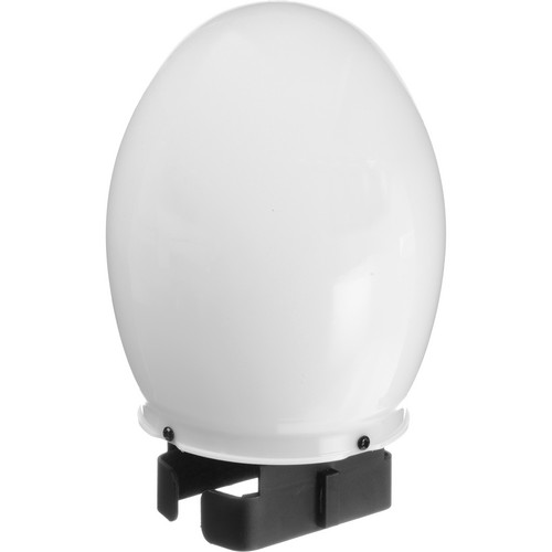
I've made several shots here, and all handheld and using LiveView on camera (not a good combination if you ask me). I needed the flexibility of framing, thus I dropped the tripod away, while the infrared filter (B+W 092) doesn't allow for inspecting through the viewfinder. Thus, I've found myself forced to do it that way. In lighting the scene, I've used a single speedlite (580EX II) with a bulb/oval diffuser which makes it act as a regular bulb somehow. My aim was to give a dramatic (close to low-key) look, thus I've used max shutter speed (sync speed that is, 1/250s). No cables here so moving to HSS mode was not an option.
Globe Diffuser
Source: B&H
In processing, noise always been an issue, even though I've used ISO 100. Some of the shots are out of focus and this is natural with handheld shots and using low f-stop such as f/1.4 and f/1.8. Thus, filtering our the images, my options were limited on which images I could process here. Eventually, I've found at least two of them; Preacher I and Preacher II. The reason for using such a low f-stop is the need to convey deceit and hidden motives, and thus keeping the dagger under the hand blurred and out of focus, while keeping the palm sharp as much as possible. At least, this is the theory I had in my head but applying was no easy task after all!

Selfies, Again

So, I took some time to shoot some selfies again using special filters, like infrared and UV-pass. It all started after a shaving session but then I continued the trend doing 3 main selfies using my main "surreal" filters: Infrared, UV, and H-Alpha. Stating that, H-alpha doesn't differ much from the infrared except that it allows more red. The infrared filter I used here though is the Kodak's gel filter with my fisheye lens (which has a threshold of around 1000nm).

Coconut Selfie!

The trigger to the series was this Coconut Selfie!, which I've decided to shoot right after shaving and dipping my face with coconut oil. I was aiming to find if there is any effect for the coconut oil on taking infrared shot. It was experimental really so there was no need to go hi-tech with it, so I've used the simple in-camera flash just to provide some infrared. The result? Well, not much really. The luster of the oil was barely visible and only with excessive sharpening to the image (and could be mistaken for digital noise as well).

UV Selfie
My second trial was with my UV-pass filter (B+W 403) with hot mirror on top to reduce the IR leak. Working with this filter had always been a hassle because of the nature of UV. I placed my 430EX II speedlite on camera just to provide some lighting but for sure this light source does not provide UV range. Using a wide aperture and a semi-manual lens here (Voigtländer 20mm) did not help that's why the selfie came out out of focus, and this is the best I could do. In this selfie though, I didn't try to dip my face in coconut oil or anything. It was a simple selfie. The good thing here is that my eyes are not glowing bright as it is the case with infrared shots which means, I suppose, that the hot mirror is doing a good job relatively for keeping most of the IR out. It seems brown eyes do reflect IR the most, but I'm not sure about other eyes colors. From simple inspection for portraits made with infrared filters online, it seems that brightly colored eyes like blue eyes do in fact absorb rather than reflect IR, and thus they become blackish in infrared shots. But this is only my suggestion I'm not sure what is going on out there really!

Daruma Selfie!

Daruma Doll
Source
The last selfie, is probably my favorite selfie in this series. I've called it the Daruma Selfie, after the well-known Japanese doll Daruma. This selfie was shot using the H-Alpha filter which actually acts like an infrared filter but with some surplus in the Red range. However, in processing this selfie, I've swapped the blue and green channels of the image, and that made the image greenish (with some white streaks in my hair). The funny looking billy is caused by the fact of using such wide angle lens (Voigtländer 20mm) at a close distance and slightly below my tummy level, and thus dimensions of objects near the lens are exaggerated (quite known trick in architecture interior photography). Again, no oil to be tested here, but still thinking of ways to use that in the future and maybe more creative selfies rather than boring ones like these.

Seachtain

"Seachtain" is the Irish for "Week." Seven days in the week, and seven images. All in Black and White. These were the rules of the little "game" which was posted on Facebook and I was tagged for the challenge. In addition to that, no shots of people, but only "stuff" from my daily life.
Despite the fact that I can hardly keep on such a challenge in a continuous way, but nevertheless, I've made it! I did take 7 images, one each day and to my own surprise, some of them are actually inspiring for me myself.

Day 1

Day 2

Day 3

Day 4

Day 5

Day 6

Day 7

Probably from all the seven, the last one does inspire me the most with its eerie atmosphere somehow. It inspires me to do something similar somehow in the near future, providing that I get a proper idea to work with.
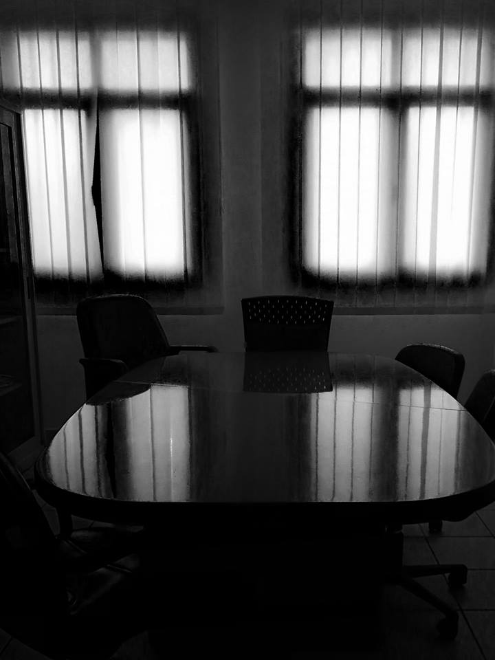
The challenge is unique and despite its simplicity it did put some strain on my brain. I had to think fast (because my day is full of things to do and with a tired body that needs some rest). Also, since all these images were taken with my mobile (Huawei Mate 9) it made the process somehow easier. My phone shoots in RAW but all these shots were done in JPG right away and then were edited on PC or Laptop. Doing all that with a mobile made the process flow easier somehow. I think doing it with a regular DSLR would have put some major block on my way or achieving it. Some of these shots were even taken at my workplace when I had no DSLR available. The quick usage factor is quite essential here and it is the main thing that pushed me to do what I did. Even though the mobile has its own flash, but I've never used it, which is something to think about for a while; One has to think whether or not the ambient light serves well. This was quite obvious doing my product shots for my nephew with black background. At the end, I've found myself using the ambient light and stopping all my speedlites, despite the somewhat flat look.

Finale

Now, there are so much going through my mind but little time and little power to chase after all of that. It's a good thing that winter is here and temperatures are down. This gives me a relief somehow. Sleeping problems though still persist and as days pass by I'm dropping my interests in life further. Not sure where life is going to lead me, but I'm hoping of some stress relief to arrive soon. Wishes of travel must be postponed now despite the urge. I don't know where my destination would be still, but I need to do some passport issues first and then think of something - who knows, maybe Ireland for a 4th time? Who knows… I'll keep dreaming about many places I wish to visit for the time being, till that time comes.

Stock photography by Taher AlShemaly at Alamy

Thursday, December 17, 2015

Schnell…

Messy, messy, messy. This is how my life is right now. Thus, this post won't be going long for the time being. Good thing is I'm doing some new experiments with my camera and trying to capture some still life, applying some ideas out of imagination so to say.

In the air there is a chance for another commissioned work, to be gotten via a friend. On the other hand, I'm surprised that the client of my first commissioned work (back in October) doesn't want me to spread my own work. The agreement first was until the calendar they are going to do is produced, I have to keep custody of the images. Now, however, the calendar is made and the client doesn't want the images to get spread. I'm wondering about the legality of such action since the rights of these images are not taken. I'm trying to consult some people in the "know" but yet no reply so far. In the meantime, I decided to make a glimpse about one the panoramas done for my first client! Well, this wouldn't count as spreading the image, would it???


This is one QTVR only (and there is a larger version for it). I'm planning to do more from this location on QTVRs, but it would need further work with composing a nadir stamp or logo. A somewhat lengthy task.

Kbir Qaddis Ġużeppi - BW

On the other hand, I've started the process of converting some of the new panoramas into B&W; mainly those from Oman and Malta, but the start was with panoramas from Malta, as it can be seen with the first one to experience that: Kbir Qaddis Ġużeppi. Under this impression, it struck me with a surprise that I did not even think or tried before, to do a QTVR out of a panorama in black and white! Most of the QTVRs Ive made or even those I've encountered personally online, were in color. Panoramas in black and white would probably give an atmosphere of what I like to call now: Jonathan's Style, in reference to Jonathan Boakes and his famous game "The Lost Crown." Probably the only problem here would be with the seam line between left and right edges of the panorama; because this was usually done by Photomatix in the tone-mapping process for the original HDR panorama altogether. I'm not sure I've turned this option on when processing most of these panoramas (if not doing them in Photoshop already instead of Photomatix).

My mind now is so busy with many ideas. Visiting some art events like the famous Den Gallery (here in Kuwait) and the 16th Theater Festival - these visits did spark my mind a bit and this what made me turn on the camera and work on bits of ideas (while abandoning some old ones). I wished to spread the results here today, but there is much to be done still and a long sorting process must be made to these images. I'm trying to extract every bit of possible angle for the set.

Time to post this and head to bed now… I'm not sure I want to see tomorrow though, but the only thing I want to do for tomorrow is work with my dear camera…

Thursday, June 2, 2011

Dancing Under The Rain...

A smooth week, in some ways. Nevertheless, it was not out of minor troubles that I hope they would be resolved soon. One of these problems is the delay in recording the Ayvarith text for Alexander's story. I'm going to restart recording in 32bit format (or sometimes called "float-point audio"). I've noticed some glitches when recording in 16bit, and I thought I might better use the 32bit format now. However, the glitches are still there. Some weird stops occur in the middle of the recording out of sudden, as if the mic do not catch any sound at that particular moment and then back to normal. Seems it is another memory issue with this "lovely" PC. Please note the sarcasm! Anyway, let's hope I go on with this project as it is weighing heavily on my shoulders now. I feel dull sitting without doing something about it and the least I need now is, a technical problem like this.

I've not worked much with my camera this week, except of a tiny experiment that I will explain later. Seems the vacation session is on, but nevertheless, I'm still working on photos from Ireland. I've remembered for a moment that there were two albums that I needed to complete; the sixth album and the black and white album (for the images from the sixth album). The process was slow but since I'm not working with my camera, I worked on boosting the process till finally finishing them off, and been sent already in a mass email message. The idea here, I think, is to create a turmoil of emotions in the eyes of the viewer by sticking the black and white version next to its colored-likeness. The gap in emotions between a colored image and a black and white version of the same image can be a huge one; personally, I do think it can be from a happy top then down to a melancholic one. Usually, the black and white images (majorly of landscapes, architecture) make a sense of mystery to melancholy somehow, because black and white is usually linked to history and old times (thanks to the history of camera developments). Anyway, the creation of emotional turmoil was not an aim from my side, but in the early beginning it was simply a notification of some image that I had different feelings for it, when every theme meant something to me, and from the moment I decided to make a separate folder for the black and white images specifically for these images in the sixth album.

Realistic with increased blackish tone reflecting the dramatic death I suppose.


Mysterious. Desaturated just before being totally black and white. Gives me an impression of Egyptian tombs and secrets of the past. It adds a sense of antiquity.
Cruelty of death. The plain truth and end. Black and white, no other options available.
I have to say that all of the three images are originated from a single HDR image which was tone-mapped and then enhanced in Photoshop later on. Please, if you are a purest and see HDR simply a toy and not an art, then remove this blog from your list. I create what my emotions tell me to do. Left to say that this gravestone is actually old, but not antique. It dates back to 1800s era, and most probably from the time of the Irish famine. Maybe the change in colors would create some dating way before this era, so I have to state this. There are other graves around Cashel town, in Co. Tipperary, that date back to the 1700s and even 1400s. This town has a fermented history scent to it.
Finished now with these two albums (which you can check them out here and here), and started already a seventh album for pictures around Co. Tipperary. Frankly, I'm not sure what will be there, as it seems I've used all tricks in my sleeve. The choices I had in Tipperary are not as much as those in Galway in 2009. Probably because I have a passion to the water and the lake there more than simply farm lands. However, each one of them is fascinating in its own way.
The picture that started the album made a nice catch for me in two ways. Two things that I've achieved by coincidence with this image. Well, not really achieved, but noticed by coincidence.

Tower in Vane
A tower in Cahir castle in Cahir town, Co. Tipperary.

The story of this image can be listed in two points:
  1. In the beginning, this image was merged into HDR. The bracketed sequence was not catastrophic and I've noticed some nice portions of each slide of the 3 images composing the HDR; mainly, the -3EV and 0EV brackets. It wasn't until later that I've realized that a bracket of -3,0,+3 does not necessarily make a good bracket for your HDR. However, I've tried in the beginning to set the images into layers and trying to substitute the layer masks around, trying to cover some portions of here and there to give a nice tone for the overall look. Didn't work. Tried merging into HDR within Photoshop, but as usual, Photoshop has the archaic problem with memory requirements when it comes to such operations. I had in my mind some manual tone-mapping because the image with its natural look is nice and I don't need to add weird tones to express my emotions, at least for the time being! Anyway, I had to merge in Photomatix and save the file into Radiance format (.hdr) and then open it back in Photoshop.
    After opening in Photoshop, I worked with an adjustment layer of Exposure and fixed some shadows and some highlights manually without harsh effects, and with a soft brush. After that was done, it's time now to the real manual tone-mapping and converting into a 16bit image. This was done also without grand breaks in the histogram curve, just darkening some portions and lightening some others a bit further and so on. Cool so far.
    The thing that I've noticed here is, the noise level is way below what I'm used to see when I tone-map in Photomatix. Does that means Photomatix is responsible for ADDING a certain noise level to the image? I was technically satisfied with the level of the noise when I zoomed to 100%, but for the sake of some sharpness, I ran NeatImage with "slightly blurred" profile in use, to make the image slightly sharper. This noise level notification makes me think further of how should I do things with HDR. This comes at a time that I'm indeed trying to reduce my "HDR intake" and depend on the best shot I can get within a bracket and adjust its RAW.
  2. Then there was a surprise. The trick that might solve my problems with color spaces. I've always wondered about the difference between "Assign Profile" and "Convert to Profile" under the Edit menu in Photoshop. Seems this made it clear to me, somehow, or at least I know what to do next time I work in ProPhoto space and preparing an image to be uploaded to some website that doesn't identify such a color space.
    The whole thing started with me, by mistake, using the Convert command, instead of the Assign command. I've converted the space into Adobe 1998; the usual. I've noticed that the colors didn't change or coming dull as it usually happens. I've undone the command and used Assign this time, and the colors were put down. The sky you see above, literally, turned purple-like and the image was darker. I've undone this command again, and used Convert to convert the image into Adobe 1998, and there was no change. Now, checking the general space of the image yielded Adobe 1998 indeed, but the looks are those of ProPhoto space! Awesome! When the image was uploaded to some websites, there was no change in colors as it happens usually. Great! Now, I have to keep a mental note:
    Assign: moves the whole set of colors into the destination space and putting down those out of range to some specific limits.
    Convert: converts colors from one space to another (and tags the image with the space of the destination) while keeping its visual looks as much as possible.
Back now to my tiny little experiment with my camera. I did that yesterday in fact in a hurry, but the results were as I expected. I was able to turn the light on and off "digitally". I did this experiment before (in the bathroom) but the results were not so good for various reasons, but now I can say that I've did it.
This time I used a desk lamp, and I made sure that the light bulb was transparent and not translucent. I think the translucent characteristics achieve some kind of diffusion in the light coming out of the tungsten filament inside and that might give me hard times. However, after fixing the setting, I shot several bracketed sequences in the range of 2-stops only (-1,0,1), and then moving the sliders all the way from -7EV to the max I could get (6EV). Tedious, yes. All of that was to ensure a smooth transition in the luminance data when the HDR slide is to be done. With any sudden cut in the luminance (can be checked in the HDR histogram) then I can say my experiment would fail and I can't "turn on or off" the lights as I want.

The histogram after merging the RAW shots (Photomatix)

The shots were all taken in RAW format of course, since this format keeps as much data about the scene as possible. When merged there were some messages about a duplicate exposures (i.e. some files had the same EV value), so I had to drop down those and merge the different ones only. The histogram above is concentrated in the middle of the graph (a good sign) and without any severe cuts on the sides or in the middle, but there is a smooth transition. The thing I'm wondering about is, why there is 2 peaks in the graph? The only explanation I could think of is, probably, the right one is corresponding to the luminance level of the light bulb itself, while the left one corresponds to the luminance of the cone or the reflector around the bulb.
I've saved the HDR file and opened in Photoshop just to play around with the exposure and test the turning off and on of the light bulb myself, and I can say I've done it! All I had to do is play with the exposure slider at the bottom...


Recorded from my own monitor after a struggle! However, notice how the shadows form inside the cone around the light bulb, and also, when the brightness go extreme; it looks real on the monitor even though the real setting and scene did not have such view or level of brightness. Seems it is embedded within the HDR image the data to predict the luminance of a certain scene behind the real limits of the scene itself at the time of the shoot.
Don't you get the feeling that this bulb is dimmed by a real dimming switch and it's not an image on a monitor? Personally, I got that feeling. This is the power of HDR. Real HDR and not tone-mapping HDR images. This makes me think about possible and interesting uses for such criteria and if there is any way to simplify it. It is this tool that can make you a super visual artist. Visual digital artist, if I should say. You can control the light as you like, all what you need now is... imagination.
Of course in this rush of joy with such results, I couldn't resist tone-mapping and uploading such an image of this beauty bulb. The tone-mapping here though was a mix between the Photomatix and the manual tone-mapping in Photoshop (because Photomatix produced high noise level in the black area around the cone and I wanted to remove that). Add to tht, some few hue changes and contrast addition.

Tone-mapped tungsten bulb
On the other hand I'm busy reading my books and Amazon is waiting for a review. Writing a review for something I have is like a duty to me, and that makes me stressed little bit. However, the two books are bout portrait photography (which has loads of technical information about light and tools), and the other is a book by George Barr; Take Your Photography to the Next Level. I have to say that this book made a jolt to my mind somehow. I'm walking around places and trying to figure out patterns of lights and lines that usually don't get my attention enough. The book has practices on how to THINK as a photographer and what to SEE as a photographer. The book is also fun to read as the author has his own sense of humor!

Take Your Photography to the Next Level: From Inspiration to Image

I've been pushing my mind so hard to write something. It is a damned feeling to have a lot of emotions to talk about yet, you can't express or write them. I was thinking of some lyrical form but anyway, I created a simple thing just to get myself satisfied, thinking that I did something at least. I called Dance Under The Rain. Maybe it's my way of saying "Screw up the world." Who cares anyway...


Sunday, August 15, 2010

Alexander 6, V123.

That was amazingly fast. Just when I've submitted some images for approval on Canstockphotos, 30 minutes later you'd see them in your portfolio! I was reluctant about those images though, well, mainly the house, because some times you are asked to get some "property release", which is like impossible in my case here!

It was not a completely idle weekend, yet it was not so active as well. At least, I've tried some stuff with my camera. Unfortunately I didn't upload the image on the net to be used here for now, but if it is accepted you can see it easily in my portfolio on Canstockphoto (and it was also submitted to Bigstock).
The whole story began when I found out that I was simply... idle. The idea sparked when I discovered that I still have a RAMs chip in my backpack (when I was looking for some papers). This chip was taken from my sister's laptop when I changed it for her in some workshop, upgrading her laptop from 500MB RAM up to 2GB RAM. I kept the chip since then and when I found it, I've put it aside to give it to my elder brother. He knows what to do with such stuff. However, after looking at my camera and tools, I realized it might be a chance for one techno-shot. Something I rarely do. I shot that thing with the help of my humble soft box, but I didn't fix any lights around it, except of the room's light. It was merely just to provide a white background. I used my 18-55mm lens, since I don't have a macro lens. This lens is my choice for close-up shots. I think I've fixed it on 55mm (max) and made the shot. I've made the chip standing up with a piece of toy clay, which was then removed from the image by cloning. Not a good solution though, I should've thought of something else. However, a macro lens, I believe, would have delivered a greater result, specially I'm using a shallow depth of field to give some sense of greatness or length to the chip, but well, this sense might come better with a macro lens as well.
I've made several shot under ISO200 and ISO100, but found out that ISO200 are better because the background was brighter and the chip stands out more. All you have to do then is just clean the noise with NeatImage, which I've calibrated to my camera long time ago. The thing I was aiming at (which was not a good option but worth a trial), I was trying to make a focus stack of 2 images, to sharpen the front and the middle areas of the chip and leave the tail blurred. Then comparing the results from focus stacking and the normal frontal image, I thought a single shot was enough to make the effect better, and no need for focus stacking. I was concerned for focus stacking mainly to show some details of the chips in the middle. Yet, turned out not so important I believe.

Beside this simple experiment, I kept on playing around with pictures from Ireland, and been changing some of them into Black and White or Sepia and see if any effects or mood changes occur. It was not until that moment, I realize the beauty of that one house I snapped from the motor boat on my way to Inchagoil island on Lough Corrib. It was something about its simple design that makes you feel peaceful. I don't know what is this house, is it just a resident or some B&B! But its view was simply fascinating! I want a home like that one day...

House on Corrib

The image to this house was added before to my collection but here we have mainly 2 different features about this image: a) it's a close up (and hence I didn't realize the beauty of the house before), b) it is made directly from the RAW file without any HDR enhancement, but only RAW file editing; in other words, no more than one exposure snap.
Realizing how beautiful this house looks, I tried to change its colors and I was surprised by the mood change that it gives me. Well, not really mood, but let's say an "inspiration" or "thought" solely by the change of tones in the image. The first thing was to do is to change this into Black and White with the help of adjustment layers (and not converting to greyscale mode).

House on Corrib (B&W under High contrast red filter)

I tend to use the "black and white" adjustment layer instead of converting into Greyscape mainly because of the options available here, which I can do manually originally from the RAW file itself, but I wouldn't be able to master this yet. Plus, my workflow forces me to use such adjustment layers because in most instances, I do need to save the colored version as well for some purpose before working in B&W. Here, I used the High Contrast Red Filter from the ready-made schemes in the adjustment layer itself. This image gives me a feeling of mystery rather than old or antique. Maybe the high contrast in black and white enforces mystery rather than antiquity. We could be on some theory here! Maybe also that this mood is highly influenced by Jonathan Boakes photography and games! Thinking about that now, this black and white with such house design do really reflect the nature of ghosts and hanuted houses. Maybe I would try to add a bit of bluish hue to the image and see how does it go as well.

The next thing to do, normally, is to add  tone to this image, naturally the sepia tone, which was simply added by Photo Filter adjustment layer.

House on Corrib (Sepia).

Now this image does indeed make me feel it is old, and I think the design of the house helps out with it. Sounds something Victorian. Add some white edges and burn some corners and do some tearing on the sides, and voila! you got an antique! It's hard to say any other thing about the sepia tone except that it turns things old. I rarely felt something different about it. Well, maybe it adds a bit of hot hue in some scenes and give an impression of some hot weather.

In the current time there is another little project I want to do with my camera and my dumbells set, but I'm thinking of the settings that I need to fix before the experiment and how to make the dumbells look like flying into the air. I need some help from another person, which unfortunately, is not something easy to do, not even among my family members in the house I live in. But there must be a trick to do everything by myself, as usual. The final product should be something in Black and White as well, and probably with silverish hue added or maybe bluish, depends on the lighting with the flash, since I'm still not mastering that yet!

Now, to some jokes around this place. One week and my watch is still not fixed. C'mon for God's sake!!!
__________
2929. it was then some moments later after the meal is over
2930. Alexander noticed that the old man was in deep thought
2931. thus he said: what is wrong O great grandfather?
2932. your mind seems quite busy as it seems, is not it?
2933. and Agdalán replied: yes, my dear, it is indeed busy,
2934. I am thinking of your ways after you leave this place,
2935. and I think the time has come to give you something
2936. and Alexander asked: and what is that O father?
2937. Agdalán raised up and went to some old wooden chest
2938. and he opened the chest with some large old key
2939. the sound of the metals in the chest were out loud
2940. testifying for the age of this old chest and its history
2941. Agdalán picked something from the chest and closed it
2942. he approached Alexander and opened his palm in his face
2943. the palm of the old man had some weird metals in it
2944. small pieces were they but shiny like the diamonds
2945. Alexander looked with surprise and said: what is it?
2946. Agdalán replied: these are what we call Kalfúd Sámith,
2947. it is the remains of an old stone that came down from Heaven,
2948. they are more precious than gold itself or silver,
2949. this is the inheritance of my fathers, it is for you now,
2950. take it and make a living by them for now for you need them,
2951. since you have no source of living in this world by now,
2952. and I do not want to see you wander as a nomad


Thursday, August 5, 2010

Alexander 6, V117.

Well well! What do you know! It's Thursday! TGIT!
I won't waste much time here writing, since I'm going out of here so soon, but just few updates follow.
I've finished reading one of the books just now. That book about geological matters and fossils. It's an amazing journey really. Also, I'm about to finish reading the other book, Alain Briot's book. The discussion at the end of this book is so fierce with so many marketing and financial issues. In the meantime, I try my best to understand how the print works and quality issues, after printing several panoramas now with my simple HP Photosmart inkjet. Small panoramas, nothing serious really. Yet, some ideas and visions visited me while reading about marketing issues in this book. Mowahaha. Ahem...

However, finishing some books doesn't mean I'm totally free. I got another list of books at hand however. Anyway, their time will come.
Not much photography or photos to be processed as for yesterday, but seems people are more in love with the black and white images. One of those was in fact a slide in a panorama, but I had to take it out separately since the panorama to be processed was not good (due to some shaky images).

The Path to Aughnanure (or to Oughterard)
A slide from a panorama

Doing things in black and white gives you a sense of documentation really. Something very important being documented. This is what I feel.
Bigstock refused some images, well, it was not a surprise at all, but anyway their reasoning was acceptable at least (unlike other websites). Some of the images could use some adjustment and re-submitted even, while some others are not of interest (to them). That's fair enough for me.

Had some time to write something new, in a haste, after some imaginary story that I've made in my mind. Well, it is imaginary for me, but who knows, it might be true for others who lived in such situations; losing someone by force...
I called it 1945, signifying the end of WWII. No need to link it I guess, unless you would like to check the rest of my profile which I guess won't interest you anyway! Thus, here go the words...

1945

Was it, or was it not,
a rainy day, when I met you?
Everything was so fast, so quick,
so much I didn't notice, but you.
And then, you held my hand, Martha,
a hug then I felt, no end was for it.
You passed your hand on my cheek, Martha,
and Aufwiedersehen Geliebt you said.

Oh, the Nazis are gone,
so well the Soviets.
No Normandy now or then,
no explosives.
The two are one, Einigkeit in the sky.
The banners are here, all fly so high.
Been ages now, since that time,
Do you hear my rhyme?
Oh Martha.

Then you slipped into that train,
to somewhere, far away from Dresden.
"Wohin Geliebt?" I said so in vain,
and the utter came on with "Zu Leben".
"Freiheit" they're singing now, O Martha,
and not many of them know you.
But I'm here always and you know, Martha,
and an Ave I'll always sing for you.

Oh, the Nazis are gone,
so well the Soviets.
No Normandy now or then,
no explosives.
The two are one, Einigkeit in the sky.
The banners are here, all fly so high.
Been ages now, since that time,
Do you hear my rhyme?
Oh Martha.

Sure we'll wander high,
O Martha.
In between the clouds,
O Martha.
Just wait not so long,
I'll follow you along,
O Martha.
__________
2785. he saw huge collections of books and papers
2786. time forgot about such objects long ago
2787. and the dust filled the air with the smell of history
2788. Alexander with a surprise said: what are all of those?
2789. Agdalán answered: these are records of history,
2790. history that expands for thousands of years before you,
2791. everything people made and everything they invented,
2792. every move they made and every battle was made, all here
2793. Alexander said with a surprised tone: should I read it all?!
2794. Agdalán giggled a bit and said: no my dear, this is to see,
2795. your Charnagút was the key to all of this history,
2796. a history that will one day be spread again on Daynur,
2797. when the people and the the tribes are ready for it,
2798. your sword is the key to this history, assigned by the fathers,
2799. the sword had been moving from hand to hand,
2800. father to son, from son to a grand son, until you come,
2801. your time was a time when Ayvars got mixed with others,
2802. and thus you became a Caqobian, but with an Ayvar blood,
2803. you are the answer for the prayers of my fathers and myself,
2804. that one man from our lineage will unite Daynur again and do good,
2805. thus, God answered the prayers and now you are here to see,
2806. your own history and why you are here my dear,
2807. and for your own goodness, these secrets are for you now,
2808. you can do whatever you like to do with them now


Monday, August 2, 2010

Alexander 6, V114.

Three days passed now and the air is still humid. Yuck! I can't walk outside without taking off my glasses just to take a glance in front of me! When does this all just be over?
A slightly busy day here in the office, with some stranded sample showing in and had to be prepared like the others. Boy, I just can't stop listening to Phil Collins all the time; eating, working, reading, sleeping. I've noticed that most of his songs were written completely or partially by him, and that proves the genius behind this head to write such touchy words, to me at least, where every song I hear seems to be telling a phase of my life in some sort of way.
Speaking of songs and words, I do have some light into this brain for writing something but so far, only few lines were done and the rope was cut and I got blank. In my work place I barely have the time to write now. All I do is read and read (after working with my samples) and then, I have plans that I must accomplish for my Ayvarith that stopped now for some unknown period of time. Ramadhan is coming on the way by next week, and the schedule would be, definitely, so clogged, that is if I was able to do anything at all. The working hours are shortened in Ramadhan, and despite the fact that I do come here so early even in Ramadhan when the working hours begin later than usual, there is still the tiresome time, and most probably, the nap that I must take in the office, and at home as well afterward. I think no need to do sports and burn calories with a busy mind like this and clogged time table like this.

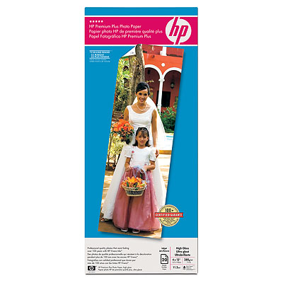
Today, as usual, I went on picking something to eat for breakfast and also I had a look on some speciality printer paper. I was looking for glossy papers to try out and print my photographs at home with my regular inkjet. When I asked about the possibility of this, since I know nothing about printing and the methodology, I've been told that I have to look after a glossy paper made up by the same brand of my printer. Thus, I went on looking for HP glossy A4 papers. I got glossy ones now but unfortunately they were not A4 size, but nevertheless, I had them. I thought I might be able to print small photographs with those now. The thing is, they were long papers and not in a regular shape. They were 30x10cm (WxH), go and figure how many inches please! However, after arriving to my work place and taking another look at them, I've discovered that they were specifically made for panorama, as indicated on the cover! Well, what you know, another spark of light in this brain! Why not! Let's try printing panoramas with this! If it didn't work anyway, I think I can make one sheet of those print 2 images beside each other and we're done.

On the way as well and before I leave the place, I've fiercely resisted my temptations to buy another book from there. I already have dozens of books I need to read. The books I got from Ireland last year were not touched so far; lot of them. That book however, was about face reading, and I like such wisdoms. I do have some books though, but one more wouldn't hurt! Yet, I had to give up. I hope it is always there to grab it when I need to or when I have the time to.

The Wisdom of Your Face: Change Your Life with Chinese Face Reading!

Talking about the glossy paper and photography, brings me back to the origins of everything that this blog has been about for big time now, away from the Ayvarith. Photogaphy.
After failing with my experiment with that high monopod approach, I didn't really think of something else to do, except of sitting there and fix some images from Ireland. I've found myself doing things in black and white again, primarily because the colors, even though beautiful and unique, I felt them distracting my eyes more. Like that snap of the little path in the little forest in front of the Waterfront...

Little Forest Path

This slide was in fact part of a panorama. After checking the photos since my arrival from Ireland last year, I've discovered some images were shaky and not suitable at all to be combined into a panorama. I've re-visited that specific folder of this panorama and I got this slide out (one image from three brackets) and worked on it for some time trying to enhance the contrast and the green glow with the beam of light from the sun. Unfortunately, it hurt my eyes more than it did give pleasure to them. I think this is mainly because of the composition that made a fuss from such a beautiful and calm place as a whole. I do remember the fragrance and the calm atmosphere in this place, yet my photo was noisy. Needless to say of course it had that "real" noise which was hard to be cleaned and smoothed by regular methods. With all of that, I've decided to go on and make it a BW version, with the addition of some contrast of course. I tried as well to make it a sepia, but I didn't like it as much as the BW version. I didn't ask many people how they feel about this, but to me, it feels like a fairy tale (like the original colored one) but the place is lost in time.
Again, I didn't stop here though, and picked up some number of photos trying them in black and white, and found one more that might be fitting as well, and it was colored and I've published it as a colored one as well, some months ago.


In this photo, I think the whitish part of this flower (is it the Dandelion by the way?) is better emphasized (I guess) in the black and white version, rather than colored one. Why I emphasize the white? Well, I believe for this specific flower, the white tone is the core of the matter, or like this flower is telling everyone "Hey! I'm white!", and to let this flower speak the truth and not lying about her existance, I made her that way instead of being a bit yellowish originally!!!

Reading now, still, Alain Briot's Mastering Photographic Composition, Creativity, and Personal Style, and combined with my BW trend lately, I've came up with a sort of an idea after reading the specific chapters in this book about vision and personal style. It is the beginning anyway and it is not the fingerprint of my style however. I still don't have a style yet. But in his words, Briot inspired to talk about my life in pictures, and when the word "life" comes, I usually picture it in black and white always, because history (which is a topic I like to read into from time to time) is something usually old, or frozen in time, and BW images reflect this idea better, or sepia tones as well. First, I have to settle down this project on paper. I shall write notes about what I do want to tell, and what aspects of my life I'm talking about. Definetely, there would be some rebull in it!!! This is one undividable part of my existance! My plan is to create 10 images to tell the course of my everyday life. Why I shall be doing this project, is something behind my comprehension yet. I think merely to talk about my life but I'm shy to say it in words, so I left pictures talk about me. I shall try as well, to make them as much as possible fit into one image only and no panoramas.
The words about concepts and ideas of Briot in his book, also made me think about some aspects of my life and what do I think about them or what is the philosophy I hold for them. One of these things were actually women. Well, I'm a man so I guess it's natural to talk about women, and photographing women. I'm not a portrait person as yet, but I think, or let's say, I made a belief for myself here, that the first thing I would look at in a woman is her face. To me, this is the center of her emotions. I believe also that 50% of the woman's nature is held in her face, and the rest of her body holds the other 50%. Maybe some men like the aspect of sexuality in a woman and her body, but to me as a man who got raised big time under the presence of a mother more than a father, I do believe that the face tells the real emotions; the passion. Whether than a passion for a man or simply a mother's passion to a child, I believe it is there, in the face. More specifically as well, the eyes of a woman are the first catching factor to me, hence I've been editing the eyes as the first thing, always, when people send me their photos to "enhance". Maybe I had hard time in college days with females, but I always considered those as merely, out of the line or bad products and should not be considered females really. Maybe my next book shall be something about portrait photography...

__________
2713. and Alexander awaited for the words from Agdalán
2714. thus Agdalán started his speech: listen O good king,
2715. it is the time when everything should over and finish,
2716. for my life for now, until the day of the great judgment,
2717. tell me O Alexander, do you know how everything started?
2718. Alexander replied with a weak voice: no knowledge I have
2719. and Agdalán went on saying: In the beginning was the mind,
2720. from the mind the lights were created,
2721. then God commanded the mind,
2722. go! He said, and so the mind went
2723. come! He said then, and so the mind did
2724. thus, God announced the Mind His beloved
2725. thus, He shall judge by it and command,
2726. and by it He shall reward and punish,
2727. thus by glance of the light of the Mind,
2728. He made a burning sun, and a ground,
2729. He called the sun as Sun, and the ground as Earth,
2730. thus He started the life with the bless of fourteen lights,
2731. and He made various peoples to meet each other,
2732. and among those people there was the Ayvar,
2733. a man who conquered and ruled over the world,
2734. and he called the world as Daynur as he wished,
2735. while people lived in wisdom and riches in his time,
2736. until the time had come for him to die, like everyone