Showing posts with label prophoto. Show all posts

Thursday, April 20, 2017

InfraVideo…

After having a vacation from almost everything for one week, I think it is time to pin down this blog, even though it is hard for me because things had been drastic a bit lately and my mood is in great swing lately. However, I'm trying to work on some stuff and I will try to post about some of my thoughts here. I wasn't going to type it but it is due after leaving it for a week!

Meanwhile I'm working on various things, mainly videos. It's just getting interesting with me exploring various filters and recording videos from my car as I used to do in the old days (with my small car back then). I'm working on that slowly and I've learned bits of videography already, but sure not like a professional anyway; I still don't have a shotgun mic even! But before delving into these videos, I've prepared a video some time ago for a hypercube (a.k.a. tesseract, 4D Cube) toy which I've created using playing straws.


The object is made by interlacing 2 cubes of straws and then connecting the corners, which was not to be done without bending the straws making what it looked like circles when viewed from the sides. I've created another model but it was not successful like this unfortunately, where 2 cubes are fit one inside the other, but again because of the bending in connectors between corners, the view was not "organized" so to say. Meanwhile, I'm trying to build a model of a hypercube using wooden pieces and some kind of glue (tried Tack-It already but didn't work properly). I'm planning to use such models for future photographic missions if possible. I might find inspiration there.

On the other hand, I got back to my habit of doing videos while driving but this time using filters to see the general look. surprisingly, fitting the tripod inside my Pajero is harder than fitting it into my small Seat before, probably because of the differences in design. My first trial was with B+W 092 infrared filter which has a threshold of about 650nm (or it might be 700nm). Such filter is supposed to let some color in when processing the images.


I'm showing here the video without audio track (meh, useless!). Luckily, the camera didn't flip with the tripod inside the car as I was roaming around. Hope you enjoy the marvelous views of how cars and trucks act like marbles thrown randomly on the floor! One of the concepts I've learned online about videography is that you must keep things in manual (to be more professional). However, in this video above, I've let things be automatic. I've used Voigtländer 20mm lens here which is semi-manual, thus I'm not sure if the aperture did change during the recording. Anyway, shutter speed and ISO are surely to be changing depending on the lighting conditions in front of the lens. I've increased the EV to +1 to be on the safe side while recording but I ended up reducing the brightness and adjusting the contrast because of that when editing the video in Photoshop (yes, Photoshop). I was dedicated though to record a video without any automated process, and I'm not sure if this rule would really be applied or could be applied to special video recording like this one under infrared filter (or UV). Anyway, I did it!


To shoot this video though, I had to change the settings for the tripod as well just because I changed the filter, since the filter is a gel filter which is placed at the back of my Canon EF 15mm fisheye lens, and thus I had to re-fold the tripod in such a way to get the camera to the front more to concentrate the view on the windshield as much as possible.
The filter in the second video is Kodak's infrared gel filter with threshold of 1000nm. You might notice how it looks more like a night vision video clip, but it was really shot in morning time. In this video, I've used complete manual settings and I had to make a compromise. The smaller version of the video here might look "clear" somehow and smooth, but the original had a significant noise level apparent while watching, since I was using ISO 4000. I had to reduce the f-number down to f/5.6 or less while fixing the shutter speed to 1/50s. I wanted to shoot at f/8 or f/11 to ensure the depth of field but that was out of question. The shutter speed here is related to the FPS rate which I've picked at 24fps, and according to some rules of thumb from the literature around the internet, the shutter speed should be equal to: 1/(2 x fps). But this point is actually sparking my interest and I want to try slower shutter speeds if possible to see how the video would look! However, probably these rules of thumb in the literature are more confined to normal video shooting and not for such conditions with special filters applied! There are a number of points I've noticed in this video though which I didn't really see in the previous video shot with B+W 092 infrared filter of 650nm threshold:
  • Some trees are bright and some are dark, so I think some plants were reflecting IR indeed and some were absorbing IR, the despite the general lack of sunshine!
  • Some car lights (brakes or signaling) were brighter than they are in reality! While some signaling from some cars didn't show up in the recording at all! I think this is related to the IR issued in each bulb type, maybe?
Away from the noise level which is somewhat annoying for me, I think the results were fascinating actually; to see a real difference in the light levels and light receptions between a video in IR and reality!
In the process, I've realized that whatever color space the camera is set to, the video is in fact recorded in sRGB. When loaded into Photoshop, it will adapt to the default working color space of Photoshop (which I set to ProPhoto) but the rendering of the video would not be "fit" if I can call it so. The colors would be so saturated and working around that is a tedious task (if it can be fixed anyway), and thus working with infrared videos I have the habit now to convert everything to sRGB first. The vivacity of the colors are not pretty much required anyway as much as it is so when working with HDR slides and tone-mapping in regular images, as I usually do!

Finale

I'm passing through some weird timing here as I'm slowing down the pace of my work with the camera (excluding the videos). I had to withdraw from the project of April within the group. After getting sick and getting slow recovery (some coughing remain though) my body and mind are not functioning well together. Despite the relative easiness or commonality of the topic for April's project (shadows and reflections), yet my mind could not come up with a good idea to perform or try.
with Ramadhan getting closer, it seems more likely I'm going to sacrifice some days from my leaves balance, and take a leave during the month or most of it after experiencing it last year with summer semester rolling in and record heat struck back then. I'm not ready to experience this at all. I'm not sure that I will be able to travel anyway but I was hoping for to more days in my balance instead of spending some right now. I have to pick the starting and ending dates still which I cannot decide and settle with yet.
I'm feeling detached, and working on detaching myself further in fact. I need to get back to my activity before. I think being a member in a group is slowing me down for the time being. When I see the number of experiments with my camera in the years before and after joining the group, I clearly see that I had more experimental work done before. Not to say they are good pictures, but I used to work, and work... I was in mood to work with my camera, as well as other projects, like my Ayvarith and other conlangs. As I'm reading more books about Arabic phonology and language to get more educated about my own native tongue, I get even more eager to work with conlangs, but yet I have to find the time for them…


Stock photography by Taher AlShemaly at Alamy

Thursday, August 2, 2012

Ahoy!

One weird week. Sad, terrifying, and weird. A mix of feelings that doesn't taste any better, but bitter. With this week beginning, on Monday specifically, we got the shocking news of the departure of a cousin in a car accident. He was 18. A memory glimpse passed through my mind, of all the times (even though short) when I had this boy in my lap.With all the sadness, there is a feeling of being lucky to be 32 (almost), and sad again to know such time passed, and sad again to know such a young fellow passed away, and terrifying to know death is lurking. Death, has no alarm clock.

I've finally finished what I was waiting for; the visa interview in the US embassy here. Easily done even with sort of a long wait. I just have to wait now to get my passport back (via DHL?). On the other hand, I didn't book anything yet; not a place, nor tickets. I better work little bit on this soon. Also, I need to plan and figure out how I'm going to move my camera and other stuff with me. It will be a heavy load for sure.

I. Cool me down:

Still struggling with long exposures, and realized now that the weather is one big challenge. With this heat (38oC~43oC at night), it doesn't matter if you take a Dark-Frame exposure and subtract it from your shot, the noise will remain a big issue still.

For those who don't know, a Dark-Frame exposure is an exposure that can be done by the camera before recording the data of the image and it is simply an exposure taken at the same time period of the original shot with the shutter shut, i.e. doubling the time of taking the exposure. This Dark-Frame exposure can be done separately by the photographer, simply by capping (closing) the lens and running the exposure and it will be saved as an image. In Photoshop, this Dark-Frame image is blended with the original shot in Difference blend to subtract the noise. I prefer this method because I can keep the image file for later uses when needed. One issue though, the Dark-Frame exposure must be taken around the same temperature.

Now, with my latest shot that took 33 minutes, I've realized that the Dark-Frame method won't do here, specially with such hot weather. However, I did some trials on cleaning the noise with a free software called RawTherapee.

33 minutes
Canon EF-S 18-55mm @30mm,
f/22, 33 min, ISO100.
Now, away from the technical talk about what RawTherapee did here, just don't be fooled for the smoothness of the image here. It is just minimized, hence the noise effect is not apparent (click to enlarge and yet it is relatively smooth). The exposure itself was dark, I guess I was fooled by the LCD, and I've totally forgotten to base my judgement on the histogram.
However, there are certain mistakes done here that I have to pay attention to next time. First of all, the rocks that were apparent in the beginning disappeared later because of the overwhelming tide. In such darkness, there would be no trace of them at all except of few dark spots beside the main rock (or crag?). Secondly, I should've counted for the advancing water, as I almost got my camera dipped! The advancing tide could have even shook the tripod slightly (even with its excessive weight). Thus, it is better next time to stay away as much as possible for the line of water and zoom the lens if possible.

RawTherapee played a great deal in reducing the noise after all and frankly I didn't mingle much in it because there is a conflicting interest. As much as I wanted it to reduce the noise in my RAW file, as much as I want to edit my RAW in ACR. RawTherapee has all the controls but they are not as flexible and user-friendly as ACR is.
Anyway, one particular option in RawTherapee that was unique, which is the ability to load the Dark-Frame file into it and it will work out the subtraction (even better than the Difference blend in Photoshop). Thus, I've uploaded the Dark-Frame which I did at 33 minutes as well but at home after coming back from the beach (in the balcony) and RawTherapee used this file to subtract the noise from the shot. Despite the relatively good results, there would be still some noise that were hard to remove with any removal plugin like NeatImage and Noise Ninja.
I've realized and remembered how the noise was a lesser issue (but still an issue) when I did a long exposure at the beach in one winter night. Thus, I've decided to take a different (and a serious) measure to reduce the effect of the heat on the sensor.

The Experiment:

Simply put, all what we need is to put down the temperature. This said, I've just got the light bulb upon my head glowing while wandering in ACE store (don't you love this place?). The idea struck as I wondered in the aisle of camping stuff (well, I was originally looking for bubble wrap, but who cares anyway) and remembered the stuff we used to put in our iceboxes when we used to leave for field trips with my work place staff; cooling gel.
Back home mom got some of those gel pads. made for medical uses, in the freezer and ready to be used. Directly after going back home I've decided to do something with those and see the effect, and I guess I wasn't disappointed. The only one thing left here is to put it into practice and see for real.
My experiment was simply to use those frozen gel pads on my camera to cool it down, and for comparison, I've ran the same long exposure of 33 minutes with the pads on.

100% zoom crop of the two slides (warm & cold)
Click to enlarge.

I think the result is astonishing. Just to avoid any wet drops on the camera that might come from the ice on the pad itself, I've wrapped the camera slightly with a plastic bag. Now, that was not the end of the story. As I was trying to make this image above for comparison, I was going to Assign the color space to sRGB (why would I use ProPhoto here?) and by coincidence I've picked Adobe 1998 space and the noise was reduced significantly too! However, sRGB noise profile was much like ProPhoto but with less saturation maybe?

Both slides are on Adobe 1998 space
sRGB slide was converted (not assigned) to keep the visual look as it is in sRGB originally

Anyway, seems this reduction in noise is only apparent or visual, as some pixels do change their color code but not really eliminated as it is the case with Dark-Frame subtraction. Now, why the noise in sRGB and ProPhoto are almost the same, yet Adobe 1998 is lesser apparently, is something beyond me for the time being.

Just to recall the color spaces and understand why it is a surprise for me, the sizes of the spaces are ordered as the following: sRGB < Adobe 1998 < ProPhoto; with ProPhoto giving more flexible adjustments and more vivid colors, as it is more forgiving. Logically, one would expect if ProPhoto is high in noise level, and Adobe space is lesser, then sRGB should be lesser too, but this is not the case apparently!

This experiment is done for now and only a real work is needed to celebrate it! But that means more work to be done in moving my stuff to and from the location. If only there is someone to help, or even cares for what I do...

II. Digging The Past:

Now with DxO Optics at hand, I've discovered new capabilities (far away from the simple Photoshop) and that sparked in me the urge to re-discover the past images, specially those from Ireland. Also, I've been visiting these images again to post them to my Flickr and share them in groups.

Cashel Rock Graveyard
Canon 15mm fisheye, f/2.8, 1/800 sec., ISO 100.
 Corrected with DxO Optics

The joy of working with DxO is to be able to correct those images taken with Canon lenses automatically (and also those taken with Tamron 70-300mm, with many others of course). However, doing all the adjustments in DxO is not that easy still because of some... I don't know what to call it but let's say complexity of design a bit. Reducing the Highlights, for example, is still an issue in DxO and cannot be done in a simple way, while in ACR it can be done simply with the Recovery slider.

Fields and Graves
Canon EF-S 18-55mm @34mm, f/4.5, 1/2000 sec., ISO 100, EV-3
Corrected with DxO Optics

Images like Fields and Graves were re-discovered as well, and despite the fact that they were taken with the simple 18-55mm lens, yet DxO Optics did correct the perspective slightly (and resulting in an image out of the usual aspect ratio a bit). Yet, as usual, not everything can be done in DxO, thus the files are saved into DNG and re-edited in Photoshop for more flexible editing.

Green Mile
Canon EF-S 18-55mm @18mm, f/22, 1 sec., ISO 100.
Corrected with DxO Optics

But shots like Green Mile were completely like new to me. I remember that day though and what I was trying to do, but I've never considered this shot for editing at all. Even though it was a bracketed shot, I've decided to take only one RAW file for editing here with DxO, and then with ACR, typically. I've dug out a lot of old photos (and sometimes I do think how did I dare to make this or that!) and now I also see that I need to clean out some space in those old hard disks!

III. Ahoy!:

I couldn't resist the temptations. I've finally placed some orders online and I'm waiting now for the arrival. Two new books (and yet I didn't finish those from the previous order last month), and some stuff from B&H.

Source: Amazon
As for the books, the first is another book by George Barr, and again, from RockyNook. My first encounter with George Barr was with his book Take Your Photography To The Next Level. A really nice book about aesthetics of photography (away a bit from the technicality of the work with the camera). This book now, seems like a mix between the technical and the aesthetic ventures.
Let's hope it wouldn't take me much time to finish the books that I'm reading still. I'm trying to dedicate more time to those: in the office my flash book (by Syl Arena) and before any nap in bed I'm reading Thomas Kida's book, about skepticism. If, only if, there is any travel outside for a vacation, most probably I would be taking one of those books (present or upcoming). I do believe that when reading a book it is important to keep a chain of thought by reading it till the end without stopping for a significant period of time.

Source: Amazon
The other book, now, is something not related to Photography at all. In fact, it is a book that George Barr (yes, again) advised me to read. Just a note, George Barr is a physician. Since I've been a follower of his blog, he did mention in one of his posts something about ADHD patients, thus I've decided to ask few questions about this case. He replied with some tips, and one of them is to read this book and compare my status to what is mentioned. Frankly, I didn't read the table of contents of the book (it is like I'm surprising myself here), but from the title it seems about giving tips to overcome the ADHD rather than a book of diagnosis. However, this is even better!
I'm not saying that I do have ADHD, however. I'm just not sure. I never did an official diagnosis with any professional in the field. Yet, I can't just deny the traits that I've been witnessing since I was in high school, and were a major abyss for my bad grades (even in college times). The inability to focus, and the (later discovered) daydreaming trend that can't be stopped easily and sweeps through the mind; all of this got to be happening for some reason, and there is something I need to know, and overcome. Yes, there is the Maladaptive Daydreaming (MD) even though it is not yet announced to be an official disorder, but referring to the most known case I believe ADHD comes closer to the symptoms I'm talking about and would be better to work on this for now.


Source: B&H
Now, to the fun part! Far away from books and the boring stuff (pardon me, books I like aren't boring to me anyway). I consider this order, somehow, to be my own birthday gift to myself. Well, it is in August but I can celebrate earlier anyway, can't I? I've placed an order for a set of few simple stuff (wish if they were simple in prices as well).
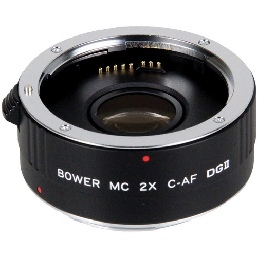
However, one item is another teleconverter: Bower 2x DGII Teleconverter. Even though I do have one already, it would be nice to have another one and compare and maybe combine the two to work as a quadrupling set! Two were available, a 4-element lens and a 7-element one. I preferred to order the 4-element type (and it is relatively cheaper) even though as it is mentioned in the specs that the 7-element type is sharper. I thought that a lesser number of elements is better (and could even reduce the chromatic aberrations problems). Vivitar's 2x teleconverter did show a strong tendency for chromatic aberrations.


Source: B&H
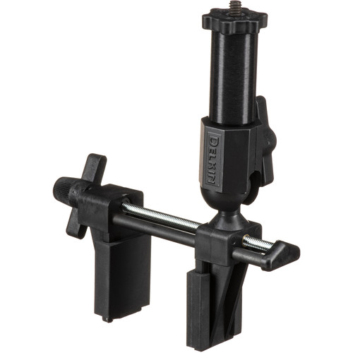
My second item is the Delkin Devices Fat Gecko Gator Camera Mount, which I was reluctant to order for some time now. With the presence of a gorillapod (I call it spiderpod sometimes) at hand, I've thought this item won't be necessary, but after some trial now, I think it is better to have both. I'm eying some sturdy performance better than the gorillapod, as it failed me in some instances recently. Even though this vice takes up to 1.36kg (3lb), I think it would take up to 2kg (4.4lb) in practice. The camera body, alone with no lenses, is almost 1kg (2.2lb). Just hope I won't be disappointed here. But hey! it can be used for other purposes as well!


Source: B&H
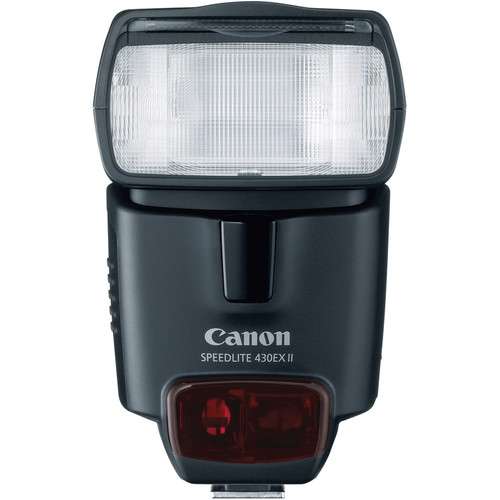
Now with the sweet stuff, my own real gift to myself. A little Canon 430EX II Speedlite to keep company with the big 580EX II Speedlite (well, not that big after the 600EX-RT). After reading Syl Arena's book (and still) my mouth got watering for more experiments and trials with Speedlites. Not aiming at portraiture yet, as it is a field that requires more than simply two Speedlites (plus the interaction with the subject). Yet, it will help in lot of occasions, like the High Speed venture. I'll try to come out with more experiments when I have it at hand. The 430EX II is generally cheaper than 580EX II (around half the price), and has a lesser guide number as well, yet I think it is a suitable choice for now because I'm thinking of using Speedlites in close distances in general and no need much light power. In fact, the opposite might be needed; a minimum power. According to the specs, minimum power (when working in manual mode) for 430EX II is 1/64, while it is 1/128 for the 580EX II - but they might be comparable because of the difference in the guide number after all.
Source: B&H
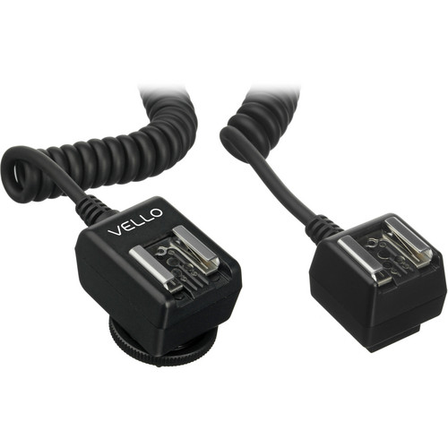
Further more, and to have more fun with my new (expected) toy, I've placed an order for Vello Universal Duo TTL Off-Camera Flash Cord (6.5'). The reason for the cable (for those of you who don't know yet) is that when it comes to E-TTL operations (let's say the automatic mode of the Speedlite) not all operations are transferable via wireless, and also for some aesthetic reasons, you might want to use your Speedlite as a master AND off-camera; something you can't do in wireless (because off the camera operations in wireless requires that your Speedlite must be in slave mode to be controlled). I'm lucky to have the Canon EOS 7D because the pop-flash (in camera flash) can work as a master for wireless operations.
All I have to do now is to sit, and wait. In hope I can get it ASAP. This seems the only joy I can get so far...

Now on the side of conlangs (and remember the main reason for having this blog is Ayvarith conlang itself!), I still didn't plan my next move yet. I'm supposed to work with Geltani though and design the phonetic scheme and maybe a syllabic system to spell out names, but with the occupations of the mind right now I can't be bothered to work with this right now and I'd rather work with my camera for the time being. However, that doesn't mean I'm forgetting about my dear conlangs! After all, I need to get busy as much as my body allows me to. As Edison said once: As a cure for worries, work is better than beer. Yes.


Thursday, June 2, 2011

Dancing Under The Rain...

A smooth week, in some ways. Nevertheless, it was not out of minor troubles that I hope they would be resolved soon. One of these problems is the delay in recording the Ayvarith text for Alexander's story. I'm going to restart recording in 32bit format (or sometimes called "float-point audio"). I've noticed some glitches when recording in 16bit, and I thought I might better use the 32bit format now. However, the glitches are still there. Some weird stops occur in the middle of the recording out of sudden, as if the mic do not catch any sound at that particular moment and then back to normal. Seems it is another memory issue with this "lovely" PC. Please note the sarcasm! Anyway, let's hope I go on with this project as it is weighing heavily on my shoulders now. I feel dull sitting without doing something about it and the least I need now is, a technical problem like this.

I've not worked much with my camera this week, except of a tiny experiment that I will explain later. Seems the vacation session is on, but nevertheless, I'm still working on photos from Ireland. I've remembered for a moment that there were two albums that I needed to complete; the sixth album and the black and white album (for the images from the sixth album). The process was slow but since I'm not working with my camera, I worked on boosting the process till finally finishing them off, and been sent already in a mass email message. The idea here, I think, is to create a turmoil of emotions in the eyes of the viewer by sticking the black and white version next to its colored-likeness. The gap in emotions between a colored image and a black and white version of the same image can be a huge one; personally, I do think it can be from a happy top then down to a melancholic one. Usually, the black and white images (majorly of landscapes, architecture) make a sense of mystery to melancholy somehow, because black and white is usually linked to history and old times (thanks to the history of camera developments). Anyway, the creation of emotional turmoil was not an aim from my side, but in the early beginning it was simply a notification of some image that I had different feelings for it, when every theme meant something to me, and from the moment I decided to make a separate folder for the black and white images specifically for these images in the sixth album.

Realistic with increased blackish tone reflecting the dramatic death I suppose.


Mysterious. Desaturated just before being totally black and white. Gives me an impression of Egyptian tombs and secrets of the past. It adds a sense of antiquity.
Cruelty of death. The plain truth and end. Black and white, no other options available.
I have to say that all of the three images are originated from a single HDR image which was tone-mapped and then enhanced in Photoshop later on. Please, if you are a purest and see HDR simply a toy and not an art, then remove this blog from your list. I create what my emotions tell me to do. Left to say that this gravestone is actually old, but not antique. It dates back to 1800s era, and most probably from the time of the Irish famine. Maybe the change in colors would create some dating way before this era, so I have to state this. There are other graves around Cashel town, in Co. Tipperary, that date back to the 1700s and even 1400s. This town has a fermented history scent to it.
Finished now with these two albums (which you can check them out here and here), and started already a seventh album for pictures around Co. Tipperary. Frankly, I'm not sure what will be there, as it seems I've used all tricks in my sleeve. The choices I had in Tipperary are not as much as those in Galway in 2009. Probably because I have a passion to the water and the lake there more than simply farm lands. However, each one of them is fascinating in its own way.
The picture that started the album made a nice catch for me in two ways. Two things that I've achieved by coincidence with this image. Well, not really achieved, but noticed by coincidence.

Tower in Vane
A tower in Cahir castle in Cahir town, Co. Tipperary.

The story of this image can be listed in two points:
  1. In the beginning, this image was merged into HDR. The bracketed sequence was not catastrophic and I've noticed some nice portions of each slide of the 3 images composing the HDR; mainly, the -3EV and 0EV brackets. It wasn't until later that I've realized that a bracket of -3,0,+3 does not necessarily make a good bracket for your HDR. However, I've tried in the beginning to set the images into layers and trying to substitute the layer masks around, trying to cover some portions of here and there to give a nice tone for the overall look. Didn't work. Tried merging into HDR within Photoshop, but as usual, Photoshop has the archaic problem with memory requirements when it comes to such operations. I had in my mind some manual tone-mapping because the image with its natural look is nice and I don't need to add weird tones to express my emotions, at least for the time being! Anyway, I had to merge in Photomatix and save the file into Radiance format (.hdr) and then open it back in Photoshop.
    After opening in Photoshop, I worked with an adjustment layer of Exposure and fixed some shadows and some highlights manually without harsh effects, and with a soft brush. After that was done, it's time now to the real manual tone-mapping and converting into a 16bit image. This was done also without grand breaks in the histogram curve, just darkening some portions and lightening some others a bit further and so on. Cool so far.
    The thing that I've noticed here is, the noise level is way below what I'm used to see when I tone-map in Photomatix. Does that means Photomatix is responsible for ADDING a certain noise level to the image? I was technically satisfied with the level of the noise when I zoomed to 100%, but for the sake of some sharpness, I ran NeatImage with "slightly blurred" profile in use, to make the image slightly sharper. This noise level notification makes me think further of how should I do things with HDR. This comes at a time that I'm indeed trying to reduce my "HDR intake" and depend on the best shot I can get within a bracket and adjust its RAW.
  2. Then there was a surprise. The trick that might solve my problems with color spaces. I've always wondered about the difference between "Assign Profile" and "Convert to Profile" under the Edit menu in Photoshop. Seems this made it clear to me, somehow, or at least I know what to do next time I work in ProPhoto space and preparing an image to be uploaded to some website that doesn't identify such a color space.
    The whole thing started with me, by mistake, using the Convert command, instead of the Assign command. I've converted the space into Adobe 1998; the usual. I've noticed that the colors didn't change or coming dull as it usually happens. I've undone the command and used Assign this time, and the colors were put down. The sky you see above, literally, turned purple-like and the image was darker. I've undone this command again, and used Convert to convert the image into Adobe 1998, and there was no change. Now, checking the general space of the image yielded Adobe 1998 indeed, but the looks are those of ProPhoto space! Awesome! When the image was uploaded to some websites, there was no change in colors as it happens usually. Great! Now, I have to keep a mental note:
    Assign: moves the whole set of colors into the destination space and putting down those out of range to some specific limits.
    Convert: converts colors from one space to another (and tags the image with the space of the destination) while keeping its visual looks as much as possible.
Back now to my tiny little experiment with my camera. I did that yesterday in fact in a hurry, but the results were as I expected. I was able to turn the light on and off "digitally". I did this experiment before (in the bathroom) but the results were not so good for various reasons, but now I can say that I've did it.
This time I used a desk lamp, and I made sure that the light bulb was transparent and not translucent. I think the translucent characteristics achieve some kind of diffusion in the light coming out of the tungsten filament inside and that might give me hard times. However, after fixing the setting, I shot several bracketed sequences in the range of 2-stops only (-1,0,1), and then moving the sliders all the way from -7EV to the max I could get (6EV). Tedious, yes. All of that was to ensure a smooth transition in the luminance data when the HDR slide is to be done. With any sudden cut in the luminance (can be checked in the HDR histogram) then I can say my experiment would fail and I can't "turn on or off" the lights as I want.

The histogram after merging the RAW shots (Photomatix)

The shots were all taken in RAW format of course, since this format keeps as much data about the scene as possible. When merged there were some messages about a duplicate exposures (i.e. some files had the same EV value), so I had to drop down those and merge the different ones only. The histogram above is concentrated in the middle of the graph (a good sign) and without any severe cuts on the sides or in the middle, but there is a smooth transition. The thing I'm wondering about is, why there is 2 peaks in the graph? The only explanation I could think of is, probably, the right one is corresponding to the luminance level of the light bulb itself, while the left one corresponds to the luminance of the cone or the reflector around the bulb.
I've saved the HDR file and opened in Photoshop just to play around with the exposure and test the turning off and on of the light bulb myself, and I can say I've done it! All I had to do is play with the exposure slider at the bottom...


Recorded from my own monitor after a struggle! However, notice how the shadows form inside the cone around the light bulb, and also, when the brightness go extreme; it looks real on the monitor even though the real setting and scene did not have such view or level of brightness. Seems it is embedded within the HDR image the data to predict the luminance of a certain scene behind the real limits of the scene itself at the time of the shoot.
Don't you get the feeling that this bulb is dimmed by a real dimming switch and it's not an image on a monitor? Personally, I got that feeling. This is the power of HDR. Real HDR and not tone-mapping HDR images. This makes me think about possible and interesting uses for such criteria and if there is any way to simplify it. It is this tool that can make you a super visual artist. Visual digital artist, if I should say. You can control the light as you like, all what you need now is... imagination.
Of course in this rush of joy with such results, I couldn't resist tone-mapping and uploading such an image of this beauty bulb. The tone-mapping here though was a mix between the Photomatix and the manual tone-mapping in Photoshop (because Photomatix produced high noise level in the black area around the cone and I wanted to remove that). Add to tht, some few hue changes and contrast addition.

Tone-mapped tungsten bulb
On the other hand I'm busy reading my books and Amazon is waiting for a review. Writing a review for something I have is like a duty to me, and that makes me stressed little bit. However, the two books are bout portrait photography (which has loads of technical information about light and tools), and the other is a book by George Barr; Take Your Photography to the Next Level. I have to say that this book made a jolt to my mind somehow. I'm walking around places and trying to figure out patterns of lights and lines that usually don't get my attention enough. The book has practices on how to THINK as a photographer and what to SEE as a photographer. The book is also fun to read as the author has his own sense of humor!

Take Your Photography to the Next Level: From Inspiration to Image

I've been pushing my mind so hard to write something. It is a damned feeling to have a lot of emotions to talk about yet, you can't express or write them. I was thinking of some lyrical form but anyway, I created a simple thing just to get myself satisfied, thinking that I did something at least. I called Dance Under The Rain. Maybe it's my way of saying "Screw up the world." Who cares anyway...


Tuesday, January 4, 2011

Happy New Year. Really?

Happy new year. So they say. Anyway, not much difference to me, for all days seem to go on one direction in a monotonous rhythm.I didn't even touch my camera for a month or more, well, except for trials to take a picture of myself to work on my idea for Asperger's but even that was a fail. I need a hand at this, but all I have is myself to work here.
I've began to really hate the start of the week for all the bad news that might come to my ears, just like the situation with my dear friend, who gets all the heavy dose of bad news in the first day, in the early hours of the morning as he steps into his work place.
I try to amuse myself now and then in my idleness by working on some of my photos from this year and the last year, and of course most if not all of them are from Ireland, as I didn't capture many photos from here. I did however catch few that are somehow worth the mention, mainly two, from Boubyan island 2 weeks ago, which brings me to the point here that I'm supposed to go to Boubyan tomorrow, Wednesday. The news makes me sick somehow in that it is, again, with the military. The view is nice really, but I'd rather work in a different environment. Moreover, we are limited by time in that we have to get back to my work place for the damn fingerprint scanning.

Boubyan incipit, Boubyan fines.
A road on the island.

As mentioned before, I've started to use Latin to name my images, thinking it gives some sense of power or mysterious hue (but Irish Gaelic can be included sometimes of course). The name here means "Boubyan begins, Boubyan ends," denoting the fact that this island is simply, clear. The long road won't make much difference in the views. Well, maybe in the middle of the island it is different, who knows! Tomorrow we are supposed to go deeper into the island. I will try to bring my camera and see what I can snap. On the right side you can see the bridge that leads into and from the island. I took a small panorama of that bridge from the same position but I didn't look after it. I don't think the angle was good.

Post-war Traffic

This truck maybe was the best catch in that trip. The rusty metal is always a good subject for HDR composition, with its destinctive reddish hue. The soldiers gathered around their officer and discussed the matter of the bullet hole in the front glass or the windshield. Some say it is the one that killed the driver while others say it is an after-math process. What an intellectual dicussion! I tried to catch the scene again with a fisheye lens but in fact, didn't make much a difference. I think I should have stepped a bit further away from the truck to allow more space for the land on the right, and to give a clearer view of the fisheye effect.

Beside those, there were many pictures processed from Ireland, old and new. I've finished my third album and going on completing my fourth album. If there is anything worthy living for right now, in my life, is the pictures I make. I'm trying hard to put my feelings into them, but I do give some space to technical matters as well sometimes. On the technical side, I'm fluctuating between sRGB and Adobe spaces, but I do become naughty sometimes and feel like I want to work in ProPhoto even though I know it won't fit my needs perfectly. It is just the need for vivid colors that makes me eager to work with this color space.

I'm tending now to use more and more adjustment layers (after tone-mapping the HDR slide of course). All to give the vivid or the mysterious look. Not everyting can be done in the tone-mapping process but at least, controlling the light and the sharpness of some zones in the image. Not much panoramas now since I worked out most of them in the early trials as I arrived back from Ireland, but nonetheless, there was one or two and some of the small ones that I needed to do. One of those was the panorama taken from the front yard of Hore Abbey, which in fact, generally in shape, didn't differ much from the previous done panorama from the inside of the abbey:

Hore Abbey in the front yard.

Hore Abbey from the inner court.

I think the two differ only in the amount of details of the structures, of course. In order to make the new panorama a sort of a magical place (and I called it already Horeus Magicalis), I used many adjustment layers to control the color of the skies and the grass (which was green of course). I preferred the yellow here because normally it adds a good contrast against a bluish sky. One of the major tools that are in use in my work is the Selective Color adjustment layer (of course beside the normal and everyday tools, like Curves and Levels). This adjustment layer allows me to blend-in different colors into some other color in varying degrees, and that affects the appearance and the mood of the image a "lot". Having the mood I want for an image is a serious, hideous and tedious work when it comes to sRGB space. Thus, as a norm, I tend to use Adobe 1998 color space the most. Ghosts and artifcts forming in HDR slides is another problem, along with the chromatic aberrations which Photomatix doesn't seem to fix them properly, hence I need to use Hue/Saturation adjustment layers often to eliminate the magenta lines from the edges (and sometimes cyan as well).

One of the small panoramas (vertical this time) that I've done recently was the chestnut tree taken from Cahir town, along the long path beside the river bank leading to the Swiss Cottage.

Castán (Chestnut)

This little vertical panorama is weird a bit because the upper part of the tree is in fact dangling over the path, i.e. it was above my head when I took the shots for this tree (handheld). Here it appears likeif the tree is springing outward like a flower and not really bending over my head! Just the effect I want! The problem here though was, as usual, fixing the colors AFTER tone-mapping. If I remember correctly, the space here was sRGB and it was so hard to convince myself with the saturation in general, but here you go. I was aiming really at elaborating more of the trunk's color and make it more reddish like. Nowto include the whole tree is another story. I would have to take a wider and higher panorama, which in fact would be probably better be done in a 360 panorama. The situation there is complicated!

Now in the mess, I'm starting to work just a little bit on my web page. Just a little and not much. The previous design I've made before was not really to my likings, so I decided to work on another one. This time I will try make the whole ting in GIF (with transparent background) and then cut it out into slides and convert the whole thing into HTML. Hope, that won't take much of the connection speed needed, and the design is simple I believe. I finished reading my book about manuscripts, and hence I have some time at work to do something about my webpage. All I need right now is just a push and a flare in my brain. I tend to sit idle in this place not able to do anything because of the bad mood.

I need some push with my poetry. I didn't write anything in a long time. I just hate it when this happens. I got the damn feelings, but I don't have the damn connection to put them together. What's happening!!!


Thursday, December 2, 2010

Dear Ol' sRGB?

A week now after the training course which I was part of, and still feel tired, mostly of everything. Just today, I woke up later than my usual time, plagued with congested nose. It is a slow and somehow boring week, despite my work on my photos, which was so-so actually, but the core of the problem, who or how, would bring my heart back from New York?

I've been working now and then in order to finish my second album of pictures from Ireland - Co. Tipperary, and somehow I'm almost done. Only one is left and the album is ready to be spread all over, and hopefully I can do this one picture today. Meanwhile, I'm having now a hard time with the Dining Room panorama, after fixing the Lounge panorama with lot of stepping down and compromises.

The Lounge of Thornbrook House.

In this final panorama stitching, I had to give up many hopes I had for this room, but at least I got the general shape in the picture without much loss of "interesting" details around the room. The following steps were stepped down:

  • Panorama stitched from JPEG files (not even 16bit TIFFs), because stitching HDR slides produced some artifacts caused by blending extremely dark with extremely bright areas.
  • Because of the above, I lost the chance to tone-map the HDR image as I like. Instead I had to tone-map everything in the beginning then stitch.
  • To reduce stitching errors radically, I had to give up the zenith and nadir completely. The zenith specifically was important for me because it had a crystalline light chandelier that I wanted to show its sparkles.
  • Henceforth, because of the above, I had to give up with creating a QTVR.

It is obvious now, from The Lounge panorama, and The Dining Room panorama, or even from old panoramas I've worked with, that my everlasting nemesis is generally, long straight lines. Such lines do not have much distinctive features making them hard to overlap accordingly by PTGui, my preferred tool for stitching as always. The Dining Room seems to be going on the same steps of the Lounge now, but I'm having a break from this panorama trying to do more single slides and images, not only from my recent visit to Ireland but also, for one image, from my previous visit in 2009.

The weirdest thing I've encountered so far is, tone-mapping HDR images in sRGB color space proved to be more attractive and sharper than tone-mapping HDR in ProPhoto color space! For those who do not know the difference, ProPhoto color space is wider and usually gives vivid colors for display rather than the regular and simple sRGB space. Everything goes back to Mostphotos website actually, when I noticed that images I'm submitting, whether tone-mapped HDR or simply RAW fix, are changing colors significantly on Mostphotos website.

 One of the images where the blue color was "killed" by change of space. 
It is apparently dark here but originally it is brighter in Photoshop. 
Photobucket, after a system upgrade, seem to gauge their acceptance for color 
spaces more than before as such change in colors was not noticed before from my side!

Of course, the first suspecion in such cases goes around the color space. Thus I decided to make a try out and submit my images in sRGB space and see and notice any changes in colors.
After that, I adapted for myself a new approach creating the HDR images, but it is lengthy. Despite the saying that merging HDR from original RAW files is better to include as much as possible of the dynamic range, I converted my files here to 16bit TIFFs and cleaned them a bit from the noise with slight sharpening by NeatImage, then saved those files. Note here in the process of converting the files from RAW to TIFFs by the Raw Converter (ACR), I've assigned the color space as sRGB and worked a bit on each slide of image to avoid out-of-histogram regions for each slide.
Next thing was using Photomatix to merge them to HDR, as I don't trust the capabilities of Photoshop in aligning images when I use the "merge to HDR" command there. I saved the HDR image as EXR for reference, and the surprise was when  I tried to tone-map. The image kept relatively sharp, nd gave out interesting vivacity of colors more than a ProPhoto tone-mapping would give out! Not only that, but the noise is significantly less and the image is relatively sharper than when I do it with ProPhoto. Since I care about the looks and not merely putting out with technical details for the sake of being technical, I'm considering now for real, going back to the rare ol' sRGB!

Image that went under experimentation.
The entrance of Inchagoil church ruins on Inchagoil island, Co. Galway.

I think right now it is the time to put my ego aside and work on the more humble sRGB just to get such significant colors and clarity from my HDR images. The first step was to try it again for real... on another image.

Cahir castle, yard entrance gate.
Don't pass under those dents!

This image proves again that sRGB in HDR merging is better, but I've noticed something now concerning the saturation of some colors. It was hard to make a vivid aspect of the grays and the blues by simply tone-mapping in Photomatix. This problem, however, could be solved using Photoshop's hue/saturation layers. My aim next step now is to try to merge directly the RAW files using sRGB space in Photomatix and see if this will work significantly in the same way. That way, I'll be shortening one step out, that is converting to TIFFs (although I do some noise cleaning in this step usually, but it is nice to try out how much noise will be added in my HDR directly from the RAW under sRGB).

Not all my HDR images, after all, are tone-mapped automatically and given vivid colors. I think this is an important aspect when dealing with HDR images; you have to know what you are dealing with and what are you trying to do. HDR technique isn't really all about "eye-catching" images, but it is just a tool. I try to keep this in my mind all the time.
One of the images that I experienced this aspect with was the picture of the field of corn, taken from over the bridge at the edges of Cashel town back in October;

Corn field in Cashel.

When I saw this picture again, I remembered the famous song, Fields of Gold, and hence I decided to work on it to give some resemblance to the title of that song, Fields of Gold! The main problem as you can see here, the day was foggy, heavily, and the colors aren't saturated much specially in yellows. Sure thing was to seek HDR solution here, but since we have a "picky" approach here to turn the day from foggy to sunny somehow, we can't really rely on automatic tone-mapping by Photomatix or any other software. We have to use the manual tone-mapping with adjustment layers and hue/saturation adjustments, in abundance.

Fields of Gold!

My skill in manual tone-mapping didn't progress much; I still have problems getting used to the tone-mapping curve in Photoshop. The "radius" and "threshold" parameters, although it is advised to not touch them at all, I can't get the hang of it to make a sharper image from my HDR slide. However, with exposure and saturation fixing manually, there was not much "curving" needed further.Just minor touch to increase the contrast between different regions. The artifacts, however, like halos around bodies is more pronounced in the original image when zoomed to 100%.

Also related to the talk about the HDR imaging, I've been looking for a reliable freeware for tone-mapping HDR images, and found some substitute, but none, so far, can really be a match for Photomatix, not in terms of quality only, but in term of easiness to use as well. The thing that really sparked this search is the memory issues and the weird squares showing on my Photomatix window (regardless of the memory issues) from time to time, preventing me from seeing the full picture and make good judgement or even move the sliders with easiness. Hence, I thought I might try some other programs and who knows, there could be really nice options out there undiscovered yet, and most importantly, free! I've encountered some programs, free- and shareware, but all in all, I couldn't depend on them completely to be a substitute for Photomatix. But some of them are good one way or another and kept them installed just in case. Some of these were:

  • Picturenaut: A freeware made by Marc Mehl and co-authorized by Christian Bloch (Blochi). They claim it is really memory-efficient (and designed specifically aiming at HDR panoramas). I've downloaded it (from here) and tried it, and I think it is indeed as they say! Memory-efficient! The main issue here is, from my perspective, is that Picturenaut is the good-boy type of tone-mapper. It has many controls and many different aspects of the tone-mapping, but generally it doesn't provide the potential to give those fancy looks or the grunge look to your HDR images. I didn't frankly test much of its other aspects like aligning images, but I do trust Blochi did take care such an issue. If you have an HDR image or panorama, and you want to be the old good-boy type with it and fix the issues with highlights and shades, and just give it the brilliant "normal" look, then this is yours. Of course, if you have memory issues, this could be the best for you. And it's free!!! (Don't hesitate to donate though, they are doing great job there!).
  • Qtfsgui (a.k.a. Luminance HDR): Another freeware. Frankly, I don't know what QTFS stands for, but the GUI is surely for "Graphical User Interface". This software has the potential of giving you the weird looking tone-mapped HDR images, but it is still under development and would need a really steep curve of learning, for me, to know what I'm doing. To tone-map an image, you would need to pick up an operator from the list of operators and work on the sliders to adjust the values as you like, to give the image the look you like. In case you don't know what are operators, let's say they are the type of algorithms or approach of tone-mapping your HDR image, and there are local ones (adjusting group of pixels or certain areas in your image) and there are the global ones (applying the algorithm to the whole image at once). When you choose an operator it gives a little description, but all in all it is not sufficient to know what you are doing with the operator. Every time you change a value of some factor, you need to click "apply" and a new window will be pop-up each time to see the latest changes to your image (and sometimes it gave an error and the program closed). It is the work and effort of one person, thus I can't say this is bad at all. The guy deserves some donations at least! You can get it from here.
  • DP HDR (Dynamic Photo-HDR): A shareware by Mediachance, and hence, you can expect it is advanced. The main feature of this tone-mapper it offers variety of operators and categorize them accordingly to local and global, and under each category there are sub-categories that are direct to the point; like "eye-catching" option for example. It extends further in controls giving you the ability to control the alpha channel itself, or the layer inside HDR which controls the luminance; you can blur it more, invert it and some other stuff, to give your image the drama needed. I can't describe all the options provided in this software but one way or another it is similar to Photomatix but with different names sometimes or more specific sliders. When merging into HDR, it gives you the option to do your OWN aligning (Cool! somehow!). It has also a built-in Noise Reduction tool (while Photomatix does that automatically) and gives you the chance to control it as you like and even brush off areas that you don't want it to be affected. So far though, I don't remember it supported OpenEXR format (.exr) but only the Radiance format (.hdr). One weird concidence though, I tone-mapped one image and saved it as 16bit TIFF, but in Photoshop it appeared completely different than what I saw in the software's window! Weird, but promising.
There had been other trials on some other programs but I didn't experience them enough to write something about them here, like FDR Tools (basic version is free while the advanced version is shareware), and easyHDR (shareware). The latter is a promising software and bears resemblance to Photomatix, but the question now is all about the memory issues in between all of the mentioned above. So far, I'll be using Photomatix, and I still feel I didn't grab it all in my mind yet.

After all of the mess above, you might be thinking I was busy with something for real, well, I was trying to. Pushing myself hard to do something out of nothing and forget some thoughts that invade my mind from time to time about life. My life, that is. I've been in the process of grasping some phrases or words in my mind and really want to write them down, yet, I can't really glue them together. My mind is scattered apart. Since my return from Ireland, I've become more isolated around myself and not able to interact much with people specially at work. The new lunar year is on the gates and the month of Muharram will start soon, announcing days of mourning and black clothing. It will be a period of silence for me, and I have to stop listening to the songs that I do listen to usually everyday. It's going to be hard and to be frank, my conservative education is against what I'm doing, but the turmoil around me wherever I go left me no choice but to let off the steam via music-listening. I just hope and wish I will be pardoned in this life and the one after...
All I hope for now, is to get rid of this annoying nose congestion.

Alayhá, šá ayná ðánúħ kay ayná yaħavt? Limaz má tixmaŧ ayná élaká yi xawant ayná e-ąasiy?