Showing posts with label greek. Show all posts

Thursday, January 23, 2014

Ludendorff and The Titles...

Here I am. Writing this before the arrival of Thursday as usual, but with one exception. As you are reading this (seriously) I'm supposedly waiting my turn in the clinic to do the ERG test. An annoying test for the eye, but a must to check the status of my retina. I'm typing these words as a slight fever is occupying my body slowly and I'm hoping that I can stop it in time before I fall completely ill. I had to use my first "casual" leave this morning (Monday) to skip work and remain in bed, after a long insomniac night, with headaches and shoulder pains.
Because of the rains (again) I couldn't do much at night except for some trial in the previous location of the week before, which didn't appeal completely to me, but I will share it with you here with some comments. I would like also to discuss and talk about the issue of the titles of the images (below).

Surreal Night

I've posted about last week when I've headed to some place where I did a panorama for (and this panorama is re-visited as well). This week too I've decided to visit the place again to change the perspective.

Das Licht der Dunkelheims (or Dunkelheits)

As I've mentioned in my previous post, in this shot, Das Licht der Dunkelheims, the lights at the back of the monument were annoying (specially at f/11 like this with fisheye lens). For this reason I planned to visit the place again and change the perspective. But unfortunately for me, things were not better, if not worse even, this time.

Der Traum

As you can see now in Der Traum the situation was much more drastic! Lights were ON in front of me! Beside some annoying people walking around (which didn't cause much harassment, thank God). The greatest mistake I've done in this shot is to concentrate on the movement of the line of the roof, in hope to make a guiding line, and totally forgetting about the brightest spots in the scene. I do not hold firmly to the law of thirds, but in this occasion like this one in Der Traum, it seems that this law would have served me better with this glowing lantern.
This shot is in fact a collection of long exposures, i.e. HDR. I tried hard to light the lantern and avoid the sparkles or the flare surrounding the lantern itself but that didn't work in any possible way at hand right now. The least I could do is reduce the presence, but not eliminate it completely. I got my lesson here, and I'm not sure if I will head back there another night, but if I'm to do this, probably I would have to head pretty late. I think those lanterns are automated to shut off at a specific time, hence in my first trial they were off, and then they were on (the time was earlier relatively in the second). I do have other night time schedule for another location but it's too early to talk about it.

The frequent visits to the previous location inspired me to produce another panorama (and good thing that I still have the HDR slides). Unlike the first trial with Planeta Columnae, my aim here was to do something crazy a bit; out of the ordinary and no symmetry (or let's say at least I tried to keep some symmetry but no use!).

Ludendorffs Wirklichkeit

Keeping some perspective symmetry in this one was hard if not impossible mainly because that the original panorama was taken a bit off the center. The dome of the monument and the pillars were competing for symmetry; fix one, then you screw the other.
The harsh noise was not a big problem with Ludendorffs Wirklihkeit; all I had to do is some Median trick and smooth out the rugged "surface." Probably, even in this small scale image in this post, you can see some cut lines after trials to fix some stitching errors. The original panorama did suffer from this as well.
In processing and adjusting the colors to produce a certain "dreamy" atmosphere, there was not much difficulty I would say, but the hardship in fact came from naming the new stitch. I had the word (hanging) and (suspended) and the likes of those in my mind, but suddenly for some reason, the name of Ludendorff kicked in. Just in case you don't know, Ludendorff was one of the major generals of the German imperial army during WWI, along with Hindenburg.
I'm not sure what came to my mind at the moment I've named this panorama the Ludendorffs Wirklichkeit (Ludendorff's Reality). In fact, I was indeed reading about him on Wikipedia, but what was serious about this panorama and Ludendorff? Is it the surreal look and Ludendorff's dreams or theory of the Dolchstoß (the stab in the back)? Do they have something in common? More about titles to come.

Luna

I've stopped shooting the sun and moon for some time now. Mainly because of the rains and the clouds, and also because I believe that the critical stage for the sunspots had faded by now. On the other hand I got the chance to shoot the full moon (which is said to be a super moon) on January 16th. By comparing several shots for the moon, I've realized that some of the features had changed mainly because of the change in the light direction and level; a typical concept in shooting to show textures - always give light on the side.

3D Luna

The difference in the "facade" of the moon for January 14th and January 16th made me drool on some 3D action by making an anaglyph from the two images. Simply, with the slight rotation of the moon, the view in my eyes became like a right-eye and left-eye shots. I needed though to rotate the image around 90o to coincide some features. I've found out that with some staring but with the eyes relaxed, the eyes can overcome some of the ghosting and the moon pops out a bit like hovering on the page. However, the lower part of the image suffers the harshest ghosting and probably won't be easily merged into a single image in most of the viewing eyes. It all depends on the distance between the two eyes of the viewer.
Ghosting (anaglyph): The inability of merging the right (blue) and left (red) layers in anaglyph images into a single view, raising a distorted view of the subject.

Warum and Why?
(About Titles)

Now to the main issue that I wanted to talk about in this post specifically. The issue of images' and photos' titles and addresses. It came striking to me that lot of people, either artists or casual photographers, or simply those who document their lives, are simply using "phrases" to address their photos. Typically though, I noticed this phenomena abruptly among Arab photographers around me. The phrases, however, in many cases do become as a line from a poem.
In this position, I have to announce my rejection for such practices for entitling and addressing photos. Yes, there might be some sessions when a photographer takes thousands of images, e.g. sports photography, and of course naming them one by one is simply not applicable, if not impossible. My talk here though is not about documenting photographers, but more about artists, or photographers who aim at producing a work of art after all.
One might argue that a sports or a wild-life photographer is not documenting, simply because the images taken are not for covering up an event for example, but looking back at the nature of the shoot and session, it does not differ much from documenting. Let's put ourselves in this scenario for example: shooting a football (soccer or American doesn't matter) game. Principally, the photographer is not knowing what he or she is looking for, unlike, let's say, architectural photographer, who has somewhat of a vision for how things should look and what to be expressed (specially if this job is paid to be done for some business!). There are, of course, certain rules for the sports photographer, like following the events, or following where the ball is to catch the action and so on. However, after all, there is no meditative status before the operation itself and it all relies on sorting out the images later on after the event. Now, this type of behavior in photography might not be really documenting for an event, but it runs in a way of documenting because the artistic venue shows later when sorting out the images. The images themselves can be submitted, say, to magazines and newspapers for publishing and thus, no name is quite required to be given to those shots, but this is just the beginning.

Now, if the photographer is willing, one of these images can be represented as a work of art by itself despite the sportive nature let's say. At this point, let's imagine some photo of two players with a football in between them. What does that mean? What does this photo express or say? One can argue that it is enough to "see" the photo to contemplate or enjoy the scene. Of course, we can enjoy the scene represented because it is a joy for the eye; colors and shapes. Now, contemplate? On what basis? The fact is there is no single base to start the contemplation from, or if you like, not a single concept to imagine something specific further behind the photo presented. Notice I said "specific," which means you might be free to imagine whatever you like beyond this sportive scene, but there is no single direction to direct your imagination.
Sure, there are the titles that are identifying elements by themselves, like what was most commonly used in personal portraiture paints in the classical era or even right now in some portraiture photography, as well as in sports photography or wild-life. However, as it is stated already, these titles would be identifying elements. Yes, they can be enough for non-artistic approach, but when art is present I do believe that philosophy must be present too, and a title that reflects this philosophy or this specific imagination beyond the presented photo is something that one must hold on seriously.

I always give this analogy for how a title might really affect us as viewers, on both levels, consciously and unconsciously. The level of consciousness though might vary from one person to another of course but a title would sure help. Imagine now you took a photo of a flower that was blooming on an arid land. Now, you produce the same image 3 times and you are to hang it in 3 different places. However, under each one of them you are supposed to hang a title, thus you entitle the first one with [xxx xxx] which is supposedly the scientific name of the flower, and on the second one you hang the word [challenge], while the third one bears the title [flower]. Put yourself in the place of the viewers visiting your printed photo, what would their mental status be when they read a scientific name, a challenge, or a simple statement as "flower"? At least, I can assure from my perspective as a person who graduated from a scientific background, when a scientific title is issued for any image, people usually would look a scientifically-motivated examining eye to the matter at hand and not bear the artistic look or imagination that they are supposed to have (if the photographer hoped for it).

Think about it: there might be some poems, and other artworks that do not have a title, but how many they are compared to those who already have an issued title? Another example would be books. How often do you find a book without a title? Probably a book is not a piece of art (not necessarily) but the title plays a great role in attracting the viewer and identifying the book itself - a book without a title would be hard to be dealt with in, for example, references let's say. This is if such thing exists. In the world of Arabic literature, writers, specially of the middle and late eras, worked a bit around the titles of their books and often they were chosen in a rhythmic way, resulting in a a bit long titles, but with ringing harmony. Probably modern Arabic writers and translators do not tend to this habit. Anyway, the point is that they realized as it seems the importance of the title in attracting the reader in the first place - it is the appetizer before reading if we can call it so. If it applies to the covers of books, then it must apply to some extent to photos. Notice that in most Photo sharing websites, .e.g Flickr, there is a space for the Title and another one for the Description.

Because the title of the image, as explained above, is to be a guidance to the imagination of the viewer to a specific category that we, the artists, want the viewer to be indulged within as we did, then it follows that the titles are greatly affected and are characteristic of the photographer's own unique style. If the title has to do anything with the feeling of the photographer then it must be unique to that photographer as well, in the sense that a photographer would develop or tend to develop his or her own sense of titles and what should be used, and what not.
If I want to talk about my experience, I mostly use English and German to give names to my photos. The problem probably is that, I don't really know why I'm using different languages but in some cases I'm aware of the effect. For example, taking pictures for holy places like a mosque (like the Grand Mosque of Kuwait) and the cathedrals and churches (old and new) in Ireland, I've used Latin to name a lot of these photos. This is mainly because in the western world (as most of my followers are non-Arabs) Latin is usually attached to classical literature, and to religious rites (specially in Catholicism). Thus, in order to approach the mentality of a viewer from that culture, the titles given were in large part, Latin. On the other hand, I've used Greek to name some photos that I've taken in Failaka island (in 2012) as it is an effort from my side to link the cultures; the local, and the Greek. Failaka island has a very well-known Hellenistic past. I seldom use Arabic (mainly because, as stated before, most of the followers are non-Arabs), and for some specific shots, Spanish  and Turkish were used as well. Probably it is part of me that acknowledge the feeling of the different languages and the way they are perceived. It could be that naming large number of my photos in German is a trial to add some strength, mainly because most people perceive this language as "hard," but the fact is, it is not a conscious process. It is the feeling that guides me to name some of these photos into German (and in fact I do have a number of soft or romantic-themed images named in German as well).

Harmonie (Harmony)
The sound of the title is not of big difference between German and English, but still I preferred to use the German spelling when this image was made.


However, this is just my own experience and style when it comes to giving the titles. The core of the matter is, titles, just like the style of photography under any field, they are characteristic and undergo the style of the photographer him- or herself.

Probably we can see the affect of the titles is pronounced more when it comes to abstract photography, where the viewer's mind would dwindle in between the ideas trying to figure out the purpose and the nature of the presented photo. Adding to that, entitling your own photos (with some good title, that is) would make it suitable to give a reference much more easily. Sure, with the advancement in EXIF technology it is relatively easy to record the data in the original file to be viewed digitally, but I don't think this is applicable for a printed material for, say, an exhibition of your work of art.

Then, how a title is supposedly given? What would make a good title? I believe it is hard to answer such a question because, as stated above, a title undergoes the woes of the style of the photographer and the ideas that a photographer wishes to accompany or to indulge the viewers with. However, probably there are some pinpoints that can be stated about the nature of the titles, and how they (most probably) should be - though I'm not trying to give rules:
  • Concise: The title should probably not be too long as to not scatter the thought and the general idea that a photographer wants to deliver with his image. This is the problem with lot of Arab photographers as I can see so far - lot of them simply put a line of a poem as a title for their images. This is more like a storyline, and not merely a title. Few words with direct impact on imagination to ignite the viewer in his or her own world and vision of the photo shown.
  • Imaginative: The title should work on indulging the imagination of the viewer. How this is done might be hard to precisely explain, but it is greatly connected to the audience. A photographer should have a hunch about his or her audience, if not know them well, to know what sparks their imagination. The imaginative title could have a physical meaning or a non-physical existence that connects to the mind (and heart) of the viewer. In any way, an imaginative title is, as I believe, highly dependent of the audience and its relation to the photographer. 
  • Connective: The core of the idea of giving titles for photos is to provide the viewer with some connection; one end of the rope of imagination, if you like to call it. Thus, the title must connect to some idea; specially an idea that is exchangeable between the audience and the photographer (i.e. of a known topic to both). But probably it is not necessarily to be like that all the time as the photographer can be an educator sometimes by educating the audience about the work of art itself, and here the title can work as an aid and as a gate to connect different ideas into the work of art (remember Ludendorff?).
  • Vocal: I do believe in the power of the sound itself to the hearing ear. And I guess that naming a photo in some language, native or not, does affect the sound, and in return how a viewer would perceive and receive the title and the photo combined. Probably I do use German most of the time because unconsciously I see it "out of the ordinary" or "unusual". In some occasions, I did use lengthened German words (e.g. Sonnenuntergangsstadt) to emphasize the vocal vibrancy as well as the "unusual" look; at least for the non-German speakers).
These are some of the points that, after some thinking, did ring a bell for me in the topic of giving titles. It is quite unfortunate to see that many exhibitions, here at least, run after displaying the images without their titles. This, in my humble opinion, is suppressing one of the dimensions for the control of the imaginative thinking for both, the viewer and the artist, and loses the effect of "tunneling" the general thoughts in a specific direction for the viewer.
It also seems to me that in serial photography, where a photographer represents a group of photos with some connection in between them, the role of the title could be shaky in this part, but I'd rather say it is essential specially if the connection is not easily apparent in between the shots. For a series of sportive shots, for example, probably a title won't matter because of the matter of the action involved, but if these shots are for different sports types in one series? How to explain the connection or give a hint for the connection that the photographer had supposedly achieved in the series? I think a title here would do the job perfectly. The only difference though, the title would rather be for the series, not for any single photograph within the series.

Thus, I beg you, please: give your images their worth of a good title.

Thursday, July 4, 2013

Peel!

Long and boring technical post. Read at your own risk!

As of writing these words I'm still struggling with my car's AC problem. It works fine one time and not working again; just like that on and off. 
In the meantime, I got some time to do some ideas with my camera back home, and in this post, I'm dedicating my efforts to an old idea that I've long abandoned, for some time, for the sake of other ideas. I've tried to do it before with some specific approach so to say but now it is completely a new door that I'm peeking through!

Peeling Hope!
After many many trials done in very long time ago to do such an effect, I've came about to some kind of a breakthrough; yet it needs more work to be done, I have to say.
The thing I'm talking about here is what I call the Peeing Effect or maybe some people refer to it as the Reverse Panorama or Internal Panorama. The idea is simple: instead of doing a panorama of the space around you, do it in perspective to one object.
The idea is not new in fact. It is used extensively in many websites (specially retailers) to offer a complete view of the object at hand, where the user can click and drag to rotate the object virtually. This is also called Object VR (for Virtual Reality). But my story, somehow related, yet completely different!
What I wanted to do long time ago is to provide a flat 2D view of a 3D object without the need for rendering into a 3D environment with some interaction from the user. A simple image that tells it all. This is all what I wanted to do!
I have to say though, I did indeed try to do an Object VR before using PTGui but I didn't go deeper into that (since I've realized that there is a special type of software to deal with this render) but what got me more interested is the artistic touch of flattening a 3D object; just like planet Earth flattened by Mercator!
My very early trials did involve PTGui but they also failed, and I've done the effect manually using layers in Photoshop. However, now with some change in wisdom and the amount of knowledge I received from previous experiences in (regular) panoramas, I wanted to try it all over again (and for weeks, but only now I got the time!) with PTGui.

Peeling a seashell, done manually by stacking layers in Photoshop (2011).

 With such trials, one thing is for sure: The more mistakes you make, the better you get! As simple as that. For the time being, my simple target was one of my favorite mugs at home! Yep, I had this one (and it has a twin!) since I was 17 probably... or 16... some time before 18, I'm sure!
The first thought about capturing this with a smooth movement is to fix the rotating table in 5o segments. Of course this is done with the help of the base of my Manfrotto 303SPH VR-head. Up till that moment, I really had no idea of how am I going to connect images together using PTGui to make out one long connected peeled mug! I just had to do it. Total images: 360o/5o is 72 images. No HDR intended here but simple RAW files.

Manfrotto's rotating base with improvised disk fixed on top by velcro. Pardon the lousy quality. The image was taken in a haste and not by artistic means!

 As I uploaded my first trial, I was searching the web for some tips, but most of the tips are dedicated to Object VR and not for what I'm trying to do here: a peeling effect! However, the idea stroke me like a bullet when I was reading an online book sample (an old book as it seems) about panoramas and tips about camera types and what methods are appropriate in each case (unfortunately, I can't remember the book's name now, it seemed good!). Within the context, there was a discussion about Slit Cameras (also called scanning cameras I think) in which the shutters of such camera do actually move over the sensor providing a thin band of light covering a portion of the sensor, and this band eventually sweeps through the entire sensor (not sure in which direction though no difference I guess!). The word Slit here inspired me to do the same: what if PTGui only picks the control points from a specific region in which movement is recorded? That would be like a reverse scanning! The proper tool to do this is the Crop tab inside PTGui. The Crop tab is dedicated, originally, for those images in which you don't like to include some portions of the scene to be implemented in generating control points for the whole panorama - the exact thing you want to do when dealing with lower level shots showing your tripod's legs and portions of the VR-head (like the bulky Manfrotto 303SPH). It is like, literally, telling PTGui, please be blind in regard of all these regions and just look at this; a technical retinitis pigmentosa.
However, in my first trial, the mistakes were apparent: so much tilt in shots and such a disturbing background. Probably the background won't do much disturbing because of the slit I'm trying to implement, but the tilt can be a problem indeed for the overall image look. Add to the problems is the uneven light around the mug which changes on the surface of the mug while rotating. The critical question, however, was: of what portion should I take the slit? In other words, what should I crop in PTGui? Naturally, the answer would be: the middle portion of the mug. However, this approach still as so much thoughts going on in my head.

Example shot from the first trial. Notice the uneven light across the surface and the tilt, and of course, the disturbing background. I've tried to isolate it as much as possible with shallow depth (low f-number), yet I had to increase it and consequently, sharpened the background more.

Since the rotating base moves in segments of 5o, I thought first that putting the crop lines for +/- 5o around the middle point of frame would suffice. Anyway, more troubles came about. First, PTGui deals with pixels, not degrees! How many pixels are equal to 5o? The answer was not so obvious in the beginning but it was just in front of me and I didn't see it, until the second trial was done! The answer was simply to find out the movement of the edge of the handle (or any point) from one side to the other (that is for 180o) and voila! You got the equation: 1o=ΔPx/180o; where ΔPx is the difference in pixels for the relative location of any point on the mug (I've taken the handle of the mug to check for this) from one side to the other exactly opposite to it. Care must be taken here because pixels are not divisible; pixels must be an integer number! Thus whenever fractions appear (and they will appear of course) it is the approximation that shall be taken.

The width of the rotation in pixels as I've measured it. Measuring in the Crop facility inside PTGui can be better and more accurate rather than Photoshop. Also, it keeps the work all in one place instead of running 2 programs.


In the beginning, I've based my calculations for the crop on the central point of the frame as a whole (i.e. the middle point of the frame which lies at pixel #2592 width-wise of course), but with my second trial to shoot the mug, I've changed this approach (mainly because it was hard to situate the mug exactly in the center of the rotation), and I've decided later to take the edges of the mug (not including the handle) and find the middle point between these two edges and increase the crop to the left and right of that middle point.

(1) The width on which I based the central crop in my first trials. (2) The width I've used later to specify the central crop.

Originally, +/- 5o was not quite a sufficient quantity because it is so small that PTGui can not find matching points between one slide and the next, thus I've increased the crop to +/- 10o, 15o, 20o. I think it did work smoothly up to +/- 30o, but the more you widen the crop, the messy PTGui gets. This is natural because we have a curvy surface that rotates and that means distorted features from one shot to the other, thus making the alignment of the slides a hard task to do and frequently, no good results at the end. So, after all, we have to keep it minimum and sufficient to include details from one slide to the other (but of course this depends on what you are scanning with this method). In many occasions there were hard times with regular panoramas when I had to, ironically, take the seat of the computer and place control points to aid the computer on aligning images. However, in the case here with the peeling effect the matter goes to the extreme somehow with zooming in and trying to find some common features between 2 slides however possible, even if it takes you to the pixels level!

Down to the second trial after few achievements with the first trial with that lousy background and annoying light levels. This time, I've placed the set in front of a plain wall, and using the lateral arm, I've raised the speedlite (with a reflector and a diffuser on) on the top of the set to illuminate the mug and reduce shadows on its side. It is at this moment only that I've realized I can fix the lateral arm with a 1/4" thread instead of the typical 3/4"! With 3/4" I would have to place it on the monopod which, of course, is not a stable fixture, but here I've used the lateral arm with a regular tripod in a 1/4" thread, which was more stable, not completely!
Source: B&H
The next surprise was still waiting for me though! My savior is now indeed my savior! The 33' Vello cable did work as if by magic! I could access the menu of the speedlite from the camera's body and even work in High-Speed mode. I'm not sure what went wrong in the first trials, but now it is working. I was going to work manually already and I was ready to change the settings from the speedlite itself since I can't access the menu from the camera. However, I was saved! Everything was set and ready, even though with some tiny tilt in the mug still but it is far better than in my first trial (you can compare the images above).

Bring Me Your Mug
First stitching trial for the peeling, with the help of Photoshop to fix some stitching errors.

Generally speaking, there is so much to learn, but Bring Me Your Mug (After UB40's song Bring Me Your Cup) sounds promising. Initially, this is not the look that I've intended to stitch as I wanted the handle to show from the side and not in the front. Anyway, some Photoshop tricks were needed to finalize the image and fix some stitching errors, and also to bring the handle to the middle of the image, as it was, originally, on the left side of the image. The experimenting is still going on in fact and the image above is just a sample for this post as I'm still working on a better image, if any!

Mistakes and Thoughts
This experiment specifically sparked many things that I've never thought of before while working with PTGui. For example, the detailed options for Field of View and the Crop were some sorts of a taboo for me to touch. Not that I can't, but I've never felt the need to do so when working with a regular panorama, because these specific options were fixed automatically by PTGui. Now, however, things had changed. I need to know more specific details about the works of these options to guide PTGui to stitch exactly what I want it to stitch - Talk about a LOT of experiments to be done, not on camera, but with the software itself.
Moreover, there were some points that I think I'm still doing wrong. Even though I've tried to get over the mistakes done in my first trial, yet I don't think I'm able to get over all the issues at once. Typical. Probably I can list some issues in the form of points:
  • Center: Probably one of the latest issues that I've noticed. The center of the rotation to me was the center of the base of the mug. Apparently, this is not the case here because we have a handle dangling on the side! Thus, the diameter of the whole shape must be taken into consideration. Unfortunately for me, my eyes were concentrating on the bulky body of the mug and forgetting about the handle issue as if the body was a perfect cylinder.
    Possibly a better rotation center would be closer to the handle somehow.
  • Shape: I think, possibly, every shape is a project by itself. When doing such peeling effect to shapes other than this mug, I really need to pay attention to how things would turn out while this specific shape is turned around. I'm quite sure at the moment that whatever techniques I've used to compose this peel for this mug, won't absolutely work smoothly for other objects. I guess it is my mistake as well to start off with somehow irregular shape to do the peeling effect on; Should've started with a more regular shape.
  • Control: Up till now, I'm still not controlling PTGui as it should be. Mainly, I'm still not aware of a possible way to specify for PTGui what should be the central part of the stitch. It does it all automatically. Also, the way to make the panorama encompass 360o field of view is still not obvious to me. One time it works as if by magic, then once again it can't be done. The demonstration above, Bring Me Your Mug, was wrapped around by Photoshop and originally, it is not a 360o stitch.
  • Dimensions: So far, all the hassle is for a single point of view: horizontal. What if there are more freedom levels, like taking the object with the same rotation pattern at 45o (either by raising the camera up and pointing down or, which is easier, by tilting the object)? How things would go on with this approach? Definitely, a novel of technical talk.
  • Rotation: Is 360o stitch a must? With different objects that I can place, I'm pretty sure that at some point for some objects there are no interesting details at some angles. Take the mug above for example. I could have done it (and will work on it soon) with stitching 180o rotation only, I presume. Yet, I'm not sure how it would look. I have to look further into this. Moreover, what if I divided the stitch for the whole 360o peel into two 180o? Is it possible to stitch the two parts together? Also, more experiments need to be conducted.
  • QTVR: Unlike the typical panorama and the typical Object VR render, what if I try to make a QTVR out of a peeled object? How does it feel to the viewer? Interesting? Not? We shall see!
  • Photoshop: Stitching errors are inevitable even with a regular, well-done panoramas. Here, it is no exception. However, I know my limits in regular panoramas, and when to rely on Photoshop to fix the errors. Yet, I'm not sure what are the conditions here with peeling. I've been mangling a lot with the Blending option in PTGui trying to reduce the stitching errors, but my attempts were unsuccessful. What I've discovered is, for such stitches, the Blending option is so sensitive (probably because of the tight Crop), making a single digit change leading to a drastic change in the blend - That way, making things hard for me to control. Either way, Photoshop is absolutely needed, either to add or to fix features.
These are my thoughts so far about it and I can't tell many things until I work more with this peeling issue. Next time, I need to get me a simple object, with no handles!
I have some ideas cooking in my head as well other than this peeling effect but the excitement about this ruled me over and made me forget about other stuff that I've set my mind to. Hopefully, some stuff will be ready by next week! 

Finale
Source: Amazon
Currently, I've been reading the last book on my list, the Handbook For Classical Research after finishing with the previous Lens Design book. It is a relaxation book if I should say. Yes, it is dedicated for, probably, college students but here I'm reading it in a fast pace without much intelligence needed to digest the contents. However, without much intelligence doesn't mean no sparks of ideas or a dull mind, I presume. The book got some nice discussions, questions and arguments, but majorly it is a resources book if I should say to help the new comers to the field. Even though it is about the Graeco-Roman culture in general, but still, many ideas can be generalized, even into the venue of natural sciences.
Geltani, on the other hand, got some time out of my brain in the past two weeks but I didn't standardize anything yet. This venue is walking slowly I'd say. Probably I will post about it next week, if possible!
Meanwhile, I'm starting to get sick of things around me and specially my car. I'm trying to vent as much as possible through camera work or music. However, I've noticed that to some extent, my daydreaming habit was reduced with the reduction in music consumption. I'm now almost like a quasi-confident that in the Islamic culture and literature, music was frowned upon for some reasons like this one - Daydreaming. Anyway, with the pressure at home, and with my car that persists on giving me headaches, I'm finding myself thrown into a dilemma. I need to vent, to dance, to sing, and simply, to smile. Been a while since I've smiled from the heart, and I've been doing it mostly as a compliment to others. Let me tell you, I'm sick of the others. Closest ones, before the furthest.
In a world where everyone tends to be a philosopher, the classy and the mundane, who has the time for a gazing wretch trying to find a meaning for the word "Happiness," like me?


Thursday, June 20, 2013

Let's Play!

I'm not sure what kind of week is this, as I'm typing this in the middle of the week to be posted on Thursday. However, one problem with the car and the whole week seems to be like a disaster.
I didn't post a thing last week despite the simple material that was available just because I did need some vacation from writing here, and because of the hectic life pace and with such heat that already exceeds 40oC at just 10:00 a.m. sometimes, my mind and brain were completely out of words and order and all what I was thinking of was sleep, sleep and sleep.
The material, however, was not much more than simply some floral shots that were taken around my work place just because I felt the need to work with my camera. I've done as I've done the 50mm challenge  before, when I would pick up my camera and the 50mm lens only and try to train my eyes to find something; the only difference here though is the fact that I've picked up my extension tubes with me.

New Born
Canon EF 50mm + tube, f/11, 30-1sec, ISO400.

Working out without a tripod and extension tubes is certainly not a work for the faint heart! One particular scene that really got my interest and surprise is some tiny blooms in a bud beside my work place, just like the one in New Born. These tiny blooms were actually almost 1 cm in diameter when fully open; and when I saw them first day I was without tubes, and when I visited them next day with the tubes, they were all gone. Most of them died because of the heat and probably the petals flew away with the hot wind. I was lucky to find this one in New Born and I had to dangle my body and holding the camera with one hand while balancing myself with the other against some rail and with the help of the on-camera flash, I've barely managed to get some stability (but not completely stable) at 30-1sec.

Floral Abstract
Canon EF 50mm + tube, f/22, 80-1sec, ISO400.

Generally speaking, one should not try to do macro without a tripod, either using a macro lens or extension tubes. Kids, don't try this at home!
However, sometimes it just happens that you need to try. After all, we do photography for fun here and not for a serious paid job to do, and yet we get somehow extra happy to find one or two shots that went out OK despite the instability of the situation. The situation becomes harder when you have to use high f-number (smaller aperture). Maybe you've noticed that New Born was taken with f/11, and Floral Abstract with f/22 and both were taken at ISO400. This is one of the reasons that I had to use the on-camera flash even though it is not a good source of light specially in macro shots but playing around can do some achievements anyway. The core purpose of the whole thing is to go light and take whatever comes your way, thus no speedlites were taken along. The shutter can be increased a bit though if the object is under the sun as in Floral Abstract which was half lit by the sun. If I'm to take this shot again I would have done it differently, with more close-up approach, and, of course, a tripod!

3D Seeds

One of the interesting findings, if I should call it so, is when I've discovered two images for the core of a sunflower that are close to each other with some change in perspective, which ignited in me directly the desire to make an anaglyph, or a 3D image. The different thing about 3D Seeds is the fact that the two shots were not exactly different in point of view, but they are different little bit in focusing distance. However, some points did coincide (not completely), mainly those in the center of the focus region of course. I'm not sure if this is a good 3D effect in fact but with red-cyan viewing glasses, the composition looks fine and almost no ghosting appears! Maybe a trend for some new studies for 3D composing? Who knows!

Revolving
It had been some time since I did a brainstorming session but some times you don't really need it when some items are available at hand to give you some kind of an idea to do and work with. This is exactly what happened when I've found a small plastic globe that my older sister brought to teach my nephews (from another sister and my brother) about geography for some of their tests.
I thought tabletop photography is, relatively, something easy to do indoors but believe me if I say it is lot harder (and even harder when you have to move your equipments out of home!). Moving stuff from my room to the guest room where I usually shoot is not any easier task, and while there is a table that is good to use for such projects, yet I can't use it because it is in a small place and I can't move it often here and there to do my projects. Thus, all I got is one small place in one corner of the guest room.

Test Shot

My plan was to record the movement of the globe with somewhat a spot light effect from the side or from top, while having a background of some old map (I do have this already on size A2 from previous project, and yet not a good size!). Lot of technical problems were in play here, mainly the question of how to rotate the globe and have a long exposure - and in the same time how to make a coherent exposure with my speedlite. In the beginning, the speedlite has to be set on 2nd shutter sync so that after the blur of the movement is recorded with the long exposure, the speedlite would freeze the motion to get a concrete image of the globe and its map at the END of the exposure. However, long exposure with an extra speedlite light meant possible overexposure, thus many test shots with varying exposure times were taken to make sure that the background is dark but not invisible while the globe is lit with the correct power from the speedlite (with honeycomb grid attached to it); a very delicate matter, and I was going to use some ND filters as well (as in the Test Shot above) but I've abandoned this idea later as the exposure was long enough just by switching off most of the lights in the room, and a double ND would tint the image magenta.

Welt im Wandel
Tamron 70-300mm @109mm, f/4, 4sec, ISO100.

However, despite the test shots, the whole game changed when the question of the motion came into play; mainly, how to do so?
After looking here and there, I've finally arrived to the idea to use my own vacuum cleaner which can be used to jet air from the other end as well as the regular vacuuming. It did achieve something in the beginning but I've realized that pointing the hose is not an easy task and the pointer should be precisely set (as I kept holding the hose with my own hand while putting the camera on timer to take the shot). However, this step rose many other problems, like the movement of the globe itself because of the power of the air (and to solve it I had to use lot of duct-taping skills!), and also, even though there was some blur movement but the freezing motion of the speedlite was dominant and the image appeared stable and not moving, thus probably requiring more exposure time and doing that I might screw the whole mathematics of the experiment! I think it was better to use one dominant light, like a desk lamp, instead of a speedlite here. Anyway, I had to satisfy myself with Welt im Wandel and few other experimental shots.

Revolving Australia
Tamron 70-300mm @109mm, f/4, 4sec, ISO100.

In one of the trial shots I was lucky to get something close to what I had in my mind, but it wasn't created with the effect of a spotlight from a speedlite, but rather by the sluggish movement of the globe as the air flow from the hose was not precise enough, but rotating the globe for a little then it would stop. The movement blur here is not quite strong and it might need more time, but with a speedlite I believe it would all stop completely and no motion blur would be obvious as well.

One point I'd like to mention here is a website that helped me now on keywording my images and I'd love to share it with you. I've mentioned some previous website in some previous post but this one now works better for me with its functionality. It belongs to Microstock, which is another photo stock website (but I didn't make up an account there yet).

It was such a long experimenting but the main part was to set and configure the gear around which consumed most of the time (and power). One of the major problems here as well even before working with the light and motion is the fact that the cable or cord from the camera to the speedlite was quite short and bulky to be dealt with - for this reason I had to keep close to the globe and bear with the reflections on the surface (but I've managed to clone some of it in Welt im Wandel). However, this problem will hopefully vanish soon with a new set of toys!

Let's Play!
What I didn't mention last week is the fact that I've placed a new order for some new stuff. Mainly light gear but one major bulky device that I've been waiting to have (and my hands got all itchy!).

Source: B&H
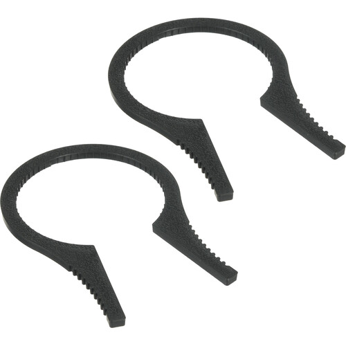
First item is the Sensei 48-58mm Filter Wrench which should be very useful when I deal with my IR filter and polarizer along with, probably, other attachments. It is probably more useful when attaching the IR filter and the polarizer together, since I had problems with these two before, specially in winter. I think in winter almost everything tends to jam a bit. These two wrenches will be useful in the near future.

Source: B&H
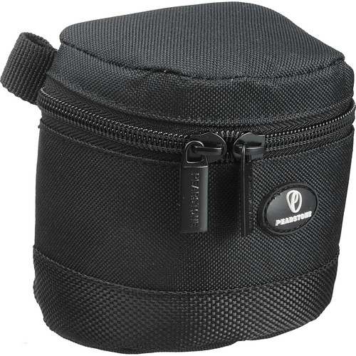
Next item is the Pearstone Onyx 30 Lens Case and this one is mainly to carry my dear Canon EF 15mm fisheye lens; my one and only lens that I usually use when creating panoramas (haven't done those in some long time now!). The cover or cap of this lens is easily removed and it doesn't click over the lens' front, thus I thought such a pocket is a better protection for it.

Source: B&H
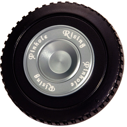
Then we come to the fun part with the Rising Standard Pinhole; yes, pinhole. Just like in the old times. This one is specifically made for Canon mounts and I believe you can find it for other type of mounts. From what I gather, the larger the sensor/film, the better for the total sharpness of the image. The f-number for this pinhole is f/222 (but in the instructions manual it's f/223 for APS-C type cameras), so just imagine the depth of field (and the length of the exposure!). I'm still interested in the mathematics involved here though and who knows, I might be able to do my own pinhole measuring to something higher than f/222. Remember that Diameter (of aperture) = focal length / N; and from there we can start on manipulating stuff.

Source: B&H
And then comes the savior! The Vello Universal Duo TTL Off-Camera Flash Cord (33'), and by "(33')" it is meant to be 33 feet, approximately about 10 meters! Unfortunately, I've done the globe experiment above before the arrival of this cable (and till the moment of writing this, I didn't test the cable). This cable would and should push the limits of my speedlites significantly. One question hovers in my mind though: what would be the situation with High-Speed photography? I'm pretty sure there would be some time delay to transfer the signal (we are talking about microseconds here). In High-Speed photography, each single micro- or even nanosecond counts. We shall see about this matter in time.

Source: B&H
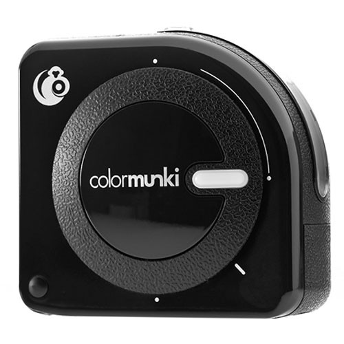
Finally, comes the one big toy that I should spend more and more time with. The X-Rite ColorMunki Photo Color Management Solution. Even though I do already have a ColorMunki device to calibrate my monitors (laptops and desktop), yet this device is here is far beyond calibrating monitors only (hence it costs more!). With this, I will be able, hopefully, to calibrate monitors, and make profiles from prints and analyze ambient light or even calibrate a projector! The perfect tool, I would say, for creating showrooms and proper digital darkrooms when needed. I'm thinking of installing this into my (old) desktop and my (new) laptop to make them ready for any task in the future. Just a point here about analyzing the ambient light; it is something important but unfortunately I don't see many people care about this tiny detail, at least in expos here in Kuwait. If you are a photographer and you really care about displaying your photos in printed form in a proper way as you envision them, it is not enough to calibrate your monitor to get the right colors. You have to get profiles for the printing but this is a matter that might be skipped for good in many cases (yet it is good to have profiles for various media). Then we arrive at the ambient light criteria. It is a good thing to know what kind of light and what color temperature the ambient light would be in the place where the photos are to be shown, because with this information, you would be able to examine the effect of such light on the colors of your photos on your (calibrated) monitor before even printing. Thus, you might think of making your photos more yellow-like to balance the extreme blue-colored light in a showroom or vice versa. It is all about taking care of the balance of colors and soft-proofing on your monitor before printing and displaying the photos.

Now with all these loads of new stuff, I think I do need an extra case to keep lot of these stuff and abandon that old small case (which was used for my old Canon 350D!). I'm thinking of getting one of those small traveling cases with wheels to keep my speedlites and related stuff in them. It is about time to organize some stuff (but not my room!).

Bücher
Source: Amazon
In the matter of books, I've finished my Lens Design book but in a fast rhythm. I've realized that such a book can't be read and completely digested without a tutor and without a practical workout. The many mathematical concepts involved are not so weird for me even though they include a high order of complexity, but in most times, many terms there within are familiar to me. However, in mathematics, at least with me, it never works without a practical workout and some tutor to walk step by step along the process. You'd think lot of the concepts here are relatively new but the fact is, most of such mathematical endeavor was developed long in the 18th and 19th centuries! Anyway, after passing through the pages quickly and read some articles, I've decided to look at some of my old books or even look into some books about optics in the library near by. That might help to achieve a better basic understanding for this topic.

Source: Amazon
I've started now reading the last book in the queue line, Handbook For Classical Research, in hope to flavor my mind with some archaeological spice. From the first few pages that I've read (and I didn't delve deep yet!) it seems that the whole book is about the Greco-Roman studies and culture. I was hoping for further expansion but anyway I still do think it is an interesting topic. The good thing about this book is that it is written by a single person, single author, and not scattered among various authors with an article or two for each. Such books with many authors involved are kind of scattered in thoughts and it's hard to keep a chain of thought going through the whole reading session. In linguistics and humanities, I've faced numerous books done in that manner and I have to say, it is kind of a waste of time to read but probably better be kept as a reference material when needed. I'm hoping this new book would give some amusement into my dull brain!

Unsettled Geltani
Maybe I didn't write much thoughts in my notebook about Geltani lately but nevertheless I was active in my mind. Yeah, I'm wondering why do I have a notebook anyway! However, I'm still planning slowly on assigning phonetic values and on the other hand I think I will abandon the newly-created system of possession articles. I think my problem was to create everything in idle and concise manner, but I think a language is more random than concise or systematic. Thus, I've decided to work on another method which might work as: pronoun-subject-suffix. For example, My Cat, would appear as: I-Cat-(suffix here). Development is slow naturally because of my stuffed schedule, and problems!

Finale
Scandinavian Eyes - Frida
Troubles on the home front keeps me busy and alert. I do say "front," yes. Because it seems that way; a game of dominance and reliance. There are moments that I do wish, and do imagine, how my life would be with another form of a family. They say you can't choose your family, but you can pick up your friends. However, under the current circumstances, it seems that I don't have the former, nor the latter. It feels like I'm floating with no support; not physically, nor emotionally. Mom is doing her best to keep me happy and I know it. I can see it in her eyes and actions. However, I'm the one who's supposed to keep her happy. I have a family that I can barely relate to.
Here and there, I'm keeping myself amused with some brush-up jobs with some photos from instagram users. It is something that I used to enjoy doing long before I take photography as a hobby. It might be just the desire to make something beautiful but trust me, if the original photo/person is not beautiful in the first place I would really have hard time creating the "uncreated". I think I do get satisfaction from the gratitude and happiness that those people show when I create some art with their pictures. I'm not a psychologist, but probably I'm projecting my needs outward - something that I've lost in my inner circle is satisfied with deeds to the outer world.
There had been some thoughts about resigning and chasing my own career but such thoughts are still cooking. It bears great responsibilities as well and even stepping into such realm should be done carefully without leaving the main job at once. However, with the current circumstances at work and the great disrespect that I face from the admins who think that my work place is something vain, I'm seriously getting sick of everyone around here and do wish to break free from all these master-slave relations. How, I don't know; but every good meal, needs a proper cooking...


Thursday, June 6, 2013

Şaşırmış...

I can't help but say, it is one weird week that has just passed me by. Despite the fact that I've stopped my fasting, in hope to continue by the beginning of the month of Sha`ban, yet I did feel tired excessively with some weak body and dryness most of time - talk about acting as a sponge.
On the other hand I was able to work with my camera just a little bit. I've made up ideas already from brainstorming my mind with the help of some of the websites I've mentioned in the previous blog post, but not all of these ideas are technically available for the time being, or maybe too much time consuming with my hectic schedule in the meantime. Mom is still taking much of my week, and despite some previous talk from the doctors that the dialysis time might be reduced in the near future, I can't see any of that happening soon. With this load, some problems from home are added. They usually call them Domestic Problems but in my case I'd rather call them a Jungle Survival game by keeping my dignity in this house. I've already started picking Mom to and from the dialysis center (before that I used to pick her from there only) because Mom is not happy to go with my sister in the morning in the traffic jam rush. Thus, she decided to go with me from now on in very early hours in the morning to avoid the high blood pressure that my sister causes her on the way to there.

Die geltanische Sprache
I hope you don't mind the German subtitle for this topic here. I'm not a German speaker myself but probably this is how I would write the adjective geltanische if I was German!
However, during this week I didn't put much thoughts on paper with Geltani, but mostly it was some work of thoughts in the mind and having mental notes about some drawings of the characters. In the meantime I'm having problems assigning phonic values for some of the characters. I didn't go through the syllabary system all over again as I've promised myself I would do this week. The major change in the syllabary system is about some characters' drawings and not the phonic values given already.
The language do sound, at the current time, a mix of an Arabic base with an English flavor in terms of general aspects; mainly when it comes to the feminine and masculine cases. However, I do have to work on the phonic values for lot of the combination of characters together and the situation is even more critical when it comes to diphthongs, that is the combinations of 2 vowels, or we might even face cases of more than two!
I'm trying to systemize the combinations of phonetics but I'm not sure yet that this would work. The only thing that would prove the usefulness of such approach is the excessive trial and error, with a pen and paper!

Silhouette
In the past few weeks I was trying hard to take a silhouette shot of my brothers depicting the evening life in a typical weekend here. Yet, despite its simplicity, I had to abandon the idea mainly for the cooperative attitude from the family members (and please note the sarcasm here) and then the unavailability of some suitable background or backdrop to represent the idea of an evening gathering. Majorly, I was trying to use some features in the guests room but this was a bad idea because it did cast a shadow and that complicates the matter further raising the necessity of using two speedlites (or even more) rather than one as I was planning. With more speedlites, then you'd need more light modifiers, and in my case, I don't have plenty of those.

Silhouetted Mother I
Canon EF 50mm, f/11, 250-1sec, ISO200.

Thus, just to keep up with the idea, I've decided to use Mom as a model! Yes, she's more flexible and the idea is simple enough and doesn't need much acting like I had in my mind when I was planning the silhouette shots with my brothers. It is just a profile or an outline of the head. To do this, I've simply placed Mom in front of a green curtain that's already there, and of course I had to use a green gel on my 580EX II speedlite, otherwise the color would get messed up; adding to that a reflector on the speedlite to spread the light to a larger area with a soft approach.

Silhouetted Mother II
Canon EF 50mm, f/18, 250-1sec, ISO200.

I've taken here two shots (close up and further away) just in case (and I was thinking somehow in a marketing venue as such images can fit into the stock sites for specific topics). Communicating with my speedlite, however, had to be done remotely without a cable, which means I'm stuck with the sync speed (250-1
sec). The speed was fine however as the lights in the room were not too strong and not so demanding to be killed out. The only change between the several shots was the aperture and this is how I controlled the intensity of the speedlite reflecting off the curtain. I don't quite remember why I've fixed the ISO to 200, but probably I've forgot it like that from the previous session! The noise level after all is not quite dramatic and was easy to smooth out, specially with such style of images not having so many colors.

Freeze Me!
Few days later after doing the silhouette shots of Mom, I headed to do another shot that I've been thinking of for some time and trust me if I say, I had to force myself and my mood to do so! The sole subject of this experiment was a glass vase brought to me as part of a bouquet by the group when Mom was still in the hospital back in March.

Pouring Down
Tamron 70-300mm @92mm,
f/16, 5000-1sec,
ISO1000.
I have to say that the vase is really seductive for many experiment, but the preparations to do such experiments is really exhaustive to myself, specially when preparing the props. The fact that my older sister wanted this vase too, made me do something, anything, just before the vase is taken away!
I've placed the vase on a table which has a glass surface in the center and placed my 430EXII speedlite below the glass. In typical situation I would actually place the speedlite light on the sides but I just wanted to do this experiment here, specially with the hardships involved because light is refracted through the glass table before reaching the subject. I've placed a white screen as a backdrop and in the beginning I've placed 2 black boards on the side (to emphasize the edges of the glass in a bright scene), but then however I've realized they are not necessary.
If you see the info in Pouring Down, you can see that I've used a telephoto lens (Tamron) while the shutter speed is 5000-1sec; quite faster than the sync speed. Thus, a cable is required to control the speedlite but with a telephoto lens, I need some distance away from the vase. In this case, I've used the Vello cable I have (which extends only 2 meters, hardly) and connected it to the 580EXII to control the 430EXII and enable me to use high shutter speeds above the sync speed. This is in case you were wondering why I did use 430EXII under the table in the first place and not the 580EXII. In the beginning, the master speedlite (580EXII) was turned off and it was set to control the 430EXII only, but then I've decided to turn it out and help me with the front little bit. It did make a little enhancement though and probably not a big deal, but I've kept it on.

There were many shots to test the light first and settle down with a certain type of lighting. I've made some light patterns because of the refraction that would look nice otherwise, except that I needed a plain background in this situation. After all is set, I added some dishes soap inside (you would think it's beer!) and set up the motion trigger. This is my first time to use the motion trigger. I have to say here that it is bulky and not quite the easy-to-handle thing. The motion sensor (with a long cable from the trigger body to the vase) was not easy to be placed to track the motion of water that I was going to pour down. How ironic it was when it triggers my body movement when I was going to the vase, but as I move my hand to pour down the water into the vase the trigger, sometimes, wouldn't respond. After some trial and error, I've finally made something right.

One of the failed trials at 1000-1sec.
Notice the movement blur.
Click to enlarge.
You might think about the high ISO here? Well, as I was trying to pour water down I did capture some amazing water texture and movement, but unfortunately, most of them were blurry. I've realized then that 1000-1sec shutter speed was not enough, and/or the depth of field is not deep enough. For this reason, I've poured down the water out of the vase (which was full after some trials) and filled it again with soap, and then worked again on fixing the light and this time with 2500-1sec shutter speed, but I've changed my mind quickly and made it 5000-1sec to ensure the freeze in motion. If I have more speedlites, I might as well have gone further than that speed! However, because of this change in aperture and shutter speed, I've realized that I must raise the ISO as well. The subject is here is not complicated and I thought that cleaning the noise in post-processing won't be such a hard task to do (specially that the experiment took a place in a cold environment and excessive chromatic sensor noise is unlikely).

Thoughts
After my experiment with the glass vase in Pouring Down, I think I've realized why I used to run away from using flashes or studio equipments in general and loved the free life of an architecture photographer, along side with doing abstracts and landscapes. Setting up a specific set, be it a tabletop or some studio is really an exhaustive process for me and by the time I sit behind the camera I think most of my power is gone already. More over, the fact that in architecture or landscape I deal usually with a light that is already there and all I have to do is control how it looks to my camera - this is quite easily done compared to the completely controlled environments of tabletop photography or studios in general where you have to imagine everything almost and do a lot of test shots before doing the actual work.
There is probably another problem that I have to put up with, but this time it is all inside my mind. This problem revolves around the processes in my mind and how my mind works in general when it comes to space orientation and organization. I'm not sure if this is a serious problem or not, or if it is somehow linked to a psychological problems as well or not, but I do have hard time setting up some configuration from scratch without having any clue about where to begin. Suppose you provide me with an empty room and some pieces of furniture and just ask me to arrange it for you freely - this is something that would be so hard to do from my side because I, simply, can't recognize what freely means in this context. I have to start up with something to build on my hypothesis of the space and how it should be arranged; say for example, how the sun rays get into the room from the window, if there is any, and how I would imagine some furniture pieces against such rays and then try to imagine a specific purpose or relation between the sun rays and the furniture pieces, and then and only then, my mind would start to arrange the objects.
Now, I reflect on such thoughts and how my processing goes with my photography projects and workflow. It seems it is pretty much the same, specially when it comes to tabletop and studio environments. I just can't make up my mind out of a free point in the space. Working with architecture is much easier when all I have to do is frame a previously configured set rather than do the whole thing by myself!

Finale
Source: Amazon
I'm still on reading my Lens Design book which far way too complicated than I thought and it is probably not so practical if I keep reading this without a practical trials or at least some visual aids to help me understand the mathematical formulations inside the book which describe many aspects about the lens (mainly the errors and aberrations aspects).
In the meantime, I've been active for a while on Instagram with all its hassle, but I'm lurking trying to catch photos of people (ahem, females) to edit. I didn't do such activities in a really long time now. Some people might thing that photoshopping or editing the photos is some kind of cheating, specially when it involves fixes. Well, I deal with art. Not all my edits are fixes in fact. Lot of them are simply artistic retouch and somehow a sway from reality at times. I feel the need to do such edits just because it endows my eyes with some beauty that I've been missing for a long time around me. One of the problems though in editing such images is that most of them are taken with phone camera (naturally) and the nature of the color space and the noise level is very questionable and vary significantly. I've seen great faces and great poses, with great facial features (mainly the eyes, I'm fond of those) but unfortunately, the low quality disturbs most of those, second comes the background or the nature of the light in the scene.
There are some ideas of ordering some new toys, but not sure what they will be exactly, but I'm still consulting my budget about this matter. Probably more details in next week's post, hopefully!

Strangely, I've been lately moved around following some foreign music, from Greek, to Uyghur, to Turkish and it keeps on rolling! I think I'm compensating for my inability to have a vacation and travel by listening to foreign music and dream; daydream, that is. Just like how it was in the old days when I was a kid, when my family used to visit only specific places, while I kept dreaming of the big world and couldn't see some of it until I reached 29 years old.
I'm living day to day, without really knowing what will happen the next day or what are my plans. Pressing hard to work my mind on photography projects yet the efforts are humble so far. Makes me ask myself more often, do people still got portions of their feelings, and does anyone out there who would really feel what burden I carry on my shoulders. Most likely, the answer is well-known and no need to state it. Einsamkeit ist ein Killer. Aber mit jemandem nicht versteht zu sein, das ist ein ewiger Folter.

Tatiana