Showing posts with label website. Show all posts

Thursday, October 24, 2019

Speed Gambling II…

I'm typing this in a very short time so I guess it will be a short post. Many things are going on and big part of that is vexing me, but some good things are happening (or happened actually by last week) when I posted my Arabic post about high speed photography in my Arabic blog.
I was not going to type anything here for this week and call it off, but I'm gathering my power (and mood) to do so. The whole week was busy and amazingly annoying with many things caused mainly by people not being able to regulate their timing and don't really know the value of time. I thought I was guilty of that myself but with this passing week, I guess I'm far way too wrong to judge myself like that. Anyway, among these tasks that I had to do, I had some time to process the last bits of my dice images which I've started 2 weeks ago, and also had the chance to filter some and even tag them (put information on these images) in order to upload them to stock websites. And there were strange events there but I will recount them later. Let's see first the Phase 2 of dice photography here.

Stroke-Stroke-Stroke

As I've posted the week before last, I was working on some high speed shooting for dice falling into water, and I've been fluctuating between the macro lens (100mm) and my trusty 50mm. However, the bulk of the work later on continued to be with 50mm since it was easier to deal with mistakes with this lens, while the macro 100mm lens needed precision (lot of it) to throw the dice exactly in place, in the viewing field of the lens.

Picasso's Dream
However, with 50mm lens, I do get the privilege of cropping the image and place the dice almost where I want in the frame. The drawback though is that the details in the water movement is not quite clear at times. Nonetheless, interesting shapes can be produced at this level. However, after some time, I thought why not speeding up the flash strokes instead of the shutter speed? In other words, what or how it would look like if I used the stroboscopic (multi) flash option? Which I did, and the results were pretty interesting here.

ارتطام (Collision)

I've started as usual with 100mm macro lens but soon I've changed to 50mm again. I realized right away that to get some nice images somehow similar to the high speed shots i can do this work alone by using regular shutter speed (far slower than the sync speed even) and simply go around that by using the stroboscopic function of the speedlite. Unless, of course, having a multiple occurrence of the object is not the aim, then the typical HSS methodology is the thing to go for, even though some shots I've made with the stroboscopic mode do look similar to HSS, as in the case of Three and Two Threes below.

Three and Two Threes
I'm guessing here that to get a closer look to HSS and eliminate multiple images is to quicken the shutter speed a bit. In the speedlite's manual, there is actually an equation to calculate the appropriate shutter speed required for a combination of flash frequency and the number of flashes. However, I've actually played around with these numbers and if there is one thing I've learned in this experiment is the fact that one should not lose oneself to the technicality and just do it. Things are not supposed to be perfect and things are not supposed to be taken with a single shot only; So, there must be a trial and error and experimenting. Calculating things can be useful as a rough estimation but NEVER decides what the end result should be nor the final outlooks.
Also, one more thing I've discovered here is the fact that increasing the number of strokes is not necessarily a good thing. Sometimes having 5 or 10 strokes of flash in a single exposure is just about enough to record the movement in a clear way, while too many strokes can or might stabilize the object more or even congest the scene.

Dice Race

Another thing I've learned, the hard way, is to keep cleaning the lens after each drop of the object! As you can see in Dice Race, there are some octagonal flares caused by some water droplets on the polarizer filter over the lens. I was able to crop it out in some images but the majority persisted and it was not easy to remove them, and the best I could do to some is to reduce their "weight" in the image by cropping, and sometimes eliminating them by adjusting the curve and contrast.

Now at this level, I think I'm done with the dice experiment and I do have some ideas to further experiment with other objects and ideas. Anyway, I've taken the time to fill in the information for these images which I've prepared to upload to the stocks (31 in total). To do so, I've prepared a list of keywords and 2 descriptions to use (one for HSS shots and one for stroboscopic ones), while changing the name of the images only. It was a long process to edit these info with every image in Photoshop and I'm not aware of any software that does the work in an easier manner. However, I've uploaded the files to my main outlets: Canstockphoto, Dreamstime, 123RF, Mostphotos.
The weird story here comes from Canstockphotos. If you click the stream at the end of this post to get into my gallery (at the moment of typing and posting this blog post) you might notice 2 images being accepted ONLY. The rest were rejected for "inappropriate keywords". This took me by surprise because the keywords are the same for all images, so why accepting two of the series and rejecting the rest? This is something beyond my "intelligence". The other thing is that they don't specify really the keyword(s) that caused the problem so it is like a gambling game to adjust and re-upload and wait and so on. Thus, I've decided to delete all my images and leave only these 2 which were accepted for reasons I don't understand yet. Meanwhile, the whole collection of 31 images is available on my Mostphotos (they don't review images), which is a relief. Now, it is just a matter of time and waiting for Dreamstime and 123RF to either accept or reject. They usually take a long time; Sometimes, pretty damn long time…


Thursday, June 5, 2014

Dull Times...

Another dull week, with few serious work on any front. Summer just began and I wish it's over already. It does sound sometimes as if all my problems start with summer. Anyway, work is minimum, and by work I mean my camera, not my "job". I don't have much respect for this place right now actually.
On the other hand, I'm slowly starting to figure the headache of the Irish visa (again). Things should be sorted out as soon as possible though, and first of all, I have to set a plan for the dates of traveling and such. Thank God the passport is valid till next year and I don't have to do anything about this. If they keep a record of visitors to the Republic, probably granting my visa would be a piece of cake... ah well.

Macro

It was a day in which I brought my camera to my workplace to take shots of the beautiful garbage containers that were left beside my workplace for months now. After taking these shots, I've decided to check out the garden on the side of the building, which was colorful and blooming just some months ago - when we had some "weather". Even though it's filled with dead blooms and plants now, it could be a good target for some abstract work as well.

لب (Core)
Canon EF 50mm + 30mm ET, f/7.1,
100-1sec, ISO640.
Because this was not planned initially, I didn't bring a tripod with me, and I guess this is obvious if you check the ISO in the specs of لب (Core). After many disastrous trials, accompanied for handshake AND slight breeze, I decided to go even beyond ISO400. The sun was fine but in such a macro level (with the hep of extension tubes of course) and such a shake, a compromise had to be made. And truth be told, I'm not sure how it became f/7.1 either! It was supposed to be fixed on f/8; seems I've nudged the dial without noticing!
I'm quite satisfied with the details in لب (Core) despite the out of focus regions which might somehow plague the scene a bit. The geometry of the details inside the dead core is to my eyes satisfaction, and the overall resolution is quite good even after cropping, so that even the fine hair on the side were pleasantly sharp at 100% view. Let's call it, a "strike of luck"! Cropping though did take some time to be decided, and yet I'm still not satisfied about it. Probably the law of thirds inside the square was due and the heart of the core should have been placed in one of the "power points".

تلك (That One)
Canon EF 50mm + 12mm ET, f/3.5,
320-1sec, ISO400.
Seeing how long are the stems carrying these dead blooms, I changed the extension tube from 30mm to 12mm. The next shot I was planning needed some perception of depth, as I was planning to shoot the stem from above. The problem here though, I must use extension tubes to allow for close distance focus (50mm's closest focusing distance is about 45cm, or about 0.18 in.). However, I think that تلك (That One) needed more than just close focusing distance. It needs more angle of view to show some curvature in a clear way (and I'm not going to use the old 18-55mm here). The situation literally left me puzzled. However, with some sharpness to a distance object (thanks to AF!), probably the depth is depicted somehow. What was left was simply squaring and adjusting to the law of thirds.

البركان الناعم (Soft Volcano)
Canon EF 50mm + 30mm ET, f/6.3,
100-1sec, ISO400.
Back to the 30mm extension tube. This time, my eyes captured a small "volcano" formation inside a dead core, just like the first shot above in fact, but this time, the point was protruding more. In البركان الناعم (Soft Volcano) the aperture was set mainly by "sense" and not by using any rules of thumb that are usually taken in macro photography. It is almost a rule that in macro shots, the aperture should not be any less than f/8. Anyway, as I was trying to make a compromise between the shutter speed and the ISO with the aperture (I was using Av mode, without tripod, without flash), f/6.3 seemed reasonable. The final result is a perplexing combination of out- and in-focus areas which makes it hard to specify exactly where is the plane of focus, as it has rendered the shot somewhat in 3D; to my eyes at least. There were several shots in fact, because I was using the burst mode (which I like to use in times of shake!), but this one seemed the finest. The protruding point from the core was not sharp enough though, unfortunately. Again, it was squared and fitted into one of the "power points" according to the law of thirds.

I'm not sure why I did name these shots specifically in Arabic in the first place, but to some sense, it did sound more "plausible". The squaring of all of these shots sounded "natural" to me since there are lot of unwanted details and the area of interest is pretty small compared to the whole frame; a whole rectangle wouldn't look "elegant" so to say, besides, it would have added more space than planned to the shot. It is also a better choice, as it seems, to rounded objects like these dead cores!

Kill It!

With minimum photographic activity, I'm still going on with Black and White exploration with old photos. Nothing special for this week in fact, except for an interesting encounter with an old panorama taken from the Arab Organization Headquarter (February, 2013), namely the Tiempos Andaluzas.

Tiempos Andaluzas


In this panorama, as you can see, there were lot of reflections because of the polished floor and, naturally, the glass facades everywhere. To me it was one major point in the weakness of the whole panorama; if these reflections were combined with symmetry, the situation might have been different at least. However, when converting to B&W (and adding a red tint), some of these reflections were simply "killed;" in the sense of being camouflaged with the surroundings. This helped a bit here and puts forward a new venture of thought and considerations when processing panoramas. B&W render could be a savior at some point beside being a touch of art!

Comparison between the colored and the B&W versions.
Notice the black arrows on the colored version.
Click to Enlarge


As you can see, not all reflections could be eliminated, naturally, but this was a good start. Moreover, the veins of the marble floor were emphasized further because of the tint. The original tint was pretty red. However, with going on with processing, the general tone changed to (dark) sepia somewhat, but I don't think it's that bad after all. I think some tint does help on pronouncing some details in white areas more than white does at times.

Finale

Well, I was supposed to talk a little about some work with Geltani conlang, and supposedly do a recording, but I'm canceling this for now as I had some technical problems concerning recording these events. I've done a primary check up for translating the UDHR and I have to say, it does sound a jaw twisting venture; not only a tongue twister! However, I'd rather train myself on producing these sounds rather than changing the value assigned. The main work though remains on putting key rules (to myself) for producing the glyphs for words, as well as adding some touches to the grammar and words manipulation. This is important because the conlang is largely based on Arabic, and Arabic script is an abjadic script, which means we might have more than one word with the same letters, but different in vowels. Vowels (short ones that is) are not recorded in Geltani.
I've been doing my homework, and sent some email asking for help with the Arabic phonology which I'm trying to understand. However, no reply as of yet. Seems I'm not good at getting responses anyway! This matter, which I reckoned to be a simple task, swept through a learning curve of phonetics and anatomy of the mouth just to understand how I speak!


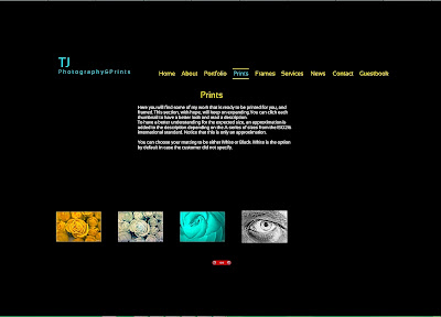
After successfully sending and printing two of my photos, I've decided to add them to printing gallery on my website; which is something I didn't update in a while! The two photos are almost of the same size (around A2 with the margin) and would cost around 35K.D. here. Still thinking of easy ways to send these prints for benefit outside but having a strong currency and the lack of means to transfer money easily, makes this project a failure for the time being. PayPal wouldn't let me receive money with my current location and credit card.

Print Screen of two pages from my website after update.


My life is getting busier now and I had to stop fasting for the time being, in hope that it would empower me to do the hanging tasks on my schedule. It's not a language or a camera matter only, but a complete sweep through my life and the capability to organize it. Just to think of all the preparations I have to do just before traveling gives me a shiver in the spine really, but remembering that it is something that I must do, makes me calm down a little. I'm starting to get careless and careless about everything around me, day by day...

Thursday, October 10, 2013

The Wait For Jonathan's...

Here we go, another week just passes. Not doing much photography, not much thinking of Geltani or other projects. However, I got the chance to update some aspects about my website and uploading new photos that are ready to be printed. I'm thinking seriously of expanding my services out of this country as well; since people here are not to be relied upon when it comes to arts. I'm expanding such ads to instagram as well as twitter.

Glimpse of my website, with the 4 new images added.

It seems like life is so slow when I'm on vacation without traveling. The orders that I've placed online last week are still not complete; not all of them reached my US box at the time of writing this. My car, still not available at the time of writing this post (and I'm supposed to pick it up today and see if it works well). My only leisure in such times was to play some games. Despite the nice weather relatively, yet I didn't stroll outside in the neighborhood much with my camera - but hopefully will do more of this in the near future (as the temperatures are dropping down to 20soC at noon time!). Beside gaming, I've doing lot of surfing and research for future photography-related equipments. My mind was struck with some crazy idea of getting one of those rangefinder lenses (expensive!!) and getting a mount to use them with my Canon EOS 7D. This plan, however, is for the far future, as well for the near future, I'm planning on having some wide lens in the range of 10-12mm - but this won't be a fisheye, but a distortion free (virtually) lens. I think such lens would help me with my future panoramas if I got it to work with my Manfrotto 303SPH VR-Head.
In the meantime, I've spent some time with my camera to do some calibration work and preparing profiles for noise reduction in NIK and NoiseNinja plugins. Ive used the MacBeth chart in the beginning (which came with my new ColorMunki device) but then I've decided to use the patch that was provided by NoiseNinja because it contains more colors. I was going to do it all manually by choosing every patch of those to be analyzed but then I've succumbed to the automatic process in both plugins. I'm not sure they would completely help with noise removal without affecting he details of the image much, but at least they can be a starting point. The temperature at which the images of the chart of patches is shot is also critical for the level of the noise in the image at any ISO. This chart, however, is taken at low temperature (room's temperature); in the range of 20o-25oC. I might do another one for some high temperature, who knows!

Calibration Chart by NoiseNinja - printed and photographed for profiling.


I've decided to provide a link for downloading these profiles (in ZIP files) just in case it would be useful for readers. The profiles do not cover the whole range of ISOs, but only full stops (100, 200, 400,... 12800 or H) and theoretically are useful only for Canon EOS 7D users.

Hope they become useful for other shooters!

Halloween at Jonathan's
As I said before, I've been spending my time playing lot of games currently in this corrupted vacation. This is the only joy for me in such vacation. Lately, I've got the news about a new spooky game from the author of TLC, The Lost Crown game, Jonathan Boakes. It is, supposedly, a mini-game under a Halloween theme. If there is a wish to visit the southern region of the British Isles that still persists in me (along with my desire to visit Ireland, again and again), it would be all attributed to Jonathan's games and his depiction of the seaside on the Cornish side of the world. The Lost Crown game sucked me into the magic of the seaside and the sea life in those simple villages that made me almost living there. I'm waiting for The Last Crown which is a sequel for the Lost Crown. I leave you here with the ad for the Halloween mini-game:

Click to Enlarge

Jonathan made a blog post as well about this game with little description. You can read it here. Jonathan Boakes is also the author of other games under the same category of the Supernatural and mystique genre, like Dark Fall I, II, III sequel and The Lost Crown, and he collaborated in other games as well under the same genre. You can't skip his games if you like the mysterious and magical, the simple and occult. They just blend in naturally...

For the time being now, I'll be surfing through some of the old images until I get some inspiration and power to create new photos and with my project. Seems like getting back to work and routine would be beneficial in my case after all!!


Thursday, February 23, 2012

TJ Prints...

Been one busy week. I could hardly touch or even think of the camera. In between my work and my projects, and the exhausted body and turbulent sleeping, my inspirations for new photos was lost amid this atmosphere.
However, not everything was gone in a thin air. I've been trying my best to represent my photos already and I've managed to build a website and register my own domain, as well as working on a catalog (which is not over yet).

I've got some up and down comments about the prices that I've settled already for my pieces, but I wouldn't know the public's opinion until I try to show them myself. Everything will be evident by the time when the expo comes. So far, I'm not sure how good they are still. I'm not sure how I'm going to cope psychologically, because I'm sure there will be much stress, either I sell something or not, the stress is there.
My daily schedule for the time being is, go to work, come back home, and work on something; no exercises as I was planning, and sometimes I can't even stay awake in the afternoons because of the exhaustion, with the return of the traffic jam into the streets of Kuwait (with school return) and the erratic behavior of drivers on road and the stress coming with that. Sometimes I don't even feel like having my lunch and all what I look for is my bed. To keep it even busier, some car issues and meetings pampered me this week.

Back to my projects. As I've mentioned before, the projects with Geltani and Ayvarith recordings are on hold for now. I've made a model catalog but not being able to print it yet because I'm waiting for the next week to get some framing samples to photograph and put in the catalog as well (so customers can choose what framing they would like to have for their prints).
In the beginning I had to design a sample page, and thanks to my Bulgarian friend (you can tell she's a multi-talented) who worked with me to put the final touches to the overall look:

Sample catalog page. Click to enlarge (large image). And please don't be shocked for the price!

Ten pages of that kind were designed for old and new images, six of them are from Ireland and four of them are from Kuwait. There will be a cover page and some introduction page just before the beginning of the catalog itself.

The cover page. Seems final even though I'm not sure that it is to my satisfaction.

As for the website, I've been working the whole week (along side with the catalog), but the work seems far from finished with it, but the basic layout is there. I've registered the domain for a year so far, which was relatively cheap in fact and in hope that it will be so for some long time to come.


I've included the catalog in the website already, but I had to turn off the Portfolio section after some technical problems. Typical with me. Nothing goes right easily. However, the work is still on.
The whole thing with the sales and selling my prints, makes me think of reducing my contribution to the stock photography websites like Mostphotos and Canstockphoto, as well as Bigstockphoto. I might keep my work uploaded in these websites, until revoked.
I can't wait until the national day here comes in and I might have some time to relax and sleep as much as I want (and stay awake as much as I want). Maybe new opportunities to use my camera are to come soon...


Monday, August 9, 2010

Alexander 6, V119.

Well, finished almost all the books at hand now, and nothing to pass my day with except of surfing, music and thinking of something to do with my webpage. I thought of adding one my photos into the webpage design but changed my mind. There is a logo already for Ayvarith and I will put it as a background. The thing that stops me from proceeding now is my ambition to include voice clips in between the webpages to let people hear how Ayvarith sounds, but in the same time I want the design to be plain and simple. This is why I wanted to avoid doing it by Flash in the first place. Flash is a time-consuming venture for someone like me who needs to read tutorials just to go through and experiment several times to do exactly what is needed.

My trials now to print some photos on the newly-purchased glossy papers had sort of failed, because the ink in my printer was over, and the prints I've made (4 photos on 2 pages) sounded more like smudged. I have a spare ink cartridges, but I'm afraid that this smudge effect was not because of the ink level being low, but mainly because of the paper quality itself. I'm not so sure how to solve this problem, but the least I can do so far is just to replace the cartridges and try my luck out. The images were large as well, with 2 images being in one A4 paper, thus I think I will shrink them to fit in 4 images in just one page. I think this is more reasonable that way.

Been working a little with the panorama I took back last Friday again and trying to figure out a way to over come the many glitches in it. Finally, I came up with some solution that sort of solved a major problem concerning the light difference on the scene caused by the sun raising so fast while my workflow was so slow.

The Beach Silhouette (Unfinished)

As you can see it is another silhouette image, and I tried hard to make it that way. Because the trees and branches made really no interesting colors or ventures in the image itself. The main problem was in the sands; some of it were dark (to the left) and the rest was light (to the right), and despite my effort to neglect the HDR approach and stitch several single brackets together of difference exposures just to balance the scene, but all was to fail. Also, I tried to manipulate the HDR file by using Exposure adjustment layer and darkening the light part of the scene on the right, but it was hard to be done and time-consuming as well (and sight consuming too!) because of the many delicate corners. Finally, I've figured out that since the image is almost in a square shape (not perfectly square anyway) maybe it is better to crop the lower part (and sacrificing the base of the shed on the right) to remove a big portion of that light sand. Also, that got me rid of the trash and stones that were under and around the shed. There is some difference in luminance in the sky, but I'm reluctant to fix this and make it all under one exposure (with dodge tool) or just keep it like that as a matter of color play. I can't decide yet. 
Despite the fact that it was an HDR image, I really didn't feel the need to "tone-map" it within the typical way. The file was simply manipulated by adjustment layers in 32-bit status and then converted to 16-bit with minimum manual tone-mapping as possible (some exposure and gamma manipulation without using the adaptive approach). I saved a version of this image as TIFF-16bit for later work of course, since it is not finished yet and needs some cleaning and some sharpening, and to remove some unwanted objects still. Here, I think it is important to know what we want from an image. In many occasions in fact, I would just open this image up in photomatix and go on playing with my sliders until I have to kind of impressive effect. But here the situation was different. I wanted a silhouette effect with a colorful sunrise sky, and that's it. This approach only, saved me time on tone-mapping like endlessly arriving to some satisfaction.

Speaking again now about TIFF 16-bit format, and after reading Alain Briot's book Mastering Photographic Composition, Creativity, and Personal Style, it seems that I've been doing something wrong all that time. Alain opened my eyes to the fact that I must "document" or keep and archive of my images. That is, finalized images after processing.
The story stems from my typical workflow; load RAW files, combine HDRs, convert to 16bit with tone-mapping, add little adjustments then convert to 8bit and save as JPGs (large and small if necessary). I think this flow is wrong. I should keep a single TIFF 16-bit file and FROM that file, I should be producing many versions in many formats (usually lower 8bit JPEGs) as I wish. Because TIFF 16-bit are the higher in resolution and color quality (naturally!), thus, they must be the base. Before this time I used to (frequently) clean my harddisk of the TIFF files that I've used in the middle of my workflow. This was mainly because of my aim to produce JPEGs rather than TIFFs with higher resolution, to upload into stock sites for sale. They don't accept TIFFs and some of them accept other 16-bit formats (such as PNG or PSD) but for vector images only. HDR and OpenEXR files I do delete from time to time but not as frequent. Sometimes I just keep them specially if they were part of a panorama. The question now is, what shall I do with JPEG files? Shall I keep them like that to take space, or delete them after uploading (which doesn't sound good either)? I can't decide yet. Most probably, I'm going to keep all.

I leave you now with one song, and I just like it so...


__________
2833. Alexander stared at the mirror curiously and carefully
2834. then Agdalán touched the mirror gently with his fingers
2835. and the image on the mirror changed slowly and faded
2836. then new images started to come over the mirror slowly
2837. fierce, violence, blood, all was fast in the eyes of Alexander
2838. he raised his voice and asked Agdalán: what is that?!
2839. Agdalán remained silent and did not answer directly
2840. the images continued to show up and massacres appeared
2841. old people, children, women, all are the same under the sword
2842. Alexander then yelled: AGDALÁN! what is going on?!
2843. Agdalán answered slowly: what you see is Daynur now,
2844. this is what has been happening since you left them,
2845. one hundred years of scattering and painful memories,
2846. your generals divided the lands among themselves,
2847. then fought against each other to take up more and more,
2848. and no one to take care of these people now as you see,
2849. you can see that the human greed has no limitations
2850. Alexander then shouted: and Hoshea? what about it?!
2851. Agdalán touched the mirror again and the image changed
2852. it shows now the image of Hoshea after he left his men there
2853. destruction, massacres, and the great wall is knocked down
2854. all are done by the hands of his one hundred loyal followers
2855. thus Alexander struck his forehead so hard with his palm
2856. and this he said: woe to you, O mischievous Alexander!


Thursday, March 26, 2009

Sickness...

Coping with my sickness while writing these words. For several days I didn't touch anything in the story and all what I do is sleep most of the time and yet I'm tired. I can't say I have a strong fever but it is coming and going.
In the meanwhile, working on with my brother's website is almost taking all my time when I'm at home and I don't do anything else. I'm trying to achieve something by reading a lot of Flash tutorials, because as it seems, this is the neatest way to do it.
The view is blurred about the site and its sections and this holds me back from doing many things about the text and some effects. I have to cope with it that way.
I'm a taking a break from all of that and play a game or two as well! Reading so much makes me eyes blur images...