Showing posts with label color. Show all posts

Thursday, June 10, 2021

Kika IX…


Kika IX

And on with the 9th Week in Kika's challenge, which bore the topic of "color". This theme kind of coincided with a separate work that I was planning for and working on away from the Kika series, and just happened that the photos I've shot were full of colors; Though in abstract sense. And that is my work with the bubbles. However, the work with the bubbles, then, was still in its beginnings and I didn't quite find a valid or perfect way to capture these bubbles, and yet was doing some stroboscopic and macro experiments. Anyway, I think I will keep the majority of these posts for later, but for the time being, I'm just going to post those that I've dedicated specifically to Kika's photo-challenge with "color" as a theme.

Bubbly
Some abstracts shot with a macro lens.


The first problem with the bubbles was not being able to blow a proper bubble, so instead of having one big bubble, there was a cluster of small bubbles, Not wanting to lose the chance, I've decided to shoot those anyway. With a bit of processing, colors popped out more. Not sure why, but these images brings me nostalgia for rainy winter days, specially in my old home.

Set A

Then, there are the trials with stroboscopic flash. As for Kika's photo challenge, I've posted only one set, and that is Set A. Now, the reason for this name is that this image is made up of various images and not a single one, all shot in stroboscopic flash. Because of the empty spaces in each image of those, I thought it might be a good idea to combine them altogether and fill the gaps with other photos in the series. Then there is another series, and that was dubbed as "Set B" but I didn't post it for this theme of Kika's photo challenge. I'll keep that set when it's due when I'll be talking about the bubbles project.
Anyway aside from bubbles, I still had one last try here, and posted it on Instagram on the last day for Week 9 challenge.

Pantone Eye


The idea in the beginning was far from the photo challenge really, as taking a macro shot of my eye was something I wanted to do in a long time. I did it before but usually with 50mm or 50mm plus extension tubes (which provides moderate magnification of 1x or a bit more). This time I was aiming for a bit more but with me failing to get any good perspective, I reduced my ambition down to 2x magnification.
It's not the first time I do take a shot of my eye but with such magnification it was so hard; harder than before even. I had to use a hand mirror and hold it behind the camera to see the LiveView in order to frame correctly. Barely made it there actually with few shots with proper lighting. As the lighting goes, I had to hold two 430EX II near my face (and feel the heat of the pulse!).

Pantone Eye (details)


As the title goes, I thought of coloring the iris to pantone's color of the year (2021) which had a hex value of #F5DF4D. I thought this would also be suitable for the theme of Kika's photo challenge for Week 9. Anyway, coloring was not an easy process; It's not as simple as picking a brush and go over the iris. But I wanted the iris itself to adapt this color to have a more natural look. Thus, I've color-picked somewhere in the brightest region of the iris and started twitching colors to arrive at the proper CMYK equivalent for #F5DF4D (I think that was 8,7,78,0 in CMYK). This might initially resemble the pantone color but of course these digital values would change as I downgrade the file from 16-bit, change the color space and save the file as 8bit JPG. But the visual outlook should be the same since I use conversion of color space and not assigning  the color space. In the end, for the love of details, I've created another image from the first one (a crop) to show more details from the iris. I just can't remember was that my right or left eye!

Oxeneye

Usually, when shooting macro outside, I wouldn't go beyond 1x or 1.5x magnification. Even with such magnification, it is quite a hurdle to get a stable shot. Anyway, I've decided to take this further up, using my Voigländer 20mm lens (in reverse) and reaching up to 4.2X, and shooting outside. It was March, so many blooming plants were still available, in contrast to the situation now in May, as the temperatures already started to reach beyond 40°C here. So, my work begins with the oxeye bloom, or in fact it could be something of that family but not exactly the oxeye daisy itself, as the petals for the bloom here are yellow instead of white.

عَيْنُ الأُقْحُوانِ
(oxeye eye)

I have to admit, despite the hurdles and difficulties (and the back pain) for setting up the tripod and the camera (with or without a rail), the view at 4.2X for such small parts of the flower is simply amazing! I used to work afternoon when the sun is almost gone and not shining on the yard; This way it would be easier for the camera to communicate with my handheld 430EX II speedlite via infrared. Otherwise, it would be impossible to shoot using a speedlite unless I use a cable or a radio transmitter, which I don't have at the moment. Holding the speedlite freely at hand also enabled me to change the light direction and experiment with the looks by changing the light direction and distance even. 

عَيْنُ الأُقْحُوانِ 2
(oxeye eye 2)


As I've stated already, changing the light direction can make quite a difference in looks, as can be seen here in Oxeye Eye and Oxeye Eye 2. In the former, the dark background wasn't quite to my liking (hence cropping to get closer to the stamen), while in the latter, the background was harmonious to some extent in terms of color (keeping the foreground darker a bit). All that change was done by changing the direction of the speedlite and/or its distance from the flower. And it's not only the background here in fact, but also the texture of the stamen's surface popped out clearly (well, in the former version it is clearer because of the crop). Probably with a lesser than 4.2X, such texture won't be visible much.

Cornered


Probably the awkward part of shooting at such high magnification and shooting such a subject, is fixing the composition. In fact, as I was working behind the camera keeping an eye on the LiveView, I would have snapped any clear details I could get there. Images like Cornered and Last were originally aimless without concrete composition, but I've tried to fix things by cropping, sometimes to some severe measures here. I'm not sure if this is normal or not, but I'm guessing that more professional photographers in the world of extreme macro photography do have their own techniques to pinpoint the composition properly. As for me, it was a mere trial-and-error and a game of chance!

Last


Finale

Something is going on with my mind and body lately, and I just can't figure what it is exactly. I've been lethargic most of the time and taking a nap after a nap, after a sleep. I'm starting to wonder if this is a normal thing to have at 40? Or should I say 42, if I want to count my age according to the lunar years. Is this part of what they call the "mid-life crisis"? Or it's just a fleeting influence or transit from the planets upon my life and would soon go away? Or maybe it's just escapism at its best? I'm hoping, as I really need to get going and work with my camera more.
I'm still going on with the process (and the bureaucracy) of attaining my "special needs" papers. And who knows, I might work on getting a medical retirement afterward, but the long from here is long and hard to speculate. I'm not sure I'm going to attain the retirement yet. It sounds inevitable though, specially with the move of my workplace to a new location which is double the distance from home almost; I can't imagine myself driving that much on a daily basis, twice a day. My body is not what it was in my 30s and 20s. Trying hard not to think ahead about it but my brain can't stop flipping the channels.
As days pass by here, I just realize how awesome it would have been if I had my own home, and yet how hard it is to gain one. Even my trials years back to settle down and get my own place were never fulfilled, and interrupted with my mother falling sick for kidney failure. I was the main carer for her for 3 years then and I've totally forgot about myself then. More chances came in later, and never worked out, and now here I am… at 40, not knowing where am I heading, nor what I'm supposed to do, or what to be…




Thursday, June 1, 2017

Colorado…

Well, Ramadan is here and boy ain't I happy to have a leave off work during this month! Despite my usual troublesome sleeping pattern during this month, yet I feel refreshed at some level and I'm eager to work with my camera more often than before (specially with me doing my experiments near my room). With May project with the group, which is about colors, I've started to re-kindle an old passion for high-speed. The work is still going on as I'm typing this, as there are a number of issues I need to fix still and some more ideas in hope I can try later.

Colorado

The May project was a priority, so I spent some time thinking about what can be done in that venue. It is easier said than done, as colors are everywhere but it's hard to get some concrete and unique work of art involving colors. In the beginning, I was trying to follow my typical steps in creating an idea: Find a deep emotion inside myself, and cast that particular feeling on the subject at hand, be it color, shadows, or whatever. However this step seemed hard and technically I was so mentally confused that I couldn't realize my own feelings or how to organize my thoughts! Thus, I had to shoot for mere fun and I started mumbling with my props and gear to find something colorful.

Colorado I
Canon EF 100mm macro, f/29,
250-1sec, ISO100.
After playing around with some props and accessories, I decided to use the refraction power of water to create some colorful abstracts by using colored Popsicle sticks placed in a separate glass jar behind the glass of water. Later on, however, I've decided to add corn syrup into the water during the shot (putting the camera on timer while pouring already). This was just to add some action to the scene instead of plain silent colors. There was no need to high-speed mode as 1/250 of a second for the shutter speed was enough to kill the ambient light, but the greater hardship was in having a proper framing for the shot since I was working inside my room and could barely have a proper distance to stay away from the set with my 100mm lens, while using 50mm lens would require me to get closer beyond the nearest possible point of focusing.

Colorado II
Canon EF 100mm macro, f/29,
250-1sec, ISO100
Distributing the light was not so hard to do but it was rather hard to adjust (as I usually work in manual mode). I've used 2 white boards on the sides to reflect off the light and later on I've placed a shade on the top of the set to reflect any astray light from below and reflect it back (and it did a great job!). While shooting, there was always something going off which made the power sometimes excessive or too low without even touching any flash settings. Not sure what is causing this but the first culprit in my mind right now is the fact that I was working in LiveView mode. Some professionals always warn against using LiveView mode for serious shooting. However, with my back problems, I find myself often forced to work that way!

Colorado III
Canon EF 100mm macro, f/32,
250-1sec, ISO100
After shooting Colorado I I decided to increase the amount of action and pour even more corn syrup to fill the frame (while some were already accumulating at the bottom of the glass) which created such a mess as seen in Colorado II, but oh well, I guess this is much better than having much plain space as in Colorado I. There was one last shot I needed to try, and here, I've replaced the colored sticks with colored pencils and filled the glass with corn syrup instead of water as I loved the looks of the bubbles in the bottle of the syrup. To add something to the scene, I've placed a small cut from a branch of some plant I've found here (no animals were killed to try this!). At this level, I wanted to step further and try the risks of using f/32 with this lens which I've experienced some weird behavior before at this aperture value. However, after several shots I did get something stable as seen in Colorado III, and even created a 3D Anaglyph out of this scene. Now, I'm creating the habit of documenting the set every time I finish one experiment. I guess it is a good practice?

The set used for Colorado I and Colorado II. A reflector was placed on top during the shoot.

The set used to shoot Colorado III.
I used 2 small candles on the sides in hope to excite the fluid and produce more bubbles inside the syrup but that wasn't useful!

Cherry Boom

I thought I was over with the Colorado experiment above, but then I thought why not implement high-speed onto the project, specially that I'm trying to work in a space near my room (even though no proper table for me yet, as you can see from the sets above). Implementing the idea of colors here emerge from the concept of the color circle and complimentary colors. Thus, I simply googled "Cherry Red Color" and I got the code #a61f34, and starting from there I got the complimentary color which is some degree of cyan. I picked cherry specifically because it was available, and because of its distinctive red color and tiny branch which typically stems out of it. I could have gone with grapes but I think grapes do not have a distinctive shape or color (and the red variety would be typically larger than I need them to be). Thus, the choice for cherries seemed legit!

Final look for the set of the project.

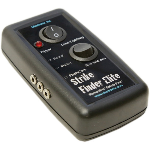
Ubertronix Strike Finder Elite.
Source: B&H
I used watercolors here to color the water and later I've added a bit of milk to kill the transparency of the water a bit. As seen in the set above, I've used here only 2 speedlites (580EX II) and didn't want to use my third speedlite (430EX II). I used here also my UV filter over the lens front just to protect the front from water droplets. I should have protected the flash heads as well with plastic bags but I skipped that actually. The big hurdle was to get my old Ubertronix trigger to work, specifically with a laser-gate. Without detailing the troubles, at the end the laser-gate method proved useless to me because of the shutter lag and the cumbersome laser pointer I was using. Thus, for the rest of the experiment, I went on doing a manual job, holding the cable remote in one hand and dropping the cherry with the other.

Cherry Boom I
Canon EF 100mm Macro, f/9, 3200-1sec, ISO200.

It was apparent from the beginning that I'm having a problem and probably should have used a larger bowl of some sort since the white edge of the plastic dish was hard to remove. Some problems did not show up till later on as I was inspecting the images like Cherry Boom I. Beside the shallow depth at f/9 (which was not enough), it seems that 1/3200 of a second was not enough for the shutter to freeze the water movement! However, during the experiment, I've raised the speed a bit more without really knowing the final outcome that I will be getting later on. Good luck? Maybe!

Cherry Boom II
Canon EF 100mm Macro, f/9, 4000-1sec, ISO200.

The speed of 1/4000 seemed just enough to freeze such a fall! In total, out of 20+ shots, I got merely 2 useful shots and one or two shots for splashes without the cherry(ies) which I simply liked for their shapes but I don't think they would be useful as stock images or printed and displayed. As for Cherry Boom II, the cherry here fell upside down and my brain being in love with illusions, I've decided to rotate the image 180o and thus the water came up and the cherry down, but standing up. What annoys me about Cherry Boom II is, like the other shots, the white space from the plastic dish edge which cannot be removed or substituted. I continued the work further in the next day and going manual too with 1/5000 shutter speed, and changing the camera tilt little bit (and pouring some water into the dish) to hide the white edge as much as possible. Again, out of 20+ shots, I've one suitable shot here.

Cherry Boom III
Canon EF 100mm Macro, f/20,
5000-1sec, ISO320.
Beside enhancing the looks, I went on enhancing the depth of field as well pushing it to f/20 (to have greater chance of having the cherry sharp wherever it falls), but that of course called for an increase in ISO, as I didn't want to use my third speedlite still. Water splashes now are more stable and live! In Cherry Boom III, seeing that the two cherries fell on their side, I've decided to rotate the image 90o clockwise to add a surreal feel to it.
In all of these shots of high speed, there was always a problem with the noise level when processing the images, despite the ISO being relatively low. With my Canon EOS 7D, I'd say that the ISO is somewhat easier to handle up until ISO 800 or around that, but in these images the processing was cumbersome and I do have my doubts about being accepted for exhibitions with the group (if they pass the aesthetic critique). However, some stock websites did already accept these images without a problem and they are up for sale!
Finishing from this cherry project I did proceed to another one, involving high-speed shooting as well, but I will keep that for a future post, as I'm still trying to work on it further.

Finale

After kindling my passion again for high-speed photography (adding to that the lack of locations and ideas for panoramas), and after the failure of my trigger, I've emailed the company asking about the reasons for such time lag and after some discussion, it seems that the reason is my shutter and not the trigger itself. I was advised to connect the trigger to the flash instead of the camera but in my working conditions this is not possible, as working with triggered flashes means opening the shutter in a dark environment while the flash becomes the only source of light. However, reading about some aspects of my camera, it seems that I do have also to adjust some of my photo-shooting habits to reduce the time lag in shutter release (depending on LiveView being one!).
Though I'm on leave without traveling but seems I do have a busy schedule here (beside taking care of Mom), but I feel some satisfaction that I didn't feel in a long time now since I could work with my camera and really think of something to do with it, without feeling exhausted like everyday after coming back from work through the traffic jam. Meanwhile, the idea of traveling is still ticking and tickling my mind, despite the fear of the hassles that I might have to face outside because of all the madness going in the world today, specially for a guy like me from the Middle East.
In the meantime, August is getting closer, my birthday that is, and I'm preparing to have some big order (well, not so big, but a bit big maybe?) of some gear and maybe some books. I would have to place the order before August I presume since there are some items that are considered "special order" (i.e. need time to be prepared and dispatched). This is to be a gift to myself, since no one around give such gifts except of perfumes! On my mind is a 4th speedlite (and probably another 580EX II if available still) and maybe some filters. I feel so excited that I want to place the order right away in the coming few days, but my financial situation and the course of Ramadan makes me hold it back and wait. Thus, I might be placing my order by the end of June or so! I need to miss my camera so much to work with it with passion…

Stock photography by Taher AlShemaly at Alamy

Thursday, June 26, 2014

Hexachromatic…

Turbulent time here. I'm trying so hard to push myself to work on various projects, and probably the only one project I'm advancing through is my other Arabic blog for photography beginners. Ramadhan will start by the next week and I have to say that it seems I'm not ready yet. The heat plus the creativity block on my side would make this Ramadhan not an easy time to pass. I even had some urge to write poetry, but words are betraying me often and pouring them to a piece of paper or to the Notepad is not an easy task anymore. Camera-wise, it's the same. Not much of ideas. The best I could do is visit my old arsenal of images and convert them to Black and White with some experimentation of Tone Splitting.

الله

I've acquired lately some amount of glycerine (a.k.a glycerol) which is sometimes used instead of water as droplets when taking shots of still life with "dew" on leaves and such. Glycerine is pretty beneficial in such instances because it has a good Surface Tension that holds each drop in a good spherical shape, beside its viscosity which allows it to be stable on the surface of a smooth leaf; unlike water drops that tend to slide easily down. My experiment, however, is something totally different to such shots.
Glycerine is also special in its optical properties; apparently a drop of it has more magnification power than water drops would have, and this property was inspiring somewhat. I wanted to use a drop of glycerine as a magnifying factor, but the problem is, inspiration was missing. The last thing I could think of is using a drop of it to magnify the holy word.

Allah
Canon EF 100mm Macro+2x Bower teleconverter,
f/5.6, 320-1sec, ISO200.

First, I had to prepare the setup, which was simple in fact but since it was on the ground, there were some problems with the level of the camera and also how to set up the Speedlite 580EXII. On the Holy Book, I've placed a clean acrylic sheet and then put on a drop of glycerine on that. The rest was experimenting and changing the position of the Speedlite. It was hard and in fact, I never did take a good image that I really liked (not even the one above). However, I tried, and ironically, the property of the liquid that I liked the most, proved to be fatal the most; as it caused severe internal reflections and would cast a pretty dark shadow. I had to carry the camera by hand and shoot since I didn't have a low level enough, and I was sort of surprised to be able to focus at such close distance. The handshake wasn't a problem since I was shooting with a relatively high shutter speed  Many shots were made and I have to say I'm still not quite satisfied, but for the time being, this is the best I could do.

Trial

As you can see in Trial, which is one of the images made in that experiment, in the beginning this was the initial position and framing but it did feel wrong. Probably I just tend to place the subject on the left side because of my left-handedness in general. Anyway, as you may know, the Arabic script goes from right to left, and such positioning for the droplet was cumbersome somewhat. Thus, I had to change the framing and place the drop on the right side to go along the direction of the text (I think this is what they call the concept of "nose room") as it is the case in Allah. Ironically, I do like the appearance and the glossy look of the drop in Trial but unfortunately, the position wasn't right. Changing the perspective later changed everything and no perfect positioning for the speedlite (with modifiers) I could think of.
I'll stop at this, and probably think of something else to do with such droplets, and I'm already doing some "brainstorming" to try and think of some ideas to use such droplets. Most of the time, I do get these crazy ideas, yet, no way for doing them...

Hexachromatic

As I've stated before, I'm still working on turning some images and panoramas into B&W and with tone splitting techniques. By coincidence, I've encountered a very useful website: ColorCodeHex.

ColorCodeHex Snapshot.

In this website, you get to learn a lot about colors. In fact, X-Rite which provides the calibration tools for monitors and such, provides a software along with the set to help on calibrating or viewing and studying colors (specifically under different lighting when required). However, this website is different in its wealth of information provided and easiness of use, despite the fact that you cannot check the cast on a color under specific light temperature (color temperature). With this website, I've decided to do some experiments with splitting tones beyond the regular "complimentary colors" combinations.

Golden Hide
B&W + Tone Splitting

One of the experiments done here is with this panorama from Staten Island (back from 2012), Golden Hide; for The Grotto. What really pronounces this image more is the sharpness (I think it sort of makes it like cut of wood). However, to split tones for this image, I've used some shade of green (picked from the trees in the original image) to be for the highlights. For shadows, I've decided to use ColorCodeHex to know what options I have, and thus I picked one of the analogous colors provided after entering the main color's hex code. The term "analogous" means a color shade that is adjacent to the major color under inspection on the color wheel. My remarks? Well, it helps on making a major tint for the whole image as it is indeed a simple one tint but with the shadows tones under control, we can have more options in lighting and darkening the shadows - this can't be done in general tinting processes. The tint just paints the whole image. I can say that using an analogous color is a delicacy. However, the analogous color is not necessary of the same shade of the major color; it can be a color of the same color temperature but not really of the same shade. That needs more experimenting.

The Temple
B&W + Tone Splitting

Then I got to try the other concepts provided by ColorCodeHex, like the concept of Monochromatic Colors. Monochromatic colors are supposedly colors that share the same hue of the original color but are different in other values (saturation and luminance). In this panorama, also from Staten Island, The Temple, I've used one shade of yellow as the major color for highlights (picked from the lanterns hanging in the original image) and using the website I've got to know its Monochromatic colors set. From the set, I've picked the darkest to be the tone for the shadows. This way I could help on adding contrast even though I did use Curves later on to put on a little contrast too. Maybe the difference between the usage of the two classes of colors is not that obvious, but in practice it proves to be so, because Monochromatic colors class provides a wide range of colors but under the same shade (or hue), yet the class of Analogous colors provides adjacent colors similar in temperature mainly but not necessarily the shade, and hence it opens a gate for some creativity work and experimenting. My work with B&W and tone splitting is far from being over!

Geltanic UDHR

I had a chance to fix some aspect about the UDHR in Geltani and also record it. I just hope the plugins works correctly for listening here!


The sound might not be a high quality though. I really had some hard time saying some of these syllables, specially nasals. However, I think it's late now to adjust these values and I better get on moving and just train myself to say these hard combinations!
On the other hand things are going on slowly in the field of Geltani. One day I have to set up a proper document to be sent to Omniglot. Things will be handwritten though. I have to tighten the grip as well on some grammatical features and some words that still make discrepancies because of the basic wording in Arabic. I better begin writing down some rules about those!

Finale

Here I am, with my Irish visa granted and just waiting for September to arrive. I'm worried, I can't deny that. I'm even more worried because of all the events in this area.  I do ask myself sometimes, do not we deserve some peace of mind for just a month? One month of peace is all I'm asking for...
Ramadhan is coming next week and I have to say that I don't feel prepared yet despite all that fasting I did before. My time becomes always compressed in Ramadhan. I do wish if I'm just not here at this moment... somewhere far...
Now another week is coming, and another struggle to work on something and achieve something in my life. An endless process, accompanied with an endless eagerness...

Thursday, June 12, 2014

Zu Teilen...

A week marked with laziness and blown mind because of the heat. I'm seriously having issues regarding my workplace; I started to reduce my "respect" to it, as if there is any already anyway. I'm skipping some days to do what I consider a more important job for me, regarding this blog, photography, and do some studies regarding my conlangs and phonology. Not sure how long this status would last, but in such summer and heat, and such disrespect for the admins who barely know what is science, which for, I spent 6 years of my life in this college - it is hard to tell if I can regain any respect back.
In the meantime, I'm on the path of doing some new set of experiments with my camera but yet I'm not ready to put on the pictures here; till the moment of typing this there are no shots yet! But hopefully something would be ready for the next week. However, I did a little tutorial for tone splitting which you can read below under Split It!, if you like this technique!

Crescent Beach

It was back in April when I worked with this panorama on the beach at night, in a place that I commonly call The Secret Spot. This panorama, which was majorly done by continuous long exposures ranging from 2 to 4 minutes, and took around 2 hours to be done - it was done in several formats and projections. Except of one which I suddenly remembered!

Mare Lunare

The forgotten projection was the Globe or Circular projection of the same panorama. I seldom use this projection to show panoramas because of the limited view, and hence, the limited creativity aspect that can be controlled with such projection. The projection is circular mainly and the background is transparent (if saved in a file format that supports it). Because of this circular shape, some features might look cut instead of being highly distorted. However, I decided to take a chance at it, specially that this is one of the last panoramas done before the advent of summer. Sorry, I mean hell.

Crescent Beach

Once achieved, it was really hard to pick up a suitable angle. Moreover, it was apparent that a crescent shape would form but there was a dilemma should it be made out by the sand or the sky. After changing the aspect (in terms of rotations) I've finally decided that I should make it with the sand portion of the panorama. In editing the panorama later, I've worked with many layers to remove color casts, increase contrast, and most importantly, brighten the sand portion of the image and suppress the luster of the sky just a bit to pronounce the crescent more. The formation of the crescent though wasn't quite good enough because of the connection between its ends on the far right. I think I've made a mistake in making the sand crescent here look directly to the right (i.e. in a right angle). Probably something twisted and tilted a bit would give more dynamic view and interaction with the eyes. Anyway, it is an experience, and hopefully the impression and knowledge shall be memorized for future work!

Split It!

As you may now know (if you are a follower), I've been working on converting some images to B&W and also using Tone Splitting specifically. Tone splitting provides a new taste and flavor to the B&W; Maybe I can call it the next level of tinting a B&W image.
For those who know nothing about it already, Split Tones, or Tone Splitting, is a technique to divide the highlights and the shadows to two different colors. Even though the technique, theoretically, can be applied to any images, but it is more apparent and more resilient in the arena of B&W images rather than colored ones.
Usually this is done in RAW editing phase, but sometimes we do need to edit a JPG file, thus I had to work out some way to split the tones "manually" if so to say. This method might not be as accurate as editing directly in RAW, but it accomplishes the look somewhat. I'll describe it below.

I. Open the image file (in Photoshop of course). Here, I will presume it is a colored image already. I'll be dealing with one of my old images: Harmonie.
Harmonie

II. You can duplicate the background layer to feel safe (Ctrl+J) or you can work directly on this layer. The choice is yours. However, we add then a Black and White adjustment layer by clicking button (1) and picking (2) from the menu. The tones are then adjusted to taste (3), but pay attention to the details and how the highlights and shadows are connected!
Click to Enlarge

III. Then we add a Threshold layer to split the highlights and shadows of the image. Click the button again (4), and pick (5) for the list, and adjust the tones to taste (6). Again, pay attention to the highlights and shadows here. I suppose there should be a balance between the two at this stage but it is after all a matter of taste.
Click to Enlarge
 
 IV. As the layer Threshold 1 is highlighted, press Ctrl+Alt+Shift+E (altogether!). This will merge all the layers in a new layer on the top (7), then turn off Threshold 1 (8) by clicking the eye icon beside it.
Click to Enlarge

V. While the new layer is still highlighted (i.e. selected), Press Ctrl+A (Select All), then Ctrl+C (Copy), and then Ctrl+D (Remove Selection). Now, the new merged layer should be stored in the memory (to paste it in the next step).

VI. We, again, add and adjustment layer (9), and this time we pick the Photo Filter adjustment layer (10). After the layer is placed on top as usual, turn off the previous layer (11). While holding Alt, click on the layer mask of the Photo Filter layer (12) and the page turns white. Press Ctrl+V to paste the image we copied earlier in step 5. After pasting make sure you press Ctrl+D to remove the selection. Now pick a color in any way you wish and tone it as you like (13) - this should be controlling the highlights. It might be a good idea to keep Preserve Luminosity option checked.
Click to Enlarge

VII. After finishing setting the color and its level in the previous step, directly duplicate this layer by pressing Ctrl+J (14), and then directly press Ctrl+I (15) to reverse the colors of the layer mask. This is, now, the shadows controller. Now set a new color and its tone (16). If the dialog didn't appear, just double click the icon of the layer (i.e. the one beside the eye icon).
Click to Enlarge

At this point, the main process is over. The rest is experimenting with the colors chosen for highlights and shadows, and their strengths. Some extra stuff can be done are:
1. Adding Vibrance adjustment layer to increase the vibrancy of the colors.
2. Adding Contrast adjustment layer to increase (or decrease contrast).
3. Do a slight Gaussian Blur to the layer masks of the Photo Filter adjustment layers; and the amount is dependent on the image size of course. This is to soften the edges where the two tones of highlights and shadows make a contact. The blur is better be of the same magnitude for both layer masks.

Just another halfie.
Tones split between blue
(highlights) and
yellow (shadows).
The balance here is shifted
to the shadows more, making
the blue tint of the image in the
highlights not directly visible.
These are just some suggestions. Generally, I've been using the concept of "complimentary colors" in doing split toning jobs to my images; that is use one color for highlight and use its complimentary color for the shadows (e.g. yellow-blue). However, this is, of course, not a rule. But a good and logical way to start. It would be useful to know (and memorize) the circle of colors!
All in all, even with split tones, it might look like a work of tinting a B&W image sometimes, specially when the weight of tinting shifts to one side (i.e. to highlights more than shadows or vice versa) in an obvious way. For example, Just another halfie on the left was split-toned (in RAW format) between Blue/Yellow*. Yet, to achieve the look that I really liked, the balance was shifted towards shadows more than highlights making the image look generally yellow, but with a slight tint of blue on the skin which can be hard to notice for some eyes; this is noticeable only when the blue is removed and the skin becomes "white" - only then, the difference to the eyes would be clear. When I did this experiment, it was obvious how important is to add a highlight tint (specially a tint from the complimentary color) even if it was hard to notice easily by the eyes. Even a slight amount of complimentary color into the image, whether in shadows or highlights, can produce a pleasant contrast that gives some more strength to the image. I had the advantage here to suppress the green background by toning the Green tones down; I think I was lucky for not wearing green that day!
Beside using complimentary colors in split toning, sometimes I do get the idea of the major colors in the image itself; this is if it was majorly ruled by two major colors.

Orbis Fidei
Original Panorama.
Majorly dominatedby yellow and blue.

Orbis Fidei
After splitting tones using Yellows for highlights,
and blues (cyan) for shadows.

Here comes another reason why manual tone splitting can be useful. Panoramas are not RAW files to be edited in RAW and their tones can't be split there. Thus, manual work is due (whether with high resolution TIFFs or regular JPGs). I'm still digging in the past panoramas to find those which are suitable for such technique.

*It is a convention, to myself, when mentioning colors of tone splitting, to mention the color of the highlights first, then of the shadows.

Finale

Time is ticking, and I've finally finished the bulk of the work with the Irish Visa. What is left now is the other half of the bulk! That is a proper photo for the application, and a 6-month record from my bank (to prove I can support myself there). I'm planning on leaving around the end of September. Though 3 months are ahead, but I have to hurry up with these tasks and send my documents (I think to the embassy in Abu Dhabi now) because such procedures might take 8 weeks as they stated; i.e. 2 months!

I have recently received a surprising phone call from an interior designer which quite swept me through in surprise - could this really be a start of a business trend? I'm not quite sure what is the next step, as the other side asked to arrange a meeting, which would probably fall within Ramadhan. The mention of panoramas, as he stated, gave him more ideas than he was thinking of. Anyway, I've left organizing a meeting for him to schedule and I just have to sit and wait I guess. If this could happen for real, I might have some sort of condolences regarding the despicable workplace I'm dipped in.
As for now, I'll just sit and watch my life, and work with my camera as much as possible. My dreams, myself, and I... with my camera... is all what is left for me here...